


Giphy preview
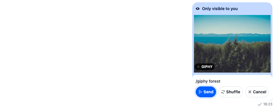
A /giphy command answers with a preview that only the user sees, with Send, Shuffle and Cancel buttons. This recipe replaces those buttons.
What you'll build
- The search term above the buttons
- Rounded Send, Shuffle and Cancel buttons with icons
Preview
Approach: Replace one part. Choosing where to start explains the approaches.
Starts from: the base app. The page shows only what the recipe adds.
Best practices
- Replace the buttons through
Attachment'sAttachmentActionsprop, and register the result as theAttachmentkey. The rest of the attachments render as before. - Keep the actions of other attachments on the default
AttachmentActions. Only a Giphy preview has Send, Shuffle and Cancel. - Call the
actionHandlerthe buttons receive. It sends the action and applies the server's answer to the message list. - Give the focus to the button
attachmentActionsDefaultFocusnames when the preview appears, and back to where it was after Send or Cancel, as the default buttons do. - Keep what the default buttons tell a screen reader: the "only visible to you" description on the focused button, and the announcements after Shuffle, Send and Cancel from
useInteractionAnnouncements(). Label the buttons withuseTranslationContext().tand the SDK's keys, so a translation registered for the default buttons applies to these too.
Register the buttons
Attachment takes a prop for each part it renders. Pass the buttons to it, and register the result:
import type { PropsWithChildren } from "react";
import type { AttachmentProps } from "stream-chat-react";
import { Attachment, WithComponents } from "stream-chat-react";
import { GiphyPreviewActions } from "./GiphyPreviewActions";

// A Giphy preview's buttons render `AttachmentActions` from this prop.
const AttachmentWithGiphyPreview = (props: AttachmentProps) => (
  <Attachment {...props} AttachmentActions={GiphyPreviewActions} />
);

// Declared once, so WithComponents gets the same object on every render.
const overrides = { Attachment: AttachmentWithGiphyPreview };

export const WithGiphyPreview = ({ children }: PropsWithChildren) => (
  <WithComponents overrides={overrides}>{children}</WithComponents>
);
Render your Channel inside WithGiphyPreview. The base app passes it as the recipe's wrapper, around the whole chat view.
The preview buttons
GiphyPreviewActions receives the attachment's actions, its type and its title, the search term. For a Giphy preview, it renders the term and a button with an icon for each action; for any other attachment, it renders the default AttachmentActions:
import { useEffect, useId, useRef } from "react";
import type { AttachmentActionsProps } from "stream-chat-react";
import {
  AttachmentActions,
  useComponentContextIcons,
  useFocusReturn,
  useInteractionAnnouncements,
  useTranslationContext,
  VisuallyHidden,
} from "stream-chat-react";
import "./GiphyPreviewActions.css";

/** A Giphy title that is a media URL is no use to a screen reader, so it counts as no title. */
const readableTitle = (title?: string) =>
  title && !/^(https?:|\/\/)/i.test(title) ? title : undefined;

/**
 * The buttons under a Giphy preview: the search term, then Send, Shuffle and Cancel with icons.
 * Actions of other attachments keep the default UI.
 */
export const GiphyPreviewActions = (props: AttachmentActionsProps) => {
  const { IconRefresh, IconSend, IconXmark } = useComponentContextIcons();
  const { t } = useTranslationContext();
  const { announceInteraction } = useInteractionAnnouncements();
  const { reserve, restore } = useFocusReturn();
  const focusedButton = useRef<HTMLButtonElement>(null);
  const descriptionId = useId();
  const isGiphy = props.type === "giphy";

  // The button `Attachment.attachmentActionsDefaultFocus` names (Send by default) takes the focus
  // when the preview appears; Send and Cancel give it back to where it was. A button that already
  // has the focus is left alone, so an effect that runs twice doesn't remember the button itself.
  useEffect(() => {
    if (!isGiphy) return;
    const button = focusedButton.current;
    if (button && document.activeElement !== button) {
      reserve();
      button.focus();
    }
  }, [isGiphy, reserve]);

  // Shuffle swaps the GIF in place while the focus stays on Shuffle, so the new GIF is announced.
  // Its URL tells one GIF from the next. The first GIF isn't announced: the focused button's
  // description already says what the preview is.
  const imageUrl = isGiphy
    ? (props.giphy?.original?.url ?? props.thumb_url ?? props.image_url)
    : undefined;
  const previousImageUrl = useRef(imageUrl);
  const title = readableTitle(props.title);
  useEffect(() => {
    if (!isGiphy || imageUrl === previousImageUrl.current) return;
    previousImageUrl.current = imageUrl;
    announceInteraction("giphy.shuffled", { title });
  }, [announceInteraction, imageUrl, isGiphy, title]);

  if (!isGiphy) return <AttachmentActions {...props} />;

  const { actionHandler, actions, defaultFocusedActionValue } = props;
  const icons: Record<string, typeof IconSend> = {
    cancel: IconXmark,
    send: IconSend,
    shuffle: IconRefresh,
  };
  // The same translation keys as the default AttachmentActions.
  const labels: Record<string, string> = {
    cancel: t("common.cancel.label", "Cancel"),
    send: t("common.send.label", "Send"),
    shuffle: t("attachment.actions.shuffle.label", "Shuffle"),
  };

  return (
    <div
      aria-label={t(
        "attachment.actions.giphyActions.ariaLabel",
        "Giphy actions",
      )}
      className="cookbook-giphy-actions"
      role="group"
    >
      {props.title && (
        <span className="cookbook-giphy-actions__query">
          /giphy {props.title}
        </span>
      )}
      <div className="cookbook-giphy-actions__buttons">
        {actions.map((action) => {
          const Icon = action.value ? icons[action.value] : undefined;
          const isFocused = action.value === defaultFocusedActionValue;
          return (
            <button
              // The focused button carries the preview's description, so it's read with the focus.
              aria-describedby={isFocused ? descriptionId : undefined}
              className={`cookbook-giphy-actions__button cookbook-giphy-actions__button--${action.value}`}
              key={action.value}
              onClick={(event) => {
                void actionHandler?.(action.name, action.value, event);
                if (action.value !== "send" && action.value !== "cancel")
                  return;
                // The focus goes back first and the announcement follows a frame later, so the
                // screen reader doesn't drop it for the focus change.
                restore();
                const interaction =
                  action.value === "send" ? "giphy.sent" : "giphy.canceled";
                requestAnimationFrame(() => announceInteraction(interaction));
              }}
              ref={isFocused ? focusedButton : undefined}
              type="button"
            >
              {Icon && <Icon />}
              {(action.value && labels[action.value]) ?? action.text}
            </button>
          );
        })}
      </div>
      <VisuallyHidden id={descriptionId}>
        {t(
          "attachment.actions.giphyPreviewOnlyVisible.ariaLabel",
          "Giphy preview, only visible to you. Use the Send, Shuffle, or Cancel actions.",
        )}
      </VisuallyHidden>
    </div>
  );
};@layer stream-overrides {
.cookbook-giphy-actions {
display: flex;
flex-direction: column;
gap: var(--str-chat__spacing-xs);
margin-top: var(--str-chat__spacing-xs);
padding: var(--str-chat__spacing-sm);
border-radius: var(--str-chat__radius-lg);
background: var(--str-chat__background-core-elevation-0);
}
.cookbook-giphy-actions__query {
color: var(--str-chat__text-secondary);
font: var(--str-chat__font-caption-emphasis);
}
.cookbook-giphy-actions__buttons {
display: flex;
gap: var(--str-chat__spacing-xs);
}
.cookbook-giphy-actions__button {
display: inline-flex;
flex: 1;
align-items: center;
justify-content: center;
gap: var(--str-chat__spacing-xxs);
padding: var(--str-chat__spacing-xs);
border: 1px solid var(--str-chat__border-core-default);
border-radius: var(--str-chat__radius-full);
background: var(--str-chat__background-core-elevation-0);
color: var(--str-chat__text-primary);
font: var(--str-chat__font-caption-emphasis);
white-space: nowrap;
cursor: pointer;
}
.cookbook-giphy-actions__button:hover {
background: var(--str-chat__background-utility-hover);
}
.cookbook-giphy-actions__button--send {
border-color: var(--str-chat__accent-primary);
background: var(--str-chat__accent-primary);
color: var(--str-chat__text-on-accent);
}
.cookbook-giphy-actions__button--send:hover {
background: var(--str-chat__accent-primary);
opacity: 0.9;
}
}The screenshot at the top of this page shows the result. It was taken in a read-only demo app, which can't send /giphy. A screenshot helper added the preview to the channel's message paginator with MessagePaginator.ingestItem(), as the server's answer would, and the GIF is a still image.
How it works
Example
The user sends /giphy forest in the Weekend trip channel. A preview with the search term and Send, Shuffle and Cancel appears at the end of the list, with the focus on Send. Shuffle shows another GIF, and Send posts it to the channel.
MessageUIrenders theAttachmentkey for a message with attachments. A Giphy attachment goes toGiphy, followed byAttachment'sAttachmentActionsprop when the attachment has actions.- Each button calls
actionHandler(action.name, action.value, event). It sends the action withChannel.sendAction()and applies the answer to the message paginator: another GIF after Shuffle, the posted message after Send, and nothing left after Cancel. Commands and Giphy explains the steps. useFocusReturn()remembers where the focus was, usually the composer, when the preview takes it, and Send and Cancel give it back.- The focused button's
aria-describedbypoints at a visually hidden description, so a screen reader says the preview is only visible to the user when the focus lands.announceInteraction()fromuseInteractionAnnouncements()announces the new GIF after Shuffle, and "Giphy sent" or "Giphy canceled" a frame after the focus goes back, so the focus change doesn't cut it off.
The preview renders among the messages in MessageList. In VirtualizedMessageList with separateGiphyPreview, it renders below the list as the GiphyPreviewMessage key instead, and that component receives the preview message with the props the list passes to every message.
Related
- Commands and Giphy explains how the user sends
/giphyand what each button does. - Attachments lists the
Attachmentprops, includingAttachmentActionsandattachmentActionsDefaultFocus. - Overriding components explains how
WithComponentskeys apply. - GIF picker adds a GIF button and picker to the composer, so a GIF goes out without a
/giphypreview. - Image gallery replaces the image grid and the lightbox.
- Custom message replaces the message UI that renders
Attachment.