


Replacing the icon set
This recipe replaces every icon the SDK draws with its counterpart from Lucide, an open-source icon set. How icons are overridden one by one is explained in Overriding components → Icons.
What you'll build
- Lucide icons across the whole UI, in your theme's colors
- Directional icons flipped in right-to-left layouts
- A file-type icon beside each file attachment
Preview
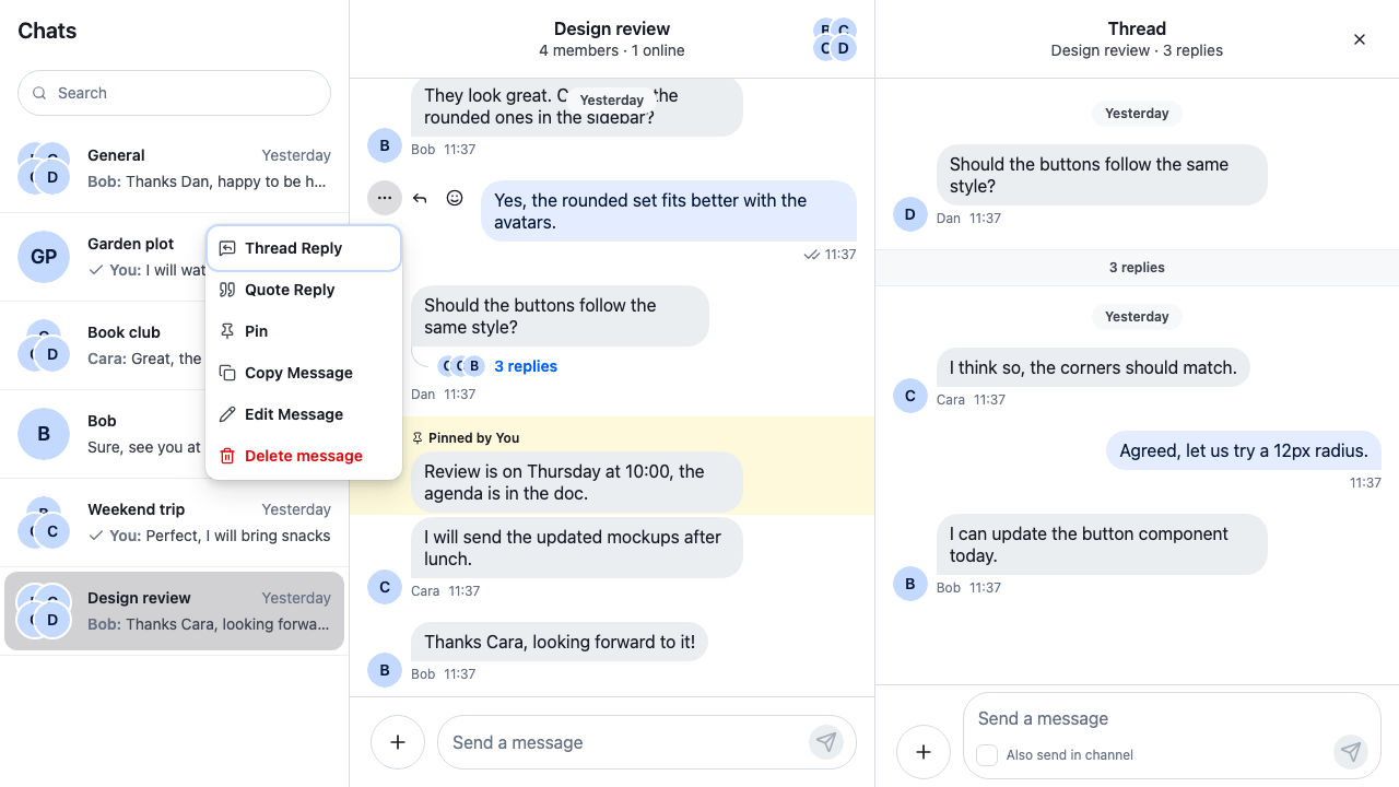
Approach: Replace one part and Restyle. Choosing where to start explains the approaches.
Starts from: the base app. The page shows only what the recipe adds.
Best practices
- Replace all the icons at once. A screen that mixes two sets looks broken, so map every name the SDK has, not only the ones you see first.
- Keep the map in one file, typed as
Record<IconName, …>. The build then fails when a name is missing, including a name a later SDK version adds. - Build each icon with
createIconand the SDK's icon name. The SDK styles some icons by a class made from that name. - Flip arrows and other directional icons in right-to-left layouts, as the SDK does for its own.
- Check the screens a quick look misses: the composer's attachment menu, the thread header, a failed upload, a voice recording, a poll.
Map the SDK's icons to your set
The SDK draws 88 icons, and each has a name such as IconSend, IconReply or IconMute. The IconName type lists them all. The recipe keeps one entry per name in lucideIcons.tsx: the Lucide icon to draw, and two options, filled for the SDK's solid icons whose Lucide shape still reads when filled, and mirrorInRtl for the directional ones.
The excerpt below shows the whole file except most of the map's rows and their imports. The full file, with all 88 rows, is examples/cookbook/src/recipes/theming/replacing-the-icon-set/lucideIcons.tsx in the stream-chat-react repository:
import {
  Archive,
  ArrowLeft,
  // …one import for each Lucide icon the map uses
  MessageSquare,
  MessageSquareReply,
  Paperclip,
  Play,
  Reply,
  Send,
  Square,
  VolumeOff,
  type LucideIcon,
} from "lucide-react";
import {
  createIcon,
  type IconComponent,
  type IconName,
} from "stream-chat-react";

type LucideOptions = {
  /**
   * Draws the shape solid. Lucide draws outlines by default. Only plain shapes are filled (play,
   * pause, stop, video, message bubble): a Lucide icon with marks inside, such as the eye's pupil, the
   * alerts' exclamation mark or the thread's arrow, would lose them, so those `…Fill` icons stay
   * outlines.
   */
  filled?: boolean;
  /** Flips the icon in right-to-left layouts, as the SDK does for its arrows. */
  mirrorInRtl?: boolean;
};

/**
 * Wraps a Lucide icon in the SDK's icon. `createIcon` derives the SDK's classes from the name
 * (`IconSend` → `str-chat__icon--send`), so the SDK's styles for that icon still apply. Lucide
 * draws on a 24×24 grid, so the SDK's svg gets that viewBox and Lucide's svg fills it.
 */
const fromLucide = (
  name: IconName,
  Lucide: LucideIcon,
  { filled = false, mirrorInRtl = false }: LucideOptions = {},
) =>
  createIcon(
    name,
    filled ? (
      <Lucide fill="currentColor" />
    ) : (
      <Lucide className="cookbook-lucide-outline" />
    ),
    { viewBox: "0 0 24 24", ...(mirrorInRtl && { "data-rtl-mirror": "" }) },
  );

// Every SDK icon, by name. The `Record<IconName, …>` type fails the build when one is missing.
const lucideIconMap: Record<IconName, [LucideIcon, LucideOptions?]> = {
  IconArchive: [Archive],
  IconArrowLeft: [ArrowLeft, { mirrorInRtl: true }],
  IconAttachment: [Paperclip],
  // …
  IconMessageBubble: [MessageSquare],
  IconMessageBubbleFill: [MessageSquare, { filled: true }],
  IconMute: [VolumeOff, { mirrorInRtl: true }],
  IconPlayFill: [Play, { filled: true }],
  IconReply: [Reply, { mirrorInRtl: true }],
  IconSend: [Send, { mirrorInRtl: true }],
  IconStopFill: [Square, { filled: true }],
  IconThread: [MessageSquareReply],
  // …one row for each of the 88 names
};

export const lucideIcons = Object.fromEntries(
  Object.entries(lucideIconMap).map(([name, [Lucide, options]]) => [
    name,
    fromLucide(name as IconName, Lucide, options),
  ]),
) as Record<IconName, IconComponent>;
Some names have no exact match in Lucide, so pick the closest shape:
IconNotificationis the Mark as unread action; the recipe usesBellDot.IconCommandopens the slash commands; the recipe usesSquareSlash.IconGiphymarks a GIF; the recipe usesImagePlay.IconCheckmark1Small,IconPlusSmallandIconXmarkSmallare smaller versions of other icons. Lucide has one size of each, so they share it.
Pass the map as the icons key of WithComponents, and wrap the app in WithLucideIcons:
import type { PropsWithChildren } from "react";
import { WithComponents } from "stream-chat-react";
import { LucideFileIcon } from "./LucideFileIcon";
import { lucideIcons } from "./lucideIcons";
import "./lucide-icons.css";

// Declared once, so WithComponents gets the same object on every render.
const overrides = { AttachmentFileIcon: LucideFileIcon, icons: lucideIcons };

export const WithLucideIcons = ({ children }: PropsWithChildren) => (
  <WithComponents overrides={overrides}>{children}</WithComponents>
);@layer stream-overrides {
/*
* Lucide draws outlines. A few SDK rules fill the svg or the paths inside an icon, for example
* the image placeholder's picture icon, so the outlines are kept hollow here.
*/
.cookbook-lucide-outline,
.cookbook-lucide-outline * {
fill: none;
}
.cookbook-file-icon {
color: var(--str-chat__accent-primary);
}
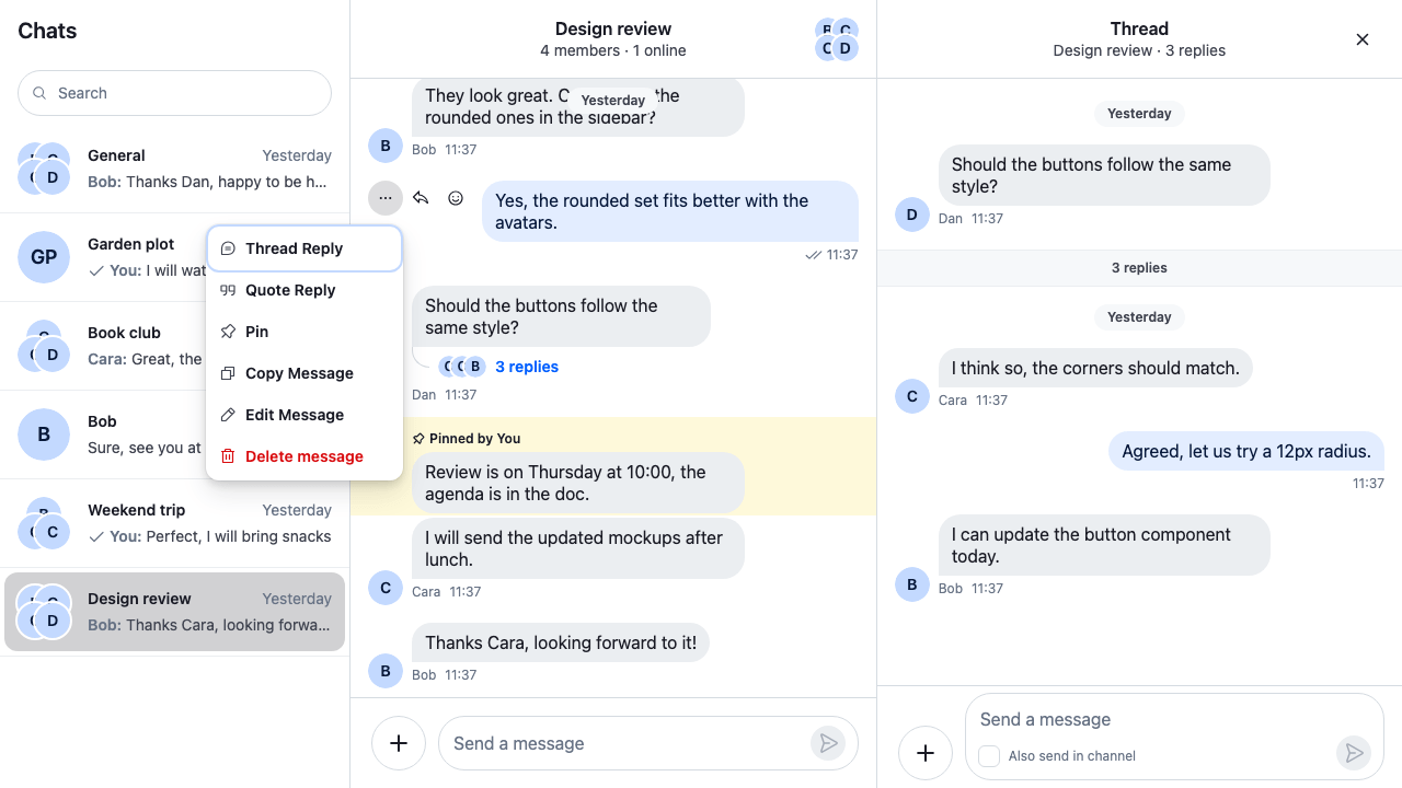
}The sections below explain the parts of these two files. Before the recipe, the same view shows the SDK's own icons:
The SDK's own icons
Keep the SDK's icon classes with createIcon
Every SDK icon is an <svg> with two classes: str-chat__icon, and one made from its name, such as str-chat__icon--send for IconSend. The SDK's stylesheet sizes or turns some icons through the second class: the send, stop and microphone buttons in the composer, the mute badge in the channel list, the play button in a quoted voice recording, and the back arrow in a submenu. A plain Lucide component has neither class, so those icons would come out the wrong size or point the wrong way.
createIcon(name, content, defaultProps) builds the icon the way the SDK builds its own. It adds both classes, hides the icon from screen readers unless the caller passes decorative={false}, and merges the classes the SDK passes in, such as str-chat__icon--destructive on the red actions of the channel details. fromLucide passes it:
- the SDK's name, so the class matches;
- the Lucide component as the content. The SDK's svg draws on a 20×20 grid by default, so
defaultPropssetsviewBox: '0 0 24 24', Lucide's grid, and Lucide's own svg fills it exactly; data-rtl-mirrorfor the directional icons. The SDK flips an icon with that attribute when the layout is right to left.
lucide-react exports one component per icon, which is all fromLucide needs. Lucide's raw shape data is also in the package, but not as a typed public export, so the recipe nests the component instead of copying its shapes.
Stroke icons and the SDK's fill rule
The SDK's stylesheet sets fill: currentColor on .str-chat__icon, because most of its icons are solid shapes. Lucide icons are outlines: their svg carries fill="none" and stroke="currentColor". In this recipe, the class sits on the SDK's outer svg and Lucide's attributes on the inner one, so the inner svg keeps fill="none" and its shapes stay hollow.
A few SDK rules reach inside an icon instead, for example the image placeholder fills every svg in it, and the play buttons on videos and quoted voice recordings fill every path. Those rules would fill a Lucide outline. fromLucide gives every outline icon the class cookbook-lucide-outline, and the rule in lucide-icons.css sets fill: none on it and everything inside it. The rule sits in the stream-overrides layer, so it wins over the SDK's rules once the SDK's stylesheet is in an earlier layer, as Theming → CSS layers sets up.
filled: true gives an icon fill="currentColor" and no outline class. The recipe sets it only where the Lucide shape is plain, such as IconPlayFill, IconPauseFill, IconStopFill, IconVideoFill and IconMessageBubbleFill, so the play, pause and stop buttons stay solid. IconEyeFill, IconExclamationCircleFill, IconExclamationMarkFill, IconExclamationTriangleFill and IconThreadFill stay outlines: a solid fill in currentColor would hide the marks drawn inside them, such as the eye's pupil, the exclamation mark and the thread's arrow.
File-type icons
The icon beside a file attachment in the message list isn't in the icons map. It's the AttachmentFileIcon key, which receives the file's mimeType and fileName, and the className the SDK uses to place it. LucideFileIcon picks a Lucide file icon from the MIME type:
import {
  File,
  FileArchive,
  FileHeadphone,
  FileImage,
  FileSpreadsheet,
  FileText,
  FileVideoCamera,
  type LucideIcon,
} from "lucide-react";
import type { FileIconProps } from "stream-chat-react";

// Spreadsheets first, so `text/csv` doesn't fall under `text/`.
const iconForMimeType = (mimeType = ""): LucideIcon => {
  if (/spreadsheet|excel|csv/.test(mimeType)) return FileSpreadsheet;
  if (/zip|compressed|tar/.test(mimeType)) return FileArchive;
  if (mimeType.startsWith("image/")) return FileImage;
  if (mimeType.startsWith("audio/")) return FileHeadphone;
  if (mimeType.startsWith("video/")) return FileVideoCamera;
  if (mimeType.startsWith("text/") || mimeType === "application/pdf")
    return FileText;
  return File;
};

type FileIconSize = NonNullable<FileIconProps["size"]>;

// The heights of the SDK's file icon sizes, in px. Lucide's icons are square.
const heightBySize: Record<FileIconSize, number> = {
  lg: 40,
  md: 32,
  sm: 24,
  xl: 48,
};

/** The file-type icon on a file attachment, picked from the file's MIME type. */
export const LucideFileIcon = ({
  className,
  mimeType,
  size = "md",
  sizeConfig,
}: FileIconProps) => {
  const Icon = iconForMimeType(mimeType);
  return (
    <Icon
      aria-hidden
      className={`${className ?? ""} cookbook-file-icon`}
      size={sizeConfig?.[size]?.height ?? heightBySize[size]}
    />
  );
};
LucideFileIcon checks spreadsheets first, so text/csv gets the spreadsheet icon rather than the text one. It draws the icon at the height of the size the SDK asks for (24px for sm, 32px for md, 40px for lg, 48px for xl, or the height in sizeConfig), and the .cookbook-file-icon rule in lucide-icons.css gives it the accent color.
AttachmentFileIcon covers file attachments in the message list only. The file preview in the composer, the file in a quoted message, and audio and voice-recording attachments render the SDK's file icon directly, so they keep it.
What the icon set doesn't cover
The composer's attachment menu, with the attachment button turned into a close button while the menu is open:
The attachment menu with Lucide icons
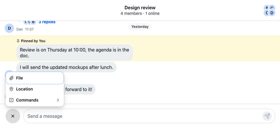
Three icons look like part of the set but can't be replaced through it:
- The voice recorder's checkmark. The button that finishes a recording draws the SDK's checkmark directly, not the one from the
iconsmap. - The location card's link icon. The icon on a shared location's link that opens it in a map is drawn directly as well.
- The checkbox tick. The tick in a checked checkbox, such as "Also send in channel" under a thread's composer, is an image in the SDK's stylesheet, not an icon component.
These parts aren't icons at all, so the set leaves them alone:
- Reactions. Reactions are emoji, set with
reactionOptions; see Reactions. - The typing indicator's dots and the upload progress ring. Both are drawn by their components and colored by theme tokens.
How it works
- Every SDK component that draws an icon reads it with
useComponentContextIcons(), which merges theiconskey ofComponentContextover the SDK's own icons, name by name.WithLucideIconssets all 88 names, so no SDK icon is left. createIcongives each Lucide icon the SDK's classes and accessibility attributes, so the SDK's stylesheet sizes and colors it as it did the original. Lucide icons draw withcurrentColor, so they follow the theme's text and accent colors.WithComponentsmergesiconsname by name with the context above it, so a nestedWithComponentscan still swap a single icon on one screen.overridesis declared at module scope, soWithComponentsgets the same object on every render and the merged icons are built once.
Related
- Overriding components → Icons explains the
iconskey, what an icon receives andcreateIcon. - Theming puts the SDK's stylesheet in a layer, so the
stream-overridesrules win. - ComponentContext lists the
iconsandAttachmentFileIconkeys. - Reactions changes the reaction emoji, which the icon set doesn't cover.