


Thread UI
A thread is a message and its replies, shown in a panel of its own beside the channel. Use this page to know what <Thread/> provides to the components inside it, what the thread header shows, and which parts you can replace. The list of the user's threads is on Thread list UI. The props are in the Thread reference.
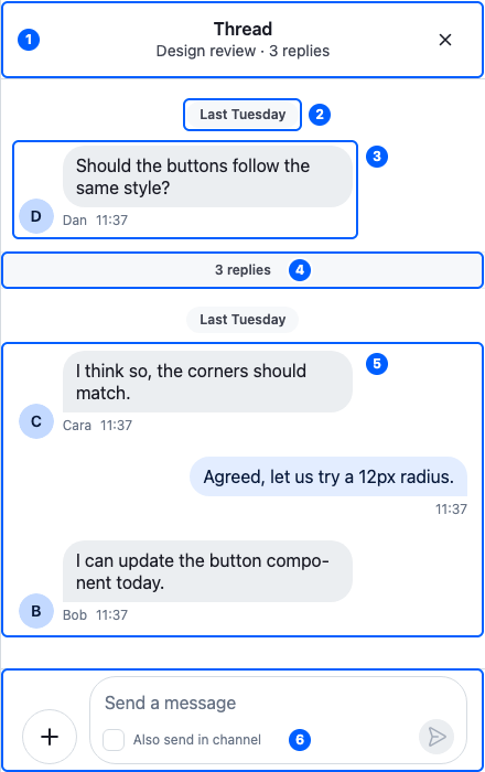
This is the default thread panel, for Dan's message in Design review, with three replies. Its parts:
| Part | Explained in |
|---|---|
| 1. The header | The thread header |
| 2. The parent message's date separator | Separators |
| 3. The parent message | The Thread component |
| 4. The reply count | Replacing parts |
| 5. The replies | Message list UI |
| 6. The composer, with "Also send in channel" | Message composer UI |
The Thread component
<Thread thread={thread}> shows the thread passed as thread. Like <Channel/>, it renders no UI of its own, only a container around its children. Here is a ThreadPanel component that renders one thread:
import type { Thread as StreamThread } from "stream-chat";
import {
  MessageComposer,
  MessageList,
  Thread,
  ThreadHeader,
} from "stream-chat-react";

export const ThreadPanel = ({ thread }: { thread: StreamThread }) => (
  <Thread thread={thread}>
    <ThreadHeader />
    <MessageList />
    <MessageComposer />
  </Thread>
);
What <Thread/> does:
<Thread/> |
What it means for you |
|---|---|
| provides the thread to the components inside | They retrieve it with useThreadContext(). useChannel() returns the thread's channel, so <Thread/> needs no <Channel/> around it. |
| connects them to the thread's controllers | <MessageList/> renders the replies in thread.messagePaginator, and <MessageComposer/> reads and writes the state of thread.messageComposer. |
| loads the thread while its state is stale | A thread created from its parent message starts stale when it may have replies to load. A thread from the thread list arrives loaded. |
| waits for the parent message | It renders nothing until the thread has its parent message, and nothing when replies are turned off for the channel (replies.enabled in its configuration). |
| provides its own audio players | Voice recordings and audio attachments in the thread stop playing when the thread closes. |
renders the .str-chat__thread container |
Style the panel through it. |
The parent message isn't a child you place. <MessageList/> renders it above the replies, so it scrolls with them: its date separator, the message, and the reply count under it. Separators shows the date separator.
Get the thread from client.threads, not with new Thread(). client.threads.ensure({ channel, parentMessage }) returns the thread for a message, creating it if needed, and client.threads.get(id) returns one the client already has. Either way the client keeps one instance per thread and sends it its events. What channels and threads hold explains the thread's state.
With <ChatView/>, <ThreadSlot/> renders <Thread/> for the thread in its slot, as in Add threads. Without <ChatView/>, render <Thread/> yourself for the thread the user opens; see Navigation.
The thread header
<ThreadHeader/> shows, from start to end:


The start area is empty in these images: the back button shows only when the thread is stacked over other content.
| Area | Shows | Prop |
|---|---|---|
| 1. Start | The back button, <WorkspaceNavigationBackButton/>, only when the thread is stacked over other content in its panel |
StartContent |
| 2. Title | "Thread" | |
| 3. Subtitle | The channel's title and the reply count, such as "Design review · 4 replies". A channel without a title shows the parent message author's name instead. While someone types in the thread, who is typing replaces the subtitle. | overrideTitle, which replaces the channel's title. It's named after the channel title it overrides, not the header's "Thread" title. |
| 4. End | The close button, <WorkspaceNavigationCloseButton/>, only when the thread's panel can be closed. It closes it with useCloseThread(). |
EndContent |
Like the channel header's buttons, both buttons come from the layout, and neither renders without one. A component passed as StartContent or EndContent replaces the button; render the button inside it to keep it. The Thread header recipe builds a header of its own.
Replacing parts
Register replacements with <WithComponents/>. Overriding components explains how overrides apply.
Component to override (<WithComponents/> key) |
Replaces |
|---|---|
ThreadHead |
The parent message above the replies, with its date separator and reply count. Gets the parent message as message. |
ThreadStart |
The reply count under the parent message |
The default ThreadHead isn't exported, so a replacement for it can't render the default inside it.
<Thread/> and <ThreadHeader/> have no override key as we render them directly. Render other children in <Thread/>, and change <ThreadHeader/> through its props. Inside a thread, the message list and the composer take the same override keys as anywhere else; Message list UI and Message composer UI list them.