


Channel details
Channel details is the SDK's panel for one channel: its name and image, its members, its pinned messages, and the photos and files shared in it. The user can mute the channel and leave it there.
What you'll build
- The channel's title as a button that opens the details
- Channel details in the side panel instead of a modal
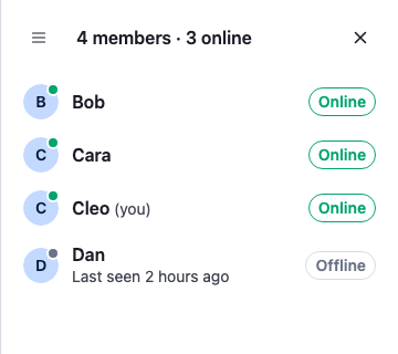
- A members view with online members first
- A restyled card of actions
Preview
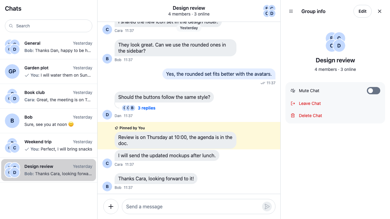
Approach: Compose, Replace one part and Restyle. Choosing where to start explains the approaches.
Starts from: the base app, with its side panel. The page shows only what the recipe adds: the panel's body, the header whose title opens it, and the stylesheets.
Best practices
- Start from the SDK's
<ChannelDetail/>, fromstream-chat-react/channel-detail. It already handles editing, muting, leaving, deleting and the members, and checks the user's capabilities for each action. Channel details and members lists what each section calls. - When a modal is enough, pass
AvatarWithChannelDetailto<ChannelHeader/>as itsAvatarand skip Channel details in the side panel. The avatar then opens the details in a modal. - Give
<ChannelDetail/>the channel through<ChannelInstanceProvider/>. The side panel sits outside the channel's<Channel/>, and the Channel info section reads the channel from that context for its online status. - Make the control that opens the panel a real
button, even when it looks like text such as the channel's title. Abuttontakes focus and answers Enter and Space, and needs a name that says what it opens and anaria-expandedthat says whether it's open. - Pass
<ChannelDetail/>anonClosethat closes your panel, as Render it in a side panel explains. - Change the panel's look through tokens, set on your own element around it. The SDK's rules keep working, and the panel follows your theme.
Channel details in the side panel
Loading the stylesheet
ChannelDetail has its own stylesheet. Put it in the same layer as the SDK's main stylesheet, so the rules in stream-overrides win over both:
@layer stream, stream-overrides;

@import "stream-chat-react/dist/css/index.css" layer(stream);
@import "stream-chat-react/dist/css/channel-detail.css" layer(stream);
The panel's body and its toggle
<ChannelDetails/> renders <ChannelDetail/> for the channel in the channel slot, so it follows the user to another channel. useChannelDetailsPanel() returns toggle, which opens it in the side panel with useSidePanel().openSidePanel() and closes the side panel when the details are the open content, and isOpen, for the control that calls it:
import { useMemo } from "react";
import { ChannelInstanceProvider } from "stream-chat-react";
import { ChannelDetail } from "stream-chat-react/channel-detail";
import type { SectionNavigatorSection } from "stream-chat-react/channel-detail";
import { useSlotChannel } from "stream-chat-react/slot-layout";
import { useSidePanel } from "./SidePanel";
import "./ChannelDetailsPanel.css";

const CHANNEL_DETAILS_ID = "channel-details";

type ChannelDetailsProps = {
  /** The panel's sections, in order. Defaults to the SDK's five. */
  sections?: SectionNavigatorSection[];
};

/**
 * The SDK's `ChannelDetail` for the channel open in the `channel` slot, so it follows the user to
 * another channel.
 */
const ChannelDetails = ({ sections }: ChannelDetailsProps) => {
  const channel = useSlotChannel({ slot: "channel" });
  const { closeSidePanel } = useSidePanel();
  const channelContext = useMemo(
    () => (channel ? { channel } : undefined),
    [channel],
  );

  if (!channelContext) return null;

  return (
    // Channel info reads the channel from the channel context for its online status, and the
    // side panel sits outside the channel's `Channel`.
    <ChannelInstanceProvider value={channelContext}>
      <div className="cookbook-channel-details">
        {/* A new channel starts the panel again on its first section. The sections' close
            button, and actions such as opening a pinned message, close the side panel. */}
        <ChannelDetail
          channel={channelContext.channel}
          key={channelContext.channel.cid}
          onClose={closeSidePanel}
          sections={sections}
        />
      </div>
    </ChannelInstanceProvider>
  );
};

/**
 * Opens the channel's details in the side panel, and closes them when they're the open content.
 * `isOpen` tells the control that toggles them whether the details are on screen.
 */
export const useChannelDetailsPanel = ({
  sections,
}: ChannelDetailsProps = {}) => {
  const { closeSidePanel, openId, openSidePanel } = useSidePanel();
  const isOpen = openId === CHANNEL_DETAILS_ID;

  const toggle = () => {
    if (isOpen) closeSidePanel();
    else
      openSidePanel({
        body: <ChannelDetails sections={sections} />,
        id: CHANNEL_DETAILS_ID,
        // ChannelDetail brings its own header, with the section's title and a close button.
        ownHeader: true,
        title: "Channel details",
      });
  };

  return { isOpen, toggle };
};@layer stream-overrides {
.cookbook-channel-details {
display: flex;
flex: 1 1 auto;
flex-direction: column;
min-height: 0;
}
/* In a modal, the panel sets its own size. Here, it fills the side panel. */
.cookbook-channel-details .str-chat__channel-detail {
width: 100%;
height: 100%;
}
}In a modal, <ChannelDetail/> is 800 by 640 pixels, and in its narrow layout it takes the whole window. The last rule makes it fill the side panel instead. At that width, <ChannelDetail/> uses its narrow layout: one section at a time, with a menu button in its header that opens the list of sections.
That header has the section's title and its own close button, so useChannelDetailsPanel() opens the details with ownHeader: true: the side panel leaves its title row out. <ChannelDetails/> passes useSidePanel().closeSidePanel to <ChannelDetail/> as onClose, so the section's close button closes the side panel.
Replace the members view
The Members section lists the members with their role and presence. This view shows the online members first, each with an Online badge, and when the others were last active. It reads the members from channel.state.members, and keeps the SDK's member profile: clicking a member opens <ChannelMemberDetail/>, with a back button to the list.
Online members first
import { useId, useState } from "react";
import { convertTimestampToDate } from "stream-chat";
import type { ChannelMemberResponse, ChannelStateData } from "stream-chat";
import {
Avatar,
Prompt,
useChatContext,
useStateStore,
} from "stream-chat-react";
import {
ChannelMemberDetail,
defaultChannelDetailSections,
SectionNavigatorHeader,
useChannelDetailContext,
} from "stream-chat-react/channel-detail";
import type {
SectionNavigatorSection,
SectionNavigatorSectionContentProps,
} from "stream-chat-react/channel-detail";
import "./MembersWithPresence.css";
const membersSelector = ({ members }: ChannelStateData) => ({ members });
// The panel's own text is English, so its dates are too. An app in another language passes its
// language here.
const relativeTime = new Intl.RelativeTimeFormat("en-US", { numeric: "auto" });
// "Last seen 5 minutes ago", in the largest unit that fits.
const formatLastSeen = (lastActive: Date) => {
const minutes = Math.round((lastActive.getTime() - Date.now()) / 60_000);
if (Math.abs(minutes) < 60)
return `Last seen ${relativeTime.format(minutes, "minute")}`;
const hours = Math.round(minutes / 60);
if (Math.abs(hours) < 24)
return `Last seen ${relativeTime.format(hours, "hour")}`;
return `Last seen ${relativeTime.format(Math.round(hours / 24), "day")}`;
};
const getName = (member: ChannelMemberResponse) =>
member.user?.name || member.user?.id || member.user_id || "";
type MemberRowProps = {
isOwnUser: boolean;
member: ChannelMemberResponse;
onSelect: (member: ChannelMemberResponse) => void;
};
const MemberRow = ({ isOwnUser, member, onSelect }: MemberRowProps) => {
const { user } = member;
const name = getName(member);
const online = !!user?.online;
const lastActive = convertTimestampToDate(user?.last_active);
const hintId = useId();
// The row's text names the button, status included; the hint adds what clicking it does.
return (
<li>
<button
aria-describedby={hintId}
className="cookbook-member-row"
onClick={() => onSelect(member)}
type="button"
>
<Avatar
imageUrl={user?.image}
isOnline={online}
size="md"
userName={name}
/>
<span className="cookbook-member-row__text">
<span className="cookbook-member-row__name">
{name}
{isOwnUser && (
<span className="cookbook-member-row__you"> (you)</span>
)}
</span>
{!online && lastActive && (
<span className="cookbook-member-row__last-seen">
{formatLastSeen(lastActive)}
</span>
)}
</span>
<span
className={`cookbook-member-row__status cookbook-member-row__status--${
online ? "online" : "offline"
}`}
>
{online ? "Online" : "Offline"}
</span>
<span hidden id={hintId}>
Opens {name}'s details
</span>
</button>
</li>
);
};
/**
* The Members section with each member's online status: who is online first, then everyone
* else. It reads the channel's members from `channel.state`, which the client updates when a
* member comes online or goes offline.
*/
export const MembersWithPresence = ({
layout,
}: SectionNavigatorSectionContentProps) => {
const { client } = useChatContext();
const { channel, close } = useChannelDetailContext();
const { members } = useStateStore(channel.state, membersSelector);
const [selectedMember, setSelectedMember] = useState<ChannelMemberResponse>();
if (selectedMember) {
return (
<ChannelMemberDetail
layout={layout}
member={selectedMember}
onBack={() => setSelectedMember(undefined)}
/>
);
}
const sorted = Object.values(members).sort(
(a, b) =>
Number(!!b.user?.online) - Number(!!a.user?.online) ||
getName(a).localeCompare(getName(b)),
);
const onlineCount = sorted.filter((member) => member.user?.online).length;
return (
<div className="cookbook-members-with-presence">
<SectionNavigatorHeader
close={close}
title={`${sorted.length} members · ${onlineCount} online`}
/>
<Prompt.Body>
<ul className="cookbook-members-with-presence__list">
{sorted.map((member) => (
<MemberRow
isOwnUser={member.user?.id === client.userId}
key={member.user?.id ?? member.user_id}
member={member}
onSelect={setSelectedMember}
/>
))}
</ul>
</Prompt.Body>
</div>
);
};
// The default sections, with this view in place of the Members section's content.
export const sectionsWithPresence: SectionNavigatorSection[] =
defaultChannelDetailSections.map((section) =>
section.id === "channel-members"
? { ...section, SectionContent: MembersWithPresence }
: section,
);@layer stream-overrides {
.cookbook-members-with-presence {
display: flex;
flex: 1 1 auto;
flex-direction: column;
min-height: 0;
}
.cookbook-members-with-presence__list {
margin: 0;
padding: 0 var(--str-chat__spacing-xs);
overflow-y: auto;
list-style: none;
}
.cookbook-member-row {
display: flex;
align-items: center;
gap: var(--str-chat__spacing-sm);
width: 100%;
padding: var(--str-chat__spacing-xs) var(--str-chat__spacing-sm);
border: 0;
border-radius: var(--str-chat__radius-lg);
background: none;
color: var(--str-chat__text-primary);
text-align: start;
cursor: pointer;
}
.cookbook-member-row:hover {
background: var(--str-chat__background-utility-hover);
}
.cookbook-member-row__text {
display: flex;
flex: 1 1 auto;
flex-direction: column;
min-width: 0;
}
.cookbook-member-row__name {
font: var(--str-chat__font-body-emphasis);
}
.cookbook-member-row__you,
.cookbook-member-row__last-seen {
color: var(--str-chat__text-secondary);
font: var(--str-chat__font-caption-default);
}
.cookbook-member-row__status {
padding: var(--str-chat__spacing-xxxs) var(--str-chat__spacing-xs);
border: 1px solid var(--str-chat__border-core-default);
border-radius: var(--str-chat__radius-max);
font: var(--str-chat__font-caption-emphasis);
}
.cookbook-member-row__status--online {
border-color: var(--str-chat__border-utility-success);
color: var(--str-chat__accent-success);
}
.cookbook-member-row__status--offline {
color: var(--str-chat__text-tertiary);
}
}<SectionNavigatorHeader/> is the SDK's section header. It shows the menu button in the narrow layout, so the user can still reach the other sections. The view replaces only the section's SectionContent; its id and nav button stay the SDK's.
The list renders every member the channel has loaded, without a search field or paging. For a channel with many members, keep the SDK's view, which searches the members on the server and loads them page by page.
Make the channel's title open the panel
<ChannelHeader/> takes a Title component that replaces only the title. It receives the channel and its display title. The back button, the subtitle, the avatar and the close button stay the SDK's.
The title is a button that calls toggle from useChannelDetailsPanel(), here with the members view above. Leave out sections for the SDK's five sections. It keeps the SDK's str-chat__channel-header__data__title class, so it looks like the title it replaces. The button's name, "Channel details for Design review", says what it opens and includes the visible title, so voice control finds it by what it shows, and aria-expanded tells assistive technology whether the details are open. The stylesheet takes away the button's chrome, underlines the title on hover, and draws the focus ring inside the button, since the header's title column clips anything outside it:
import type { ChannelHeaderTitleProps } from "stream-chat-react";
import { ChannelHeader } from "stream-chat-react";
import { useChannelDetailsPanel } from "./ChannelDetailsPanel";
import { sectionsWithPresence } from "./MembersWithPresence";
import "./ChannelHeaderWithDetails.css";

/** The channel's title as a button that opens the channel's details in the side panel, and closes them. */
const TitleThatOpensDetails = ({ displayTitle }: ChannelHeaderTitleProps) => {
  const { isOpen, toggle } = useChannelDetailsPanel({
    sections: sectionsWithPresence,
  });

  return (
    // The name keeps the visible title, so voice control finds the button by what it shows.
    <button
      aria-expanded={isOpen}
      aria-label={`Channel details for ${displayTitle}`}
      className="str-chat__channel-header__data__title cookbook-channel-title-button"
      onClick={toggle}
      type="button"
    >
      {displayTitle}
    </button>
  );
};

export const ChannelHeaderWithDetails = () => (
  <ChannelHeader Title={TitleThatOpensDetails} />
);@layer stream-overrides {
/* The title keeps the header's look: no button chrome, only an underline on hover. */
.cookbook-channel-title-button {
padding: 0 var(--str-chat__spacing-xs);
border: 0;
border-radius: var(--str-chat__radius-sm);
background: none;
color: inherit;
cursor: pointer;
}
.cookbook-channel-title-button:hover {
text-decoration: underline;
}
/* Drawn inside the button: the header's title column clips anything outside it. */
.cookbook-channel-title-button:focus-visible {
outline: 2px solid var(--str-chat__accent-primary);
outline-offset: -2px;
}
}Use it in place of <ChannelHeader/> in the base app's channels view:
<ChannelSlot slot="channel">
  <ChannelHeaderWithDetails />
  <MessageList />
  <MessageComposer />
</ChannelSlot>
Restyle it with tokens
The panel's rules read the SDK's tokens, so setting tokens on .cookbook-channel-details, the element around <ChannelDetail/>, restyles it without matching the SDK's selectors. This stylesheet gives the card of actions larger corners through --str-chat__switch-field-border-radius; its background stays the SDK's card surface, which stands out on the side panel. The screenshot at the top of this page shows the result.
@layer stream-overrides {
  /* The card of actions gets larger corners; it keeps the SDK's card background. */
  .cookbook-channel-details {
    --str-chat__switch-field-border-radius: var(--str-chat__radius-xl);
  }
}
How it works
Example
The user opens Design review and clicks its title, Design review, in the header:
- The title calls
togglefromuseChannelDetailsPanel(), which callsuseSidePanel().openSidePanel()with<ChannelDetails/>as the body. The side panel shows it after the channel, and after the thread when one is open, in place of anything it showed. - The panel opens on Channel info: the group's avatar and name, the member and online counts, and the Mute chat switch, Leave chat and Delete chat, which the user's capabilities allow.
- The user opens the menu and picks Members.
<MembersWithPresence/>readschannel.state.membersand lists the online members first, and when the others were last seen. - A member comes online. The client updates their
member.userinchannel.state.members, and the list moves them up with an Online badge. - The user opens Book club.
<ChannelDetails/>reads the new channel from thechannelslot and starts again on Channel info for Book club. - The user clicks the close button in the section's header. It calls
useSidePanel().closeSidePanel(), theonClosethat<ChannelDetails/>passes to<ChannelDetail/>. The side panel closes, and focus goes back to the title. Clicking the title again closes the panel too.
The switch and the buttons in Channel info call the state layer: the switch calls Channel.mute() and Channel.unmute(), and Leave chat asks the user to confirm, then calls Channel.removeMembers() with the user's id. Opening a pinned message also calls close from useChannelDetailContext(), and the channel's message list jumps to it.
The header's online count and the members list can disagree. The header counts channel.state.watcherCount, the users watching the channel now. The list reads member.user.online, which is true while the member is connected to your app anywhere.
Related
- Channel details and members: what each section does and calls, and who sees which action.
- Channel Detail: the
ChannelDetailprops, its sections and its layouts. - Channel Detail Views:
ChannelMembersView,ChannelMemberDetailand the other views. - Channel details actions: removing, adding and replacing the panel's actions.
- Theming: CSS layers and the tokens.
- Members and online status: the members and their online status in the channel header.
- Channel and thread side by side: the channel and thread slots the side panel sits after.