


Reactions
What users get
Users react to a message with an emoji, and see who reacted with what. A reaction shows on the message at once, for everyone viewing it.
- Adding a reaction. The smiley button next to a message, or Add reaction in its menu, opens the reaction selector with the quick reactions. When extended reactions are configured, a + button opens the full list. Picking a reaction the user already gave removes it.
- Reactions on the message. The reactions sit at the edge of the message bubble with their counts. By default they're clustered into one pill; the segmented style shows one chip per reaction type.
- Who reacted. Clicking the reactions opens a dialog that lists the users who reacted, filtered by reaction type or showing all of them. The dialog has its own button to add a reaction.
| Clustered | Segmented |
|---|---|
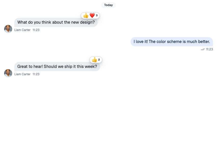 |
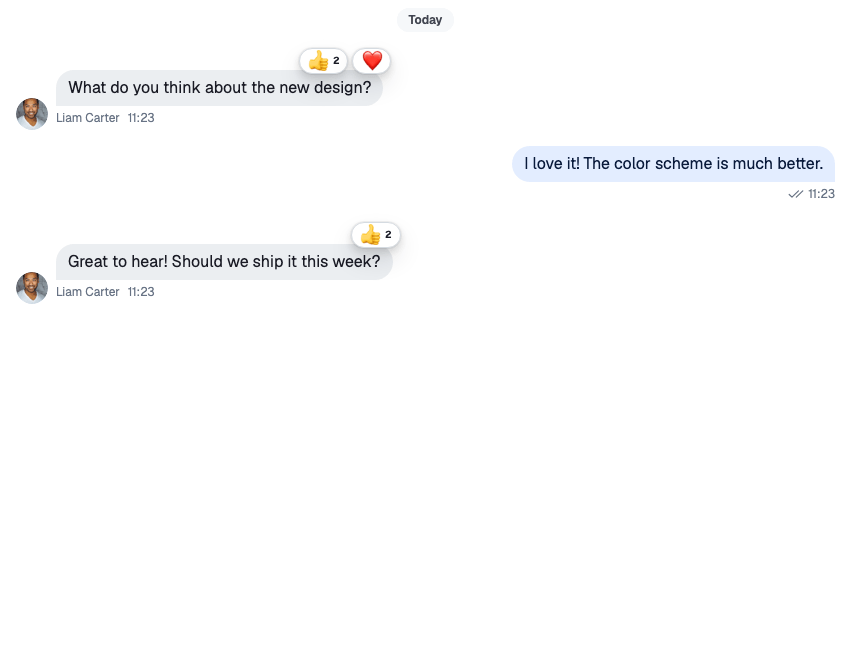 |
How it works across the layers
State
A message carries its reactions in three fields:
reaction_groups: one summary per reaction type, with the count and when it was first and last used;latest_reactions: the most recent reactions, with their users;own_reactions: the current user's reactions.
The state layer applies reaction.new, reaction.updated and reaction.deleted events to the message, wherever it's shown: the channel's list, a thread, or a thread's parent message.
MessageOperations.addReaction() and MessageOperations.deleteReaction(), on a channel or a thread, change the message before the request goes out, as Optimistic updates explains. A failed request is undone, unless it was queued to be sent later. With options: { enforce_unique: true }, MessageOperations.addReaction() replaces the user's other reactions on the message.
UI
The user picks 👍 on Ben's message:
ReactionSelectorcallshandleReaction("like")from the message context.- The handler checks
own_reactions. The user hasn't reacted withlikeyet, so it adds the reaction; had they, it would remove it. - The message updates in the list at once, and the handler sends the request with the reaction's emoji as
emoji_code, so push notifications can show it. The handler goes throughthread.messageOperationsin a thread andchannel.messageOperationselsewhere, so it behaves as described for the state layer. A failure shows no error. Repeated clicks on one reaction are throttled to one request a second. MessageReactionsre-renders from the message'sreaction_groupsandown_reactions, and marks the user's reaction as theirs.
| Part | Component |
|---|---|
| The quick reactions | ReactionSelector |
| The full list behind + | ReactionSelectorExtendedList |
| The reactions on a message | MessageReactions |
| The dialog that lists who reacted | MessageReactionsDetail |
| The reactions that are offered, and their emoji | reactionOptions in the component context |
The dialog loads the users with client.queryReactions(), 25 at a time, up to 1000 reactions. For a message with more than 1000 reactions, the default MessageReactions doesn't open the dialog.
Turning it on or off
Reactions are always available. The send-reaction capability decides who can add them: without it, the message actions leave out the smiley button and Add reaction. The server derives the capability from the user's role and the channel type's settings, which include reactions.
To hide reactions in your UI, remove the react actions from the message action set (see Actions), and replace MessageReactions with a component that renders nothing.
Customizing
The reactions on offer
reactionOptions in the component context lists the reactions. When it isn't set, the components use defaultReactionOptions: six quick reactions and no extended list, so the selector shows no + button:
type |
Emoji | Name |
|---|---|---|
haha |
😂 | Joy |
like |
👍 | Thumbs up |
love |
❤️ | Heart |
sad |
😔 | Sad |
wow |
😮 | Astonished |
fire |
🔥 | Fire |
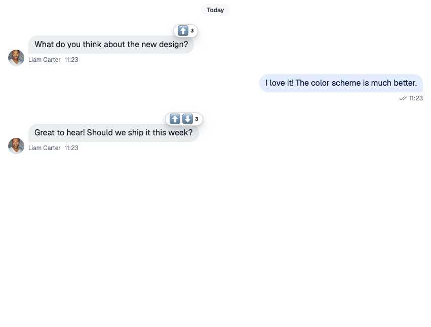
To offer other reactions, set reactionOptions with <WithComponents/>, so the selector, the reactions on a message and the dialog all use the same set. quick is the row in the selector; extended is the full list behind +:
import type { ReactionOptions } from "stream-chat-react";
import { emojiToUnicode, WithComponents } from "stream-chat-react";

const reactionOptions: ReactionOptions = {
  quick: {
    arrow_up: {
      Component: () => <>⬆️</>,
      name: "Up vote",
      unicode: emojiToUnicode("⬆️"),
    },
    arrow_down: {
      Component: () => <>⬇️</>,
      name: "Down vote",
      unicode: emojiToUnicode("⬇️"),
    },
  },
  extended: {
    fire: {
      Component: () => <>🔥</>,
      name: "Fire",
      unicode: emojiToUnicode("🔥"),
    },
    rocket: {
      Component: () => <>🚀</>,
      name: "Rocket",
      unicode: emojiToUnicode("🚀"),
    },
  },
};

export const App = () => (
  <WithComponents overrides={{ reactionOptions }}>
    {/* the rest of the app */}
  </WithComponents>
);
Each key is the reaction type stored on the server. The handler turns unicode back into the emoji and sends it as emoji_code; leave it out and push notifications have no emoji to show. To offer the whole emoji set as extended reactions, mapEmojiMartData(data) turns the @emoji-mart/data set into an extended map.
Style and position
MessageReactions takes visualStyle ("clustered" or "segmented") and verticalPosition ("top" or "bottom"). Replace it with a version that sets them:
import type { MessageReactionsProps } from "stream-chat-react";
import { MessageReactions, WithComponents } from "stream-chat-react";

const SegmentedReactions = (props: MessageReactionsProps) => (
  <MessageReactions
    {...props}
    verticalPosition="bottom"
    visualStyle="segmented"
  />
);

export const App = () => (
  <WithComponents overrides={{ MessageReactions: SegmentedReactions }}>
    {/* the rest of the app */}
  </WithComponents>
);
Segmented reactions at the top show at most four chips and a counter for the rest. At the bottom, every reaction type shows.
Order
By default, reaction types are in the order they were first used on the message. Pass sortReactions to MessageList or VirtualizedMessageList to change it:
import type { MessageListProps } from "stream-chat-react";
import { MessageList } from "stream-chat-react";

const byCount: MessageListProps["sortReactions"] = (a, b) =>
  b.reactionCount - a.reactionCount;

export const SortedMessageList = () => <MessageList sortReactions={byCount} />;
reactionDetailsSort on the same lists sets the order of users in the dialog. It's sent to the server with the query, and defaults to the newest first.
Changing what a reaction does
ReactionSelector takes a handleReaction prop that replaces the message's handler. This selector allows one reaction per user, through the state layer's messageOperations. A plain function component fits the ReactionSelector override key:
import type { ReactionSelectorProps } from "stream-chat-react";
import {
  ReactionSelector,
  useChannel,
  useMessageContext,
  useThreadContext,
  WithComponents,
} from "stream-chat-react";

// One reaction per user: a new reaction replaces the previous one.
const SingleReactionSelector = (props: ReactionSelectorProps) => {
  const { message } = useMessageContext();
  const channel = useChannel();
  const thread = useThreadContext();
  const { messageOperations } = thread ?? channel;

  const handleReaction = async (type: string) => {
    const alreadyReacted = message.own_reactions?.some(
      (reaction) => reaction.type === type,
    );
    if (alreadyReacted) {
      await messageOperations.deleteReaction({ messageId: message.id, type });
      return;
    }
    await messageOperations.addReaction({
      messageId: message.id,
      options: { enforce_unique: true },
      reaction: { type },
    });
  };

  return <ReactionSelector {...props} handleReaction={handleReaction} />;
};

export const App = () => (
  <WithComponents overrides={{ ReactionSelector: SingleReactionSelector }}>
    {/* the rest of the app */}
  </WithComponents>
);
The handler covers the selector and its extended list. The add step in the reactions dialog still uses the message's handler, unless you also replace MessageReactionsDetail.
The reactions dialog
MessageReactionsDetail is an override key. If you rebuild it, keep the default behaviour:
selectedReactionType={null}means "show all reactions". Clicking the selected type again goes back to it. With no type selected, each user's row also shows the emoji they picked.- The clustered
MessageReactionsopens the dialog showing all reactions; a segmented chip opens it filtered to its type. - The add button switches the dialog to
ReactionSelectorExtendedList. MessageReactionsDetailLoadingIndicatoris the default loading skeleton, ready to reuse.
ReactionSelector, ReactionSelectorExtendedList and MessageReactions are override keys too. See Overriding components.
Reference
- State: Message operations, and its Optimistic updates.
- UI: Message UI and Overriding components.
- Props: Reaction components, MessageContext and MessageList.
- Hooks: Message hooks.