


Preview UI
A channel list renders one row per channel. This recipe gives the row a look of its own. What a row reads and which parts you can replace are explained in Channel list UI.
What you'll build
- A compact channel row with avatar, title, time, unread badge and last message
- A channel chip for showing a channel outside the list
Preview
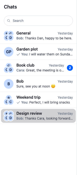
Approach: Replace one part. Choosing where to start explains the approaches.
Starts from: the base app. The page shows only what the recipe adds.
Best practices
- Replace
ChannelListItemUI, the row's look.ChannelListItemstill wraps it: it subscribes to the channel and passes the title, image, latest message, unread count and delivery status as props. - Open the channel the way the default row does. Call
onSelectwhen the row gets one, and otherwiseopenChannel(channel, { event }). Passing the click event keeps ⌘/ctrl-click opens beside working. - Keep
role="option"andaria-selectedon the row's button. The list is a listbox, and its arrow-key navigation moves between options. - Give the button an
aria-labelbuilt withcomposeChannelListItemAccessibleLabel, as the default row does, and hide the avatar from screen readers. The label reads the channel name, unread count and last message as one sentence. - Add the
classNamethe row gets to your own. Search results passstr-chat__search-result. - Keep the
str-chat__channel-list-item-containerclass on the row's root if you render the row actions. The SDK's styles show the actions while the row is hovered or focused, and the right arrow key moves from the row to them. - Preview
previewedMessage, not a message you read yourself. A search result passes the matched message there instead of the latest one. - Build the last-message line with
<SummarizedMessagePreview/>oruseLatestMessagePreview. They handle deleted and failed messages, attachments, polls and the sender's name.<SummarizedMessagePreview/>shows the text without inline Markdown. When the line shows the message text,useLatestMessagePreviewreturns it with its Markdown syntax; see The last-message line. - Keep rows light. Every row re-renders when its own channel changes.
Custom channel preview
This row shows the avatar, the title, the time of the last message, an unread badge and the last message. WithCompactChannelRows registers it as ChannelListItemUI for every channel list inside it:
import type { PropsWithChildren } from "react";
import type { ChannelListItemUIProps } from "stream-chat-react";
import {
  ChannelAvatar,
  ChannelListItemActionButtons,
  ChannelListItemTimestamp,
  composeChannelListItemAccessibleLabel,
  SummarizedMessagePreview,
  useChatContext,
  useTranslationContext,
  useWorkspaceNavigation,
  WithComponents,
} from "stream-chat-react";
import "./CompactChannelRow.css";

const CompactChannelRow = ({
  accessibleLabelConfig,
  active,
  channel,
  className,
  displayImage,
  displayTitle,
  groupChannelDisplayInfo,
  messageDeliveryStatus,
  onSelect,
  previewedMessage,
  unread,
}: ChannelListItemUIProps) => {
  const { client, isMessageAIGenerated } = useChatContext();
  const { t, tDateTimeParser, userLanguage } = useTranslationContext();
  const { openChannel } = useWorkspaceNavigation();
  // What a screen reader announces for the row: name, unread count, last message and its time.
  const accessibleLabel = composeChannelListItemAccessibleLabel(
    {
      active,
      channel,
      client,
      displayTitle,
      isMessageAIGenerated,
      latestMessage: previewedMessage,
      messageDeliveryStatus,
      t,
      tDateTimeParser,
      unreadCount: unread,
      userLanguage,
    },
    accessibleLabelConfig,
  );

  return (
    <div className="str-chat__channel-list-item-container">
      <button
        aria-label={accessibleLabel}
        aria-selected={active || undefined}
        // Search results pass their own class, `str-chat__search-result`.
        className={
          className
            ? `cookbook-channel-row ${className}`
            : "cookbook-channel-row"
        }
        onClick={(event) => {
          if (onSelect) onSelect(event);
          else openChannel(channel, { event });
        }}
        role="option"
        type="button"
      >
        <ChannelAvatar
          aria-hidden
          displayMembers={groupChannelDisplayInfo?.members}
          imageUrl={displayImage}
          size="lg"
          userName={displayTitle}
        />
        <div className="cookbook-channel-row__main">
          <div className="cookbook-channel-row__top">
            <span className="cookbook-channel-row__title">{displayTitle}</span>
            <ChannelListItemTimestamp previewedMessage={previewedMessage} />
          </div>
          <SummarizedMessagePreview
            latestMessage={previewedMessage}
            messageDeliveryStatus={messageDeliveryStatus}
            participantCount={channel.data?.member_count}
          />
        </div>
        {!!unread && (
          <span className="cookbook-channel-row__unread">{unread}</span>
        )}
      </button>
      <ChannelListItemActionButtons />
    </div>
  );
};

// Declared once, so WithComponents gets the same object on every render.
const overrides = { ChannelListItemUI: CompactChannelRow };

export const WithCompactChannelRows = ({ children }: PropsWithChildren) => (
  <WithComponents overrides={overrides}>{children}</WithComponents>
);@layer stream-overrides {
.cookbook-channel-row {
display: flex;
align-items: center;
gap: var(--str-chat__spacing-sm);
width: 100%;
min-width: 0;
padding: var(--str-chat__spacing-xs) var(--str-chat__spacing-sm);
border: 0;
border-radius: var(--str-chat__radius-lg);
background: none;
color: var(--str-chat__text-primary);
text-align: start;
cursor: pointer;
}
.cookbook-channel-row:hover {
background: var(--str-chat__background-utility-hover);
}
.cookbook-channel-row[aria-selected="true"] {
background: var(--str-chat__background-utility-selected);
}
.cookbook-channel-row__main {
flex: 1;
min-width: 0;
}
.cookbook-channel-row__top {
display: flex;
align-items: baseline;
justify-content: space-between;
gap: var(--str-chat__spacing-xs);
}
.cookbook-channel-row__title {
overflow: hidden;
font: var(--str-chat__font-body-emphasis);
text-overflow: ellipsis;
white-space: nowrap;
}
.cookbook-channel-row .str-chat__channel-list-item-timestamp {
color: var(--str-chat__text-tertiary);
font: var(--str-chat__font-caption-default);
}
.cookbook-channel-row__unread {
min-width: 20px;
padding: var(--str-chat__spacing-xxxs) var(--str-chat__spacing-xs);
border-radius: var(--str-chat__radius-full);
background: var(--str-chat__badge-bg-primary);
color: var(--str-chat__badge-text-on-accent);
font: var(--str-chat__font-caption-emphasis);
text-align: center;
}
}The rules sit in the stream-overrides layer, so they win over the SDK's own rules once the SDK's stylesheet is in an earlier layer, as Theming → CSS layers sets up. They take their colors, spacing and type from the SDK's tokens, so they follow your theme. The row's root keeps str-chat__channel-list-item-container, so the SDK's styles still show the row actions on hover and focus.
Wrap the part of the app that renders the channel list, for example ChatView, which renders it through ChannelNavigation:
<Chat client={client}>
  <WithCompactChannelRows>
    <ChatView layouts={layouts} views={views} />
  </WithCompactChannelRows>
</Chat>
Using display helpers
Outside a channel list there is no ChannelListItem to compute the props. The hooks it uses are exported, so a channel shown anywhere else can look the same. This chip shows a channel the app holds, for example a "Recent" strip above the list:
import type { Channel, MessagePaginatorAggregateState } from "stream-chat";
import {
  ChannelAvatar,
  useChannelPreviewInfo,
  useLatestMessagePreview,
  useStateStore,
  useWorkspaceNavigation,
} from "stream-chat-react";
import "./ChannelChip.css";

const latestMessageSelector = ({
  latestMessage,
}: MessagePaginatorAggregateState) => ({
  latestMessage: latestMessage ?? undefined,
});

export const ChannelChip = ({ channel }: { channel: Channel }) => {
  const { openChannel } = useWorkspaceNavigation();
  const { displayImage, displayTitle, groupChannelDisplayInfo } =
    useChannelPreviewInfo({
      channel,
    });
  const { latestMessage } = useStateStore(
    channel.messagePaginator.aggregateState,
    latestMessageSelector,
  );
  const { senderName, text, type } = useLatestMessagePreview({
    latestMessage,
    participantCount: channel.data?.member_count,
  });

  return (
    <button
      className="cookbook-channel-chip"
      onClick={(event) => openChannel(channel, { event })}
      type="button"
    >
      <ChannelAvatar
        aria-hidden
        displayMembers={groupChannelDisplayInfo.members}
        imageUrl={displayImage}
        // Group avatars come in lg, xl and 2xl.
        size="lg"
        userName={displayTitle}
      />
      <span className="cookbook-channel-chip__text">
        <span className="cookbook-channel-chip__title">{displayTitle}</span>
        <span className="cookbook-channel-chip__preview">
          {type === "giphy" ? "🎞️ " : null}
          {senderName ? `${senderName}: ` : null}
          {text}
        </span>
      </span>
    </button>
  );
};@layer stream-overrides {
.cookbook-channel-chip {
display: flex;
align-items: center;
gap: var(--str-chat__spacing-sm);
width: 200px;
padding: var(--str-chat__spacing-xs) var(--str-chat__spacing-sm);
border: 1px solid var(--str-chat__border-core-default);
border-radius: var(--str-chat__radius-lg);
background: var(--str-chat__background-core-elevation-1);
color: var(--str-chat__text-primary);
text-align: start;
cursor: pointer;
}
.cookbook-channel-chip:hover {
background: var(--str-chat__background-utility-hover);
}
.cookbook-channel-chip__text {
display: flex;
flex-direction: column;
min-width: 0;
}
.cookbook-channel-chip__title,
.cookbook-channel-chip__preview {
overflow: hidden;
text-overflow: ellipsis;
white-space: nowrap;
}
.cookbook-channel-chip__title {
font: var(--str-chat__font-caption-emphasis);
}
.cookbook-channel-chip__preview {
color: var(--str-chat__text-secondary);
font: var(--str-chat__font-caption-default);
}
}Channel chips under the header

useChannelPreviewInfo({ channel })returns the title, the image and the group members the default row uses. It subscribes to the channel, so a renamed channel shows its new name.channel.messagePaginator.aggregateStateholds the channel's latest message. Read it withuseStateStoreand a selector declared outside the component; Reading state in components explains the rules.useLatestMessagePreviewturns the message into the line's text.typesays what the message holds:text,image,giphy,video,voice,file,link,location,poll,deleted,error,emptyorunsupported. A Giphy has its own type, so give it its own branch rather than treating it as an image.senderNameis "You" for the user's own message, and the author's name in a group. When the line shows the message text,useLatestMessagePreviewreturns it with its Markdown syntax, so this chip shows syntax such as**as the user typed it.
Going deeper
When replacing the row's look isn't the right size of change:
- Only the last-message line. Override
SummarizedMessagePreviewand keep the default row around it. - The whole row, wrapper included. Override
ListItem. It gets the channel asitem, and the default rendersChannelListItem. - The row actions. Override
ChannelListItemActionButtons; Channel-list row actions shows how. - The empty and loading states. Override
EmptyListIndicator,FirstPageLoadingIndicatorandLoadingNextPageIndicator. - When the next page loads. Set
loadMoreThresholdPxandloadMoreDebounceMsonChannelList.
Every key is listed in Channel list UI → Replacing parts, and the props in the Channel Preview reference.
How it works
When the channel list renders a channel:
ChannelListrenders aChannelListItemfor the channel. It reads the channel's data, members, read state and latest message, and renders theChannelListItemUIoverride,CompactChannelRow, with them as props.displayTitleanddisplayImagefall back to the other member's name and image in a direct message, andgroupChannelDisplayInfoletsChannelAvatarshow the members of a group without an image.unreadis the user's unread count, or0while the channel is muted.activeistruewhile the channel is open in the layout.SummarizedMessagePreviewrenders the last-message line.ChannelListItemTimestamprenders its time.composeChannelListItemAccessibleLabelbuilds the button'saria-labelfrom the same data, with the parts and order thatChannelListItem'saccessibleLabelConfigprop sets, so a screen reader hears the row the way the default row reads it.ChannelListItemActionButtonsrenders the row's actions: a mute button, and a menu with archive, block (in a direct message), pin and leave. It reads the row's channel from context, so it needs no props. Leave it out to drop the actions.- A click on the row calls
onSelectwhen the row got one, and otherwiseWorkspaceNavigation.openChannel()with the click event. The layout opens the channel, and the row'sactiveturnstrue.
Channel results in search are ChannelListItems too, so they render with CompactChannelRow as well. They pass onSelect, which opens and watches the channel, and the matched message as previewedMessage.
Related
- Channel list UI: what a row reads, and every part of the channel list you can replace.
- Channel lists: the feature these rows belong to.
- Reading state in components: reading a store with
useStateStoreand a selector. - Channel-list row actions: changing the actions
ChannelListItemActionButtonsrenders. - Channel Preview reference: the props of
ChannelListItemUI. - ⌘/ctrl-click opens beside: the click event that
openChannelgets. - Search customization: changing how channel results look in search.