


Message composer UI
The message composer UI is where a user writes, edits and sends a message. The message composition is held by a MessageComposer controller from stream-chat, in its state stores: the text, attachments, quoted message, poll and location. The UI components subscribe to that state and call the controller's API to carry out what the user does. Use this page to know which MessageComposer controller the UI uses (the channel's, the thread's, or one you supply), what each part of the UI shows, and how to add or replace parts. The props are in the MessageComposer reference, and the controller is explained on Message composer.
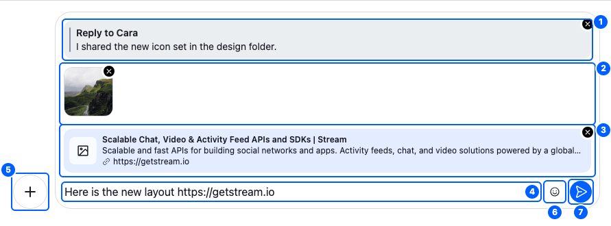
This composer is replying to Cara, with an image attached and a link in its text. Its parts, from top to bottom:
| Part | Component to override (<WithComponents/> key) |
Explained in |
|---|---|---|
| 1. The quoted message preview | QuotedMessagePreview |
Previews |
| 2. The attachment previews | AttachmentPreviewList |
Previews |
| 3. The link preview | LinkPreviewList |
Previews |
| 4. The text input | TextareaComposer |
The input |
| 5. The attachment selector | AttachmentSelector |
Actions |
| 6. The emoji picker | EmojiPicker, in AdditionalMessageComposerActions |
Actions |
| 7. The send button | SendButton |
Actions |
Which composer it drives
<MessageComposer/>, its parts and your own components get the composer from useMessageComposerController(). It returns a composer supplied with MessageComposerControllerProvider, or else the thread's or the channel's:
graph LR
    H["useMessageComposerController()"] --> P{"Supplied by a provider?"}
    P -- no --> T{"In a Thread?"}
    P -- yes --> S["supplied composer"]
    T -- yes --> TC["thread.messageComposer"]
    T -- no --> CC["channel.messageComposer"]
Supply a composer of your own for a separate composition, such as editing a message inline, so its state doesn't leak into the channel's or thread's composer already rendered in the UI. This InlineEditor component edits a message in a composer of its own:
import { useState } from "react";
import { MessageComposer as MessageComposerController } from "stream-chat";
import type { LocalMessage } from "stream-chat";
import {
  MessageComposer,
  MessageComposerControllerProvider,
  useChatContext,
} from "stream-chat-react";

export const InlineEditor = ({ message }: { message: LocalMessage }) => {
  const { client } = useChatContext();
  const [composer] = useState(
    () =>
      new MessageComposerController({
        client,
        composition: message,
        compositionContext: message,
      }),
  );

  return (
    <MessageComposerControllerProvider messageComposerController={composer}>
      <MessageComposer />
    </MessageComposerControllerProvider>
  );
};
Inline message editing builds the full editor.
The default "Edit" action edits in the channel's or thread's composer itself:
| The user | The composer |
|---|---|
| Picks "Edit" on a message | keeps a copy of what the user was writing, loads the message, sets editedMessage |
| Sends | saves the edit and discards the copy |
| Clicks ✕ on the edited-message preview | cancels the edit and brings the copy back |
When <MessageComposer/> unmounts:
| The thread's or channel's composer | A composer you supplied | |
|---|---|---|
| Saved as a draft | if drafts are on and no edit is in progress | the same |
| Cleared | yes | no: you clear it |
Previews
Above the input, the composer shows what the message will carry: the message being replied to, the files, a link card and so on. <MessageComposerPreviews/> renders these previews from a preview set.
The preview set
A preview set is an array, and each item in it describes one preview:
| Field | What it is |
|---|---|
type |
The preview's name, unique within the set, such as "quotedMessage". Code that changes a set finds an item by it. |
Component |
The component that draws the preview. It gets no props: it reads what it shows from the composer with useMessageComposerController(). |
isVisible |
A function that gets the composer's state and returns whether the preview shows. The state holds the attachments, link previews, location, quoted message, the message being edited, the poll id and the composer's custom data. |
<MessageComposerPreviews/> goes through the set in order and renders the Component of every item whose isVisible returns true. When none does, it renders nothing, not even its wrapper. When any does, the wrapper renders, even if that item's Component then renders nothing, so an item that often has nothing to show should hide itself through isVisible.
Example
The quotedMessage item of the default set has the type "quotedMessage", a Component that renders the QuotedMessagePreview override, <QuotedMessagePreview/> by default, and an isVisible that returns true while a message is quoted and none is being edited:
- The user picks Reply on a message, and the composer now holds a quoted message in
messageComposer.state.quotedMessage. The item'sisVisiblefinds it, and the quoted message shows above the input. - The user removes the quote with ✕, and the composer no longer holds one.
isVisiblefinds none, and the preview goes away. No other item is visible, so the preview area goes away too.
The default set, defaultMessageComposerPreviewSet, has these items, in this order:
type |
Shows | Visible while | Looks like |
|---|---|---|---|
editedMessage |
The message being edited, with ✕ to cancel the edit | a message is being edited | 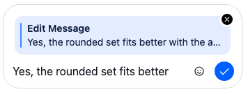 |
quotedMessage |
The message being replied to, with ✕ to remove it | a message is quoted and none is being edited | 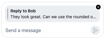 |
voiceRecording |
A recording waiting to be sent | the composer holds a voice recording | 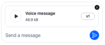 |
attachments |
Files, images and videos, with their upload progress | the composer holds an attachment other than a voice recording | 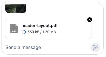 |
linkPreviews |
The first link's card. The displayLinkCount prop of <LinkPreviewList/> shows more. |
a link preview is loading or loaded | 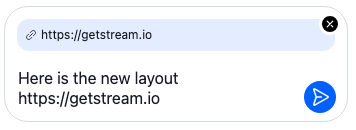 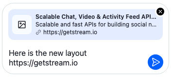 |
location |
A location to share, as <GeolocationPreview/>. It can't be removed while editing. |
the composer holds a location | 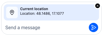 |
No item shows a poll: the default poll creation dialog sends the poll at once, so the composer doesn't keep one. Poll with text and attachments keeps the poll in the composer and adds an item that shows it.
Custom previews
To hide, reorder or add previews, build your own set from the default one, render <MessageComposerPreviews/> with it, and register that component under the MessageComposerPreviews key. The state isVisible gets is what useMessageComposerPreviewState returns.
Here is a ComposerPreviews component that hides the link cards and adds a hint while the user replies:
import type { ReactNode } from "react";
import {
  defaultMessageComposerPreviewSet,
  MessageComposerPreviews,
  type MessageComposerPreviewSetItem,
  WithComponents,
} from "stream-chat-react";

// Your own preview: static text, so it reads no composer state.
const ReplyHint = () => (
  <div className="reply-hint">Everyone in the channel sees your reply.</div>
);

// The default previews without the link cards, then the hint while a message is quoted.
const previewSet: MessageComposerPreviewSetItem[] = [
  ...defaultMessageComposerPreviewSet.filter(
    ({ type }) => type !== "linkPreviews",
  ),
  {
    Component: ReplyHint,
    isVisible: ({ editedMessage, quotedMessage }) =>
      !editedMessage && !!quotedMessage,
    type: "replyHint",
  },
];

const CustomPreviews = () => (
  <MessageComposerPreviews messageComposerPreviewSet={previewSet} />
);

const overrides = { MessageComposerPreviews: CustomPreviews };

export const ComposerPreviews = ({ children }: { children: ReactNode }) => (
  <WithComponents overrides={overrides}>{children}</WithComponents>
);
Hiding an item hides only its preview. The message still carries what the composer holds: here, the link previews still go out with it.
To build a preview area of your own, use the two hooks <MessageComposerPreviews/> is built on. useMessageComposerPreviewSetFilter returns the visible items of a set. useMessageComposerPreviewState returns the state that isVisible gets.
The input
<TextareaComposer/> is the text input. It reads and writes messageComposer.textComposer state: the text, the cursor position, the mentions and the active command.
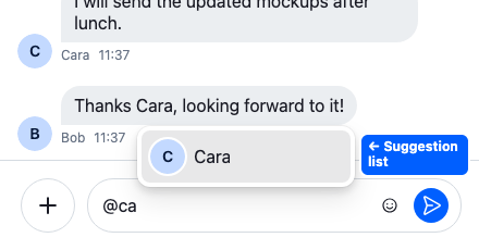
Typing a trigger opens the suggestion list, <SuggestionList/>: @ suggests people and groups to mention, / suggests commands, and : suggests emoji once you add the emoji middleware from stream-chat-react/emojis to the text composer. Each item is a <SuggestionListItem/>. The suggestions come from the text composer's middleware; Suggestions explains them.
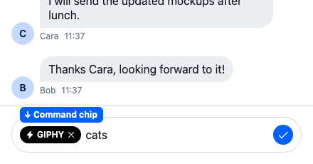
Picking a command, such as /giphy, shows it as a chip before the input, <CommandChip/>. The chip's ✕ clears the command.
Actions
The composer has three action areas around the input:
| Area | Where | Shows |
|---|---|---|
<AttachmentSelector/> |
before the input | A menu to upload a file, create a poll, share a location (not in a thread) or pick a command. In a composer inside a message, such as an inline edit, only an upload button. It's an action set. |
<AdditionalMessageComposerActions/> |
after the input | Action buttons. The default shows only the emoji picker, when you register one under the EmojiPicker key, and hides it during a cooldown and while a command is active. Replace it to add buttons of your own, as in the ComposerWithCount example in What each part reads or in GIF picker. |
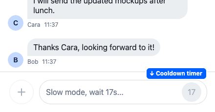
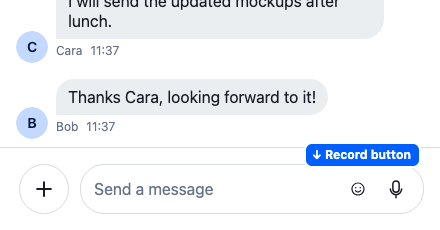
| The send area | at the end | The stop AI streaming button, the cooldown timer, the record button or the send button |
The send area shows the first of these that applies:
| Control | Shown when | See |
|---|---|---|
<StopAIGenerationButton/>, which calls Channel.stopAIResponse() |
an AI is thinking or generating a reply in the channel. Register StopAIGenerationButton: null to turn it off. |
SDK integration |
<CooldownTimer/>, the seconds left |
slow mode stops the user from sending | Slow mode |
<StartRecordingAudioButton/> |
the composer is empty, nothing is edited, no command is active, <MessageComposer audioRecordingEnabled /> is set and the browser can record. It's disabled while the composer accepts no uploads. While recording, <AudioRecorder/> replaces the whole composer. |
Voice recordings |
<SendButton/> |
otherwise. Disabled until there's something to send; the default shows a checkmark while editing or with a command. |
In threads
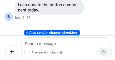
In a thread, the composer shows a checkbox, <SendToChannelCheckbox/>, that also posts the reply to the channel. It reads "Also send in channel", or "Also send as a direct message" in a channel with two members. It toggles showReplyInChannel in the composer's state, and is hidden while editing.
Drag and drop
Files dropped on the composer are uploaded into it. The composer UI wraps itself in <WithDragAndDropUpload/>, which shows "Drag your files here" while files are dragged over it, and refuses the files that messageComposer.attachments.acceptedFiles in client.config doesn't accept.
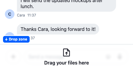
To accept drops on a larger area, such as the whole channel, wrap that area in <WithDragAndDropUpload/>. Files dropped anywhere in it go to the composers inside. Here is a ChannelWithDropZone component that accepts drops on the whole channel:
import {
  Channel,
  ChannelHeader,
  MessageComposer,
  MessageList,
  WithDragAndDropUpload,
} from "stream-chat-react";
import type { Channel as StreamChannel } from "stream-chat";

export const ChannelWithDropZone = ({
  channel,
}: {
  channel: StreamChannel;
}) => (
  <Channel channel={channel}>
    <WithDragAndDropUpload className="channel-drop-zone" component="section">
      <ChannelHeader />
      <MessageList />
      <MessageComposer />
    </WithDragAndDropUpload>
  </Channel>
);
A thread works the same way: wrap its list and composer inside <Thread/>. The thread renders beside the channel, not inside it, so each wrapper uploads only to its own composer. A wrapper uploads a dropped file to every composer inside it, so wrap the channel and the thread separately. When wrappers are nested, only the outermost one handles drops. It gets the class str-chat__dropzone-root, which makes the overlay cover it; add your own layout with className if necessary.
The composer's own drop zone turns off during a cooldown and when the user can't upload files. A wrapper around it takes over and stays on, but the composer still refuses those uploads. The props are in the WithDragAndDropUpload reference.
The composer state each UI part reads
Each part of the composer UI subscribes to the state of the MessageComposer member it shows, and calls that member's API when the user acts:
MessageComposer member |
Used by |
|---|---|
state |
The quoted and edited message previews, the input, the send button, the also-send-to-channel checkbox |
textComposer |
The input, the suggestion list, the command chip |
attachmentManager |
The attachment and voice recording previews, the input, drag and drop, the attachment selector |
linkPreviewsManager |
The link previews |
pollComposer |
The poll creation dialog |
locationComposer |
The location preview and the share location dialog |
customDataManager |
No built-in part. It holds custom fields that your own parts add to the message. |
A UI part of your own reads the same way: get the composer with useMessageComposerController() and subscribe to a store with useStateStore. Here is a ComposerWithCount component that shows the number of characters typed, beside the emoji picker:
import type { TextComposerState } from "stream-chat";
import {
  AdditionalMessageComposerActions,
  MessageComposer,
  useMessageComposerController,
  useStateStore,
  WithComponents,
} from "stream-chat-react";

const textSelector = ({ text }: TextComposerState) => ({ text });

const CharacterCount = () => {
  const { textComposer } = useMessageComposerController();
  const { text } = useStateStore(textComposer.state, textSelector);

  return <span className="character-count">{text.length}</span>;
};

// Renders the default part too, so the emoji picker stays.
const ActionsWithCount = () => (
  <>
    <CharacterCount />
    <AdditionalMessageComposerActions />
  </>
);

const overrides = { AdditionalMessageComposerActions: ActionsWithCount };

export const ComposerWithCount = () => (
  <WithComponents overrides={overrides}>
    <MessageComposer />
  </WithComponents>
);
The same part works in a channel, in a thread and while editing, because the hook returns the composer of the place it is rendered in.
Replacing parts
Register replacements with <WithComponents/>. Overriding components explains how overrides apply.
Component to override (<WithComponents/> key) |
Replaces |
|---|---|
MessageComposerUI |
The whole composer UI. <MessageComposer/> still provides the composer. |
MessageComposerPreviews |
The preview area. Render <MessageComposerPreviews/> with your own set, as in Custom previews. |
EditedMessagePreview, QuotedMessagePreview |
The edited and quoted message previews |
AttachmentPreviewList, VoiceRecordingPreviewSlot |
The attachment and voice recording previews |
LinkPreviewList |
The link previews |
TextareaComposer |
The input |
AutocompleteSuggestionList, AutocompleteSuggestionItem |
The suggestion list and each suggestion |
CommandChip |
The command chip |
AttachmentSelector |
The attachment selector |
AttachmentSelectorInitiationButtonContents |
The contents of the button that opens the selector |
PollCreationDialog, ShareLocationDialog |
The dialogs the selector opens |
PollCreationDialogControls |
The footer of the poll creation dialog: Cancel, and Send Poll, which creates the poll and sends it at once |
AdditionalMessageComposerActions, EmojiPicker |
The action buttons after the input, and the emoji picker among them |
SendButton |
The send button. Gets sendMessage, and no checkmark: a replacement shows its own. |
CooldownTimer |
The cooldown timer |
StartRecordingAudioButton, AudioRecorder |
The record button and the recorder |
StopAIGenerationButton |
The stop button. null turns it off. |
SendToChannelCheckbox |
The also-send-to-channel checkbox |
A replacement for EditedMessagePreview, QuotedMessagePreview, VoiceRecordingPreviewSlot, AttachmentPreviewList or LinkPreviewList shows only while its item in the preview set is visible. Say your AttachmentPreviewList also draws the location. It still shows only while the composer holds attachments, so a location on its own wouldn't appear. Build your own preview set from defaultMessageComposerPreviewSet, as Custom previews shows, and in it:
- make the
attachmentsitem'sisVisiblealso returntruewhile the composer holds a location; - leave out the
locationitem, so the location isn't drawn twice.
The defaults of SendToChannelCheckbox and StopAIGenerationButton aren't exported, so a replacement for one of them can't render the default inside it.
The Custom composer recipe builds a composer UI of its own.