


Actions
Every menu of actions in the SDK is built from an action set: a list of items, each naming an action and the component that renders it. Use this page to know which action sets there are, how the SDK filters them for each user, and how to add, remove or replace actions.
| Action set | Where it shows | Prop that takes your set |
|---|---|---|
| Message actions | Next to each message, and in its menu (Message UI) | messageActionSet on <MessageActions/> |
| Channel list item actions | On each channel list item (Channel list UI) | None. Register your own component under the ChannelListItemActionButtons key with <WithComponents/> |
| Attachment selector | In the menu beside the composer's input (Message composer UI) | attachmentSelectorActionSet on <AttachmentSelector/> |
| Channel management | At the bottom of the Channel info section of channel details (Channel details UI) | channelManagementActionSet on <ChannelManagementView/> |
| Channel member | In a member's detail view, opened from the Members section of channel details | channelMemberActionSet on <ChannelMemberDetail/> |
| Channel members header | In the header of the Members section of channel details | headerActionSet on <ChannelMembersView/> |
Each set has a default you can start from, and a base filter that removes the actions the user can't take. Each section names them.
The last three are channel details actions, exported from stream-chat-react/channel-detail. Everything else is exported from stream-chat-react.
How an action set works
An action set is a list of items. Every item has:
- a
type, the action's name, which the base filter uses to recognize it. The menu button item, described in Placements, has none; - a component that renders the action;
- in the message, channel list item and channel members header sets, a
placementthat decides where the action renders.
Placements
| Placement | In the sets | Where the item renders |
|---|---|---|
quick |
Message, channel list item, channel members header | As a button: next to the message, on the channel list item, or in the members header |
dropdown |
Message, channel list item, channel members header | In the menu |
quick-dropdown-toggle |
Message, channel list item, channel members header | As the menu button that opens the dropdown items: "…" on messages and channel list items, "Actions" in the members header. It's an item of its own, with no type, and it renders only while at least one dropdown item is left. Without it, the dropdown items can't be opened. |
What happens when a menu renders
The same three steps apply to every set:
- The base filter drops the actions the user can't take. It reads the user's capabilities, the channel's settings, and what the action applies to: the message, the channel or the member. A
typethe filter doesn't know passes it, so your own actions always show, and checking whether the user may use them is up to your component. - The placement, in the sets that have one, decides where an action goes, as in Placements.
- The list's order is the order in the menu.
When the filter leaves no action, the message actions, the attachment selector, the channel list item actions and the channel members header actions render nothing.
Message actions
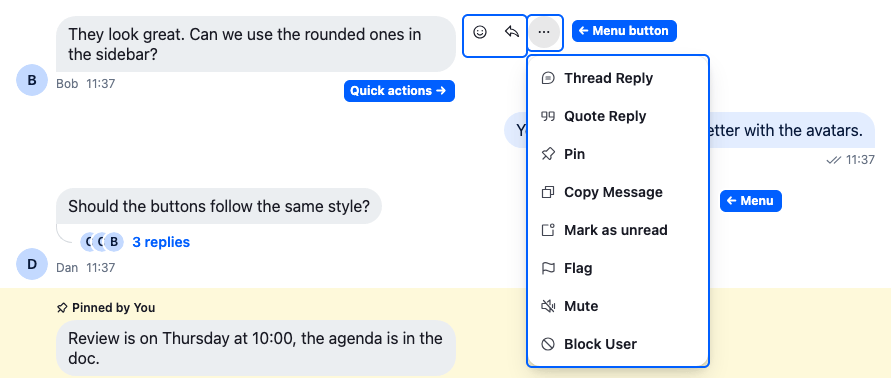
The menu of someone else's message. Edit and Delete show on the user's own messages, and Remind me and Save for later when reminders are on.
<MessageActions/> renders one message's actions from a message action set. By default, that's defaultMessageActionSet.
The message action set
A message action set is an array, and each item in it describes one action:
| Field | What it is |
|---|---|
type |
The action's name, such as "edit". The base filter checks the default names, as in Checks per action, and lets any other name through. Code that changes a set finds an item by it. The menu button item has none. |
placement |
Where the action renders: quick next to the message, dropdown in the menu, or quick-dropdown-toggle as the menu button. |
Component |
The component that renders the action. It reads the message with useMessageContext(). A dropdown component gets the props of a menu item, ContextMenuItemProps, and the quick-dropdown-toggle component gets the props of a button. A quick component gets none. |
isVisible |
Optional. A rule that gets the message, whether it's the user's own and whether it's a thread reply, and returns whether the action shows. It can only hide an action, as Rules on the items explains. The menu button item has none. |
For each message, <MessageActions/> drops the items the base filter or their own isVisible rules out, then renders the rest by placement, in the set's order.
Example
The edit item of the default set has the type "edit", the placement dropdown, an Edit button as its Component, and an isVisible that hides it on a message with a poll or a giphy:
- The user opens the menu on someone else's message. The base filter drops
edit, because the user may not edit it, and the menu has no Edit. - The user opens the menu on their own text message. The base filter keeps
edit,isVisiblereturnstrue, and Edit shows in the menu. - The user opens the menu on their own poll message. The base filter keeps
edit, butisVisiblereturnsfalse, and the menu has no Edit.
The default set starts like this:
[
  { Component: QuickDropdownToggle, placement: "quick-dropdown-toggle" },
  { Component: QuickReply, placement: "quick", type: "reply" },
  { Component: QuickReact, placement: "quick", type: "react" },
  { Component: AddReaction, placement: "dropdown", type: "react" },
  { Component: ThreadReply, placement: "dropdown", type: "reply" },
  // quote, download, pin, copy, resend, edit, mark unread, remind me,
  // save for later, flag, mute, delete, block user
];
An item's placement decides where it renders, and what its component must do:
| Placement | Where it renders | Your component |
|---|---|---|
dropdown |
In the menu | Closes the menu when the action is done: call closeMenu() from useContextMenuContext() |
quick |
Next to the message | Needs nothing extra: there's no menu to close |
quick-dropdown-toggle |
As the menu button that opens the menu, when at least one dropdown item is left |
Keep one in your set, or the dropdown items can't be opened |
Next to the message, the menu button always comes first, then the quick items in list order. The SDK's stylesheet lays them out from right to left.
To use your own set, register a component under the MessageActions key that renders <MessageActions messageActionSet={yourSet} />. Here is a ChannelWithCustomMessageActions component, a channel whose messages have no "Block user" action and a "Copy link" one:
import {
  Channel,
  ContextMenuButton,
  defaultMessageActionSet,
  MessageActions,
  MessageComposer,
  MessageList,
  useComponentContextIcons,
  useContextMenuContext,
  useMessageContext,
  WithComponents,
} from "stream-chat-react";
import type { MessageActionSetItem } from "stream-chat-react";
import type { Channel as StreamChannel } from "stream-chat";

const CopyLinkAction = () => {
  const { IconLink } = useComponentContextIcons();
  const { closeMenu } = useContextMenuContext();
  const { message } = useMessageContext();

  return (
    <ContextMenuButton
      Icon={IconLink}
      onClick={() => {
        void navigator.clipboard.writeText(
          `${window.location.origin}/messages/${message.id}`,
        );
        closeMenu();
      }}
    >
      Copy link
    </ContextMenuButton>
  );
};

// Declared once: the base filter recomputes whenever it gets a new list.
const messageActionSet: MessageActionSetItem[] = [
  ...defaultMessageActionSet.filter(
    (item) =>
      item.placement === "quick-dropdown-toggle" || item.type !== "blockUser",
  ),
  { Component: CopyLinkAction, placement: "dropdown", type: "copyLink" },
];

const CustomMessageActions = () => (
  <MessageActions messageActionSet={messageActionSet} />
);

const messageOverrides = { MessageActions: CustomMessageActions };

// The messages in this channel get the custom actions.
export const ChannelWithCustomMessageActions = ({
  channel,
}: {
  channel: StreamChannel;
}) => (
  <WithComponents overrides={messageOverrides}>
    <Channel channel={channel}>
      <MessageList />
      <MessageComposer />
    </Channel>
  </WithComponents>
);
The base filter gives some messages no actions, or only a few, such as a message still sending or one that failed to send; Message actions lists them. On a reply in a thread it drops pin, reply and markUnread. On any other message it keeps each action that passes the base filter's check in Checks per action, and never resendMessage.
Checks per action
| Action | Shown when | Checked by |
|---|---|---|
edit |
The user may edit the message | base filter |
edit |
The message has no poll and isn't a giphy | the item's isVisible |
delete |
The user may delete the message, and it isn't deleted already | base filter |
flag, markUnread, mute |
The message isn't the user's own, and the user has flag-message, read-events or mute-channel capability |
base filter |
blockUser |
The message isn't the user's own | base filter |
quote, react, reply |
The user has the capability to quote, react or reply in the channel | base filter |
remindMe, saveForLater |
Message reminders are on for the channel: channel.configState's userMessageReminders.enabled |
base filter |
copyMessageText |
The message has text | the item's isVisible |
download |
The message has a file, image, video, audio or voice recording attachment | the item's isVisible |
pin |
The user has the pin-message capability |
base filter |
Rules on the items
An item can carry its own rule as isVisible(params). It gets MessageActionVisibilityFilterParams: isMyMessage, isThreadReply and the message. The action shows only while isVisible returns true.
An item's rule can only hide an action: one the base filter drops stays hidden. The rule also applies to a message that failed to send, and with disableBaseMessageActionSetFilter.
An item without isVisible shows wherever the base filter allows it. So a set that writes its own edit, copyMessageText or download item by hand loses the default rule: without it, edit shows on a poll message the user may update. Spread the default item, or copy its isVisible. To change a rule, replace the item's isVisible:
import { defaultMessageActionSet } from "stream-chat-react";
import type { MessageActionSetItem } from "stream-chat-react";

// Lets users edit the text and attachments sent with a poll; a giphy still can't be edited.
const messageActionSet: MessageActionSetItem[] = defaultMessageActionSet.map(
  (item) =>
    item.placement !== "quick-dropdown-toggle" && item.type === "edit"
      ? { ...item, isVisible: ({ message }) => message.command !== "giphy" }
      : item,
);
<MessageActions/> takes disableBaseMessageActionSetFilter to skip the base filter's checks. Pass it only when your components check the base filter's conditions in Checks per action themselves. To build your own actions component, run useBaseMessageActionSetFilter(set) on your list, as <MessageActions/> does.
What each default action does, and the actions that come with flagging, muting and reminders, are on Message actions.
Channel list item actions
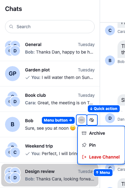
<ChannelListItemActionButtons/> renders each channel list item's actions. To customize them, replace it with your own component, as in Replacing the actions. It renders defaultChannelActionSet, filtered by useBaseChannelActionSetFilter.
The default set, in this order:
| Type | Placement | Shown when |
|---|---|---|
| None: the menu button | quick-dropdown-toggle |
At least one dropdown action is left |
mute |
quick |
The user has the mute-channel capability |
archive |
dropdown |
The user is a member of the channel |
ban ("Block User") |
dropdown |
The channel is a direct message (the user is a member, and it has 2 members) and the user has the ban-channel-members capability |
pin |
dropdown |
The user is a member of the channel |
leave |
dropdown |
The user has the leave-channel capability |
The placements work as in Message actions: quick on the channel list item, dropdown in the menu.
Replacing the actions
The set has no prop, and neither it nor its filter is exported, so your component starts from scratch:
- Write a component that renders the actions you want. It renders inside the channel list item, so
useChannelListItemContext()gives it the item's channel. - Register it under the
ChannelListItemActionButtonskey with<WithComponents/>, around the channel list.
Here is a ChannelListWithMarkAsRead component, a channel list whose items show a "Mark as read" button, MarkAsReadAction, instead of their actions:
import type { ChannelPaginator, OwnCapabilitiesState } from "stream-chat";
import {
  Button,
  ChannelList,
  useChannelListItemContext,
  useComponentContextIcons,
  useStateStore,
  WithComponents,
} from "stream-chat-react";

const capabilitiesSelector = ({ ownCapabilities }: OwnCapabilitiesState) => ({
  ownCapabilities,
});

const MarkAsReadAction = () => {
  const { channel } = useChannelListItemContext();
  const { IconChecks } = useComponentContextIcons();
  const { ownCapabilities } = useStateStore(
    channel.state,
    capabilitiesSelector,
  );

  if (!ownCapabilities.includes("read-events")) return null;

  return (
    <div className="str-chat__channel-list-item__action-buttons">
      <Button
        appearance="ghost"
        aria-label="Mark as read"
        circular
        onClick={() => void channel.markRead()}
        size="sm"
        variant="secondary"
      >
        <IconChecks />
      </Button>
    </div>
  );
};

const channelListItemOverrides = {
  ChannelListItemActionButtons: MarkAsReadAction,
};

// Every item of this channel list gets the "Mark as read" button instead of its actions.
export const ChannelListWithMarkAsRead = ({
  paginator,
}: {
  paginator: ChannelPaginator;
}) => (
  <WithComponents overrides={channelListItemOverrides}>
    <ChannelList paginator={paginator} />
  </WithComponents>
);
Your component replaces the default buttons, menu included, and does its own capability checks, here through channel.state. The actions themselves are on Channel lists.
Attachment selector actions
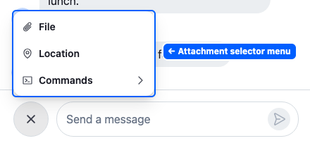
The menu in a channel with polls disabled. Attachment Selector lists when Poll and the other actions show.
<AttachmentSelector/>, the button beside the composer's input, renders a menu of defaultAttachmentSelectorActionSet, filtered by a filter built into it. The filter isn't exported, and it always runs. An item of this set has a type and an ActionButton, its entry in the menu, but no placement.
To change the set, see Custom action sets, which lists the fields of an item. To give an action of your own a button that replaces the menu, see Standalone buttons.
Channel details actions
Channel details come from stream-chat-react/channel-detail. An app usually opens them from the channel header, by passing AvatarWithChannelDetail as its Avatar. They have three action sets, each rendered by one view. Using your own sets changes two of them in one example.
Channel management
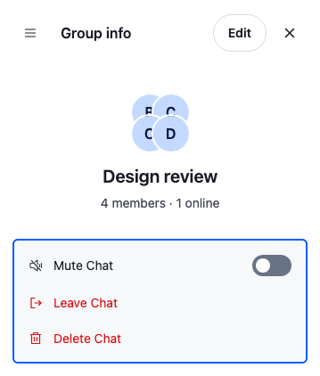
The actions of a group channel.
<ChannelManagementView/>, the Channel info section, renders them at its bottom: defaultChannelManagementActionSet, filtered by useBaseChannelManagementActionSetFilter. The filter always runs.
The channel management action set
An item has no placement, and these fields:
| Field | What it is |
|---|---|
type |
The action's name, such as "deleteChat". The base filter checks the default names and lets any other name through. |
Component |
The component that renders the action. It gets no props: it reads the channel with useChannelDetailContext(). |
The view renders the items the base filter keeps, in the set's order.
The default set, in this order:
| Type | Shown when |
|---|---|
muteChannel |
The user has the mute-channel capability |
muteUser |
The channel is a direct message with another user |
blockUser |
The channel is a direct message with another user, and the user has the ban-channel-members capability |
leaveChannel |
The channel is a group channel, and the user has the leave-channel capability |
deleteChat |
The user has the delete-channel capability |
Channel member
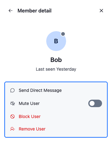
<ChannelMemberDetail/>, a member's detail view opened from the Members section, renders the member's actions: defaultChannelMemberActionSet, filtered by useBaseChannelMemberActionSetFilter. The filter always runs.
The channel member action set
An item has these fields:
| Field | What it is |
|---|---|
type |
The action's name, such as "removeUser". The base filter checks the default names and lets any other name through. |
Component |
The component that renders the action. It gets no props. It reads the member with useChannelMemberActionContext(), which gives member, memberDisplayName and targetUserId, and the channel with useChannelDetailContext(). |
The view renders the items the base filter keeps, in the set's order.
The default set, in this order:
| Type | Shown when |
|---|---|
sendMessage, muteUser, blockUser |
The member isn't the user |
removeUser |
The member isn't the user, and the user has the update-channel-members capability |
<ChannelMembersView/> opens this view from the members list without passing a set, so the Members section always shows the default member actions. Only a <ChannelMemberDetail/> you render yourself uses your set.
Channel members header
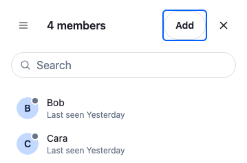
<ChannelMembersView/>, the Members section, renders these actions in its header, in browse mode: defaultChannelMembersHeaderActionSet, filtered by useBaseChannelMembersHeaderActionSetFilter.
The channel members header action set
An item has the same fields as a message action item:
| Field | What it is |
|---|---|
type |
The action's name, such as "addMembers". The base filter checks only addMembers. The menu button item has none. |
placement |
Where the action renders: quick as a button in the header, dropdown in the header's menu, or quick-dropdown-toggle as the menu button. |
Component |
The component that renders the action. A quick or dropdown component gets modeController, which switches the Members section between its modes, such as browse and add. ChannelMembersView explains the modes. The quick-dropdown-toggle component is the menu button. |
isVisible |
Optional. A rule that gets { channel } and returns whether the action shows. Use it for your own actions' permission checks. It can only hide an action. The menu button item has none. |
The default header actions drop the items that the base filter or their own isVisible rules out, then render the rest by placement, in the set's order.
The default set:
| Type | Placement | Shown when |
|---|---|---|
| (none) | quick-dropdown-toggle |
At least one dropdown item is left |
addMembers |
quick |
The user has the update-channel-members capability |
Placements says where each placement renders. Two of them ask more of your component here:
- A
dropdowncomponent closes the menu when its action is done: it callscloseMenu()fromuseContextMenuContext(). - The
quick-dropdown-togglecomponent is aforwardRefbutton. It gets aref,aria-expandedandonClick, and spreads them onto its button. One that ignores them never opens the menu.
The default set already holds a menu button. Keep it when you build your set from the default one, and add one when you write a set from scratch, or the dropdown items can't be opened.
The filter runs in the default header actions only. <ChannelMembersView/> takes a HeaderActions component that replaces them, and it receives your headerActionSet unfiltered. To match the default, run useBaseChannelMembersHeaderActionSetFilter(set) in your component and render the dropdown items in a <ContextMenu/> anchored to the menu button, since useContextMenuContext() throws outside one. DefaultHeaderActions in ChannelMembersHeaderActions.defaults.tsx of the SDK shows the wiring.
Using your own sets
Each view takes its set as a prop, and you reach the view through the sections of <ChannelDetail/>. Using your own sets takes six steps:
- Write the components of your own actions.
- Build your sets from the defaults.
- Give each set to its view, and use that view as its section's content.
- Give the sections to
<ChannelDetail/>. - Open that
<ChannelDetail/>from the channel header's avatar. - Render that header in a channel.
Here is a ChannelWithCustomDetails component that follows them. It removes "Delete chat", adds "Export chat" to the channel management actions, and adds "Copy invite link" to the members header. The comments mark the steps:
import {
  Channel,
  ChannelHeader,
  ContextMenuButton,
  ListItemLayout,
  MessageComposer,
  MessageList,
  useContextMenuContext,
} from "stream-chat-react";
import type { Channel as StreamChannel } from "stream-chat";
import {
  AvatarWithChannelDetail,
  ChannelDetail,
  ChannelManagementView,
  ChannelMembersView,
  defaultChannelDetailSections,
  defaultChannelManagementActionSet,
  defaultChannelMembersHeaderActionSet,
  useChannelDetailContext,
} from "stream-chat-react/channel-detail";
import type {
  AvatarWithChannelDetailProps,
  ChannelDetailProps,
  ChannelManagementActionItem,
  ChannelMembersHeaderActionItem,
  SectionNavigatorSection,
  SectionNavigatorSectionContentProps,
} from "stream-chat-react/channel-detail";

// 1. Write the components of your own actions.
const ExportChatAction = () => {
  const { channel } = useChannelDetailContext();

  return (
    <ListItemLayout
      RootElement="button"
      rootProps={{
        onClick: () => window.open(`/exports/${channel.id}`),
        type: "button",
      }}
      title="Export chat"
    />
  );
};

const CopyInviteLinkAction = () => {
  const { channel } = useChannelDetailContext();
  const { closeMenu } = useContextMenuContext();

  return (
    <ContextMenuButton
      onClick={() => {
        void navigator.clipboard.writeText(
          `${window.location.origin}/join/${channel.id}`,
        );
        closeMenu();
      }}
    >
      Copy invite link
    </ContextMenuButton>
  );
};

// 2. Build your sets from the defaults.
const channelManagementActionSet: ChannelManagementActionItem[] = [
  ...defaultChannelManagementActionSet.filter(
    ({ type }) => type !== "deleteChat",
  ),
  { Component: ExportChatAction, type: "exportChat" },
];

const headerActionSet: ChannelMembersHeaderActionItem[] = [
  ...defaultChannelMembersHeaderActionSet,
  {
    Component: CopyInviteLinkAction,
    // An app's own action carries its own permission check.
    isVisible: ({ channel }) =>
      channel.data?.own_capabilities?.includes("update-channel-members") ??
      false,
    placement: "dropdown",
    type: "copyInviteLink",
  },
];

// 3. Give each set to its view, and use that view as its section's content.
const ManagementSection = (props: SectionNavigatorSectionContentProps) => (
  <ChannelManagementView
    {...props}
    channelManagementActionSet={channelManagementActionSet}
  />
);

const MembersSection = (props: SectionNavigatorSectionContentProps) => (
  <ChannelMembersView {...props} headerActionSet={headerActionSet} />
);

// 4. Give the sections to ChannelDetail.
const sections: SectionNavigatorSection[] = defaultChannelDetailSections.map(
  (section) => {
    if (section.id === "channel-info")
      return { ...section, SectionContent: ManagementSection };
    if (section.id === "channel-members")
      return { ...section, SectionContent: MembersSection };
    return section;
  },
);

const CustomChannelDetail = (props: ChannelDetailProps) => (
  <ChannelDetail {...props} sections={sections} />
);

// 5. Open that ChannelDetail from the channel header's avatar.
const HeaderAvatar = (props: AvatarWithChannelDetailProps) => (
  <AvatarWithChannelDetail {...props} ChannelDetail={CustomChannelDetail} />
);

const CustomChannelHeader = () => <ChannelHeader Avatar={HeaderAvatar} />;

// 6. Render the custom header in a channel.
export const ChannelWithCustomDetails = ({
  channel,
}: {
  channel: StreamChannel;
}) => (
  <Channel channel={channel}>
    <CustomChannelHeader />
    <MessageList />
    <MessageComposer />
  </Channel>
);
The views and their other props are on Channel Detail Views, and the feature on Channel details and members.
Adding, removing and replacing actions
Start from the default set and change it, rather than writing a list from scratch:
| To | Do |
|---|---|
| Remove an action | Filter out its type |
| Add an action | Put an item where you want it: the list's order is the order in the menu |
| Replace an action | Keep its type and swap its component |
| Change when an action shows | Keep its type and replace its isVisible, as in Rules on the items |
Here is a PinWithConfirmation component that replaces the pin action, and a message action set that also adds CopyLinkAction from Message actions before "flag":
// Asks before pinning or unpinning.
const PinWithConfirmation = () => {
  const { closeMenu } = useContextMenuContext();
  const { handlePin, message } = useMessageContext();

  return (
    <ContextMenuButton
      onClick={(event) => {
        if (
          window.confirm(
            message.pinned ? "Unpin this message?" : "Pin this message?",
          )
        ) {
          void handlePin(event);
        }
        closeMenu();
      }}
    >
      {message.pinned ? "Unpin" : "Pin"}
    </ContextMenuButton>
  );
};

// Replace the pin action's component, and add CopyLinkAction (from the Message actions example) before "flag".
const messageActionSet: MessageActionSetItem[] =
  defaultMessageActionSet.flatMap((item): MessageActionSetItem[] => {
    if (item.placement === "dropdown" && item.type === "pin") {
      return [{ ...item, Component: PinWithConfirmation }];
    }
    if (item.placement === "dropdown" && item.type === "flag") {
      return [
        { Component: CopyLinkAction, placement: "dropdown", type: "copyLink" },
        item,
      ];
    }
    return [item];
  });
A replaced action keeps its type, so the base filter still treats it as that action: PinWithConfirmation still shows only to users with the pin-message capability, and not on thread replies. An added action has a type the filter doesn't know: it always passes, so its component checks whether the user may use it and returns null when not. Keep the base filter on, so the default actions keep following the user's capabilities.
The Custom message actions and Product card recipes walk through complete examples.