


Image gallery
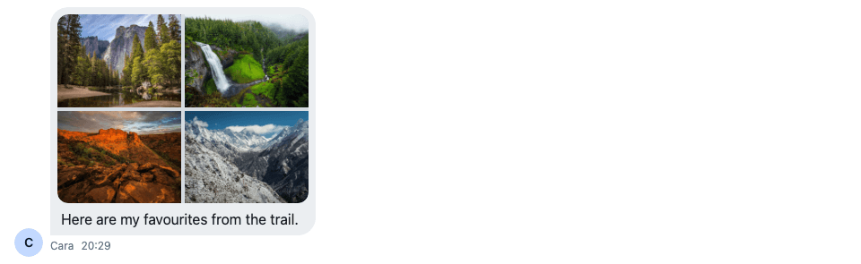
A message with several images shows them as a grid of thumbnails, and a click opens them in a gallery. This recipe replaces both.
What you'll build
- A grid of up to four tiles with a "+N" count
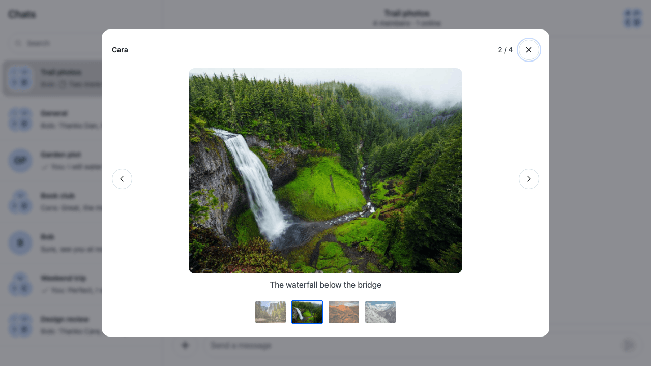
- A lightbox with Previous and Next
- A thumbnail strip for jumping between items
- Keyboard and swipe navigation
- Captions, and videos in the same gallery
Preview
Approach: Replace one part. Choosing where to start explains the approaches.
Starts from: the base app. The page shows only what the recipe adds.
Best practices
- Replace the grid through
Attachment'sModalGalleryprop and register the result as theAttachmentkey. Register the grid as theModalGallerykey too: a message with one image rendersImage, which reads the key, not the prop. - Keep the SDK's
Galleryfor the lightbox. It holds the current index and the navigation, so your UI only readsuseGalleryContext(). - Pass your lightbox to
Galleryas itsGalleryUIprop. The defaultModalGalleryalways renders the defaultGalleryUI, so theGalleryUIkey doesn't reach it. - Give the lightbox the same ways to move as the SDK's gallery: Previous and Next buttons, the arrow keys and a swipe.
- Leave the arrow keys to a video while it has the focus. Its own player seeks with them.
Register the grid
Attachment takes a prop for each part it renders. Pass the grid to it, and register the result:
import type { PropsWithChildren } from "react";
import type { AttachmentProps } from "stream-chat-react";
import { Attachment, WithComponents } from "stream-chat-react";
import { ImageGrid } from "./ImageGrid";

// A message with several images or videos renders `ModalGallery` from this prop.
const AttachmentWithImageGrid = (props: AttachmentProps) => (
  <Attachment {...props} ModalGallery={ImageGrid} />
);

// Declared once, so WithComponents gets the same object on every render. A message with one image
// renders `Image`, which takes `ModalGallery` from here, not from the prop.
const overrides = {
  Attachment: AttachmentWithImageGrid,
  ModalGallery: ImageGrid,
};

export const WithImageGallery = ({ children }: PropsWithChildren) => (
  <WithComponents overrides={overrides}>{children}</WithComponents>
);
Render your Channel inside WithImageGallery. The base app passes it as the recipe's wrapper, around the whole chat view.
The image grid
ModalGallery receives the message's images and videos as gallery items. Each image carries its imageUrl. Each video carries its videoUrl, and a videoThumbnailUrl when it has a thumbnail. Videos in a gallery shows how the default components render a video without one. ImageGrid shows up to four of them as tiles, with "+N" on the fourth when there are more. A tile opens the SDK's Gallery in a GlobalModal, at that item, and renders it with Lightbox:
import { useContext, useMemo, useState } from "react";
import { convertTimestampToDate } from "stream-chat";
import type { ModalGalleryProps } from "stream-chat-react";
import {
  Gallery,
  GlobalModal,
  MessageContext,
  useComponentContextIcons,
} from "stream-chat-react";
import { Lightbox } from "./Lightbox";
import "./ImageGrid.css";

const MAX_TILES = 4;

/**
 * A message's images and videos as a grid of up to four tiles; a click opens the lightbox at that
 * item. A video tile shows the video's thumbnail with a play badge.
 */
export const ImageGrid = ({ items }: ModalGalleryProps) => {
  const { IconPlayFill } = useComponentContextIcons();
  // The SDK also renders the `ModalGallery` component outside a message, where there is no
  // `MessageContext`, so the message may be missing.
  const { message } = useContext(MessageContext) ?? {};
  const [openAt, setOpenAt] = useState<number>();

  // The lightbox renders in a modal, outside MessageContext, so each item carries its message,
  // its sender and when it was shared.
  const galleryItems = useMemo(
    () =>
      items.map((item) => ({
        ...item,
        createdAt:
          item.createdAt ?? convertTimestampToDate(message?.created_at),
        message: item.message ?? message,
        user: item.user ?? message?.user ?? undefined,
      })),
    [items, message],
  );
  const tiles = galleryItems.slice(0, MAX_TILES);
  const hiddenCount = galleryItems.length - tiles.length;
  const close = () => setOpenAt(undefined);

  return (
    <>
      <div className="cookbook-image-grid" data-count={tiles.length}>
        {tiles.map((item, index) => (
          <button
            aria-label={`Open ${item.videoUrl ? "video" : "image"} ${index + 1} of ${galleryItems.length}`}
            className="cookbook-image-grid__tile"
            key={item.imageUrl ?? item.videoUrl ?? index}
            onClick={() => setOpenAt(index)}
            type="button"
          >
            <img
              alt=""
              className="cookbook-image-grid__image"
              src={item.imageUrl ?? item.videoThumbnailUrl}
            />
            {item.videoUrl && (
              <span className="cookbook-image-grid__play">
                <IconPlayFill />
              </span>
            )}
            {index === MAX_TILES - 1 && hiddenCount > 0 && (
              <span className="cookbook-image-grid__more">+{hiddenCount}</span>
            )}
          </button>
        ))}
      </div>
      <GlobalModal
        aria-label="Image gallery"
        className="cookbook-lightbox-modal"
        onClose={close}
        open={openAt !== undefined}
      >
        {openAt !== undefined && (
          <Gallery
            GalleryUI={Lightbox}
            initialIndex={openAt}
            items={galleryItems}
            onRequestClose={close}
          />
        )}
      </GlobalModal>
    </>
  );
};@layer stream-overrides {
.cookbook-image-grid {
display: grid;
grid-template-columns: repeat(2, 1fr);
gap: var(--str-chat__spacing-xxs);
width: 280px;
overflow: hidden;
border-radius: var(--str-chat__radius-lg);
}
/* One image fills the attachment's width, as the SDK sizes it. */
.cookbook-image-grid[data-count="1"] {
grid-template-columns: 1fr;
width: 100%;
}
/* With three items, the first one spans the top row. */
.cookbook-image-grid[data-count="3"] .cookbook-image-grid__tile:first-child {
grid-column: span 2;
}
.cookbook-image-grid__tile {
position: relative;
aspect-ratio: 4 / 3;
padding: 0;
border: 0;
background: var(--str-chat__background-core-surface-subtle);
cursor: zoom-in;
}
.cookbook-image-grid__tile:focus-visible {
outline: 2px solid var(--str-chat__border-utility-focused);
outline-offset: -2px;
}
.cookbook-image-grid__image {
display: block;
width: 100%;
height: 100%;
object-fit: cover;
}
.cookbook-image-grid__play {
position: absolute;
inset: 50% auto auto 50%;
display: grid;
place-items: center;
width: 40px;
height: 40px;
border-radius: var(--str-chat__radius-full);
background: var(--str-chat__background-core-scrim);
color: var(--str-chat__text-on-accent);
transform: translate(-50%, -50%);
}
.cookbook-image-grid__more {
position: absolute;
inset: 0;
display: grid;
place-items: center;
background: var(--str-chat__background-core-scrim);
color: var(--str-chat__text-on-accent);
font: var(--str-chat__font-heading-md);
}
}The lightbox renders in a modal, outside the message's MessageContext, so ImageGrid copies the message, its sender and its message.created_at onto each item, as the default ModalGallery does. Like ModalGallery, it reads MessageContext with useContext() rather than useMessageContext(), because the SDK also renders the ModalGallery key outside a message, where there is no message to copy.
The lightbox
Lightbox is the GalleryUI the grid passes to Gallery. It reads the current item and the navigation from useGalleryContext(), and lays out the sender, the position, a Close button, the item with Previous and Next, and the thumbnail strip:
import { useEffect, useRef } from "react";
import { useComponentContextIcons, useGalleryContext } from "stream-chat-react";
import { LightboxCaption } from "./LightboxCaption";
import { LightboxMedia } from "./LightboxMedia";
import { ThumbnailStrip } from "./ThumbnailStrip";
import { useLightboxNavigation } from "./useLightboxNavigation";
import "./Lightbox.css";

/** The open gallery: who shared it, the current item with Previous and Next, its caption, and a strip of every item. */
export const Lightbox = () => {
  const { IconChevronLeft, IconChevronRight, IconXmark } =
    useComponentContextIcons();
  const {
    currentIndex,
    currentItem,
    goToNext,
    goToPrevious,
    hasNext,
    hasPrevious,
    itemCount,
    onRequestClose,
  } = useGalleryContext();
  const swipeHandlers = useLightboxNavigation();
  const closeButton = useRef<HTMLButtonElement>(null);

  // The lightbox opens with the focus on Close, so Enter or Escape closes it at once.
  useEffect(() => closeButton.current?.focus(), []);

  return (
    <div className="cookbook-lightbox">
      <div className="cookbook-lightbox__header">
        <span className="cookbook-lightbox__sender">
          {currentItem.user?.name ?? currentItem.user?.id}
        </span>
        <span className="cookbook-lightbox__position">
          {currentIndex + 1} / {itemCount}
        </span>
        <button
          aria-label="Close"
          className="cookbook-lightbox__button"
          onClick={onRequestClose}
          ref={closeButton}
          type="button"
        >
          <IconXmark />
        </button>
      </div>
      <div className="cookbook-lightbox__stage">
        <button
          aria-label="Previous"
          className="cookbook-lightbox__button"
          disabled={!hasPrevious}
          onClick={goToPrevious}
          type="button"
        >
          <IconChevronLeft />
        </button>
        <figure className="cookbook-lightbox__figure" {...swipeHandlers}>
          <LightboxMedia item={currentItem} />
          <LightboxCaption item={currentItem} />
        </figure>
        <button
          aria-label="Next"
          className="cookbook-lightbox__button"
          disabled={!hasNext}
          onClick={goToNext}
          type="button"
        >
          <IconChevronRight />
        </button>
      </div>
      <ThumbnailStrip />
    </div>
  );
};@layer stream-overrides {
.cookbook-lightbox {
display: flex;
flex-direction: column;
gap: var(--str-chat__spacing-md);
width: min(880px, 90vw);
padding: var(--str-chat__spacing-lg);
border-radius: var(--str-chat__radius-xl);
background: var(--str-chat__background-core-elevation-1);
color: var(--str-chat__text-primary);
}
.cookbook-lightbox__header {
display: flex;
align-items: center;
gap: var(--str-chat__spacing-sm);
}
.cookbook-lightbox__sender {
flex: 1;
font: var(--str-chat__font-heading-xs);
}
.cookbook-lightbox__position {
color: var(--str-chat__text-secondary);
font: var(--str-chat__font-caption-default);
}
.cookbook-lightbox__stage {
display: flex;
align-items: center;
gap: var(--str-chat__spacing-sm);
}
/* A horizontal swipe on the figure is the lightbox's; a vertical one still scrolls the page. */
.cookbook-lightbox__figure {
display: flex;
flex: 1;
flex-direction: column;
align-items: center;
gap: var(--str-chat__spacing-sm);
min-width: 0;
margin: 0;
touch-action: pan-y;
user-select: none;
}
.cookbook-lightbox__button {
display: grid;
flex-shrink: 0;
place-items: center;
width: 40px;
height: 40px;
padding: 0;
border: 1px solid var(--str-chat__border-core-default);
border-radius: var(--str-chat__radius-full);
background: var(--str-chat__background-core-elevation-0);
color: var(--str-chat__text-primary);
cursor: pointer;
}
.cookbook-lightbox__button:hover:not(:disabled) {
background: var(--str-chat__background-utility-hover);
}
.cookbook-lightbox__button:disabled {
color: var(--str-chat__text-disabled);
cursor: default;
}
}The lightbox at the waterfall
A thumbnail strip
ThumbnailStrip shows every item of the gallery. The current one is marked with aria-current, and a click calls goToIndex(). When the strip is wider than the lightbox, it scrolls, and the current thumbnail scrolls into view:
import { useEffect, useRef } from "react";
import { useComponentContextIcons, useGalleryContext } from "stream-chat-react";
import "./ThumbnailStrip.css";

/** A thumbnail of every item in the gallery; the current one is marked, and a click shows another. */
export const ThumbnailStrip = () => {
  const { IconPlayFill } = useComponentContextIcons();
  const { currentIndex, goToIndex, itemCount, items } = useGalleryContext();
  const currentThumbnail = useRef<HTMLButtonElement>(null);

  // Keeps the current thumbnail in view when the strip is wider than the lightbox.
  useEffect(() => {
    currentThumbnail.current?.scrollIntoView({
      block: "nearest",
      inline: "nearest",
    });
  }, [currentIndex]);

  if (itemCount < 2) return null;

  return (
    <div
      aria-label="All items"
      className="cookbook-thumbnail-strip"
      role="group"
    >
      {items.map((item, index) => (
        <button
          aria-current={index === currentIndex}
          aria-label={`Show ${item.videoUrl ? "video" : "image"} ${index + 1}`}
          className="cookbook-thumbnail-strip__thumbnail"
          key={item.imageUrl ?? item.videoUrl ?? index}
          onClick={() => goToIndex(index)}
          ref={index === currentIndex ? currentThumbnail : undefined}
          type="button"
        >
          <img alt="" src={item.imageUrl ?? item.videoThumbnailUrl} />
          {item.videoUrl && (
            <span className="cookbook-thumbnail-strip__play">
              <IconPlayFill />
            </span>
          )}
        </button>
      ))}
    </div>
  );
};@layer stream-overrides {
.cookbook-thumbnail-strip {
display: flex;
justify-content: safe center;
gap: var(--str-chat__spacing-xs);
padding: var(--str-chat__spacing-xxs);
overflow-x: auto;
}
.cookbook-thumbnail-strip__thumbnail {
position: relative;
flex-shrink: 0;
width: 64px;
height: 48px;
padding: 0;
overflow: hidden;
border: 2px solid transparent;
border-radius: var(--str-chat__radius-sm);
background: none;
opacity: 0.6;
cursor: pointer;
}
.cookbook-thumbnail-strip__thumbnail[aria-current="true"] {
border-color: var(--str-chat__accent-primary);
opacity: 1;
}
.cookbook-thumbnail-strip__thumbnail:focus-visible {
outline: 2px solid var(--str-chat__border-utility-focused);
outline-offset: 2px;
}
.cookbook-thumbnail-strip__thumbnail img {
display: block;
width: 100%;
height: 100%;
object-fit: cover;
}
.cookbook-thumbnail-strip__play {
position: absolute;
inset: 0;
display: grid;
place-items: center;
color: var(--str-chat__text-on-accent);
}
}Keyboard and swipe navigation
useLightboxNavigation listens for the arrow keys, Home and End while the lightbox is open. It returns pointer handlers for the figure, so a drag to the side steps to the next or the previous item with a finger, a pen or the mouse:
import type { PointerEvent } from "react";
import { useEffect, useRef } from "react";
import { useGalleryContext } from "stream-chat-react";

/** How far, in pixels, a pointer has to travel sideways to count as a swipe. */
const SWIPE_DISTANCE = 50;

/** Whether a key press belongs to a video's own controls, where the arrows seek. */
const isInVideo = (target: EventTarget | null) =>
  target instanceof Element && !!target.closest("video");

/**
 * Keyboard and swipe navigation for the lightbox. The arrow keys step to the previous or next
 * item, Home and End jump to the first and last. Returns pointer handlers for the element a swipe
 * starts on: a drag of at least {@link SWIPE_DISTANCE} pixels, more sideways than up or down,
 * steps in the direction the content moves, with a finger, a pen or the mouse.
 */
export const useLightboxNavigation = () => {
  const { goToIndex, goToNext, goToPrevious, itemCount } = useGalleryContext();
  const swipeStart = useRef<{ x: number; y: number }>(undefined);

  useEffect(() => {
    const onKeyDown = (event: KeyboardEvent) => {
      if (isInVideo(event.target)) return;
      const step = {
        ArrowLeft: goToPrevious,
        ArrowRight: goToNext,
        End: () => goToIndex(itemCount - 1),
        Home: () => goToIndex(0),
      }[event.key];
      if (!step) return;
      event.preventDefault();
      step();
    };
    document.addEventListener("keydown", onKeyDown);
    return () => document.removeEventListener("keydown", onKeyDown);
  }, [goToIndex, goToNext, goToPrevious, itemCount]);

  return {
    onPointerCancel: () => {
      swipeStart.current = undefined;
    },
    onPointerDown: (event: PointerEvent) => {
      // A drag on a video's timeline seeks; it isn't a swipe.
      if (isInVideo(event.target)) return;
      swipeStart.current = { x: event.clientX, y: event.clientY };
    },
    onPointerUp: (event: PointerEvent) => {
      const start = swipeStart.current;
      swipeStart.current = undefined;
      if (!start) return;
      const deltaX = event.clientX - start.x;
      const deltaY = event.clientY - start.y;
      if (
        Math.abs(deltaX) < SWIPE_DISTANCE ||
        Math.abs(deltaX) <= Math.abs(deltaY)
      )
        return;
      if (deltaX < 0) goToNext();
      else goToPrevious();
    },
  };
};
The figure sets touch-action: pan-y in Lightbox.css, so the browser leaves a sideways swipe to the handlers and still scrolls on a vertical one. goToNext() and goToPrevious() do nothing at the last and the first item.
Captions
A Stream image attachment can carry a title, which the SDK copies to the gallery item as title. Its fallback, usually the file name, isn't copied. LightboxCaption shows the title, or the text of the message the item was shared in when it has none:
import type { GalleryItem } from "stream-chat-react";
import "./LightboxCaption.css";

/**
 * The caption under the current item: the attachment's own `title`, or the text of the message it
 * was shared in when the attachment has none.
 */
export const LightboxCaption = ({ item }: { item: GalleryItem }) => {
  const caption = item.title || item.message?.text;
  if (!caption) return null;

  return (
    <figcaption className="cookbook-lightbox-caption">{caption}</figcaption>
  );
};@layer stream-overrides {
.cookbook-lightbox-caption {
max-width: 100%;
color: var(--str-chat__text-secondary);
font: var(--str-chat__font-body-default);
text-align: center;
}
}Videos next to images
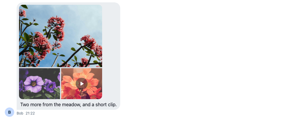
A message with images and a video attachment puts them all in one gallery. The video attachment's asset_url becomes the item's videoUrl, and its thumb_url the videoThumbnailUrl. The grid shows the thumbnail with a play badge:
Photos and a video in one grid
In the lightbox, LightboxMedia plays the video in the browser's own player, with the thumbnail as its poster:
import type { GalleryItem } from "stream-chat-react";
import "./LightboxMedia.css";

/**
 * The lightbox's current item: a video plays in the browser's own player, with its thumbnail as
 * the poster; an image shows at full size.
 */
export const LightboxMedia = ({ item }: { item: GalleryItem }) =>
  item.videoUrl ? (
    <video
      className="cookbook-lightbox-media"
      controls
      // A new key per video, so moving to another item stops the one that was playing.
      key={item.videoUrl}
      poster={item.videoThumbnailUrl}
      preload="metadata"
      src={item.videoUrl}
    />
  ) : (
    <img
      alt={item.title ?? ""}
      className="cookbook-lightbox-media"
      draggable={false}
      src={item.imageUrl}
    />
);@layer stream-overrides {
.cookbook-lightbox-media {
max-width: 100%;
max-height: 56vh;
border-radius: var(--str-chat__radius-lg);
}
}The lightbox at the video
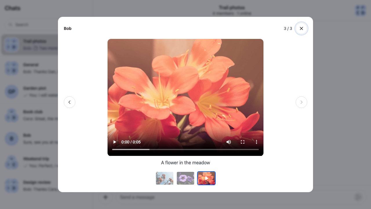
The SDK's VideoPlayer isn't exported, so a lightbox of your own can't render it. A VideoPlayer override in ComponentContext changes the player of the default gallery and of a single video, not this one.
How it works
Example
Cara posts four photos from a hike in the Trail photos channel. The user sees them as a grid, clicks the second one, and the lightbox opens at the waterfall with its caption. They step through the photos with the arrow keys, or swipe on a phone, jump back with a thumbnail, and close the lightbox with Escape.
MessageUIrenders theAttachmentkey for a message with attachments.Attachmentputs its images and videos in one group: several go to itsModalGalleryprop with one item each, one image goes toImage, and one video toMedia.Imagerenders theModalGallerykey with one item. RegisteringImageGridunder the key gives that image the same lightbox.GlobalModalrenders the lightbox above the app, traps the focus in it, and closes on Escape or a click on the backdrop, callingonClose.Galleryis mounted only while the modal is open, so it starts at the clicked item every time.Lightboxmoves the focus to Close itself when it mounts.GlobalModal'sgetInitialFocusElementruns before the modal's children mount, so it can't find the button.GallerykeepscurrentIndexand gives the UIgoToNext(),goToPrevious()andgoToIndex(). Every part of the lightbox reads them fromuseGalleryContext(), so the buttons, the keys, a swipe and the strip stay in step.
Related
- Attachments and uploads lists which component renders each kind of attachment.
- Attachments lists the
Attachmentprops, includingModalGallery. - Modal describes
GlobalModaland its props. - Overriding components explains how
WithComponentskeys apply. - Giphy preview replaces the buttons under a
/giphypreview. - GIF picker adds a GIF from the composer, which the message list renders with
Giphy, not the image grid. - Custom message replaces the message UI that renders
Attachment.