


Image gallery
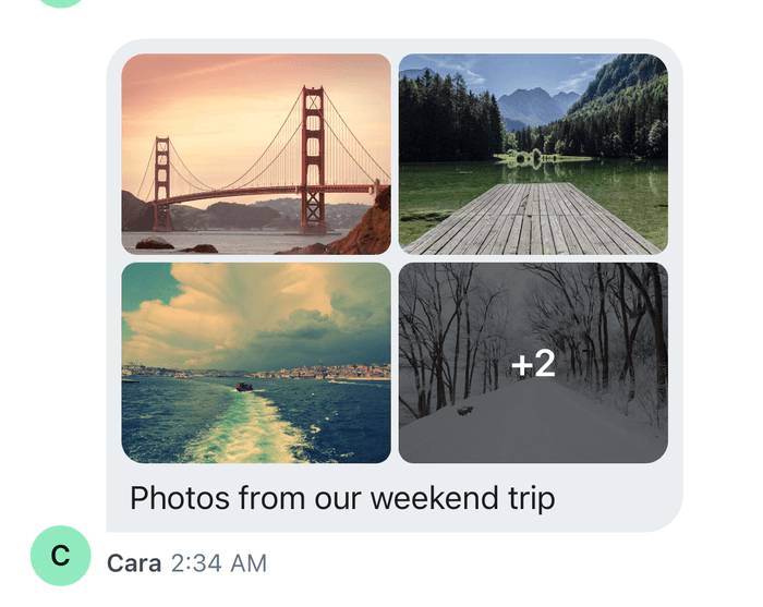
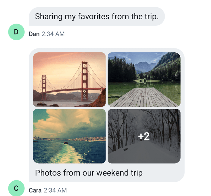
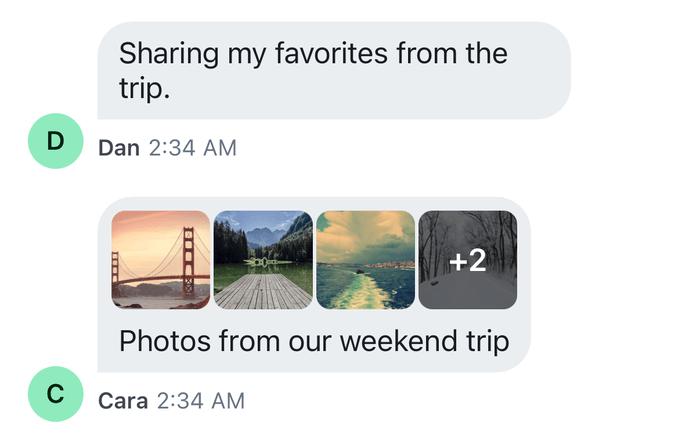
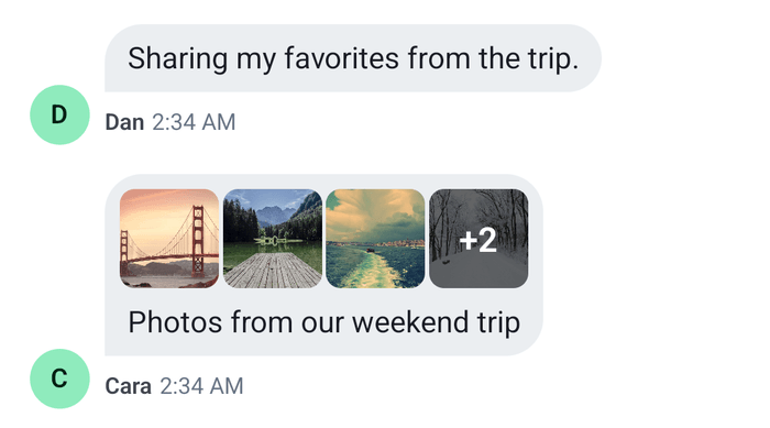
A message with several images or videos shows them as a grid of thumbnails, and pressing one opens them in a full-screen viewer. This UI cookbook restyles the grid with the theme, replaces it with a row of tiles that shows a "+N" count on the last one, and replaces the footer of the viewer with one that shows the message's text as a caption and a strip of thumbnails for jumping between items. The grid and the viewer are explained in Message UI and Image gallery.
What you'll build
- The grid restyled with the theme
- A row of tiles with a "+N" count on the last one
- A viewer footer with the message's text as a caption
- A strip of thumbnails for jumping between items
Approach: Restyle and Replace one part. Choosing where to start explains the approaches.
Best practices
- Restyle the grid through
messageItemView.gallerywhen only its size, corners or the "+N" overlay change. Replace theGallerykey when the layout changes. - Open the viewer the way the SDK does:
imageGalleryStateStore.openImageGallery(), thensetOverlay("gallery"). Pass the attachment's URL asselectedAttachmentUrl, and the native handle of the tile asrequesterNode, so screen reader focus returns to it when the viewer closes. - Read the viewer's state with
useStateStore()and a selector declared at module scope. A part of the viewer reads the asset on screen fromimageGalleryStateStore.state. - Put the
WithComponentsthat replaces a part of the viewer aroundOverlayProvider. The viewer renders there, outside your screens. - Keep the video controls in a footer of your own by rendering the
ImageGalleryVideoControlskey for a video asset, as the default footer does. - Let the user move through the items by swiping, as the viewer's pager does, and give the strip a press that moves it to an item.
Restyling the grid
The default grid lays out the first four images and videos of a message, with "+N" over the last tile when there are more. gridWidth and gridHeight size a grid of two or more items. maxWidth, maxHeight, minWidth and minHeight bound a single item. moreImagesContainer and moreImagesText style the "+N" overlay, and galleryContainer, image and imageContainer the grid and its tiles:
import type { DeepPartial, Theme } from "stream-chat-react-native";

export const galleryTheme: DeepPartial<Theme> = {
  messageItemView: {
    gallery: {
      gridHeight: 216,
      gridWidth: 288,
      moreImagesContainer: { backgroundColor: "rgba(0, 0, 0, 0.6)" },
      moreImagesText: { fontSize: 20 },
    },
  },
};
Pass the theme to OverlayProvider and Chat, as Theming shows. The colors of the tiles come from semantic tokens, so they follow the color scheme. The theme's imageGallery key styles the viewer: backgroundColor for its background, and header, footer, grid and videoControl for its parts.
 |  |
The grid
Gallery renders a message's images and videos. The message list renders it for the gallery part of the bubble, and Attachment renders it for a single image or video. In both cases it reads the images and videos from the props, or from MessageContext. This replacement shows up to four items as square tiles in a row, with "+N" over the fourth when there are more, and a play badge on a video. Pressing a tile opens the viewer at that item, and a long press opens the message menu:
import { useRef } from "react";
import type { ComponentRef } from "react";
import {
  findNodeHandle,
  Image,
  Pressable,
  StyleSheet,
  Text,
  View,
} from "react-native";
import type { Attachment } from "stream-chat";
import {
  useComponentsContext,
  useImageGalleryContext,
  useMessageContext,
  useOverlayContext,
} from "stream-chat-react-native";
import type { GalleryProps } from "stream-chat-react-native";

const MAX_TILES = 4;

const GridTile = ({
  attachment,
  hiddenCount,
}: {
  attachment: Attachment;
  hiddenCount: number;
}) => {
  const { message, onLongPress } = useMessageContext();
  const { imageGalleryStateStore } = useImageGalleryContext();
  const { setOverlay } = useOverlayContext();
  const { VideoThumbnail } = useComponentsContext();
  const tileRef = useRef<ComponentRef<typeof View>>(null);
  const isVideo = attachment.type === "video";

  const openViewer = () => {
    imageGalleryStateStore.openImageGallery({
      messages: [message],
      requesterNode: findNodeHandle(tileRef.current),
      // A video's `image_url` holds its playable URL in the message context.
      selectedAttachmentUrl: attachment.image_url ?? attachment.asset_url,
    });
    setOverlay("gallery");
  };

  return (
    <Pressable
      accessibilityLabel={isVideo ? "Open video" : "Open image"}
      accessibilityRole="button"
      onLongPress={(event) => onLongPress({ emitter: "gallery", event })}
      onPress={openViewer}
      ref={tileRef}
      style={styles.tile}
    >
      {isVideo ? (
        <VideoThumbnail thumb_url={attachment.thumb_url} />
      ) : (
        <Image
          source={{ uri: attachment.thumb_url ?? attachment.image_url }}
          style={styles.image}
        />
      )}
      {hiddenCount > 0 ? (
        <View style={[StyleSheet.absoluteFill, styles.more]}>
          <Text style={styles.moreText}>+{hiddenCount}</Text>
        </View>
      ) : null}
    </Pressable>
  );
};

export const ImageGrid = ({
  images: imagesProp,
  videos: videosProp,
}: GalleryProps) => {
  const { alignment, images, videos } = useMessageContext();
  const items = [...(imagesProp ?? images), ...(videosProp ?? videos)];
  const tiles = items.slice(0, MAX_TILES);
  const hiddenCount = items.length - tiles.length;

  return (
    <View
      style={[
        styles.grid,
        { alignSelf: alignment === "right" ? "flex-end" : "flex-start" },
      ]}
    >
      {tiles.map((attachment, index) => (
        <GridTile
          attachment={attachment}
          hiddenCount={index === MAX_TILES - 1 ? hiddenCount : 0}
          key={attachment.image_url ?? attachment.asset_url ?? index}
        />
      ))}
    </View>
  );
};

const styles = StyleSheet.create({
  grid: { flexDirection: "row", gap: 2, maxWidth: 256 },
  image: { flex: 1 },
  more: {
    alignItems: "center",
    backgroundColor: "rgba(0, 0, 0, 0.6)",
    justifyContent: "center",
  },
  moreText: { color: "white", fontSize: 18, fontWeight: "600" },
  tile: { aspectRatio: 1, borderRadius: 8, flex: 1, overflow: "hidden" },
}); |  |
message and onLongPress come from the message the tile is in. The tile opens the viewer itself, so it doesn't call the message's onPress, and onPressMessage on Channel isn't called for these presses.
The viewer's footer
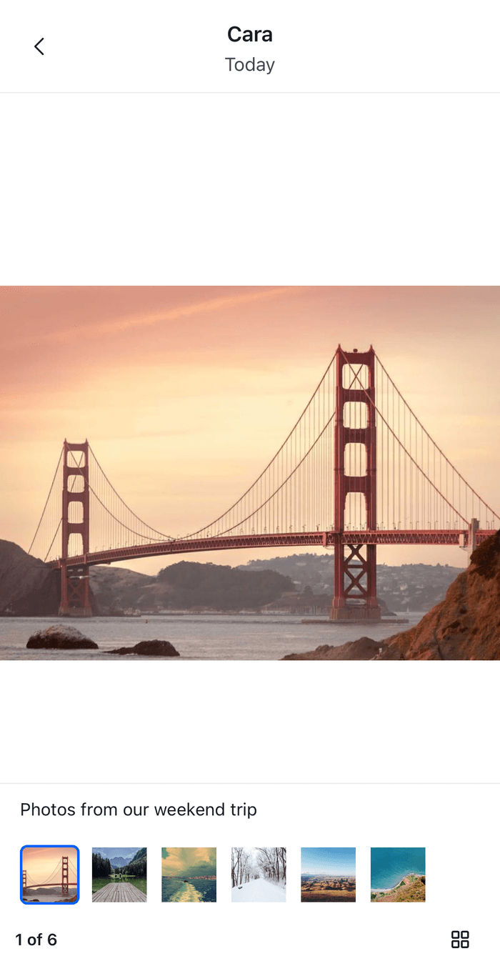
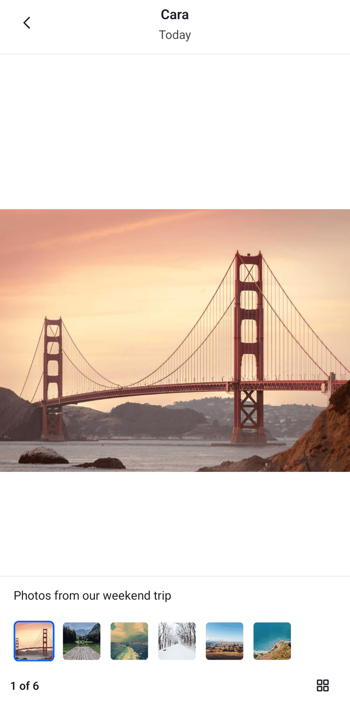
The viewer reads its assets from imageGalleryStateStore.state: assets holds one asset for each attachment of the messages it was opened with that have a viewable attachment, currentIndex the asset on screen, and messages the messages. The default footer shows the share button, the position and the grid button. This footer shows the text of the message that the asset belongs to as a caption, a strip of thumbnails that moves the viewer to the item that is pressed, the position and the grid button. For a video, it renders the video controls above them:
import { useEffect, useRef, useState } from "react";
import {
  FlatList,
  Image,
  Pressable,
  StyleSheet,
  Text,
  View,
} from "react-native";
import Animated, {
  Extrapolation,
  interpolate,
  useAnimatedStyle,
} from "react-native-reanimated";
import { useSafeAreaInsets } from "react-native-safe-area-context";
import {
  Button,
  useComponentsContext,
  useImageGalleryContext,
  useStateStore,
  useTheme,
  useTranslationContext,
} from "stream-chat-react-native";
import type {
  ImageGalleryAsset,
  ImageGalleryFooterProps,
  ImageGalleryState,
} from "stream-chat-react-native";

const THUMBNAIL_SIZE = 48;
const THUMBNAIL_GAP = 8;

const gallerySelector = ({
  assets,
  currentIndex,
  messages,
}: ImageGalleryState) => ({ assets, currentIndex, messages });

const getItemLayout = (_data: unknown, index: number) => ({
  index,
  length: THUMBNAIL_SIZE + THUMBNAIL_GAP,
  offset: (THUMBNAIL_SIZE + THUMBNAIL_GAP) * index,
});

export const GalleryFooter = ({
  opacity,
  openGridView,
  visible,
}: ImageGalleryFooterProps) => {
  const { icons, ImageGalleryVideoControls } = useComponentsContext();
  const { imageGalleryStateStore } = useImageGalleryContext();
  const { t } = useTranslationContext();
  const { bottom } = useSafeAreaInsets();
  const {
    theme: { semantics },
  } = useTheme();
  const { assets, currentIndex, messages } = useStateStore(
    imageGalleryStateStore.state,
    gallerySelector,
  );
  const [height, setHeight] = useState(200);
  const stripRef = useRef<FlatList<ImageGalleryAsset>>(null);

  // Slides in and out with the header, and fades while the image is dragged down.
  const animatedStyle = useAnimatedStyle(
    () => ({
      opacity: opacity.value,
      transform: [
        {
          translateY: interpolate(
            visible.value,
            [0, 1],
            [height, 0],
            Extrapolation.CLAMP,
          ),
        },
      ],
    }),
    [height],
  );

  // Keeps the strip centered on the item on screen, also after a swipe.
  useEffect(() => {
    if (currentIndex < assets.length) {
      stripRef.current?.scrollToIndex({
        animated: true,
        index: currentIndex,
        viewPosition: 0.5,
      });
    }
  }, [assets.length, currentIndex]);

  const asset = assets[currentIndex];
  if (!asset) return null;

  const caption = messages.find(({ id }) => id === asset.messageId)?.text;

  return (
    <Animated.View
      onLayout={(event) => setHeight(event.nativeEvent.layout.height)}
      pointerEvents="box-none"
      style={[styles.wrapper, animatedStyle]}
    >
      <View
        style={[
          styles.container,
          {
            backgroundColor: semantics.backgroundCoreElevation1,
            borderTopColor: semantics.borderCoreSubtle,
            paddingBottom: bottom + 8,
          },
        ]}
      >
        {asset.type === "video" ? (
          <ImageGalleryVideoControls attachmentId={asset.id} />
        ) : null}
        {caption ? (
          <Text
            numberOfLines={3}
            style={[styles.caption, { color: semantics.textPrimary }]}
          >
            {caption}
          </Text>
        ) : null}
        <FlatList
          contentContainerStyle={styles.strip}
          data={assets}
          extraData={currentIndex}
          getItemLayout={getItemLayout}
          horizontal
          keyExtractor={(item) => item.id}
          ref={stripRef}
          renderItem={({ index, item }) => (
            <Pressable
              accessibilityLabel={`Item ${index + 1}`}
              accessibilityRole="button"
              accessibilityState={{ selected: index === currentIndex }}
              onPress={() => {
                imageGalleryStateStore.currentIndex = index;
              }}
              style={[
                styles.thumbnail,
                {
                  borderColor:
                    index === currentIndex
                      ? semantics.accentPrimary
                      : "transparent",
                },
              ]}
            >
              <Image
                source={{
                  uri: item.type === "video" ? item.thumb_url : item.uri,
                }}
                style={styles.thumbnailImage}
              />
            </Pressable>
          )}
          showsHorizontalScrollIndicator={false}
        />
        <View style={styles.bar}>
          <Text style={[styles.position, { color: semantics.textPrimary }]}>
            {t(
              "imageGallery.footer.position.text",
              "{{ index }} of {{ photoLength }}",
              {
                index: currentIndex + 1,
                photoLength: assets.length,
              },
            )}
          </Text>
          <Button
            LeadingIcon={icons.ImageGrid}
            accessibilityLabelKey="imageGallery.footer.grid.accessibilityLabel"
            iconOnly
            onPress={openGridView}
            size="md"
            type="ghost"
            variant="secondary"
          />
        </View>
      </View>
    </Animated.View>
  );
};

const styles = StyleSheet.create({
  bar: {
    alignItems: "center",
    flexDirection: "row",
    justifyContent: "space-between",
    paddingHorizontal: 12,
  },
  caption: { fontSize: 14, paddingHorizontal: 16, paddingTop: 12 },
  container: { borderTopWidth: 1, gap: 8 },
  position: { fontSize: 13, fontWeight: "600" },
  strip: { gap: THUMBNAIL_GAP, paddingHorizontal: 16, paddingTop: 12 },
  thumbnail: {
    borderRadius: 6,
    borderWidth: 2,
    height: THUMBNAIL_SIZE,
    overflow: "hidden",
    width: THUMBNAIL_SIZE,
  },
  thumbnailImage: { flex: 1 },
  wrapper: { bottom: 0, left: 0, position: "absolute", right: 0 },
}); |  |
The footer has no share button. The default footer's share button shows only when the share and file system handlers are registered, and a footer of your own would have to do the saving and sharing itself.
Register the parts
Both overrides go in one WithComponents. It goes around OverlayProvider, because the viewer renders there:
import type { PropsWithChildren } from "react";
import { WithComponents } from "stream-chat-react-native";
import { GalleryFooter } from "./GalleryFooter";
import { ImageGrid } from "./ImageGrid";

// Declared once, so WithComponents gets the same object on every render.
const overrides = { Gallery: ImageGrid, ImageGalleryFooter: GalleryFooter };

export const WithImageGallery = ({ children }: PropsWithChildren) => (
  <WithComponents overrides={overrides}>{children}</WithComponents>
);import type { PropsWithChildren } from "react";
import type { StreamChat } from "stream-chat";
import { Chat, OverlayProvider } from "stream-chat-react-native";
import { WithImageGallery } from "./WithImageGallery";
export const App = ({
children,
client,
}: PropsWithChildren<{ client: StreamChat }>) => (
<WithImageGallery>
<OverlayProvider>
<Chat client={client}>{children}</Chat>
</OverlayProvider>
</WithImageGallery>
);How it works
Example
Cleo shares five trail photos in one message, with the text "Saturday's hike". Her message shows four tiles, and "+1" over the fourth. The user presses the second tile:
GridTilegives the image gallery store the message and the second photo's URL, and sets the overlay to"gallery".OverlayProviderrenders the viewer.- The store turns the five photos into assets and finds the one whose URL matches, so the viewer opens on the second.
GalleryFooterreadsassets,currentIndexandmessagesfrom the store. It shows "Saturday's hike", five thumbnails with the second one outlined, and "2 of 5".- The user swipes to the fifth photo, which the grid doesn't show. The store's
currentIndexmoves to it, the strip scrolls to its thumbnail and the position reads "5 of 5". - The user presses the first thumbnail.
GalleryFootersetsimageGalleryStateStore.currentIndex, and the viewer pages back to the first photo.
- The store keeps the messages that have an image that isn't a link preview, a Giphy, or a video when a video player is installed. Without a player a video renders as a file, so the grid never gets one. A file in the same message as an image becomes a slide too, so the strip can hold more items than the grid.
- Setting
currentIndexpauses the video of the asset the viewer leaves, and moves the pager. - The default header keeps the back button, the sender and the time, and clears the store when the viewer closes. This cookbook leaves it as it is, so the store is cleared as usual.
- The grid of every asset in a bottom sheet is the
ImageGalleryGridkey. The footer's grid button calls theopenGridViewthat the viewer passes.
Read more
- Image gallery: the parts, the context, the store and the props that the viewer passes.
- Overlays and bottom sheets: the viewer from the user's side.
- Attachments: the props of
Gallery. - Message UI: where the gallery sits in a message's bubble.
- Theme object: the
imageGallerykeys. - Giphy preview: replaces the buttons of a
/giphypreview. - Custom message: replaces the message view that renders the gallery.