


Unread and scroll controls
When the user opens a channel with unread messages, the message list shows a separator above the first unread message, a notification that jumps back to it, and a scroll-to-bottom button. This UI cookbook restyles the separator and the notification with the theme, then replaces all three. Message list UI explains when each one shows.
What you'll build
- The unread separator and notification restyled with the theme
- A "14 new messages" separator with a Mark as read link
- A notification that jumps to the first unread message
- A scroll-to-bottom button of your own
Approach: Restyle and Replace one part. Choosing where to start explains the approaches.
Best practices
- Restyle through the theme when only the look changes.
messageList.inlineUnreadIndicatorstyles the separator, andmessageList.unreadMessagesNotificationthe notification. - Replace
InlineUnreadIndicatorandUnreadMessagesNotificationwhen the wording or the actions change. Both render insideChannel, so they can readuseChannel(). - Mark the channel read with
useMarkRead(channel), which also resets the unread snapshot that the separator renders from. Marking read on its own doesn't reset it. - Call the
onPressthatScrollToBottomButtonreceives, and returnnullwhenshowNotificationisfalse. The list decides what a press does. - Read the unread count of the button with
useOwnUnreadCount()and pass it no channel in a thread, as the default does. - Declare the override object and the components in it at module scope.
WithComponentsreads its overrides once.
The default controls
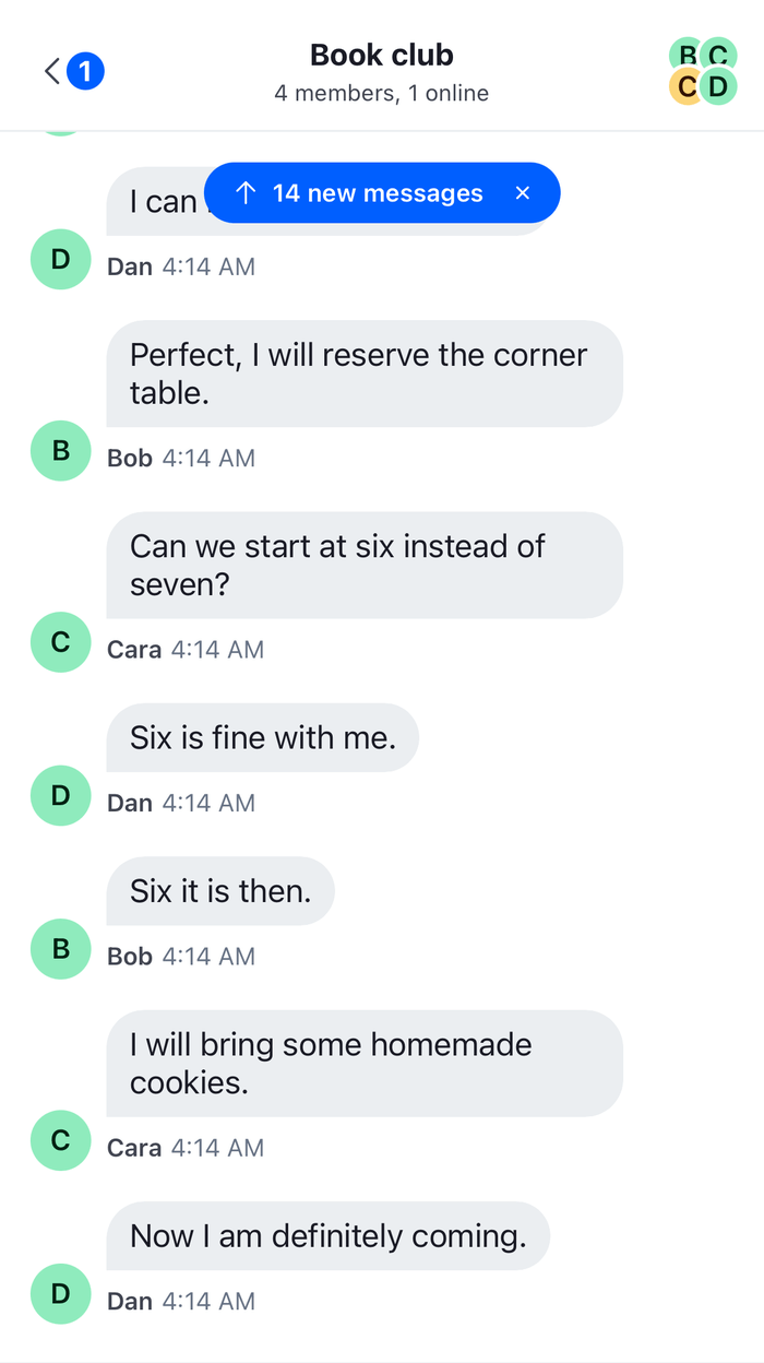
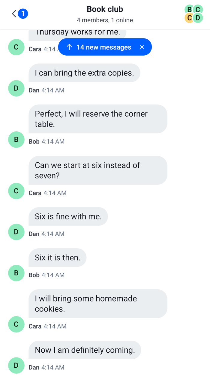
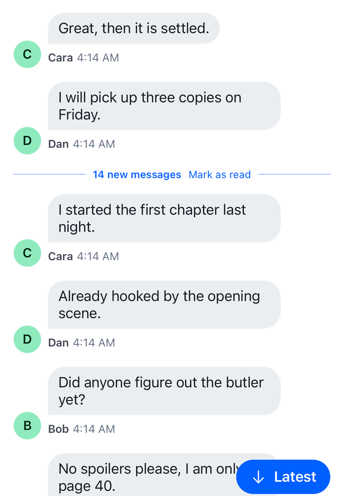
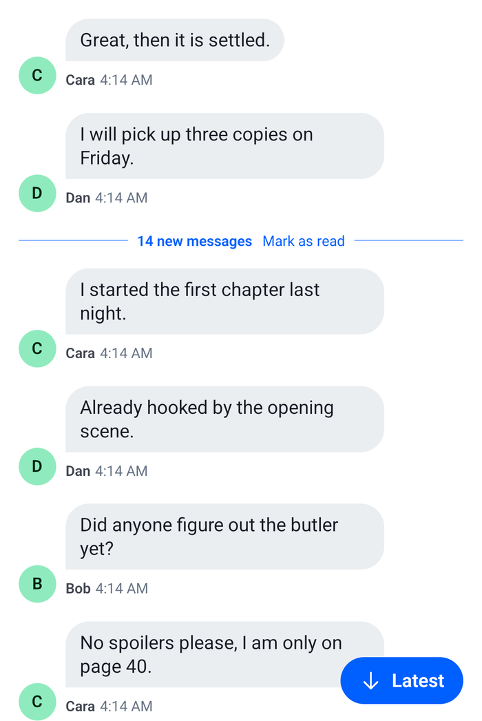
The user opens the channel at its latest message. The last message they read is above the screen, so a "14 unread" notification shows at the top of the list. Pressing it jumps to the first unread message, with the message highlighted. The separator, reading "14 unread messages", is now on screen and the notification goes. The list isn't at the latest message, so the scroll-to-bottom button shows.
When messages arrive while the user reads older ones, the button's badge counts them. The close button of the notification marks the channel read, which also removes the separator.
Restyling with the theme
The separator is a row with a background, a border above and below, and a label. inlineUnreadIndicator.container styles the row, and inlineUnreadIndicator.text the label. The notification is a pill with a border: unreadMessagesNotification.container styles it, and leftButtonContainer and rightButtonContainer its two buttons. unreadMessagesNotificationContainer positions it over the list. This theme draws both in an accent color, with values for each color scheme:
import type { DeepPartial, Theme } from "stream-chat-react-native";

const createUnreadTheme = (
  accent: string,
  tint: string,
): DeepPartial<Theme> => ({
  messageList: {
    inlineUnreadIndicator: {
      container: { backgroundColor: tint, borderColor: accent },
      text: { color: accent },
    },
    unreadMessagesNotification: {
      container: { borderColor: accent },
    },
  },
});

export const lightUnreadTheme = createUnreadTheme("#0B57D0", "#E8F0FE");
export const darkUnreadTheme = createUnreadTheme("#8AB4F8", "#1C2B41");
Pass the one that matches the color scheme to OverlayProvider and Chat, as Theming shows.
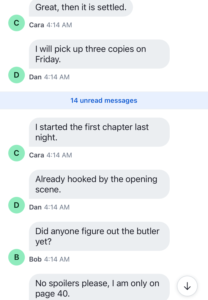 | 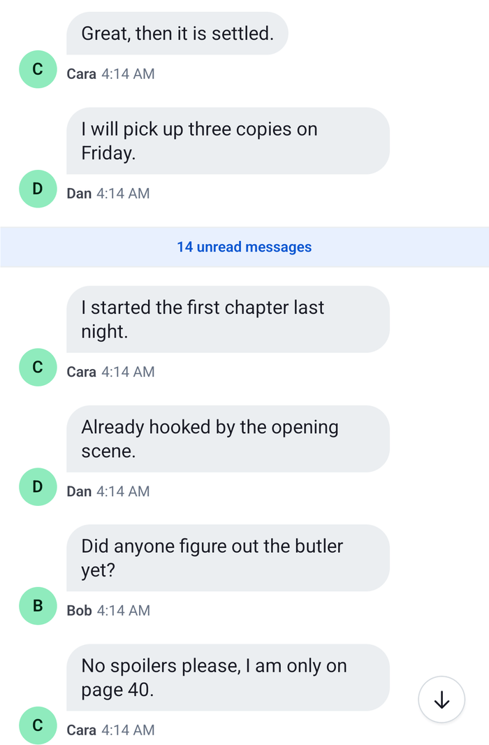 |
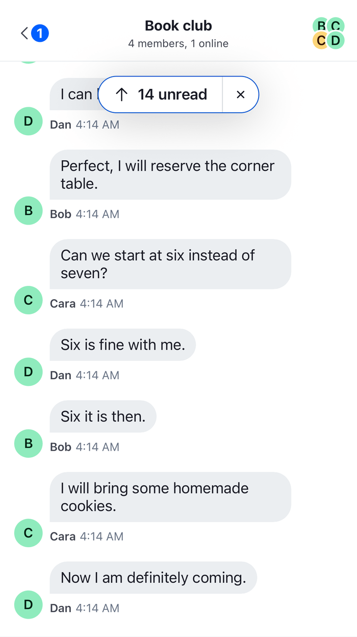 | 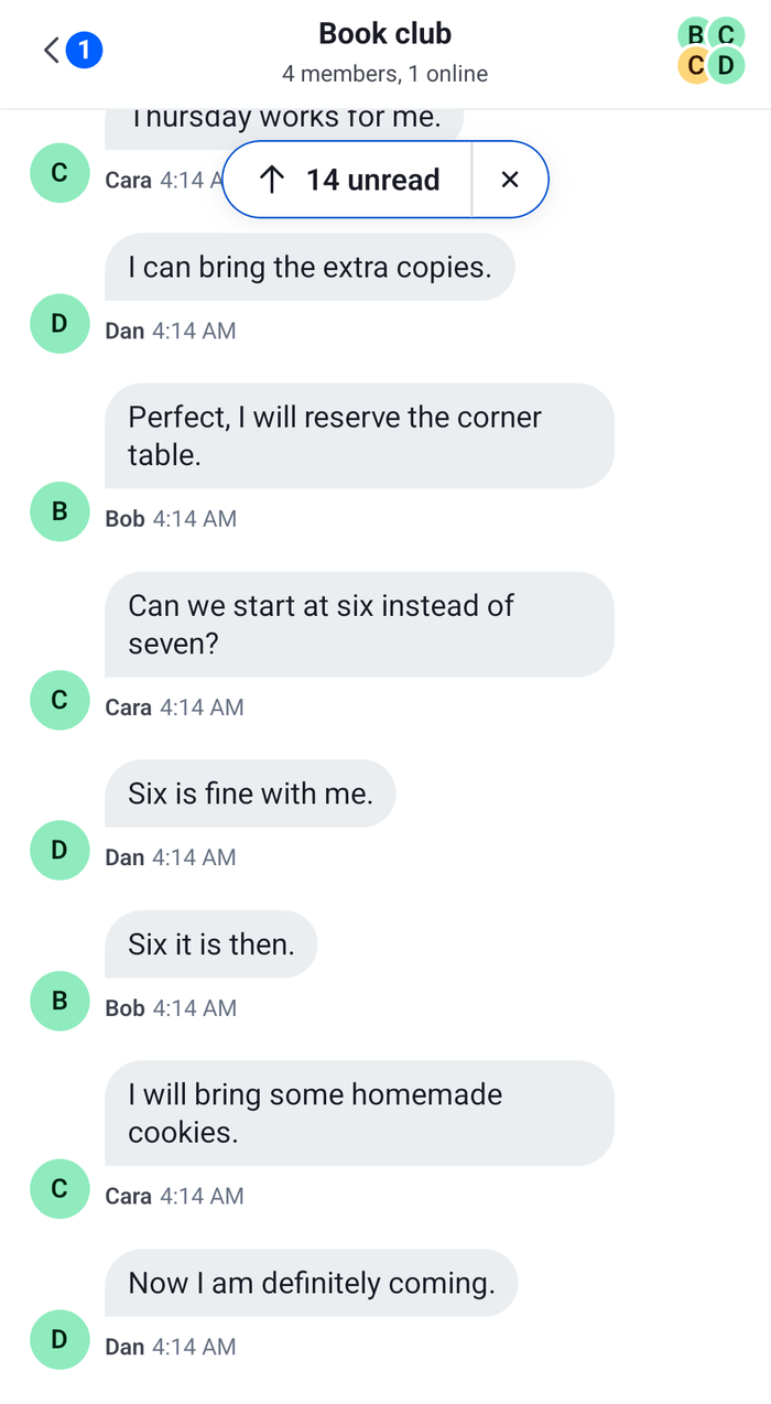 |
- Each style is spread over the default one, so the properties you leave out keep their defaults.
- The label and the icons inside the notification belong to its
Buttons, which take their colors from the theme's semantic tokens, so a filled notification needs a replacement. scrollToBottomButtonContainerpositions the scroll-to-bottom button over the list, for example{ right: 24 }. The look of the button comes from theButtonit renders, so changing it also needs a replacement.
Replacing the controls
This separator is a line across the list with "14 new messages" and a Mark as read link. The notification is an accent pill that reads "14 new messages" and jumps on a press. The scroll-to-bottom button is an accent pill that reads "Latest", or "2 new" while messages wait:
import type { PropsWithChildren } from "react";
import { Pressable, StyleSheet, Text, View } from "react-native";
import type { UnreadSnapshotState } from "stream-chat";
import {
  Button,
  DEFAULT_HIGHLIGHT_DURATION,
  useChannel,
  useComponentsContext,
  useMarkRead,
  useOwnUnreadCount,
  useStateStore,
  useTheme,
  useThreadContext,
  WithComponents,
} from "stream-chat-react-native";
import type {
  InlineUnreadIndicatorProps,
  ScrollToBottomButtonProps,
} from "stream-chat-react-native";

const newMessagesLabel = (count?: number) =>
  count ? `${count} new message${count === 1 ? "" : "s"}` : "New messages";

const UnreadSeparator = ({ unreadCount }: InlineUnreadIndicatorProps) => {
  const channel = useChannel();
  const markRead = useMarkRead(channel);
  const {
    theme: { semantics },
  } = useTheme();

  return (
    <View style={styles.separator}>
      <View
        style={[styles.line, { backgroundColor: semantics.accentPrimary }]}
      />
      <Text style={[styles.label, { color: semantics.accentPrimary }]}>
        {newMessagesLabel(unreadCount)}
      </Text>
      <Pressable
        accessibilityRole="button"
        hitSlop={8}
        onPress={() => markRead()}
      >
        <Text style={[styles.action, { color: semantics.textLink }]}>
          Mark as read
        </Text>
      </Pressable>
      <View
        style={[styles.line, { backgroundColor: semantics.accentPrimary }]}
      />
    </View>
  );
};

const unreadCountSelector = ({ unreadCount }: UnreadSnapshotState) => ({
  unreadCount,
});

const JumpToUnreadBanner = ({
  onCloseHandler,
}: {
  onCloseHandler?: () => void;
}) => {
  const channel = useChannel();
  const { icons } = useComponentsContext();
  const {
    theme: { semantics },
  } = useTheme();
  const { unreadCount } = useStateStore(
    channel.messagePaginator.unreadStateSnapshot,
    unreadCountSelector,
  );

  const jumpToFirstUnread = () => {
    channel.messagePaginator
      .jumpToTheFirstUnreadMessage({
        focusSignalTtlMs: DEFAULT_HIGHLIGHT_DURATION,
      })
      .catch((error: unknown) => console.warn("Jumping failed", error));
  };

  return (
    <View style={[styles.banner, { backgroundColor: semantics.accentPrimary }]}>
      <Pressable
        accessibilityRole="button"
        onPress={jumpToFirstUnread}
        style={styles.bannerJump}
      >
        <icons.ArrowUp height={16} stroke={semantics.textOnAccent} width={16} />
        <Text style={[styles.bannerText, { color: semantics.textOnAccent }]}>
          {newMessagesLabel(unreadCount)}
        </Text>
      </Pressable>
      <Pressable
        accessibilityLabel="Mark as read"
        accessibilityRole="button"
        hitSlop={8}
        onPress={onCloseHandler}
        style={styles.bannerDismiss}
      >
        <icons.NewClose
          height={16}
          stroke={semantics.textOnAccent}
          width={16}
        />
      </Pressable>
    </View>
  );
};

const ScrollToLatest = ({
  onPress,
  showNotification = true,
}: ScrollToBottomButtonProps) => {
  const channel = useChannel();
  const { thread } = useThreadContext();
  const { icons } = useComponentsContext();
  const unreadCount = useOwnUnreadCount(thread ? undefined : channel);

  if (!showNotification) {
    return null;
  }

  return (
    <Button
      LeadingIcon={icons.Down}
      label={unreadCount ? `${unreadCount} new` : "Latest"}
      onPress={onPress}
      size="md"
      type="solid"
      variant="primary"
    />
  );
};

// Declared once, so WithComponents gets the same object on every render.
const overrides = {
  InlineUnreadIndicator: UnreadSeparator,
  ScrollToBottomButton: ScrollToLatest,
  UnreadMessagesNotification: JumpToUnreadBanner,
};

export const WithUnreadControls = ({ children }: PropsWithChildren) => (
  <WithComponents overrides={overrides}>{children}</WithComponents>
);

const styles = StyleSheet.create({
  action: { fontSize: 12 },
  banner: {
    alignItems: "center",
    borderRadius: 999,
    flexDirection: "row",
    overflow: "hidden",
  },
  bannerDismiss: { paddingHorizontal: 12, paddingVertical: 8 },
  bannerJump: {
    alignItems: "center",
    flexDirection: "row",
    gap: 6,
    paddingStart: 14,
    paddingVertical: 8,
  },
  bannerText: { fontSize: 13, fontWeight: "600" },
  label: { fontSize: 12, fontWeight: "600" },
  line: { flex: 1, height: StyleSheet.hairlineWidth },
  separator: {
    alignItems: "center",
    flexDirection: "row",
    gap: 8,
    paddingHorizontal: 16,
  },
}); |  |
 |  |
Pass WithUnreadControls around the Channel screen and the Thread screen, or around the whole app, as Overriding components explains:
import type { Channel as StreamChannel } from "stream-chat";
import {
  Channel,
  MessageComposer,
  MessageList,
} from "stream-chat-react-native";
import { WithUnreadControls } from "./UnreadControls";

export const UnreadChannel = ({ channel }: { channel: StreamChannel }) => (
  <WithUnreadControls>
    <Channel channel={channel}>
      <MessageList />
      <MessageComposer />
    </Channel>
  </WithUnreadControls>
);
shouldShowUnreadUnderlay={false} on Channel turns the separator off. The notification and the separator never render in a thread, so only the button replacement applies there.
How it works
Example
The user last read "Running club" at their own "Thanks! See you all on Sunday." Since then the others posted 14 messages. The user opens the channel:
- The paginator loads the latest page and takes the unread snapshot,
channel.messagePaginator.unreadStateSnapshot, from the user's entry inchannel.state.read: 14 unread, last read "Thanks! See you all on Sunday." Channelmarks the channel read, so the user'sunread_messagesinchannel.state.readdrops to 0. Marking read on mount doesn't change the snapshot.- The list renders
InlineUnreadIndicatorafter the last read message, withunreadCount14 from the snapshot. That message is above the screen, so the list also rendersUnreadMessagesNotification. - The user presses the notification.
MessagePaginator.jumpToTheFirstUnreadMessage()goes to the first message after the last read one, loading it first if needed, and the list scrolls it into view. The last read message is on screen, so the notification goes. - The list isn't at the latest message, so
ScrollToBottomButtonshows. Two messages arrive. The user isn't looking at the latest messages, so they count as unread:unread_messagesgoes to 2, and the button reads "2 new". - The user presses Mark as read on the separator.
useMarkRead()reports the read throughclient.messageDeliveryReporterand resets the snapshot, so the separator goes.
The button's count is the user's unread_messages in channel.state.read, so it also counts unread messages the list hasn't marked read, for example after Mark as Unread. The notification's close button calls the onCloseHandler the list passes, which marks the channel read and hides the notification. Pressing the button scrolls down, or jumps to the latest messages when they aren't loaded, and marks the channel read without resetting the snapshot, so the separator stays where it was. Read state, unread and receipts lists the rules for each.
The default UnreadMessagesNotification and its props type aren't exported, so a replacement can't wrap the default. It receives markRead and onCloseHandler from the list. A channel without read events doesn't show the notification, unless it counts unread messages on the device with localUnreadCountEnabled.
Read more
- Read state, unread and receipts: what the user sees and when the lists mark a channel read.
- Read state and unread counts:
channel.state.readand every way to mark read and unread. - Message paginator: the unread snapshot and
MessagePaginator.jumpToTheFirstUnreadMessage(). - Message list UI: the separators and the floating controls.
- Scroll to bottom button: the props and the hooks of the button.
- Theme object: the
messageListkeys.