


GIF picker
The SDK has no GIF picker, but it renders a giphy attachment, the kind the /giphy command produces, and the composer sends one that the app adds. This UI cookbook builds a picker on top of that: a GIF button in the attachment picker's bar opens a sheet with search, trending GIFs and a scrolling grid, the picked GIF shows above the input, and the sent message renders like one sent with /giphy. The attachment and its rendering are explained in Commands and Giphy, and the attachment picker in Message composer UI.
What you'll build
- A Giphy search source with trending and search results
- A GIF sheet with a search field and a grid
- A GIF button in the attachment picker's bar
- A GIF card above the input
Approach: Replace one part and Compose. Choosing where to start explains the approaches.
Best practices
- Put the picker in a sheet of its own, not in the attachment picker's content. The attachment picker closes when the keyboard opens, so a search field inside it would close it as the user taps the field.
- Add the button to the attachment picker's bar through the
AttachmentPickerSelectionBarkey, so it sits with the other attachment types. - Search with a search source.
BaseSearchSourcealready debounces the text, cancels a request that a newer one replaces, and pages by offset, so the sheet only renders its state. - Send the GIF by URL as a
giphyattachment withgiphy,thumb_urlandtitle. Nothing is uploaded, and the message list renders it with itsGiphycomponent. - Let a GIF replace what the composer holds. A message renders a
giphyattachment only while it has no image, video or file, so a GIF next to a photo isn't shown. - Keep the API key out of the code. Read it from your app's configuration, and in production proxy the requests through your own server. Giphy also asks apps to show its attribution next to results, so the sheet shows "Powered by GIPHY".
A GIF search source
A GIF is an id, a title and its renditions. attachment.giphy holds seven renditions, typed as Images in stream-chat, and the message list reads the one that the giphyVersion prop of Channel names, fixed_height by default. toImages() turns whatever the source returns into that shape, and toGiphyAttachment() makes the attachment the composer adds:
import type {
  GiphyVersions,
  ImageData,
  Images,
  LocalAttachment,
} from "stream-chat";

/** One GIF the picker offers: its id, a title for screen readers, and its renditions. */
export type Gif = {
  id: string;
  images: Images;
  title: string;
};

/**
 * The renditions in the shape `attachment.giphy` takes: the seven versions the SDK knows, with
 * every field a string. A missing field becomes an empty string.
 */
export const toImages = (
  versions: Partial<Record<GiphyVersions, Partial<ImageData>>>,
): Images => {
  const imageData = (version: GiphyVersions): ImageData => {
    const {
      frames = "",
      height = "",
      size = "",
      url = "",
      width = "",
    } = versions[version] ?? {};
    return { frames, height, size, url, width };
  };
  return {
    fixed_height: imageData("fixed_height"),
    fixed_height_downsampled: imageData("fixed_height_downsampled"),
    fixed_height_still: imageData("fixed_height_still"),
    fixed_width: imageData("fixed_width"),
    fixed_width_downsampled: imageData("fixed_width_downsampled"),
    fixed_width_still: imageData("fixed_width_still"),
    original: imageData("original"),
  };
};

/**
 * The attachment the composer adds for a GIF. It has no file and no upload state, so the composer
 * sends it as it is. `thumb_url` is the image the composer shows; `giphy` holds the renditions the
 * message list draws.
 */
export const toGiphyAttachment = (gif: Gif): LocalAttachment => ({
  custom: {},
  giphy: gif.images,
  localMetadata: { id: `gif-${gif.id}` },
  thumb_url: gif.images.fixed_height.url,
  title: gif.title,
  type: "giphy",
});
fetchGiphyPage() asks Giphy's API for one page: its search for a search text, its trending GIFs for an empty one. The signal lets the source cancel the request:
import type { GiphyVersions, ImageData } from "stream-chat";
import type { Gif } from "./gif";
import { toImages } from "./gif";

/** The part of a Giphy API GIF object the picker reads. */
type GiphyGif = {
  id: string;
  images: Partial<Record<GiphyVersions, Partial<ImageData>>>;
  title: string;
};

export type GifPage = { limit: number; offset: number };

/**
 * One page of Giphy's search results, or of its trending GIFs when `searchQuery` is empty.
 * `signal` cancels the request when a newer query starts.
 */
export const fetchGiphyPage = async ({
  apiKey,
  page,
  searchQuery,
  signal,
}: {
  apiKey: string;
  page: GifPage;
  searchQuery: string;
  signal?: AbortSignal;
}): Promise<Gif[]> => {
  const params = new URLSearchParams({
    api_key: apiKey,
    limit: String(page.limit),
    offset: String(page.offset),
    rating: "g",
  });
  if (searchQuery) params.set("q", searchQuery);
  const endpoint = searchQuery ? "search" : "trending";

  const response = await fetch(
    `https://api.giphy.com/v1/gifs/${endpoint}?${params.toString()}`,
    { signal },
  );
  if (!response.ok) throw new Error(`Giphy answered ${response.status}`);
  const { data } = (await response.json()) as { data: GiphyGif[] };

  return data.map(({ id, images, title }) => ({
    id,
    images: toImages(images),
    title,
  }));
};
GifSearchSource extends BaseSearchSource. Its query() returns one page as { items }, so the source pages by offset: it moves offset forward by the number of items, and hasNext stays true while a page comes back full. allowEmptySearchString makes an empty search text a query too, the one for trending GIFs:
import { BaseSearchSource } from "stream-chat";
import type { SearchQueryOptions, SearchSourceOptions } from "stream-chat";
import type { Gif } from "./gif";
import { fetchGiphyPage } from "./giphy";

/** Searches GIFs: Giphy's search, or its trending GIFs while the search text is empty. */
export class GifSearchSource extends BaseSearchSource<Gif> {
  readonly type = "gifs";
  private readonly apiKey: string;

  constructor({
    apiKey,
    ...options
  }: SearchSourceOptions & { apiKey: string }) {
    // An empty search text is a query too: it loads the trending GIFs.
    super({
      allowEmptySearchString: true,
      debounceMs: 300,
      pageSize: 24,
      ...options,
    });
    this.apiKey = apiKey;
  }

  protected async query(
    searchQuery: string,
    { signal }: SearchQueryOptions = {},
  ) {
    const page = { limit: this.pageSize, offset: this.offset ?? 0 };
    const items = await fetchGiphyPage({
      apiKey: this.apiKey,
      page,
      searchQuery,
      signal,
    });
    return { items };
  }

  protected filterQueryResults(items: Gif[]) {
    return items;
  }
}
Search sources explains the contract the source implements.
The GIF sheet
The sheet holds a search field and a grid. It starts a GifSearchSource when it opens, loads the trending GIFs at once with executeQuery(""), runs a search as the user types with search(text), and loads the next page with search() when the grid reaches its end. Each tile calls onPick with its GIF:
import { useEffect, useState } from "react";
import {
  FlatList,
  Image,
  Modal,
  Platform,
  Pressable,
  StyleSheet,
  Text,
  TextInput,
  View,
} from "react-native";
import { useSafeAreaInsets } from "react-native-safe-area-context";
import type { SearchSourceState } from "stream-chat";
import { useStateStore, useTheme } from "stream-chat-react-native";
import type { Gif } from "./gif";
import { GifSearchSource } from "./GifSearchSource";

const GIPHY_API_KEY = "YOUR_GIPHY_API_KEY";

const gifsSelector = ({ items, lastQueryError }: SearchSourceState<Gif>) => ({
  items,
  lastQueryError,
});

const GifSheetContent = ({
  onClose,
  onPick,
}: {
  onClose: () => void;
  onPick: (gif: Gif) => void;
}) => {
  const {
    theme: { semantics },
  } = useTheme();
  // On Android the modal draws under the system bars.
  const insets = useSafeAreaInsets();
  const [source] = useState(
    () => new GifSearchSource({ apiKey: GIPHY_API_KEY }),
  );
  const { items, lastQueryError } = useStateStore(source.state, gifsSelector);

  useEffect(() => {
    source.activate();
    // The trending GIFs, without the debounce of a typed search.
    void source.executeQuery("");
    return () => {
      source.cancelScheduledQuery();
      source.deactivate();
    };
  }, [source]);

  return (
    <View
      style={[
        styles.sheet,
        Platform.OS === "android" && {
          paddingBottom: insets.bottom,
          paddingTop: insets.top,
        },
        { backgroundColor: semantics.backgroundCoreElevation1 },
      ]}
    >
      <View style={styles.header}>
        <TextInput
          accessibilityLabel="Search GIFs"
          autoCapitalize="none"
          onChangeText={(text) => void source.search(text)}
          placeholder="Search GIFs"
          placeholderTextColor={semantics.textTertiary}
          returnKeyType="search"
          style={[
            styles.input,
            {
              backgroundColor: semantics.backgroundCoreSurfaceCard,
              color: semantics.textPrimary,
            },
          ]}
        />
        <Pressable accessibilityRole="button" onPress={onClose}>
          <Text style={{ color: semantics.accentPrimary }}>Close</Text>
        </Pressable>
      </View>
      <FlatList
        columnWrapperStyle={styles.row}
        contentContainerStyle={styles.grid}
        data={items ?? []}
        keyboardShouldPersistTaps="handled"
        keyExtractor={(gif) => gif.id}
        ListEmptyComponent={
          lastQueryError ? (
            <Text style={{ color: semantics.accentError }}>
              The GIFs couldn't be loaded.
            </Text>
          ) : null
        }
        numColumns={2}
        onEndReached={() => void source.search()}
        renderItem={({ item }) => {
          const { height, url, width } = item.images.fixed_width_downsampled;
          return (
            <Pressable
              accessibilityLabel={item.title || "GIF"}
              accessibilityRole="button"
              onPress={() => onPick(item)}
              style={styles.tile}
            >
              <Image
                source={{ uri: url }}
                style={{ aspectRatio: Number(width) / Number(height) || 1 }}
              />
            </Pressable>
          );
        }}
      />
      <Text style={[styles.attribution, { color: semantics.textTertiary }]}>
        Powered by GIPHY
      </Text>
    </View>
  );
};

export const GifSheet = ({
  onClose,
  onPick,
  visible,
}: {
  onClose: () => void;
  onPick: (gif: Gif) => void;
  visible: boolean;
}) => (
  <Modal
    animationType="slide"
    onRequestClose={onClose}
    presentationStyle="pageSheet"
    visible={visible}
  >
    {/* Mounted while the sheet is open, so every opening starts a new search. */}
    {visible ? <GifSheetContent onClose={onClose} onPick={onPick} /> : null}
  </Modal>
);

const styles = StyleSheet.create({
  attribution: { fontSize: 12, padding: 8, textAlign: "center" },
  grid: { gap: 8, padding: 8 },
  header: { alignItems: "center", flexDirection: "row", gap: 12, padding: 12 },
  input: {
    borderRadius: 12,
    flex: 1,
    paddingHorizontal: 12,
    paddingVertical: 10,
  },
  row: { gap: 8 },
  sheet: { flex: 1 },
  tile: { flex: 1, overflow: "hidden", borderRadius: 8 },
});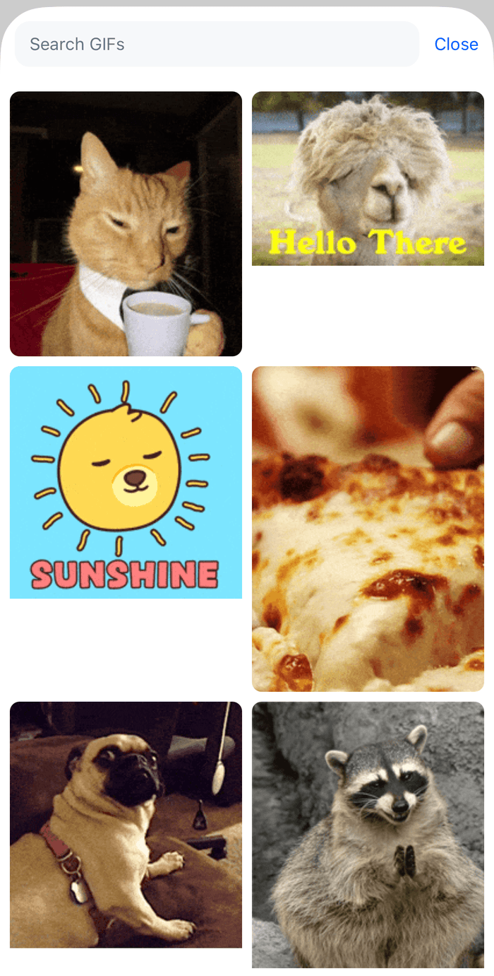 | 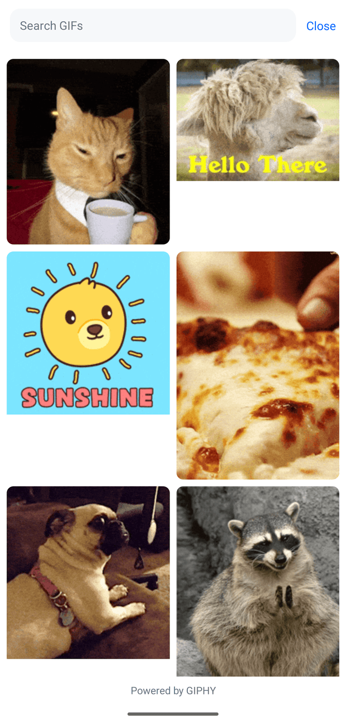 |
The grid shows the fixed_width_downsampled rendition, which Giphy keeps small, and aspectRatio gives each tile the GIF's own proportions. useStateStore() reads the source's state with a selector declared at module scope. Closing the sheet unmounts its content, which cancels a search that hasn't started, and a new opening starts from the trending GIFs.
Add the GIF to the composer
A message renders a giphy attachment only while it has no image, video or file. So picking a GIF removes what the composer holds, and adds the GIF in its place, with AttachmentManager.upsertAttachments(). The attachment has no file, so the composer sends it without an upload:
import type { MessageComposer } from "stream-chat";
import type { Gif } from "./gif";
import { toGiphyAttachment } from "./gif";

/** Puts the GIF into the composer as its only attachment. */
export const addGifToComposer = (composer: MessageComposer, gif: Gif) => {
  const { attachmentManager } = composer;

  attachmentManager.removeAttachments(
    attachmentManager.attachments.map(({ localMetadata }) => localMetadata.id),
  );
  attachmentManager.upsertAttachments([toGiphyAttachment(gif)]);
};
AttachmentManager.removeAttachments() cancels an upload that is still running. The attachment's local id comes from the GIF's id, so picking the same GIF twice doesn't add it twice. The composer counts the attachment as content, so the send button is on without any text.
The GIF button
The button lives in the attachment picker's bar. It closes the attachment picker and opens the sheet, which a provider above the channel and the thread renders once. The button hands the provider a function that adds the picked GIF to the composer the button was pressed in, a channel's or a thread's:
import { createContext, useContext, useMemo, useState } from "react";
import type { PropsWithChildren } from "react";
import { StyleSheet, Text, View } from "react-native";
import {
  AttachmentTypePickerButton,
  CameraPickerButton,
  CommandsPickerButton,
  FilePickerButton,
  MediaPickerButton,
  PollPickerButton,
  useMessageComposer,
  useMessageInputContext,
  useTheme,
} from "stream-chat-react-native";
import type { IconProps } from "stream-chat-react-native";
import { addGifToComposer } from "./addGifToComposer";
import type { Gif } from "./gif";
import { GifSheet } from "./GifSheet";

type OnPick = (gif: Gif) => void;

const GifPickerContext = createContext<{
  openGifPicker: (onPick: OnPick) => void;
}>({ openGifPicker: () => undefined });

/** Renders the GIF sheet once, above the channel and the thread. */
export const GifPickerProvider = ({ children }: PropsWithChildren) => {
  // The function is wrapped, because a function given to `setState` is called.
  const [target, setTarget] = useState<{ onPick: OnPick }>();
  const value = useMemo(
    () => ({ openGifPicker: (onPick: OnPick) => setTarget({ onPick }) }),
    [],
  );

  return (
    <GifPickerContext.Provider value={value}>
      {children}
      <GifSheet
        onClose={() => setTarget(undefined)}
        onPick={(gif) => {
          target?.onPick(gif);
          setTarget(undefined);
        }}
        visible={!!target}
      />
    </GifPickerContext.Provider>
  );
};

// The button passes the color of its icons as `stroke`.
const GifIcon = ({ stroke }: IconProps) => (
  <View style={[styles.gifIcon, { borderColor: stroke }]}>
    <Text style={[styles.gifText, { color: stroke }]}>GIF</Text>
  </View>
);

const GifPickerButton = () => {
  const { closeAttachmentPicker } = useMessageInputContext();
  const messageComposer = useMessageComposer();
  const { openGifPicker } = useContext(GifPickerContext);

  return (
    <AttachmentTypePickerButton
      Icon={GifIcon}
      onPress={() => {
        closeAttachmentPicker();
        openGifPicker((gif) => addGifToComposer(messageComposer, gif));
      }}
    />
  );
};

export const SelectionBarWithGif = () => {
  const {
    theme: { semantics },
  } = useTheme();

  return (
    <View
      style={[
        styles.bar,
        { backgroundColor: semantics.backgroundCoreElevation1 },
      ]}
    >
      <MediaPickerButton />
      <CameraPickerButton />
      <FilePickerButton />
      <PollPickerButton />
      <CommandsPickerButton />
      <GifPickerButton />
    </View>
  );
};

const styles = StyleSheet.create({
  bar: {
    alignItems: "center",
    flexDirection: "row",
    paddingBottom: 8,
    paddingHorizontal: 16,
  },
  gifIcon: {
    alignItems: "center",
    borderRadius: 4,
    borderWidth: 1.5,
    height: 16,
    justifyContent: "center",
    width: 22,
  },
  gifText: { fontSize: 9, fontWeight: "700" },
});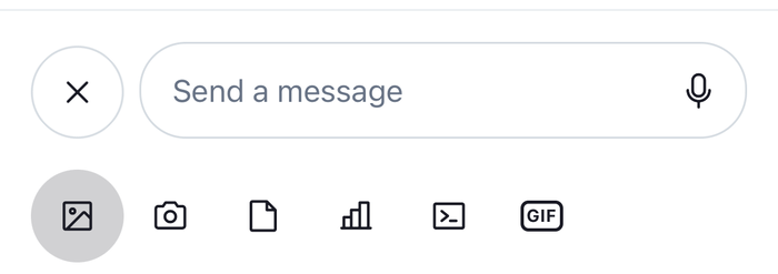 | 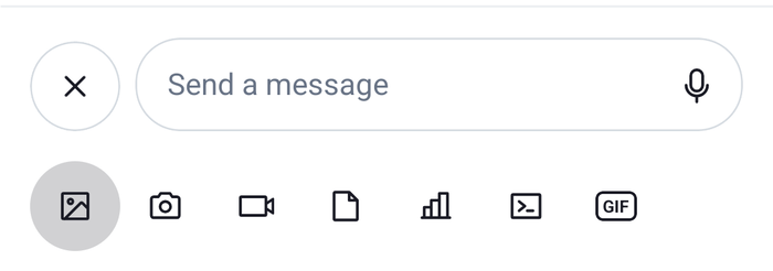 |
The button draws a small GIF label in the color it passes as stroke, so it follows the theme. The SDK's GiphyIcon is Giphy's colored logo, which reads as a dark disc at the 20 points the bar draws icons at.
The bar lists the default buttons, and the GIF button comes last. Each default button shows itself only when it applies, such as the commands button in a channel type that has commands, so the bar behaves as the default one does. With disableAttachmentPicker on Channel, the sheet shows the bar only, the default buttons open the system pickers directly, and the GIF button still opens the GIF sheet. With shouldRenderAttachmentPicker set to false, the bar isn't rendered, so the button has no place to show.
The GIF above the input
The attachment preview list has no preview for a giphy attachment, so the composer shows nothing for it. MessageInputHeaderView renders the previews above the input, and a replacement of it can render the GIF next to them. This one renders the default header, and a card with the GIF and a button that takes it out:
import { Image, Pressable, StyleSheet, Text, View } from "react-native";
import type { AttachmentManagerState } from "stream-chat";
import {
  MessageInputHeaderView,
  useComponentsContext,
  useMessageComposer,
  useStateStore,
  useTheme,
} from "stream-chat-react-native";

const gifSelector = ({ attachments }: AttachmentManagerState) => ({
  gif: attachments.find(({ type }) => type === "giphy"),
});

const GifPreview = () => {
  const { attachmentManager } = useMessageComposer();
  const { gif } = useStateStore(attachmentManager.state, gifSelector);
  const { icons } = useComponentsContext();
  const {
    theme: { semantics },
  } = useTheme();

  if (!gif?.thumb_url) return null;

  return (
    <View
      style={[
        styles.card,
        {
          backgroundColor: semantics.backgroundCoreSurfaceCard,
          borderColor: semantics.borderCoreDefault,
        },
      ]}
    >
      <Image
        accessibilityLabel={gif.title ?? "The picked GIF"}
        resizeMode="contain"
        source={{ uri: gif.thumb_url }}
        style={styles.image}
      />
      <Text style={[styles.title, { color: semantics.textSecondary }]}>
        {gif.title}
      </Text>
      <Pressable
        accessibilityLabel="Remove GIF"
        accessibilityRole="button"
        hitSlop={8}
        onPress={() =>
          attachmentManager.removeAttachments([gif.localMetadata.id])
        }
      >
        <icons.Cross height={20} stroke={semantics.textSecondary} width={20} />
      </Pressable>
    </View>
  );
};

/** The composer's header, with the picked GIF under the other previews. */
export const MessageInputHeaderWithGif = () => (
  <>
    <MessageInputHeaderView />
    <GifPreview />
  </>
);

const styles = StyleSheet.create({
  card: {
    alignItems: "center",
    borderRadius: 12,
    borderWidth: 1,
    flexDirection: "row",
    gap: 8,
    marginHorizontal: 8,
    marginTop: 4,
    padding: 8,
  },
  image: { borderRadius: 8, height: 72, width: 96 },
  title: { flex: 1 },
});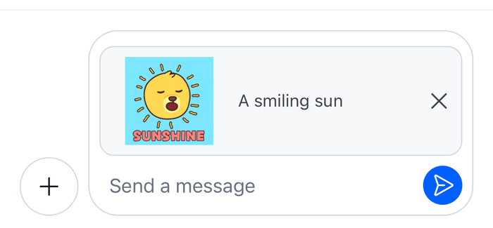 | 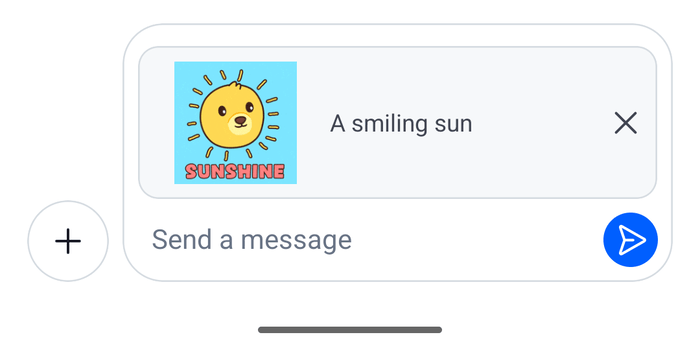 |
The attachment's thumb_url is an animated GIF, so the card plays it.
Register it
Render GifPickerProvider around the screens that use the picker, and pass the two overrides to WithComponents, declared once at module scope. A Thread on its own screen needs the same overrides, and the provider can sit above the navigator, so both screens share one sheet:
import type { Channel as StreamChannel } from "stream-chat";
import {
  Channel,
  MessageComposer,
  MessageList,
  WithComponents,
} from "stream-chat-react-native";
import type { ComponentOverrides } from "stream-chat-react-native";
import { GifPickerProvider, SelectionBarWithGif } from "./GifPicker";
import { MessageInputHeaderWithGif } from "./GifPreview";

const overrides: ComponentOverrides = {
  AttachmentPickerSelectionBar: SelectionBarWithGif,
  MessageInputHeaderView: MessageInputHeaderWithGif,
};

export const GifChannelScreen = ({ channel }: { channel: StreamChannel }) => (
  <GifPickerProvider>
    <WithComponents overrides={overrides}>
      <Channel channel={channel}>
        <MessageList />
        <MessageComposer />
      </Channel>
    </WithComponents>
  </GifPickerProvider>
);Example
The user wants to send a GIF of mountains:
- They open the attachment picker and tap the GIF button. The picker closes, and the sheet slides up with Giphy's trending GIFs.
- They type "mountain". After the debounce,
GifSearchSourcequeries Giphy's search, and the grid shows the results. They scroll down, andsearch()loads the next page. - They tap a GIF.
addGifToComposer()empties the composer's attachments and adds agiphyattachment, and the sheet closes. The card above the input shows the GIF, and the send button is on. - They send. The composer sends the attachment as it is, with no upload. The message renders the attachment with the
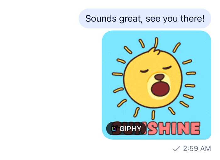
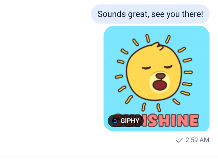
Giphycomponent, with the Giphy badge, as it renders a GIF sent with/giphy.
The GIF in the message
The message list shows the GIF through the Giphy component, at the rendition giphyVersion names on Channel and Thread, fixed_height by default. A tap and a long press on the GIF go through the message's handlers, so the message menu opens as for any message.
 |  |
The default menu has no Edit Message action on a message that carries a giphy attachment, so a message with a GIF can't be edited. The text the user types with the GIF goes into the same message, and renders under it.
Read more
- Commands and Giphy: the
/giphycommand and the Giphy preview. - Location sharing: another button in the attachment picker's bar.
- Attachment previews: the previews above the input.
- Search sources: the contract of
BaseSearchSource. - Attachments and uploads: how the composer sends attachments.