


Replacing the icon set
This UI cookbook replaces the icons the SDK draws with their counterparts from Lucide, an open-source icon set that draws with react-native-svg, as the SDK's own icons do. How icons are overridden one by one is explained in Icons. The Lucide icons take the colors and sizes the SDK passes, flip in right-to-left layouts where the SDK's own do, and stand in for the file-type icons on file attachments.
What you'll build
- Lucide icons in place of the SDK's icons
- Directional icons that flip in right-to-left layouts
- File-type icons with a color of their own
Approach: Restyle and Replace one part. Choosing where to start explains the approaches.
Best practices
- Replace all the icons at once. A screen that mixes two sets looks broken, so map every key the SDK has that your set can draw, not only the ones you see first.
- Keep the map in one file and type it so that a missing key is a compile error, including a key a later SDK version adds.
- Read the color from
stroke,fillorpathFill, whichever the SDK passes. The SDK picks one for each place an icon renders, so an icon that reads onlystrokeignores the color of some of them. - Flip the icons that point somewhere in right-to-left layouts, and only those. A checkmark or a bell stays as it is.
- Keep icons light. One may render once per message row.
- Check the screens a quick look misses: the attachment picker, a failed upload, a voice recording, a poll, the thread list and channel details.
Map the SDK's icons to your set
The icons key of WithComponents holds 92 icons, each under the name of the SDK's icon component, such as SendRight, ThreadReply and Mute. ComponentOverrides["icons"] lists them. This file keeps one row for each: the Lucide icon to draw, and two options, filled for the SDK's solid icons whose Lucide shape still reads when filled, and mirrorInRtl for the directional ones.
Six icons have no row. Giphy, GiphyIcon and Imgur are the brands' logos, Exclamation is the bare mark inside the error badge, and ReplyConnectorLeft and ReplyConnectorRight are the curved lines that join a message to its thread replies. Lucide has no counterpart, so the SDK's own stay. The map's type leaves them out and requires every other key:
import { I18nManager, StyleSheet } from "react-native";
import type { ColorValue } from "react-native";
import {
  ArrowDown,
  ArrowUp,
  ArrowUpRight,
  Ban,
  Bell,
  Bookmark,
  Camera,
  Check,
  CheckCheck,
  ChevronLeft,
  ChevronRight,
  ChevronUp,
  CircleAlert,
  CircleHelp,
  CircleMinus,
  CircleX,
  Clock,
  Command,
  Copy,
  CornerUpLeft,
  Ellipsis,
  Eye,
  File,
  FileArchive,
  FileAudio,
  FileCode,
  FileSpreadsheet,
  FileText,
  FileVideo,
  Flag,
  Folder,
  GripVertical,
  Image,
  Info,
  LayoutGrid,
  Link,
  ListChecks,
  LoaderCircle,
  Lock,
  LogOut,
  Mail,
  MapPin,
  Megaphone,
  MessageSquare,
  MessageSquareReply,
  Mic,
  Minus,
  Paperclip,
  Pause,
  Pencil,
  Pin,
  PinOff,
  Play,
  Plus,
  Presentation,
  RefreshCw,
  Reply,
  RotateCw,
  Search,
  Send,
  Share,
  Shield,
  Smile,
  SmilePlus,
  Square,
  Trash2,
  TriangleAlert,
  Unlock,
  UserMinus,
  UserPlus,
  Users,
  Video,
  Volume2,
  VolumeX,
  X,
  Zap,
} from "lucide-react-native";
import type { LucideIcon } from "lucide-react-native";
import { useTheme } from "stream-chat-react-native";
import type { ComponentOverrides, IconProps } from "stream-chat-react-native";

type IconMap = Required<NonNullable<ComponentOverrides["icons"]>>;

// The icons Lucide has no counterpart for. The SDK keeps drawing them.
type KeptIcons =
  | "Exclamation"
  | "Giphy"
  | "GiphyIcon"
  | "Imgur"
  | "ReplyConnectorLeft"
  | "ReplyConnectorRight";

type LucideIconProps = IconProps & {
  // `Loading` is the only icon the SDK colors with these.
  startColor?: ColorValue;
  stopColor?: ColorValue;
};

type FromLucideOptions = {
  // Fills the shape with the icon's color, for the SDK's solid icons.
  filled?: boolean;
  // Flips the icon when the layout is right to left.
  mirrorInRtl?: boolean;
};

const styles = StyleSheet.create({
  mirrored: { transform: [{ scaleX: -1 }] },
});

const fromLucide = (
  Icon: LucideIcon,
  { filled, mirrorInRtl }: FromLucideOptions = {},
) => {
  const LucideBacked = ({
    fill,
    height,
    pathFill,
    size,
    startColor,
    stopColor,
    stroke,
    strokeWidth,
    width,
  }: LucideIconProps) => {
    const {
      theme: { semantics },
    } = useTheme();

    // The SDK passes the color as `stroke`, `fill` or `pathFill`, and `Loading` as
    // `startColor` and `stopColor`.
    const color =
      stroke ??
      pathFill ??
      fill ??
      startColor ??
      stopColor ??
      semantics.textSecondary;

    return (
      <Icon
        color={color}
        fill={filled ? color : "none"}
        height={height ?? size ?? 20}
        strokeWidth={strokeWidth ?? 1.5}
        style={mirrorInRtl && I18nManager.isRTL ? styles.mirrored : undefined}
        width={width ?? size ?? 20}
      />
    );
  };
  return LucideBacked;
};

export const lucideIcons: Omit<IconMap, KeptIcons> = {
  ArrowBoxLeft: fromLucide(LogOut, { mirrorInRtl: true }),
  ArrowShareLeft: fromLucide(Reply, { mirrorInRtl: true }),
  ArrowUp: fromLucide(ArrowUp),
  ArrowUpRight: fromLucide(ArrowUpRight, { mirrorInRtl: true }),
  Audio: fromLucide(FileAudio),
  Bell: fromLucide(Bell),
  BlockUser: fromLucide(Ban),
  Bookmark: fromLucide(Bookmark),
  Camera: fromLucide(Camera),
  Check: fromLucide(Check),
  CheckAll: fromLucide(CheckCheck),
  Checkmark: fromLucide(Check),
  ChevronLeft: fromLucide(ChevronLeft, { mirrorInRtl: true }),
  ChevronRight: fromLucide(ChevronRight, { mirrorInRtl: true }),
  ChevronUp: fromLucide(ChevronUp),
  CircleBan: fromLucide(Ban),
  CircleMinus: fromLucide(CircleMinus),
  Code: fromLucide(FileCode),
  CommandsIcon: fromLucide(Command),
  Copy: fromLucide(Copy),
  Cross: fromLucide(X),
  CurveLineLeftUp: fromLucide(CornerUpLeft, { mirrorInRtl: true }),
  Delete: fromLucide(Trash2),
  DOC: fromLucide(FileText),
  DotGrid: fromLucide(GripVertical),
  Down: fromLucide(ArrowDown),
  Edit: fromLucide(Pencil),
  ExclamationCircle: fromLucide(CircleAlert),
  EyeOpen: fromLucide(Eye),
  File: fromLucide(File),
  FilePickerIcon: fromLucide(Paperclip),
  Flag: fromLucide(Flag),
  Folder: fromLucide(Folder),
  ImageGrid: fromLucide(LayoutGrid),
  InfoTooltip: fromLucide(Info),
  Lightning: fromLucide(Zap, { filled: true }),
  Link: fromLucide(Link),
  Loading: fromLucide(LoaderCircle),
  Lock: fromLucide(Lock),
  MapPin: fromLucide(MapPin),
  Megaphone: fromLucide(Megaphone),
  MenuPointHorizontal: fromLucide(Ellipsis),
  MessageBubbleEmpty: fromLucide(MessageSquare, { mirrorInRtl: true }),
  MessageFlag: fromLucide(Flag),
  Mic: fromLucide(Mic),
  Minus: fromLucide(Minus),
  MoreEmojis: fromLucide(SmilePlus),
  Mute: fromLucide(VolumeX, { mirrorInRtl: true }),
  NewClose: fromLucide(X),
  OtherFileIcon: fromLucide(File),
  Pause: fromLucide(Pause, { filled: true }),
  PDF: fromLucide(FileText),
  PeopleIcon: fromLucide(Users),
  PhotoIcon: fromLucide(Image),
  Picture: fromLucide(Image),
  Pin: fromLucide(Pin),
  Play: fromLucide(Play, { filled: true }),
  Plus: fromLucide(Plus),
  PollIcon: fromLucide(ListChecks),
  PollThumbnail: fromLucide(ListChecks),
  Presentation: fromLucide(Presentation),
  Recorder: fromLucide(Video, { filled: true, mirrorInRtl: true }),
  Reload: fromLucide(RefreshCw),
  Resend: fromLucide(RotateCw),
  Search: fromLucide(Search, { mirrorInRtl: true }),
  SendRight: fromLucide(Send, { mirrorInRtl: true }),
  Share: fromLucide(Share),
  Shield: fromLucide(Shield),
  Smile: fromLucide(Smile),
  Sound: fromLucide(Volume2, { mirrorInRtl: true }),
  SpreadSheet: fromLucide(FileSpreadsheet),
  Stop: fromLucide(Square, { filled: true }),
  ThreadReply: fromLucide(MessageSquareReply, { mirrorInRtl: true }),
  Tick: fromLucide(Check),
  Time: fromLucide(Clock),
  Unknown: fromLucide(CircleHelp),
  Unlock: fromLucide(Unlock),
  Unpin: fromLucide(PinOff),
  UnreadIndicator: fromLucide(Mail),
  UserAdd: fromLucide(UserPlus),
  UserDelete: fromLucide(UserMinus),
  Video: fromLucide(FileVideo),
  VideoIcon: fromLucide(Video, { mirrorInRtl: true }),
  Warning: fromLucide(TriangleAlert),
  XCircle: fromLucide(CircleX),
  ZIP: fromLucide(FileArchive),
};
Each icon the SDK renders reads its size and color from the props the SDK passes, as What an icon receives explains.
fromLucidedraws at thewidthandheightthe SDK passes, or atsize, and at 20 when it passes none. The 20 matches the size the SDK's buttons use.- The color is whichever of
stroke,pathFillandfillis set, so the icon follows the theme and states such as disabled and error.Loadingis colored withstartColorandstopColor, whichSpinnerpasses. With none set, the icon uses thetextSecondarytoken. strokeWidthis the one the SDK passes, and 1.5 otherwise. Lucide draws at 2 by default, and the SDK's icons at 1.5.- Lucide icons are outlines. The SDK passes
fillto its solid icons, such asPlay,Pauseand the video recorder, and those would come out as an outline in the fill color.filled: truefills the shape with the color too, so these three,StopandLightningstay solid. The other icons the SDK colors withfill, such asExclamationCircle, stay outlines in that color: a solid fill would hide the mark drawn inside them. Loadingis a ring, which the SDK'sSpinnerrotates, soLoaderCirclespins as the SDK's own does.
Flip the directional icons
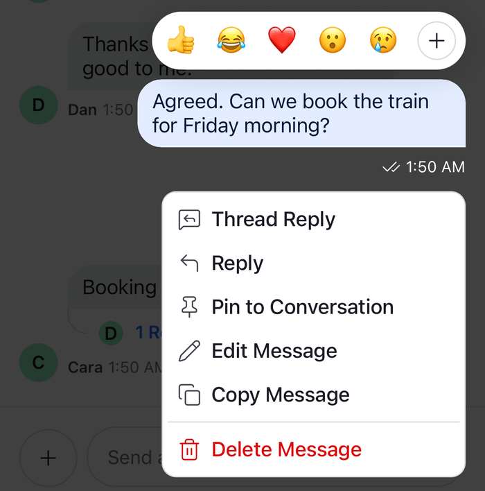
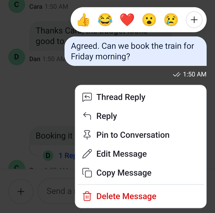
The SDK's icons that point in a direction mirror themselves when I18nManager.isRTL is true. Arrows, chevrons, reply, send, thread, search, the message bubble and the speaker icons do. A checkmark, a bell and a face don't, since mirroring them would look wrong. mirrorInRtl does the same for the Lucide icons: it flips the icon with a scaleX of -1 when the layout is right to left. The rows that set it are the ones the SDK mirrors: ArrowBoxLeft, ArrowShareLeft, ArrowUpRight, ChevronLeft, ChevronRight, CurveLineLeftUp, MessageBubbleEmpty, Mute, Recorder, Search, SendRight, Sound, ThreadReply and VideoIcon.
A new icon you add to the map needs the same question: does it point somewhere? If it does, set mirrorInRtl. Theming covers the layout direction.
File-type icons
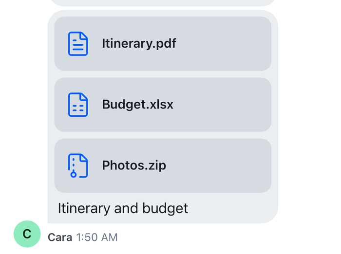
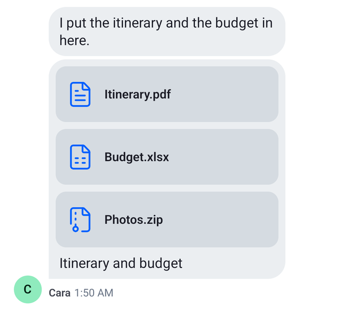
The icon beside a file attachment is FileAttachmentIcon, a key of its own. By default it reads the file type from the attachment's MIME type, then draws the icon under PDF, DOC, SpreadSheet, Presentation, ZIP, Audio, Video, Code or OtherFileIcon. Those nine are in the map above, so the Lucide file icons already show on file attachments, in the file preview in the composer and in the file list of channel details. FileAttachmentIcon gives each a width and height that follow the page's proportions: 19 by 24 for sm, 32 by 40 for md and 40 by 48 for lg. Lucide's file icons are square, so they scale to fit the smaller side and are centered in the box.
The icons in the map take their color from the theme's messageItemView.file.icon, which FileAttachmentIcon spreads onto the icon, and from textSecondary when it sets none. To give file icons the accent color, set it in the theme:
import type { DeepPartial, Theme } from "stream-chat-react-native";

// Pass the same object to OverlayProvider (value.style) and Chat (style).
export const theme: DeepPartial<Theme> = {
  messageItemView: {
    file: { icon: { stroke: "#005FFF" } },
  },
}; |  |
Register the set
Wrap the app in WithComponents with the map, around OverlayProvider. The image gallery renders its icons from inside OverlayProvider, so a provider below it doesn't reach them:
import type { PropsWithChildren } from "react";
import type { StreamChat } from "stream-chat";
import {
  Chat,
  OverlayProvider,
  WithComponents,
} from "stream-chat-react-native";
import type { ComponentOverrides } from "stream-chat-react-native";
import { lucideIcons } from "./lucideIcons";

// Declared once: WithComponents reads its overrides when it mounts.
const overrides: ComponentOverrides = { icons: lucideIcons };

export const ChatWithLucideIcons = ({
  children,
  client,
}: PropsWithChildren<{ client: StreamChat }>) => (
  <WithComponents overrides={overrides}>
    <OverlayProvider>
      <Chat client={client}>{children}</Chat>
    </OverlayProvider>
  </WithComponents>
); |  |
A WithComponents deeper in the tree can still swap one icon for one screen, because icons merges icon by icon.
Example
What happens when the current user sends a message in a right-to-left layout:
- The composer's send button reads
SendRightfromicons, which isfromLucide(Send, { mirrorInRtl: true }), and renders it with awidthandheightof 20 and astrokecolor. - The icon takes its color from
strokeand draws Lucide'sSendat that size, with a stroke width of 1.5. I18nManager.isRTListrue, somirrorInRtlapplies ascaleXof -1 and the arrow points left, toward the end of the line.- When the send button is disabled, the button passes the disabled color, and the icon follows it.
What the icon set doesn't cover
These parts look like icons but don't come from the map:
- The logos of Giphy and Imgur, the error badge's mark and the connectors between a message and its thread replies stay the SDK's own, as above.
- Reactions are emoji. Set them with
supportedReactions; the Custom reactions UI cookbook builds a set of your own. - The upload progress ring is drawn by its component and colored by theme tokens.
- The AI components, published as
stream-chat-react-native/ai-components, draw their own icons.
Read more
- Icons explains the
iconskey, what an icon receives and where to putWithComponents. - Theming explains the tokens the default icons take their colors from.
- Custom reactions changes the reaction set, which the icon map doesn't cover.