


Commands UI
This UI cookbook builds a command UI for the composer. When the user picks a command, such as /giphy, a bar above the input shows the command, what it does and the arguments it takes, with a button that cancels it. Sending posts the command with its name, so /giphy cats reaches the server as /giphy cats and not as cats. How commands work, from the suggestions to the Giphy preview, is explained in Commands and Giphy.
What you'll build
- A command bar above the input
- The command's name, description and arguments in the bar
- A button that cancels the command
Approach: Replace one part. Choosing where to start explains the approaches.
Best practices
- Leave the four command middleware installed.
stream-chatinstalls them in every composer, and the bar relies on them to keep the command apart from the text. - Remove all four or none. A composer without a command chip removes all of them in the composer setup function.
- Read the active command from
textComposer.statewith a selector declared at module scope. - Cancel a command with
TextComposer.clearCommand(), which puts back the content the composer held before the command. - Keep
AutoCompleteInputat the same place in the tree whether a command is active or not, so the input keeps its focus.
The command middleware
The bar needs no setup. The composer keeps the active command apart from the text, and four middleware that stream-chat installs in every composer do the rest:
- Two write the command's name back in front of the text when the message is sent and when a draft is saved, so
/giphy catsreaches the server as/giphy catsand not ascats. - Two keep the command suggestions from opening again while a command is active, and take the command out of the text when the user types it in full.
They run for the channel's composer, a thread's and the one that edits a message. The command middleware lists their ids and what each one does.
Build the command bar
The command chip is part of InputView, which renders the chip, the text input AutoCompleteInput, and in a thread the also-send-to-channel checkbox. This InputView renders a bar in the chip's place:
import { Pressable, StyleSheet, Text, View } from "react-native";
import type { TextComposerState } from "stream-chat";
import {
  AutoCompleteInput,
  ShowThreadMessageInChannelButton,
  useMessageComposer,
  useStateStore,
  useTheme,
} from "stream-chat-react-native";
import type { InputViewProps } from "stream-chat-react-native";

const commandSelector = ({ command }: TextComposerState) => ({ command });

export const CommandInputView = (props: InputViewProps) => {
  const { textComposer } = useMessageComposer();
  const { command } = useStateStore(textComposer.state, commandSelector);
  const {
    theme: { semantics },
  } = useTheme();

  return (
    <View style={styles.container}>
      {command ? (
        <View
          style={[
            styles.bar,
            { borderBottomColor: semantics.borderCoreDefault },
          ]}
        >
          <View style={styles.details}>
            <Text style={[styles.name, { color: semantics.textPrimary }]}>
              /{command.name} {command.args}
            </Text>
            {command.description ? (
              <Text style={{ color: semantics.textSecondary }}>
                {command.description}
              </Text>
            ) : null}
          </View>
          <Pressable
            accessibilityLabel={`Cancel /${command.name}`}
            accessibilityRole="button"
            hitSlop={8}
            onPress={() => textComposer.clearCommand()}
          >
            <Text style={{ color: semantics.accentPrimary }}>Cancel</Text>
          </Pressable>
        </View>
      ) : null}
      <AutoCompleteInput {...props} />
      <ShowThreadMessageInChannelButton />
    </View>
  );
};

const styles = StyleSheet.create({
  bar: {
    alignItems: "center",
    borderBottomWidth: 1,
    flexDirection: "row",
    gap: 12,
    paddingHorizontal: 16,
    paddingVertical: 8,
  },
  container: { flex: 1 },
  details: { flex: 1 },
  name: { fontWeight: "600" },
});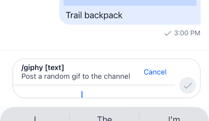 | 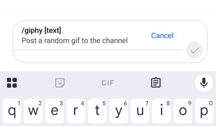 |
The command comes from the channel type's configuration on the server, with its name, its args, such as [text] for giphy, and its description. Here is what the composer does around the bar:
- Picking a command, from the suggestions after
/or from the attachment picker, setstextComposer.command. The composer saves its content and empties itself, so the user types only the arguments. - While a command is active, the attach button is hidden and the send button shows a checkmark. Mentions still open after
@, so/mute @bobcan be completed. TextComposer.clearCommand()drops the command and puts back the attachments and other content the composer held. For a command picked from the suggestions, the text comes back empty, because it held only the/githe user typed to find it.- The input shows a placeholder for some commands: "Search GIFs" for
giphy, and@usernameforban,unban,muteandunmute.
AutoCompleteInput stays the second child of the view in both states, so React keeps the same input when the bar appears, and the keyboard stays open. props carries additionalTextInputProps from Channel or Thread. AutoCompleteInput reads them when it mounts, and doesn't update when they change later.
Register it
InputView is an override key. Declare the overrides once and pass them to WithComponents around the screens that use the bar:
import type { Channel as StreamChannel } from "stream-chat";
import {
  Channel,
  MessageComposer,
  MessageList,
  WithComponents,
} from "stream-chat-react-native";
import type { ComponentOverrides } from "stream-chat-react-native";
import { CommandInputView } from "./CommandInputView";

const overrides: ComponentOverrides = { InputView: CommandInputView };

export const ChannelScreen = ({ channel }: { channel: StreamChannel }) => (
  <WithComponents overrides={overrides}>
    <Channel channel={channel}>
      <MessageList />
      <MessageComposer />
    </Channel>
  </WithComponents>
);
A Thread on its own screen needs the same overrides. In a thread, ShowThreadMessageInChannelButton renders the also-send-to-channel checkbox under the input. In a channel it renders nothing.
Require arguments before sending
The bar shows which arguments a command takes, but the composer decides when a command can be sent. By default, /ban, /mute, /unmute and /unban need a mentioned user, /ban needs a reason too, and the others can be sent empty. To hold back /giphy until the user types a search term, register a sendValidator, as Commands shows. Sending a command that isn't ready publishes a warning, and nothing is sent.
A composer without the bar
A composer that shows the command in the text instead, with no bar or chip, removes all four middleware in the composer setup function, so the text keeps /giphy cats and is sent as typed:
import type { StreamChat } from "stream-chat";

export const setUpComposers = (client: StreamChat) =>
  client.config.setSetupFunction("messageComposer", ({ composer }) => {
    composer.textComposer.middlewareExecutor.remove([
      "stream-io/text-composer/active-command-guard",
      "stream-io/text-composer/command-string-extraction",
    ]);
    composer.compositionMiddlewareExecutor.remove(
      "stream-io/message-composer-middleware/command-string-injection",
    );
    composer.draftCompositionMiddlewareExecutor.remove(
      "stream-io/message-composer-middleware/draft-command-string-injection",
    );
  });
Call setUpComposers(client) once the client exists, before any Channel renders, as in Emoji suggestions. Remove all four, not only the two in the text chain. With the injection middleware left in, the command stays active after the user deletes /giphy from the text, and cats still goes out as /giphy cats. A UI without a command chip explains what changes for such a composer. The command bar above relies on the middleware, so use one or the other.
Related
- Commands and Giphy covers the Giphy preview and its buttons.
- Custom suggestions changes the command rows in the suggestion list.
- Custom composer builds a composer layout that keeps
InputView, so the bar works inside it too.