# Commands UI

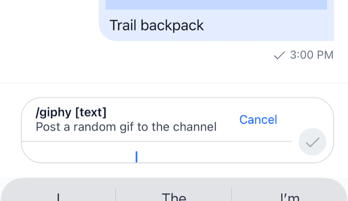
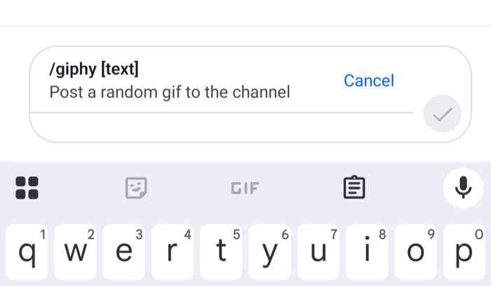
This UI cookbook builds a command UI for the composer. When the user picks a command, such as `/giphy`, a bar above the input shows the command, what it does and the arguments it takes, with a button that cancels it. Sending posts the command with its name, so `/giphy cats` reaches the server as `/giphy cats` and not as `cats`. How commands work, from the suggestions to the Giphy preview, is explained in [Commands and Giphy](https://getstream.io/chat/docs/sdk/react-native/features/rich-content/commands-and-giphy/).

>
> **Note:** **What you'll build**
>
> - A command bar above the input
> - The command's name, description and arguments in the bar
> - A button that cancels the command
>

---

**Approach:** Replace one part. [Choosing where to start](https://getstream.io/chat/docs/sdk/react-native/ui-cookbooks/overview/#choosing-where-to-start) explains the approaches.

## Best practices

- Leave the four command middleware installed. `stream-chat` installs them in every composer, and the bar relies on them to keep the command apart from the text.
- Remove all four or none. A composer without a command chip removes all of them in the composer setup function.
- Read the active command from `textComposer.state` with a selector declared at module scope.
- Cancel a command with `TextComposer.clearCommand()`, which puts back the content the composer held before the command.
- Keep `AutoCompleteInput` at the same place in the tree whether a command is active or not, so the input keeps its focus.

## The command middleware

The bar needs no setup. The composer keeps the active command apart from the text, and four middleware that `stream-chat` installs in every composer do the rest:

- Two write the command's name back in front of the text when the message is sent and when a draft is saved, so `/giphy cats` reaches the server as `/giphy cats` and not as `cats`.
- Two keep the command suggestions from opening again while a command is active, and take the command out of the text when the user types it in full.

They run for the channel's composer, a thread's and the one that edits a message. [The command middleware](https://getstream.io/chat/docs/sdk/react-native/state/writing-messages/commands/#the-command-middleware) lists their ids and what each one does.

## Build the command bar

The command chip is part of `InputView`, which renders the chip, the text input `AutoCompleteInput`, and in a thread the also-send-to-channel checkbox. This `InputView` renders a bar in the chip's place:

```tsx title="src/CommandInputView.tsx"
import { Pressable, StyleSheet, Text, View } from "react-native";
import type { TextComposerState } from "stream-chat";
import {
  AutoCompleteInput,
  ShowThreadMessageInChannelButton,
  useMessageComposer,
  useStateStore,
  useTheme,
} from "stream-chat-react-native";
import type { InputViewProps } from "stream-chat-react-native";

const commandSelector = ({ command }: TextComposerState) => ({ command });

export const CommandInputView = (props: InputViewProps) => {
  const { textComposer } = useMessageComposer();
  const { command } = useStateStore(textComposer.state, commandSelector);
  const {
    theme: { semantics },
  } = useTheme();

  return (
    <View style={styles.container}>
      {command ? (
        <View
          style={[
            styles.bar,
            { borderBottomColor: semantics.borderCoreDefault },
          ]}
        >
          <View style={styles.details}>
            <Text style={[styles.name, { color: semantics.textPrimary }]}>
              /{command.name} {command.args}
            </Text>
            {command.description ? (
              <Text style={{ color: semantics.textSecondary }}>
                {command.description}
              </Text>
            ) : null}
          </View>
          <Pressable
            accessibilityLabel={`Cancel /${command.name}`}
            accessibilityRole="button"
            hitSlop={8}
            onPress={() => textComposer.clearCommand()}
          >
            <Text style={{ color: semantics.accentPrimary }}>Cancel</Text>
          </Pressable>
        </View>
      ) : null}
      <AutoCompleteInput {...props} />
      <ShowThreadMessageInChannelButton />
    </View>
  );
};

const styles = StyleSheet.create({
  bar: {
    alignItems: "center",
    borderBottomWidth: 1,
    flexDirection: "row",
    gap: 12,
    paddingHorizontal: 16,
    paddingVertical: 8,
  },
  container: { flex: 1 },
  details: { flex: 1 },
  name: { fontWeight: "600" },
});
```

<table>
  <tr>
  <td align='center' width='50%'>

![A command bar above the input showing the giphy command, its description and a Cancel button on iOS](https://getstream.io/docs-assets/images/fc92daebb99a.png)

  </td>
  <td align='center' width='50%'>

![A command bar above the input showing the giphy command, its description and a Cancel button on Android](https://getstream.io/docs-assets/images/c88f5edf0942.png)

  </td>
  </tr>
</table>

The command comes from the channel type's configuration on the server, with its `name`, its `args`, such as `[text]` for `giphy`, and its `description`. Here is what the composer does around the bar:

- Picking a command, from the suggestions after `/` or from the attachment picker, sets `textComposer.command`. The composer saves its content and empties itself, so the user types only the arguments.
- While a command is active, the attach button is hidden and the send button shows a checkmark. Mentions still open after `@`, so `/mute @bob` can be completed.
- `TextComposer.clearCommand()` drops the command and puts back the attachments and other content the composer held. For a command picked from the suggestions, the text comes back empty, because it held only the `/gi` the user typed to find it.
- The input shows a placeholder for some commands: "Search GIFs" for `giphy`, and `@username` for `ban`, `unban`, `mute` and `unmute`.

`AutoCompleteInput` stays the second child of the view in both states, so React keeps the same input when the bar appears, and the keyboard stays open. `props` carries `additionalTextInputProps` from `Channel` or `Thread`. `AutoCompleteInput` reads them when it mounts, and doesn't update when they change later.

## Register it

`InputView` is an override key. Declare the overrides once and pass them to `WithComponents` around the screens that use the bar:

```tsx title="src/ChannelScreen.tsx"
import type { Channel as StreamChannel } from "stream-chat";
import {
  Channel,
  MessageComposer,
  MessageList,
  WithComponents,
} from "stream-chat-react-native";
import type { ComponentOverrides } from "stream-chat-react-native";
import { CommandInputView } from "./CommandInputView";

const overrides: ComponentOverrides = { InputView: CommandInputView };

export const ChannelScreen = ({ channel }: { channel: StreamChannel }) => (
  <WithComponents overrides={overrides}>
    <Channel channel={channel}>
      <MessageList />
      <MessageComposer />
    </Channel>
  </WithComponents>
);
```

A `Thread` on its own screen needs the same overrides. In a thread, `ShowThreadMessageInChannelButton` renders the also-send-to-channel checkbox under the input. In a channel it renders nothing.

## Require arguments before sending

The bar shows which arguments a command takes, but the composer decides when a command can be sent. By default, `/ban`, `/mute`, `/unmute` and `/unban` need a mentioned user, `/ban` needs a reason too, and the others can be sent empty. To hold back `/giphy` until the user types a search term, register a `sendValidator`, as [Commands](https://getstream.io/chat/docs/sdk/react-native/state/writing-messages/commands/#sending-a-command) shows. Sending a command that isn't ready publishes a warning, and nothing is sent.

## A composer without the bar

A composer that shows the command in the text instead, with no bar or chip, removes all four middleware in the composer setup function, so the text keeps `/giphy cats` and is sent as typed:

```ts title="src/setUpComposers.ts"
import type { StreamChat } from "stream-chat";

export const setUpComposers = (client: StreamChat) =>
  client.config.setSetupFunction("messageComposer", ({ composer }) => {
    composer.textComposer.middlewareExecutor.remove([
      "stream-io/text-composer/active-command-guard",
      "stream-io/text-composer/command-string-extraction",
    ]);
    composer.compositionMiddlewareExecutor.remove(
      "stream-io/message-composer-middleware/command-string-injection",
    );
    composer.draftCompositionMiddlewareExecutor.remove(
      "stream-io/message-composer-middleware/draft-command-string-injection",
    );
  });
```

Call `setUpComposers(client)` once the client exists, before any `Channel` renders, as in [Emoji suggestions](https://getstream.io/chat/docs/sdk/react-native/ui-cookbooks/composer/emoji-suggestions/#install-the-middleware). Remove all four, not only the two in the text chain. With the injection middleware left in, the command stays active after the user deletes `/giphy` from the text, and `cats` still goes out as `/giphy cats`. [A UI without a command chip](https://getstream.io/chat/docs/sdk/react-native/state/writing-messages/commands/#a-ui-without-a-command-chip) explains what changes for such a composer. The command bar above relies on the middleware, so use one or the other.

## Related

- [Commands and Giphy](https://getstream.io/chat/docs/sdk/react-native/features/rich-content/commands-and-giphy/#the-giphy-preview) covers the Giphy preview and its buttons.
- [Custom suggestions](https://getstream.io/chat/docs/sdk/react-native/ui-cookbooks/composer/custom-suggestions/) changes the command rows in the suggestion list.
- [Custom composer](https://getstream.io/chat/docs/sdk/react-native/ui-cookbooks/composer/custom-composer/) builds a composer layout that keeps `InputView`, so the bar works inside it too.

---

For the most recent version of this documentation, visit [https://getstream.io/chat/docs/sdk/react-native/ui-cookbooks/composer/commands-ui/](https://getstream.io/chat/docs/sdk/react-native/ui-cookbooks/composer/commands-ui/).