


Giphy preview
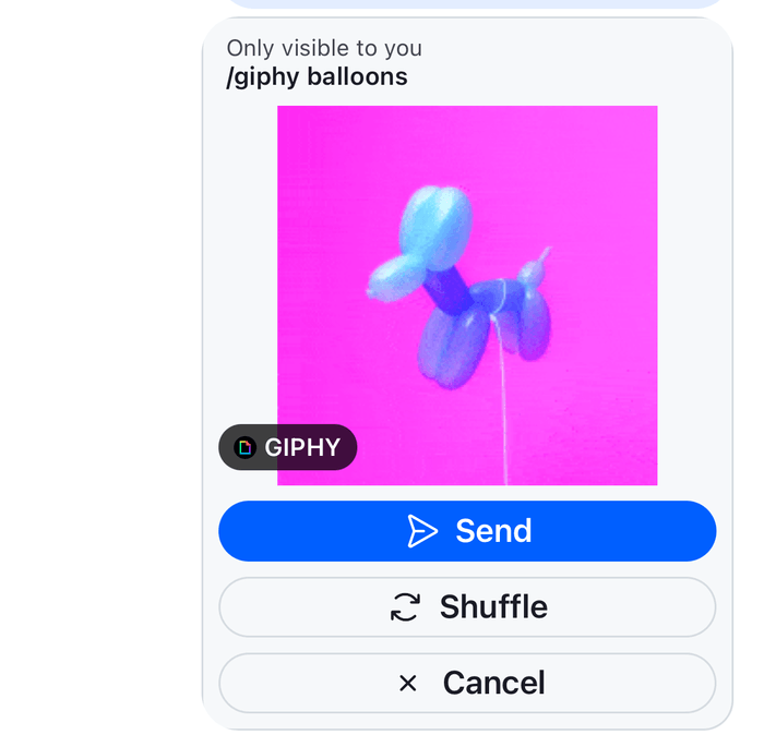
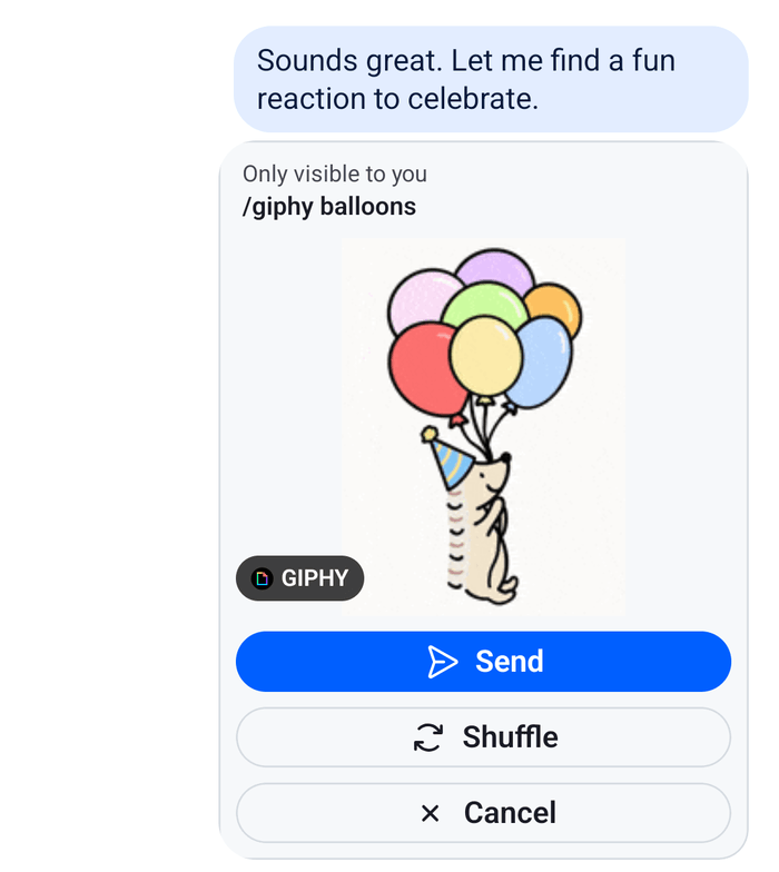
A /giphy command answers with a preview that only the user sees, with Send, Shuffle and Cancel buttons. This UI cookbook replaces that preview: it shows the search term above the GIF and puts an icon on each button. How the user sends /giphy, and what each button does, is explained in Commands and Giphy.
What you'll build
- The search term above the GIF
- An icon on each of the Send, Shuffle and Cancel buttons
Approach: Replace one part. Choosing where to start explains the approaches.
Best practices
- Replace the preview through the
Giphykey, and render the SDK'sGiphyfor every attachment that has noactions. A GIF that was sent has none, and the SDK renders it. - Call the
handleActionfromuseMessageContext()with each action'snameandvalue. It sends the action and applies the server's answer to the message list. - Read the labels from the actions, as the default does. The server sends them in English, so translate them yourself if your app has other languages.
- Render the GIF with
GiphyImage, so the rendition thatgiphyVersionnames and the loading and error states keep working. - Keep the "Only visible to you" line, and take it from the SDK's translation key, so the user knows no one else sees the preview.
The preview
The Giphy key receives the attachment. A preview from /giphy has actions, a title that holds the search term, and the GIF in giphy. This component renders the term, the GIF and a button with an icon for each action, on a card. For an attachment without actions, it renders the default Giphy:
import type { PropsWithChildren } from "react";
import { StyleSheet, Text, View } from "react-native";
import {
  Button,
  Giphy,
  GiphyImage,
  useComponentsContext,
  useMessageContext,
  useTheme,
  useTranslationContext,
  WithComponents,
} from "stream-chat-react-native";
import type { GiphyProps, IconRenderer } from "stream-chat-react-native";

const GiphyPreview = (props: GiphyProps) => {
  const { attachment } = props;
  const { handleAction } = useMessageContext();
  const { icons } = useComponentsContext();
  const { t } = useTranslationContext();
  const {
    theme: { semantics },
  } = useTheme();

  // A GIF that was sent has no actions, and the SDK renders it.
  if (!attachment.actions) return <Giphy {...props} />;

  const actionIcons: Record<string, IconRenderer> = {
    cancel: icons.NewClose,
    send: icons.SendRight,
    shuffle: icons.Reload,
  };

  return (
    <View
      style={[
        styles.card,
        {
          backgroundColor: semantics.backgroundCoreSurfaceSubtle,
          borderColor: semantics.borderCoreDefault,
        },
      ]}
    >
      <Text style={[styles.hint, { color: semantics.textSecondary }]}>
        {t("attachment.giphy.onlyVisibleToYou.text", "Only visible to you")}
      </Text>
      {attachment.title ? (
        <Text style={[styles.query, { color: semantics.textPrimary }]}>
          /giphy {attachment.title}
        </Text>
      ) : null}
      <GiphyImage attachment={attachment} preview />
      <View style={styles.actions}>
        {attachment.actions.map((action) => (
          <Button
            key={action.value}
            LeadingIcon={action.value ? actionIcons[action.value] : undefined}
            label={action.text}
            onPress={() => {
              if (action.name && action.value) {
                handleAction(action.name, action.value);
              }
            }}
            size="sm"
            type={action.value === "send" ? "solid" : "outline"}
            variant={action.value === "send" ? "primary" : "secondary"}
          />
        ))}
      </View>
    </View>
  );
};

// Declared once, so WithComponents gets the same object on every render.
const overrides = { Giphy: GiphyPreview };

export const WithGiphyPreview = ({ children }: PropsWithChildren) => (
  <WithComponents overrides={overrides}>{children}</WithComponents>
);

const styles = StyleSheet.create({
  actions: {
    flexDirection: "row",
    flexWrap: "wrap",
    gap: 8,
    justifyContent: "center",
    padding: 8,
  },
  card: { borderRadius: 16, borderWidth: 1, maxWidth: 280, overflow: "hidden" },
  hint: { fontSize: 12, paddingHorizontal: 12, paddingTop: 8 },
  query: {
    fontSize: 13,
    fontWeight: "600",
    paddingHorizontal: 12,
    paddingBottom: 8,
  },
}); |  |
Wrap the screens that render a message list, Channel and Thread, in WithGiphyPreview:
import type { Channel as StreamChannel } from "stream-chat";
import {
  Channel,
  MessageComposer,
  MessageList,
} from "stream-chat-react-native";
import { WithGiphyPreview } from "./GiphyPreview";

export const GiphyChannel = ({ channel }: { channel: StreamChannel }) => (
  <WithGiphyPreview>
    <Channel channel={channel}>
      <MessageList />
      <MessageComposer />
    </Channel>
  </WithGiphyPreview>
);
The channel type needs the giphy command, as Commands and Giphy explains. To try the preview, type /giphy forest in the composer and send it.
How it works
Example
The user sends /giphy forest in the Weekend trip channel. A preview with the search term and Send, Shuffle and Cancel appears at the end of the list. Shuffle shows another GIF, and Send posts it to the channel.
- The server answers with an ephemeral message that only the user receives. It has an attachment of type
giphywith three actions, and it takes the place of the sent/giphy forestin the list. Messagefinds that an attachment has actions, so the message can't be long-pressed for the message menu and doesn't render its quoted message. It renders the attachment through theAttachmentkey, which renders theGiphykey for an attachment of typegiphy.GiphyPreviewrenders the card.GiphyImageshows the renditiongiphyVersionnames onChannel,fixed_heightby default.- Each button calls
handleAction(action.name, action.value).Messagesends it withChannel.sendAction()and applies the answer: another GIF after Shuffle, the posted message after Send, and nothing left after Cancel.
The preview renders among the messages in MessageList and MessageFlashList. A GIF that was sent renders through the same Giphy key, without actions, which is why the component hands it to the SDK's Giphy.
Read more
- Commands and Giphy: how the user sends
/giphyand what each button does. - Attachments: the props of
GiphyandGiphyImage. - Message UI: what a message with attachment actions renders.
- Overriding components: how
WithComponentskeys apply. - Image gallery: the grid of a message's images and the viewer.
- Custom message: replaces the message view that renders
Attachment.