


Product card
A product card is an attachment type of your own: a product attachment that carries a product's name, price, picture and link. This recipe adds it everywhere an attachment shows up. How the SDK handles attachments in general is on Attachments and uploads.
What you'll build
- An Attach product entry with a product picker
- A product preview above the input
- A product card in the message list
- A one-line product summary in the channel list and quoted replies
Preview
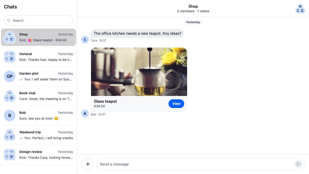
Approach: Replace one part. Choosing where to start explains the approaches.
Starts from: the base app. The page shows only what the recipe adds.
The recipe replaces six ComponentContext keys, each wrapping the SDK's default and handing everything that isn't a product back to it. The composer keeps the product in its attachment manager and sends it like any other attachment, also when the message is edited or saved as a draft.
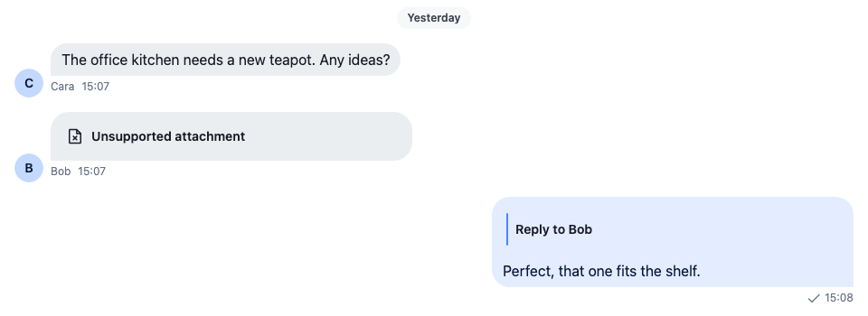
Without it, the SDK doesn't know the type. The message shows "Unsupported attachment", and a reply quoting it shows no content:
Without registering the type
Best practices
- Give the type a name of its own,
product, and keep its fields in the attachment'scustom. Type them by extendingCustomAttachmentData. - Don't set
title_linkorog_scrape_urlon the attachment. Either one makes it a link preview, rendered byCard, and the custom renderer never sees it. Keep the product link incustom. - Branch on the type in each override and render the SDK's default for everything else, so files, images and link previews keep working.
- Give an attachment added in code only a
localMetadata.id. With no file and nouploadState, the composer sends it as it is. - Describe the product in text wherever the SDK shows a message as one line: the channel list and quoted replies.
The attachment type
A product attachment uses the attachment's own fields where they fit, title and image_url, and keeps the rest in custom: the price, its currency and the link to the product page. CustomAttachmentData types custom for every attachment, so the fields are optional. Data conventions explains the custom data interfaces.
The file also has the helpers every part below uses: a check for the type, the price formatted in its currency, a one-line description, and the composer attachment for a product.
import type { Attachment, LocalAttachment } from "stream-chat";

declare module "stream-chat" {
  // The fields a `product` attachment keeps in its `custom`. Optional, because every attachment
  // in the app shares this interface.
  interface CustomAttachmentData {
    currency?: string;
    price?: number;
    product_url?: string;
  }
}

export const PRODUCT_ATTACHMENT_TYPE = "product";

export type Product = {
  currency: string;
  id: string;
  imageUrl: string;
  price: number;
  title: string;
  url: string;
};

/** True for an attachment this app sends for a product. */
export const isProductAttachment = (attachment: Attachment) =>
  attachment.type === PRODUCT_ATTACHMENT_TYPE;

/** The message's first product attachment, if it has one. */
export const findProductAttachment = (message: {
  attachments?: Attachment[];
}) => message.attachments?.find(isProductAttachment);

/** The price in its currency, for example "€34.00". */
export const formatPrice = ({
  currency,
  price,
}: {
  currency?: string;
  price?: number;
}) =>
  price === undefined || !currency
    ? ""
    : new Intl.NumberFormat(undefined, { currency, style: "currency" }).format(
        price,
      );

/** One line for places that show text only, for example "🛍 Glass teapot · €34.00". */
export const describeProduct = (attachment: Attachment) =>
  [`🛍 ${attachment.title ?? "Product"}`, formatPrice(attachment.custom)]
    .filter(Boolean)
    .join(" · ");

/** The attachment the composer adds for a product. It has nothing to upload, so it needs only an id. */
export const toProductAttachment = (product: Product): LocalAttachment => ({
  custom: {
    currency: product.currency,
    price: product.price,
    product_url: product.url,
  },
  image_url: product.imageUrl,
  localMetadata: { id: crypto.randomUUID() },
  title: product.title,
  type: PRODUCT_ATTACHMENT_TYPE,
});
The picker offers a short, fixed list of products. An app would load them from its shop:
import type { Product } from "./product";

/** The products the picker offers. An app would load them from its shop. */
export const catalogue: Product[] = [
  {
    currency: "EUR",
    id: "glass-teapot",
    imageUrl: "https://picsum.photos/id/225/480/360",
    price: 34,
    title: "Glass teapot",
    url: "https://example.com/shop/glass-teapot",
  },
  {
    currency: "EUR",
    id: "honey-jar",
    imageUrl: "https://picsum.photos/id/312/480/360",
    price: 9.5,
    title: "Honey jar",
    url: "https://example.com/shop/honey-jar",
  },
  {
    currency: "EUR",
    id: "sprinkled-doughnut",
    imageUrl: "https://picsum.photos/id/488/480/360",
    price: 3.5,
    title: "Sprinkled doughnut",
    url: "https://example.com/shop/sprinkled-doughnut",
  },
];
A product attachment, as the message carries it:
{
  "type": "product",
  "title": "Glass teapot",
  "image_url": "https://picsum.photos/id/225/480/360",
  "custom": {
    "currency": "EUR",
    "price": 34,
    "product_url": "https://example.com/shop/glass-teapot"
  }
}
Adding a product from the composer
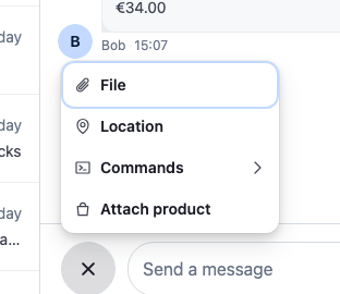
The attachment menu is an action set passed to AttachmentSelector. This one keeps the default actions and adds "Attach product" at the end. Its ActionButton opens the action's ModalContent, the picker, through openModalForAction(). Picking a product adds it to the composer with AttachmentManager.upsertAttachments() and closes the modal:
import type {
  AttachmentSelectorAction,
  AttachmentSelectorActionProps,
  AttachmentSelectorModalContentProps,
} from "stream-chat-react";
import {
  AttachmentSelector,
  ContextMenuButton,
  createIcon,
  defaultAttachmentSelectorActionSet,
  Prompt,
  useContextMenuContext,
  useMessageComposerController,
} from "stream-chat-react";
import { catalogue } from "./catalogue";
import type { Product } from "./product";
import { formatPrice, toProductAttachment } from "./product";
import "./ProductPicker.css";

export const ATTACH_PRODUCT_ACTION = "attachProduct";

const IconBag = createIcon(
  "IconBag",
  <path
    d="M4 7h12l-1 10H5L4 7Zm3 0V6a3 3 0 0 1 6 0v1"
    fill="none"
    stroke="currentColor"
    strokeLinejoin="round"
    strokeWidth="1.5"
  />,
);

/** The menu item: opens the picker in the selector's modal. */
export const AttachProductButton = ({
  openModalForAction,
}: AttachmentSelectorActionProps) => {
  const { closeMenu } = useContextMenuContext();

  return (
    <ContextMenuButton
      className="cookbook-attach-product-button"
      Icon={IconBag}
      onClick={() => {
        openModalForAction(ATTACH_PRODUCT_ACTION);
        closeMenu();
      }}
    >
      Attach product
    </ContextMenuButton>
  );
};

/** The modal's content: picking a product adds it to the composer and closes the modal. */
export const ProductPicker = ({
  close,
}: AttachmentSelectorModalContentProps) => {
  const messageComposer = useMessageComposerController();

  return (
    <Prompt.Root className="cookbook-product-picker">
      <Prompt.Header close={close} title="Attach a product" />
      <Prompt.Body>
        <ul className="cookbook-product-picker__list">
          {catalogue.map((product: Product) => (
            <li key={product.id}>
              <button
                className="cookbook-product-picker__item"
                onClick={() => {
                  messageComposer.attachmentManager.upsertAttachments([
                    toProductAttachment(product),
                  ]);
                  close();
                }}
                type="button"
              >
                <img
                  alt=""
                  className="cookbook-product-picker__image"
                  src={product.imageUrl}
                />
                <span className="cookbook-product-picker__title">
                  {product.title}
                </span>
                <span className="cookbook-product-picker__price">
                  {formatPrice(product)}
                </span>
              </button>
            </li>
          ))}
        </ul>
      </Prompt.Body>
    </Prompt.Root>
  );
};

// Declared once: the selector filters its actions again whenever it gets a new list.
const attachmentSelectorActionSet: AttachmentSelectorAction[] = [
  ...defaultAttachmentSelectorActionSet,
  {
    ActionButton: AttachProductButton,
    ModalContent: ProductPicker,
    type: ATTACH_PRODUCT_ACTION,
  },
];

export const ProductAttachmentSelector = () => (
  <AttachmentSelector
    attachmentSelectorActionSet={attachmentSelectorActionSet}
  />
);@layer stream-overrides {
.cookbook-product-picker__list {
display: flex;
flex-direction: column;
gap: var(--str-chat__spacing-xs);
margin: 0;
padding: 0;
list-style: none;
}
.cookbook-product-picker__item {
display: flex;
align-items: center;
gap: var(--str-chat__spacing-sm);
width: 100%;
padding: var(--str-chat__spacing-xs);
border: 1px solid var(--str-chat__border-core-default);
border-radius: var(--str-chat__radius-lg);
background: var(--str-chat__background-core-surface-card);
color: var(--str-chat__text-primary);
text-align: start;
cursor: pointer;
}
.cookbook-product-picker__item:hover {
background: var(--str-chat__background-utility-hover);
}
.cookbook-product-picker__image {
width: 48px;
height: 48px;
border-radius: var(--str-chat__radius-md);
object-fit: cover;
}
.cookbook-product-picker__title {
flex: 1;
font: var(--str-chat__font-body-emphasis);
}
.cookbook-product-picker__price {
color: var(--str-chat__text-secondary);
font: var(--str-chat__font-caption-default);
}
}The attachment menu
The product picker
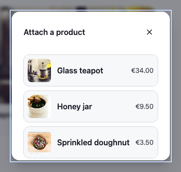
createIcon() makes the bag icon, sized like the SDK's own icons. The selector filters the built-in action types, such as uploadFile and createPoll; an action with a type of its own, attachProduct here, is always shown. Attachment Selector lists the action fields and the selector's props.
A product has nothing to upload, so toProductAttachment() gives it a localMetadata.id and no file or uploadState. The composer sends such an attachment as it is, and it doesn't count toward the file limit (messageComposer.attachments.maxNumberOfFilesPerMessage). The localMetadata.id is new for every pick, so the preview can remove it.
Its preview in the composer
The composer's AttachmentPreviewList sends an attachment of a type it doesn't know to its UnsupportedAttachmentPreview. This one renders a product as a small card with the picture, the title and the price, and passes every other attachment to the default:
import type { UnsupportedAttachmentPreviewProps } from "stream-chat-react";
import {
  AttachmentPreviewList,
  RemoveAttachmentPreviewButton,
  UnsupportedAttachmentPreview,
} from "stream-chat-react";
import { formatPrice, isProductAttachment } from "./product";
import "./ProductAttachmentPreview.css";

const ProductOrUnsupportedPreview = (
  props: UnsupportedAttachmentPreviewProps,
) => {
  const { attachment, removeAttachments } = props;

  if (!isProductAttachment(attachment)) {
    return <UnsupportedAttachmentPreview {...props} />;
  }

  return (
    <div className="cookbook-product-preview">
      {attachment.image_url && (
        <img
          alt=""
          className="cookbook-product-preview__image"
          src={attachment.image_url}
        />
      )}
      <div className="cookbook-product-preview__details">
        <span className="cookbook-product-preview__title">
          {attachment.title}
        </span>
        <span className="cookbook-product-preview__price">
          {formatPrice(attachment.custom)}
        </span>
      </div>
      <RemoveAttachmentPreviewButton
        aria-label="Remove product"
        onClick={() => removeAttachments([attachment.localMetadata.id])}
      />
    </div>
  );
};

export const ProductAttachmentPreviewList = () => (
  <AttachmentPreviewList
    UnsupportedAttachmentPreview={ProductOrUnsupportedPreview}
  />
);@layer stream-overrides {
.cookbook-product-preview {
position: relative;
display: flex;
align-items: center;
gap: var(--str-chat__spacing-sm);
min-width: 220px;
padding: var(--str-chat__spacing-xs);
padding-inline-end: var(--str-chat__spacing-lg);
border: 1px solid var(--str-chat__border-core-default);
border-radius: var(--str-chat__radius-lg);
background: var(--str-chat__background-core-surface-card);
}
.cookbook-product-preview__image {
width: 48px;
height: 48px;
border-radius: var(--str-chat__radius-md);
object-fit: cover;
}
.cookbook-product-preview__details {
display: flex;
flex-direction: column;
min-width: 0;
}
.cookbook-product-preview__title {
overflow: hidden;
color: var(--str-chat__text-primary);
font: var(--str-chat__font-caption-emphasis);
text-overflow: ellipsis;
white-space: nowrap;
}
.cookbook-product-preview__price {
color: var(--str-chat__text-secondary);
font: var(--str-chat__font-caption-default);
}
}A product in the composer

RemoveAttachmentPreviewButton is the SDK's ✕. It places itself on the top corner of the nearest positioned element, which is why the card is position: relative. Its aria-label names what it removes. The Attachment previews recipe covers the other previews.
Rendering it in the message list
Attachment sorts a message's attachments into groups. A product attachment is none of the kinds it knows, so it goes to its UnsupportedAttachment. This card renders the product with a View link that opens the product page in a new tab:
import type {
  AttachmentProps,
  UnsupportedAttachmentProps,
} from "stream-chat-react";
import { Attachment, UnsupportedAttachment } from "stream-chat-react";
import { formatPrice, isProductAttachment } from "./product";
import "./ProductCard.css";

const ProductOrUnsupported = ({ attachment }: UnsupportedAttachmentProps) => {
  if (!isProductAttachment(attachment)) return <UnsupportedAttachment />;

  const { product_url } = attachment.custom;

  return (
    <div className="cookbook-product-card">
      {attachment.image_url && (
        <img
          alt=""
          className="cookbook-product-card__image"
          src={attachment.image_url}
        />
      )}
      <div className="cookbook-product-card__body">
        <div className="cookbook-product-card__details">
          <span className="cookbook-product-card__title">
            {attachment.title}
          </span>
          <span className="cookbook-product-card__price">
            {formatPrice(attachment.custom)}
          </span>
        </div>
        {product_url && (
          <a
            aria-label={`View ${attachment.title ?? "product"}`}
            className="cookbook-product-card__link"
            href={product_url}
            rel="noreferrer"
            target="_blank"
          >
            View
          </a>
        )}
      </div>
    </div>
  );
};

export const ProductAttachment = (props: AttachmentProps) => (
  <Attachment {...props} UnsupportedAttachment={ProductOrUnsupported} />
);@layer stream-overrides {
.cookbook-product-card {
overflow: hidden;
border-radius: var(--str-chat__radius-lg);
background: var(--str-chat__background-core-surface-card);
color: var(--str-chat__text-primary);
}
.cookbook-product-card__image {
display: block;
width: 100%;
height: 200px;
object-fit: cover;
}
.cookbook-product-card__body {
display: flex;
align-items: center;
gap: var(--str-chat__spacing-sm);
padding: var(--str-chat__spacing-sm);
}
.cookbook-product-card__details {
display: flex;
flex: 1;
flex-direction: column;
min-width: 0;
}
.cookbook-product-card__title {
font: var(--str-chat__font-body-emphasis);
}
.cookbook-product-card__price {
color: var(--str-chat__text-secondary);
font: var(--str-chat__font-caption-default);
}
.cookbook-product-card__link {
padding: var(--str-chat__spacing-xs) var(--str-chat__spacing-md);
border-radius: var(--str-chat__radius-max);
background: var(--str-chat__accent-primary);
color: var(--str-chat__text-on-accent);
font: var(--str-chat__font-caption-emphasis);
text-decoration: none;
}
.cookbook-product-card__link:focus-visible {
outline: 2px solid var(--str-chat__accent-primary);
outline-offset: 2px;
}
}The product card in a message
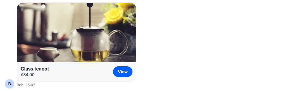
The card fills the attachment's container, which the SDK makes --str-chat__attachment-max-width wide, as it does for files and link previews. The link's visible text is "View" and its accessible name is "View Glass teapot", so a screen reader tells several cards apart. Change how attachments render lists every renderer Attachment takes.
The channel list's last-message preview
The channel list shows a channel's last message in one line, built by useLatestMessagePreview(). For an attachment type it doesn't know, that line is "Unsupported attachment". This preview, set on the SummarizedMessagePreview key, describes the product instead and keeps the sender in front, as the default does:
import type { SummarizedMessagePreviewProps } from "stream-chat-react";
import {
  SummarizedMessagePreview,
  useLatestMessagePreview,
} from "stream-chat-react";
import { describeProduct, findProductAttachment } from "./product";
import "./ProductMessagePreview.css";

export const ProductMessagePreview = (props: SummarizedMessagePreviewProps) => {
  // The sender prefix the default preview shows: "You", or the sender's name in a group.
  const { senderName } = useLatestMessagePreview(props);
  const product =
    props.latestMessage && findProductAttachment(props.latestMessage);

  if (!product) return <SummarizedMessagePreview {...props} />;

  return (
    <div className="cookbook-product-message-preview">
      {senderName && (
        <span className="cookbook-product-message-preview__sender">
          {senderName}:
        </span>
      )}
      <span className="cookbook-product-message-preview__text">
        {describeProduct(product)}
      </span>
    </div>
  );
};@layer stream-overrides {
.cookbook-product-message-preview {
display: flex;
gap: var(--str-chat__spacing-xxs);
min-width: 0;
color: var(--str-chat__text-secondary);
font: var(--str-chat__font-caption-default);
}
.cookbook-product-message-preview__sender {
flex-shrink: 0;
color: var(--str-chat__text-tertiary);
font: var(--str-chat__font-caption-emphasis);
}
.cookbook-product-message-preview__text {
flex: 1;
min-width: 0;
overflow: hidden;
text-overflow: ellipsis;
white-space: nowrap;
}
}The channel list row
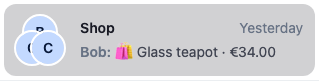
useLatestMessagePreview() returns the sender's name, "You" for the user's own messages, or nothing in a direct message. The delivery status of the user's own messages isn't shown in this preview. The Preview UI recipe replaces the whole row.
Quoted replies
A reply that quotes a message shows the quoted message above its own text, in the message list and in the composer while the user writes it. QuotedMessagePreviewUI renders both. It shows the quoted message's text, or a label and a thumbnail for the attachment types it knows, such as "Photo"; a product message has neither, so the quote is empty.
These two overrides give the quoted product message a text before passing it to QuotedMessagePreviewUI: QuotedMessage for the quote in the message list, and QuotedMessagePreview for the one above the composer's input:
import type {
  LocalMessage,
  MessageComposerState,
  MessageResponse,
} from "stream-chat";
import type {
  QuotedMessagePreviewProps,
  QuotedMessageProps,
} from "stream-chat-react";
import {
  QuotedMessagePreview,
  QuotedMessagePreviewUI,
  useMessageComposerController,
  useMessageContext,
  useMessagePaginator,
  useStateStore,
} from "stream-chat-react";
import { describeProduct, findProductAttachment } from "./product";

/**
 * The quoted preview shows the message's text, or a label for the attachment types it knows. A
 * product message has no text, so it gets one to show.
 */
const withProductText = <T extends LocalMessage | MessageResponse>(
  message: T,
): T => {
  const product = findProductAttachment(message);
  return product && !message.text
    ? { ...message, text: describeProduct(product) }
    : message;
};

/** The quote above a reply in the message list. */
export const ProductQuotedMessage = ({
  renderText: propsRenderText,
}: QuotedMessageProps) => {
  const { message, renderText: contextRenderText } = useMessageContext();
  const messagePaginator = useMessagePaginator();
  const quotedMessage = message.quoted_message;

  if (!quotedMessage) return null;

  return (
    <QuotedMessagePreviewUI
      onClick={(event) => {
        event.preventDefault();
        event.stopPropagation();
        void messagePaginator.jumpToMessage(quotedMessage.id);
      }}
      quotedMessage={withProductText(quotedMessage)}
      renderText={propsRenderText ?? contextRenderText}
    />
  );
};

const quotedMessageSelector = ({ quotedMessage }: MessageComposerState) => ({
  quotedMessage,
});

/** The quote above the composer's input while the user writes a reply. */
export const ProductQuotedMessagePreview = (
  props: QuotedMessagePreviewProps,
) => {
  const messageComposer = useMessageComposerController();
  const { quotedMessage } = useStateStore(
    messageComposer.state,
    quotedMessageSelector,
  );

  if (!quotedMessage || !findProductAttachment(quotedMessage)) {
    return <QuotedMessagePreview {...props} />;
  }

  return (
    // The SDK's slot class keeps the quote placed as the default preview places it.
    <div className="str-chat__message-composer__quoted-message-preview-slot">
      <QuotedMessagePreviewUI
        {...props}
        onRemove={() => messageComposer.setQuotedMessage(null)}
        quotedMessage={withProductText(quotedMessage)}
      />
    </div>
  );
};
A reply quoting the product

Quoting the product in the composer

The text is changed only on the copy passed to the preview; the message itself stays as it is. ProductQuotedMessage renders text with the renderText it's given, or the message context's, as the default QuotedMessage does. Clicking the quote in the message list jumps to the quoted message with MessagePaginator.jumpToMessage(), as the default does. In the composer, the ✕ removes the quote with MessageComposer.setQuotedMessage(null). A quoted message that isn't a product goes to the default QuotedMessagePreview.
Putting it together
Register every part under its key, and wrap ChatView, or a single Channel, in WithProductAttachments:
import type { PropsWithChildren } from "react";
import { WithComponents } from "stream-chat-react";
import { ProductAttachmentPreviewList } from "./ProductAttachmentPreview";
import { ProductAttachment } from "./ProductCard";
import { ProductMessagePreview } from "./ProductMessagePreview";
import { ProductAttachmentSelector } from "./ProductPicker";
import {
  ProductQuotedMessage,
  ProductQuotedMessagePreview,
} from "./ProductQuotedMessage";

// Declared once, so WithComponents gets the same object on every render.
const overrides = {
  Attachment: ProductAttachment,
  AttachmentPreviewList: ProductAttachmentPreviewList,
  AttachmentSelector: ProductAttachmentSelector,
  QuotedMessage: ProductQuotedMessage,
  QuotedMessagePreview: ProductQuotedMessagePreview,
  SummarizedMessagePreview: ProductMessagePreview,
};

export const WithProductAttachments = ({ children }: PropsWithChildren) => (
  <WithComponents overrides={overrides}>{children}</WithComponents>
);
How it works
Example
The user opens the Shop channel and sends a honey jar:
- The user opens the attachment menu with the + button and picks Attach product.
AttachmentSelectorrenders the picker in its modal. - The user picks the honey jar.
AttachmentManager.upsertAttachments()adds aproductattachment, with only alocalMetadata.id, tomessageComposer.attachmentManager. AttachmentPreviewListrenders it withProductOrUnsupportedPreview, since its type is unknown to the list.- The user sends. The composer's attachments middleware adds the finished uploads and the attachments with nothing to upload, such as the product, to the message, without their
localMetadata. The server stores the product'scustomwith it. - The message list renders the message's attachments with
Attachment, which sends the product toProductOrUnsupported. - The channel's last message is now the product message, so its row in the channel list reads "You: 🛍 Honey jar · €9.50".
- When Bob replies quoting it, the quote reads "🛍 Honey jar · €9.50".
- The user edits the message's text. The composer loads the product back with only a
localMetadata.id, and the attachments middleware keeps it in the update.
Every override branches on attachment.type and hands other attachments, and messages without a product, to the SDK's default, so the rest of the app looks as before.
Related
- Attachments and uploads: how attachments are added, uploaded and rendered.
- Attachment previews: the composer's previews, one kind at a time.
- Attachment Selector: the attachment menu's props and action set.
- Attachments: the
Attachmentprops. - Actions: how action sets work.
- Data conventions: typing custom fields.
- Attachments: the composer's attachment manager.
- Quoted replies: how a reply quotes a message.