


Custom suggestions
This recipe changes the composer's suggestion list, which opens while the user types a mention, a command or an emoji.
What you'll build
- Compact mention rows with an avatar and a name
- Rows of their own for user group mentions
- Suggestions for a trigger of your own, such as # for tags
- A wider suggestion box with rounder corners
Preview
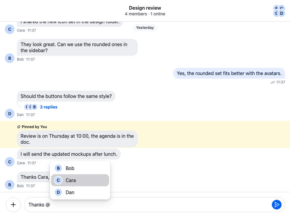
Approach: Restyle and Replace one part. Choosing where to start explains the approaches.
Starts from: the base app. The page shows only what the recipe adds.
The composer suggests items while the user types a trigger:
| Trigger | Suggests | Example |
|---|---|---|
@ |
people and groups | @tom, @channel, @here, @admin, @Support Team |
/ |
commands | /giphy |
: |
emoji, once you add it | :smiling |
Where the suggestions come from, and how to add a trigger, is explained in Suggestions. Emoji suggestions need the emoji middleware: see Emoji.
Enabling mention types
User mentions always work. @channel, @here, roles and user groups appear only for users with the matching capability, and roles and user groups also need data on the server. Mentions lists the capabilities and where to grant them. The composer checks them itself, so a row you replace never shows a mention the user can't make.
Best practices
- Start from
SuggestionListanddefaultComponents, and replace only the rows you need. - Register the list through
WithComponentswith theAutocompleteSuggestionListkey, so every composer below it uses it, in channels and threads alike. - Spread the props a row receives onto its button, and keep the
classNameit receives. They carry the click handler, theoptionrole, the selection state that keyboard navigation relies on and the SDK's row classes. - Keep rows light: the list re-renders them as the user types.
- In a composer of your own, keep
TextareaComposer. It opens the list, positions it and handles the arrow keys and Enter.
Customizing suggestion items
SuggestionList renders the open list. Its suggestionItemComponents prop maps each trigger to the component of a row, and defaultComponents holds the defaults for @, / and :.
The @ row is MentionItem. It renders a different row for each kind of mention, so to change only the people, keep MentionItem and replace its UserItem:
import type { MentionSuggestion } from "stream-chat";
import type {
  SuggestionListItemComponentProps,
  SuggestionListProps,
  UserItemProps,
} from "stream-chat-react";
import {
  Avatar,
  defaultComponents,
  MentionItem,
  SuggestionList,
} from "stream-chat-react";

const CustomUserItem = ({
  className,
  entity,
  // Kept off the button: the list already gives the focused row its class.
  // eslint-disable-next-line @typescript-eslint/no-unused-vars
  focused,
  ...buttonProps
}: UserItemProps) => {
  const title = entity.name ?? entity.id;
  if (!title) return null;

  return (
    <button
      {...buttonProps}
      // Keeps the classes the list passes, such as the one for the focused row.
      className={`${className ?? ""} cookbook-suggestion-row`}
      type="button"
    >
      <Avatar imageUrl={entity.image} size="sm" userName={title} />
      <span>{title}</span>
    </button>
  );
};

const CustomMentionItem = (props: SuggestionListItemComponentProps) => (
  <MentionItem
    {...props}
    entity={props.entity as MentionSuggestion}
    UserItem={CustomUserItem}
  />
);

const rows = { ...defaultComponents, "@": CustomMentionItem };

export const CustomSuggestionList = (props: SuggestionListProps) => (
  <SuggestionList {...props} suggestionItemComponents={rows} />
);@layer stream-overrides {
.cookbook-suggestion-row {
display: flex;
align-items: center;
gap: var(--str-chat__spacing-sm);
width: 100%;
padding: var(--str-chat__spacing-xs) var(--str-chat__spacing-sm);
border: 0;
border-radius: var(--str-chat__radius-lg);
background: none;
color: var(--str-chat__text-primary);
font: var(--str-chat__font-body-default);
text-align: start;
cursor: pointer;
}
/* The SDK marks the row the arrow keys reached with this class. */
.cookbook-suggestion-row.str-chat__suggestion-list-item--selected {
background: var(--str-chat__background-utility-selected);
}
}The rules sit in the stream-overrides layer, so they win over the SDK's own rules once the SDK's stylesheet is in an earlier layer, as Theming → CSS layers sets up. They take their colors, spacing and type from the SDK's tokens, so they follow your theme.
The row keeps the className it receives and adds its own. The list passes the SDK's row classes through it, str-chat__suggestion-list-item and, on the focused row, str-chat__suggestion-list-item--selected, so styles and tests that rely on them keep working. The focused row's style hangs on that SDK class, so the row needs no modifier of its own, and focused stays off the button.
Register the list once, around ChatView:
import type { PropsWithChildren } from "react";
import { WithComponents } from "stream-chat-react";
import { CustomSuggestionList } from "./CustomSuggestionList";
import "./CustomSuggestionList.css";

const overrides = { AutocompleteSuggestionList: CustomSuggestionList };

export const WithCustomSuggestionList = ({ children }: PropsWithChildren) => (
  <WithComponents overrides={overrides}>{children}</WithComponents>
);
Customizing rows per mention type
MentionItem reads entity.mentionType and renders the matching row. Replace any of them and the rest keep their defaults. Each row receives the same props: entity, narrowed to its kind of mention, focused, and the button props.
mentionType |
Prop of MentionItem |
Default row |
|---|---|---|
user |
UserItem |
Avatar and name |
channel / here |
BroadcastMentionItem |
@channel or @here with a description |
role |
RoleItem |
The role's name and "Notify all … members" |
user_group |
UserGroupItem |
The group's name and description |
| any other | SpecialMentionItem |
Nothing |
This one changes only the user group row:
import type { MentionSuggestion } from "stream-chat";
import type {
  SuggestionListItemComponentProps,
  UserGroupItemProps,
} from "stream-chat-react";
import { MentionItem } from "stream-chat-react";

const CustomUserGroupItem = ({
  className,
  entity,
  // Kept off the button: the list already gives the focused row its class.
  // eslint-disable-next-line @typescript-eslint/no-unused-vars
  focused,
  ...buttonProps
}: UserGroupItemProps) => (
  <button
    {...buttonProps}
    className={`${className ?? ""} cookbook-suggestion-row`}
    type="button"
  >
    👥 {entity.name}
  </button>
);

export const GroupMentionItem = (props: SuggestionListItemComponentProps) => (
  <MentionItem
    {...props}
    entity={props.entity as MentionSuggestion}
    UserGroupItem={CustomUserGroupItem}
  />
);
Use GroupMentionItem as the "@" entry of suggestionItemComponents, as in the example above.
Rows for a trigger of your own
A trigger of your own needs a row in suggestionItemComponents, under the trigger character. Without one, the list doesn't open. Custom triggers adds a # trigger that suggests tags, each { id, name }. This list renders its rows:
import type {
  SuggestionListItemComponentProps,
  SuggestionListProps,
} from "stream-chat-react";
import { defaultComponents, SuggestionList } from "stream-chat-react";

type Tag = { id: string; name: string };

const TagItem = ({
  className,
  entity,
  // Kept off the button: the list already gives the focused row its class.
  // eslint-disable-next-line @typescript-eslint/no-unused-vars
  focused,
  ...buttonProps
}: SuggestionListItemComponentProps) => (
  <button
    {...buttonProps}
    className={`${className ?? ""} cookbook-suggestion-row`}
    type="button"
  >
    #{(entity as Tag).name}
  </button>
);

const rows = { ...defaultComponents, "#": TagItem };

export const SuggestionListWithTags = (props: SuggestionListProps) => (
  <SuggestionList {...props} suggestionItemComponents={rows} />
);
Register SuggestionListWithTags under the AutocompleteSuggestionList key. Picking a tag runs the middleware's onSuggestionItemSelect, which writes it into the text.
Styling the list's box
SuggestionList positions its own box next to the cursor. An element you wrap around it stays where the list is rendered, inside the composer, so a header or a frame placed around SuggestionList doesn't move with the list, and shows even while the list is closed. To change the box, pass a class with className. It goes on the box that holds the rows:
import type { SuggestionListProps } from "stream-chat-react";
import { SuggestionList } from "stream-chat-react";
import "./StyledSuggestionList.css";

export const StyledSuggestionList = (props: SuggestionListProps) => (
  <SuggestionList {...props} className="cookbook-suggestion-list" />
);@layer stream-overrides {
.cookbook-suggestion-list {
min-width: 240px;
padding: var(--str-chat__spacing-xs);
border: 1px solid var(--str-chat__border-core-default);
border-radius: var(--str-chat__radius-2xl);
background: var(--str-chat__background-core-elevation-1);
box-shadow: var(--str-chat__box-shadow-3);
}
}The restyled list box
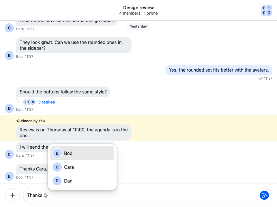
Register it with the AutocompleteSuggestionList key, like the lists above. containerClassName puts a class on the positioned element around the box instead; leave its position to the list.
Replacing AutocompleteSuggestionItem
Each row sits in a wrapper that handles selection: it scrolls the focused row into view and, on click, writes the item into the text and moves the focus back to the input. To change the wrapper for every trigger at once, override AutocompleteSuggestionItem. It receives SuggestionItemProps:
item, the suggestion;focused, whether the row is the one the arrow keys reached;component, the row component for the open trigger;- the button props it passes on to the row.
This one adds a class to every row and keeps the default wrapper:
import type { SuggestionItemProps } from "stream-chat-react";
import { SuggestionListItem } from "stream-chat-react";

export const CustomAutocompleteSuggestionItem = (
  props: SuggestionItemProps,
) => <SuggestionListItem {...props} className="cookbook-suggestion-item" />;
Most apps need only AutocompleteSuggestionList and suggestionItemComponents. Override AutocompleteSuggestionItem when you change how a row is selected.
Custom inputs
A composer layout of your own keeps the suggestions as long as it renders TextareaComposer: the list, the keyboard navigation and its position next to the cursor come with it. The overrides on this page apply inside it too. The Custom composer recipe builds such a layout.
How it works
Example
The user types @b in Weekend trip, with WithCustomSuggestionList around ChatView:
TextareaComposersees the@trigger. The composer finds the people that matchband opens the list registered underAutocompleteSuggestionList,CustomSuggestionList.SuggestionListtakes the row for@fromsuggestionItemComponents,CustomMentionItem. It rendersMentionItem, which rendersCustomUserItemfor Bob: his avatar and his name.- The user presses the down arrow. The list gives the focused row the class
str-chat__suggestion-list-item--selected, and the CSS highlights it. - The user presses Enter. The mention goes into the text, and the list closes.
Rows for / and : keep their defaults, from defaultComponents.
Related
- Suggestions: where the suggestions come from, and how to add a trigger.
- Mentions: the mention types and the capabilities they need.
- Emoji: the emoji middleware behind
:suggestions. - Commands and Giphy: the commands behind
/suggestions. - Overriding components: how overrides registered with
WithComponentsapply. - Message composer UI: the composer's parts,
TextareaComposeramong them. - Custom composer: a composer layout of your own that keeps the suggestions.