


Channel list UI
The channel list is the column of channels a user picks from. It is the UI of a ChannelPaginator: the paginator holds the list's filters and sort, and the channels it loaded, and <ChannelList/> renders them. Each row of the list renders a channel preview: the channel's title, image, last message and status. This page covers what renders the list and its channel previews, what each channel preview reads, and which parts you can replace. The props are in the ChannelList reference.
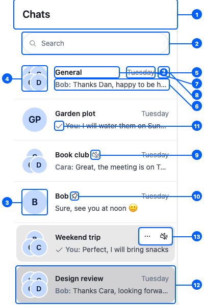
This is the default channel list, with six channels. Its parts:
| Part | Explained in |
|---|---|
| 1. The header | Header |
| 2. The search bar | Search |
| 3. The channel image | Channel previews |
| 4. The group member avatars | Channel previews |
| 5. The title | Channel previews |
| 6. The last message | Channel previews |
| 7. The last message's time | Channel previews |
| 8. The unread count | Channel previews |
| 9. The muted icon | Channel previews |
| 10. The pinned icon | Channel previews |
| 11. The sent, delivered or read mark | Channel previews |
| 12. The open channel, highlighted | Channel previews |
| 13. The actions menu, on hover | Channel preview actions |
The ChannelList component
<ChannelList paginator={paginator} /> renders the channels of one paginator:
- When it mounts and the paginator has no loaded page, it loads the first page, even when events already put channels into it. It does the same if the paginator is cleared later, for example by
client.disconnectUser(). After a reconnect, the channel manager reloads the channels already in the list itself, up to 150 per list; see Channel list paginators. - It subscribes to
paginator.stateand renders a channel preview for each channel. - When the user scrolls near the end, it loads the next page. Its props
loadMoreThresholdPx(how close to the end, in pixels) andloadMoreDebounceMs(how often the scroll position is checked) tune when. - It starts the channel manager's event subscriptions, so the list stays up to date as messages and other events arrive. Every list shares one set of subscriptions.
The list holds no selection. Clicking a channel preview calls openChannel(channel) from useWorkspaceNavigation(), and the layout decides where the channel opens. Without a layout, openChannel does nothing; see Navigation.
The paginator should be registered on client.channelManager. Registering is what keeps it live; Channel list paginators explains it.
Several lists
Two components render every registered list for you:
<ChannelLists/>renders one<ChannelList/>per paginator onclient.channelManager, in their order.<ChannelNavigation/>renders the list header, the search bar and<ChannelLists/>. While a search is active, the search results replace the lists.
Both name every list "Channel list", so a screen reader user can't tell the lists apart. To give each list its own name, place the lists yourself: render one <ChannelList/> per paginator and pass it listboxProps, with aria-label for a name, or aria-labelledby with the id of a visible heading. ChannelList props describes the prop.
Here is a TwoChannelLists component that renders an "Unread" list above the list of all channels, each named by its heading:
import { useEffect, useMemo } from "react";
import { ChannelPaginator } from "stream-chat";
import type { ChannelFilters, SortParamRequest } from "stream-chat";
import { ChannelList, useChatContext } from "stream-chat-react";

const userId = "YOUR_USER_ID";

const sort: SortParamRequest[] = [{ direction: -1, field: "last_message_at" }];
const allFilters: ChannelFilters = {
  members: { $in: [userId] },
  type: "messaging",
};
const unreadFilters: ChannelFilters = { ...allFilters, has_unread: true };

export const TwoChannelLists = () => {
  const { client } = useChatContext();

  const [unread, all] = useMemo(
    () => [
      new ChannelPaginator({
        client,
        filters: unreadFilters,
        id: "unread",
        sort,
      }),
      new ChannelPaginator({ client, filters: allFilters, id: "all", sort }),
    ],
    [client],
  );

  // Registered lists are kept up to date by the channel manager.
  useEffect(() => {
    client.channelManager.insertPaginator({ paginator: unread });
    client.channelManager.insertPaginator({ paginator: all });
    return () => {
      client.channelManager.removePaginator(unread);
      client.channelManager.removePaginator(all);
    };
  }, [all, client, unread]);

  return (
    <div className="sidebar">
      <h2 id="unread-channels-heading">Unread</h2>
      <ChannelList
        listboxProps={{ "aria-labelledby": "unread-channels-heading" }}
        paginator={unread}
      />
      <h2 id="all-channels-heading">All channels</h2>
      <ChannelList
        listboxProps={{ "aria-labelledby": "all-channels-heading" }}
        paginator={all}
      />
    </div>
  );
};
A channel can match both lists. The channel manager decides which lists keep it; see Channels that match several paginators.
Channel previews
Each channel preview is a <ChannelListItem/>. It reads its channel's stores, so a channel preview re-renders only when its own channel changes. It passes what it reads to ChannelListItemUI, the channel preview's look, as props:
| The channel preview shows | Prop | Read from |
|---|---|---|
| Title and image | displayTitle, displayImage |
channel.state: data and members |
| Group member avatars | groupChannelDisplayInfo |
channel.state: members, only for channels with more than 2 members |
| Last message and its time | previewedMessage |
channel.messagePaginator.aggregateState: latestMessage |
| Unread count | unread |
channel.state: read[userId].unread_messages, 0 while the channel is muted |
| Muted icon | muted |
channel.state: muteStatus |
| Pinned icon | pinned |
channel.state: membership.pinned_at |
| Sent, delivered or read mark | messageDeliveryStatus |
channel.messageReceiptsTracker, only for the user's own message |
| Highlight | active |
isChannelActive(cid) from useWorkspaceNavigation(): the channel is open |
A ChannelListItemUI of your own receives these props, as in the example in Replacing parts and in Preview UI.
Clicking a channel preview opens the channel and passes the click event on, so a layout can open it beside the current one on ⌘/ctrl-click. See ⌘/ctrl-click opens beside.
A channel preview shows the channel's latest message by default. To show another one, pass it to <ChannelListItem/> as previewedMessage. The search results do this: a message search result renders a channel preview of the message's channel, with the matched message in place of the latest one.
The channel of a channel preview
A ChannelListItemUI receives its channel as the channel prop. The components it renders, at any depth, retrieve the same channel with useChannelListItemContext(), so you don't pass it down:
import type { ChannelStateData } from "stream-chat";
import { useChannelListItemContext, useStateStore } from "stream-chat-react";

const memberCountSelector = ({ memberCount }: ChannelStateData) => ({
  memberCount,
});

// Rendered anywhere inside a channel preview.
export const MemberCount = () => {
  const { channel } = useChannelListItemContext();
  // Subscribes to the channel's state, so the count follows member changes.
  const { memberCount } = useStateStore(channel.state, memberCountSelector);

  return <span className="member-count">{memberCount} members</span>;
};
useChannel() doesn't work here: a channel preview isn't inside a <Channel/>, so it throws.
Header
<ChannelListHeader/> shows the "Chats" title. <ChannelNavigation/> renders it above the lists, without props. <ChannelListHeader/> takes two props, both components with no default:
| Prop | Renders |
|---|---|
StartContent |
before the title |
EndContent |
after the title, such as a sidebar toggle |
Each one renders whenever it's set. To pass them, register a component under the ChannelListHeader key that renders <ChannelListHeader/> with them:
import { ChannelListHeader, useWorkspaceNavigation } from "stream-chat-react";

// SidebarToggle stands for a control of your own.
const SidebarToggle = () => <button type="button">Menu</button>;

// The toggle, only while a channel is open. With nothing open, collapsing the sidebar would
// leave an empty screen.
const SidebarToggleWhileChannelOpen = () => {
  const { openChannels } = useWorkspaceNavigation();
  return openChannels.length > 0 ? <SidebarToggle /> : null;
};

const ChannelListHeaderWithToggle = () => (
  <ChannelListHeader EndContent={SidebarToggleWhileChannelOpen} />
);

// Declared once, so WithComponents gets the same object on every render.
export const overrides = { ChannelListHeader: ChannelListHeaderWithToggle };
The thread list header takes the same props; see Thread list UI → Header.
Channel preview actions
Each channel preview has an actions menu, <ChannelListItemActionButtons/>: a mute button, and a dropdown with the other actions. An action the user can't take is left out:
| Action | Where | What it does | Shown when |
|---|---|---|---|
| Mute / Unmute | button | Channel.mute() or Channel.unmute() |
the user has the mute-channel capability |
| Archive / Unarchive | dropdown | Channel.archive() or Channel.unarchive() |
the user is a member of the channel |
| Block User / Unblock User | dropdown | Channel.banUser() or Channel.unbanUser() on the other member |
the channel is a direct message (2 members, one of them the user) and the user has the ban-channel-members capability |
| Pin / Unpin | dropdown | Channel.pin() or Channel.unpin() |
the user is a member of the channel |
| Leave | dropdown | Channel.removeMembers() with the user's id |
the user has the leave-channel capability |
The menu is an action set with no prop, so you change it by replacing <ChannelListItemActionButtons/>; Channel-list row actions shows how.
Loading, empty and error states
<ChannelList/> shows a state of its own while the first page loads, when it fails, while the next page loads, and when it has no channels. List states UI lists each state's default and <WithComponents/> key, and explains what happens when a query fails.
Replacing parts
Register replacements with <WithComponents/>. Overriding components explains how overrides apply.
Component to override (<WithComponents/> key) |
Replaces |
|---|---|
ListItem |
The whole channel preview, including its click handling. Your component receives the channel as its item prop: ({ item }: { item: Channel }) => …. The default renders <ChannelListItem channel={item} />. |
ChannelListItemUI |
The channel preview's look. Gets the props in Channel previews. |
SummarizedMessagePreview |
The last-message line of a channel preview |
ChannelListItemActionButtons |
The channel preview actions menu |
ChannelListHeader |
The header that <ChannelNavigation/> renders. To keep the default and add content, see Header |
Search |
The search bar and results in <ChannelNavigation/> |
FirstPageLoadingIndicator, ListLoadErrorIndicator, LoadingNextPageIndicator, EmptyListIndicator, EndReachedIndicator |
The loading, error, empty and end-of-list states; see List states UI |
Here is a Sidebar component that renders <ChannelNavigation/> with two replacements: a channel preview that keeps the default look and adds a "Frozen" label to frozen channels, and an empty state of its own:
import type { ChannelStateData } from "stream-chat";
import type { ChannelListItemUIProps } from "stream-chat-react";
import {
  ChannelListItemUI,
  ChannelNavigation,
  useStateStore,
  WithComponents,
} from "stream-chat-react";

const frozenSelector = ({ data }: ChannelStateData) => ({
  frozen: !!data?.frozen,
});

const RowWithFrozenLabel = (props: ChannelListItemUIProps) => {
  const { frozen } = useStateStore(props.channel.state, frozenSelector);

  return (
    <div className="channel-row">
      <ChannelListItemUI {...props} />
      {frozen && <span className="channel-row__label">Frozen</span>}
    </div>
  );
};

const NoChannels = () => (
  <p className="no-channels">You aren't in any channels yet.</p>
);

// Declared outside the component, so WithComponents gets the same object on every render.
const overrides = {
  ChannelListItemUI: RowWithFrozenLabel,
  EmptyListIndicator: NoChannels,
};

export const Sidebar = () => (
  <WithComponents overrides={overrides}>
    <ChannelNavigation />
  </WithComponents>
);
The label reads frozen from channel.state through useStateStore, so it updates when the channel is frozen. Reading channel.data.frozen during render would not: the getter isn't reactive. See Reading state in components.