# Product card
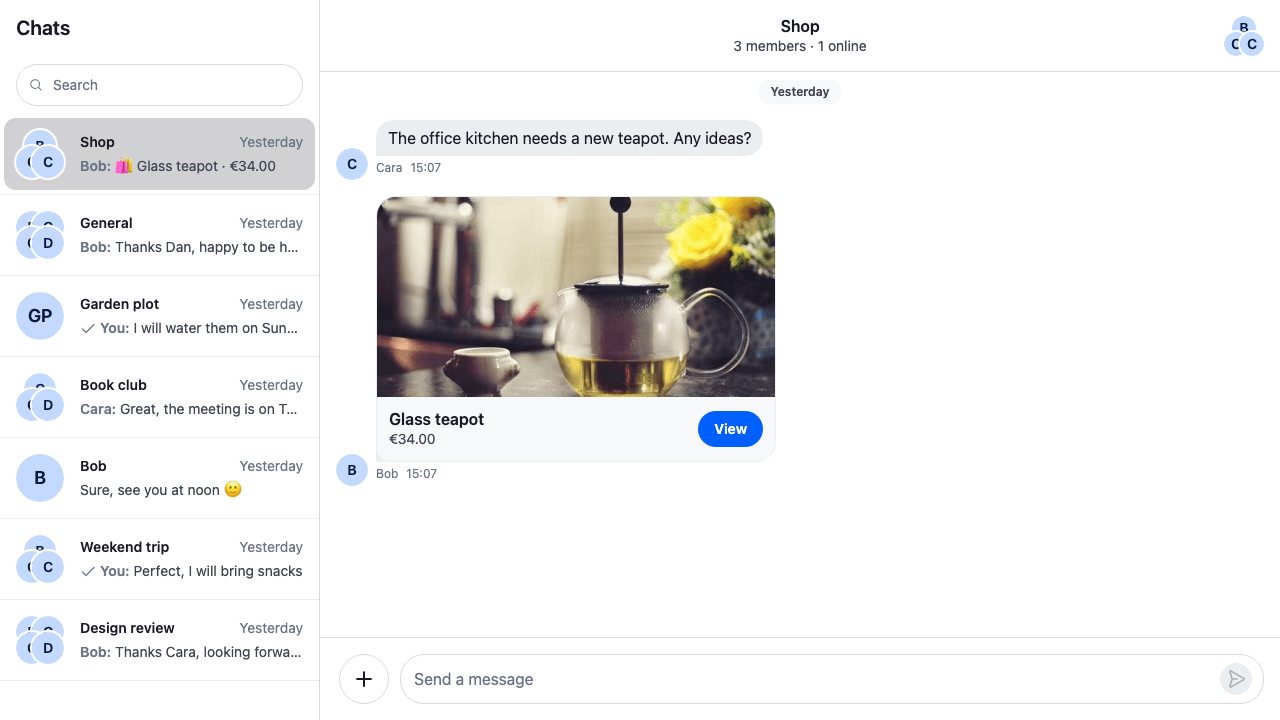
A product card is an attachment type of your own: a `product` attachment that carries a product's name, price, picture and link. This recipe adds it everywhere an attachment shows up. How the SDK handles attachments in general is on [Attachments and uploads](https://getstream.io/chat/docs/sdk/react/features/rich-content/attachments-and-uploads/).
>
> **Note:** **What you'll build**
>
> - An Attach product entry with a product picker
> - A product preview above the input
> - A product card in the message list
> - A one-line product summary in the channel list and quoted replies
>
---
**Preview**
---
**Approach:** Replace one part. [Choosing where to start](https://getstream.io/chat/docs/sdk/react/ui-cookbooks/overview/#choosing-where-to-start) explains the approaches.
**Starts from:** [the base app](https://getstream.io/chat/docs/sdk/react/ui-cookbooks/overview/#the-base-app). The page shows only what the recipe adds.
The recipe replaces six `ComponentContext` keys, each wrapping the SDK's default and handing everything that isn't a product back to it. The composer keeps the product in its attachment manager and sends it like any other attachment, also when the message is edited or saved as a draft.
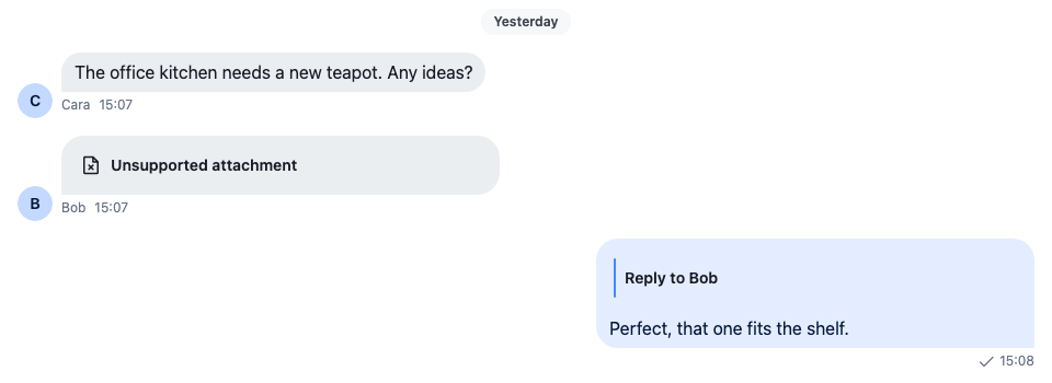
Without it, the SDK doesn't know the type. The message shows "Unsupported attachment", and a reply quoting it shows no content:
---
**Without registering the type**
---
## Best practices
- Give the type a name of its own, `product`, and keep its fields in the attachment's `custom`. Type them by extending `CustomAttachmentData`.
- Don't set `title_link` or `og_scrape_url` on the attachment. Either one makes it a link preview, rendered by `Card`, and the custom renderer never sees it. Keep the product link in `custom`.
- Branch on the type in each override and render the SDK's default for everything else, so files, images and link previews keep working.
- Give an attachment added in code only a `localMetadata.id`. With no file and no `uploadState`, the composer sends it as it is.
- Describe the product in text wherever the SDK shows a message as one line: the channel list and quoted replies.
## The attachment type
A `product` attachment uses the attachment's own fields where they fit, `title` and `image_url`, and keeps the rest in `custom`: the price, its currency and the link to the product page. `CustomAttachmentData` types `custom` for every attachment, so the fields are optional. [Data conventions](https://getstream.io/chat/docs/sdk/react/state/state-and-entities/data-conventions/#custom-data-types) explains the custom data interfaces.
The file also has the helpers every part below uses: a check for the type, the price formatted in its currency, a one-line description, and the composer attachment for a product.
```ts title="src/product.ts"
import type { Attachment, LocalAttachment } from "stream-chat";
declare module "stream-chat" {
// The fields a `product` attachment keeps in its `custom`. Optional, because every attachment
// in the app shares this interface.
interface CustomAttachmentData {
currency?: string;
price?: number;
product_url?: string;
}
}
export const PRODUCT_ATTACHMENT_TYPE = "product";
export type Product = {
currency: string;
id: string;
imageUrl: string;
price: number;
title: string;
url: string;
};
/** True for an attachment this app sends for a product. */
export const isProductAttachment = (attachment: Attachment) =>
attachment.type === PRODUCT_ATTACHMENT_TYPE;
/** The message's first product attachment, if it has one. */
export const findProductAttachment = (message: {
attachments?: Attachment[];
}) => message.attachments?.find(isProductAttachment);
/** The price in its currency, for example "€34.00". */
export const formatPrice = ({
currency,
price,
}: {
currency?: string;
price?: number;
}) =>
price === undefined || !currency
? ""
: new Intl.NumberFormat(undefined, { currency, style: "currency" }).format(
price,
);
/** One line for places that show text only, for example "🛍 Glass teapot · €34.00". */
export const describeProduct = (attachment: Attachment) =>
[`🛍 ${attachment.title ?? "Product"}`, formatPrice(attachment.custom)]
.filter(Boolean)
.join(" · ");
/** The attachment the composer adds for a product. It has nothing to upload, so it needs only an id. */
export const toProductAttachment = (product: Product): LocalAttachment => ({
custom: {
currency: product.currency,
price: product.price,
product_url: product.url,
},
image_url: product.imageUrl,
localMetadata: { id: crypto.randomUUID() },
title: product.title,
type: PRODUCT_ATTACHMENT_TYPE,
});
```
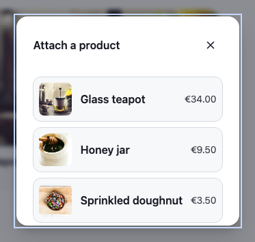
The picker offers a short, fixed list of products. An app would load them from its shop:
```ts title="src/catalogue.ts"
import type { Product } from "./product";
/** The products the picker offers. An app would load them from its shop. */
export const catalogue: Product[] = [
{
currency: "EUR",
id: "glass-teapot",
imageUrl: "https://picsum.photos/id/225/480/360",
price: 34,
title: "Glass teapot",
url: "https://example.com/shop/glass-teapot",
},
{
currency: "EUR",
id: "honey-jar",
imageUrl: "https://picsum.photos/id/312/480/360",
price: 9.5,
title: "Honey jar",
url: "https://example.com/shop/honey-jar",
},
{
currency: "EUR",
id: "sprinkled-doughnut",
imageUrl: "https://picsum.photos/id/488/480/360",
price: 3.5,
title: "Sprinkled doughnut",
url: "https://example.com/shop/sprinkled-doughnut",
},
];
```
A product attachment, as the message carries it:
```json
{
"type": "product",
"title": "Glass teapot",
"image_url": "https://picsum.photos/id/225/480/360",
"custom": {
"currency": "EUR",
"price": 34,
"product_url": "https://example.com/shop/glass-teapot"
}
}
```
## Adding a product from the composer
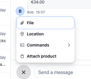
The attachment menu is an action set passed to `AttachmentSelector`. This one keeps the default actions and adds "Attach product" at the end. Its `ActionButton` opens the action's `ModalContent`, the picker, through `openModalForAction()`. Picking a product adds it to the composer with `AttachmentManager.upsertAttachments()` and closes the modal:
```tsx label="React" title="src/ProductPicker.tsx"
import type {
AttachmentSelectorAction,
AttachmentSelectorActionProps,
AttachmentSelectorModalContentProps,
} from "stream-chat-react";
import {
AttachmentSelector,
ContextMenuButton,
createIcon,
defaultAttachmentSelectorActionSet,
Prompt,
useContextMenuContext,
useMessageComposerController,
} from "stream-chat-react";
import { catalogue } from "./catalogue";
import type { Product } from "./product";
import { formatPrice, toProductAttachment } from "./product";
import "./ProductPicker.css";
export const ATTACH_PRODUCT_ACTION = "attachProduct";
const IconBag = createIcon(
"IconBag",
,
);
/** The menu item: opens the picker in the selector's modal. */
export const AttachProductButton = ({
openModalForAction,
}: AttachmentSelectorActionProps) => {
const { closeMenu } = useContextMenuContext();
return (
{
openModalForAction(ATTACH_PRODUCT_ACTION);
closeMenu();
}}
>
Attach product
);
};
/** The modal's content: picking a product adds it to the composer and closes the modal. */
export const ProductPicker = ({
close,
}: AttachmentSelectorModalContentProps) => {
const messageComposer = useMessageComposerController();
return (
{catalogue.map((product: Product) => (
))}
);
};
// Declared once: the selector filters its actions again whenever it gets a new list.
const attachmentSelectorActionSet: AttachmentSelectorAction[] = [
...defaultAttachmentSelectorActionSet,
{
ActionButton: AttachProductButton,
ModalContent: ProductPicker,
type: ATTACH_PRODUCT_ACTION,
},
];
export const ProductAttachmentSelector = () => (
);
```
```css label="CSS" title="src/ProductPicker.css"
@layer stream-overrides {
.cookbook-product-picker__list {
display: flex;
flex-direction: column;
gap: var(--str-chat__spacing-xs);
margin: 0;
padding: 0;
list-style: none;
}
.cookbook-product-picker__item {
display: flex;
align-items: center;
gap: var(--str-chat__spacing-sm);
width: 100%;
padding: var(--str-chat__spacing-xs);
border: 1px solid var(--str-chat__border-core-default);
border-radius: var(--str-chat__radius-lg);
background: var(--str-chat__background-core-surface-card);
color: var(--str-chat__text-primary);
text-align: start;
cursor: pointer;
}
.cookbook-product-picker__item:hover {
background: var(--str-chat__background-utility-hover);
}
.cookbook-product-picker__image {
width: 48px;
height: 48px;
border-radius: var(--str-chat__radius-md);
object-fit: cover;
}
.cookbook-product-picker__title {
flex: 1;
font: var(--str-chat__font-body-emphasis);
}
.cookbook-product-picker__price {
color: var(--str-chat__text-secondary);
font: var(--str-chat__font-caption-default);
}
}
```
---
**The attachment menu**
---
**The product picker**
---
`createIcon()` makes the bag icon, sized like the SDK's own icons. The selector filters the built-in action types, such as `uploadFile` and `createPoll`; an action with a type of its own, `attachProduct` here, is always shown. [Attachment Selector](https://getstream.io/chat/docs/sdk/react/component-reference/message-composer/attachment-selector/) lists the action fields and the selector's props.
A product has nothing to upload, so `toProductAttachment()` gives it a `localMetadata.id` and no file or `uploadState`. The composer sends such an attachment as it is, and it doesn't count toward the file limit (`messageComposer.attachments.maxNumberOfFilesPerMessage`). The `localMetadata.id` is new for every pick, so the preview can remove it.
## Its preview in the composer
The composer's `AttachmentPreviewList` sends an attachment of a type it doesn't know to its `UnsupportedAttachmentPreview`. This one renders a product as a small card with the picture, the title and the price, and passes every other attachment to the default:
```tsx label="React" title="src/ProductAttachmentPreview.tsx"
import type { UnsupportedAttachmentPreviewProps } from "stream-chat-react";
import {
AttachmentPreviewList,
RemoveAttachmentPreviewButton,
UnsupportedAttachmentPreview,
} from "stream-chat-react";
import { formatPrice, isProductAttachment } from "./product";
import "./ProductAttachmentPreview.css";
const ProductOrUnsupportedPreview = (
props: UnsupportedAttachmentPreviewProps,
) => {
const { attachment, removeAttachments } = props;
if (!isProductAttachment(attachment)) {
return ;
}
return (
);
};
export const ProductAttachmentPreviewList = () => (
);
```
```css label="CSS" title="src/ProductAttachmentPreview.css"
@layer stream-overrides {
.cookbook-product-preview {
position: relative;
display: flex;
align-items: center;
gap: var(--str-chat__spacing-sm);
min-width: 220px;
padding: var(--str-chat__spacing-xs);
padding-inline-end: var(--str-chat__spacing-lg);
border: 1px solid var(--str-chat__border-core-default);
border-radius: var(--str-chat__radius-lg);
background: var(--str-chat__background-core-surface-card);
}
.cookbook-product-preview__image {
width: 48px;
height: 48px;
border-radius: var(--str-chat__radius-md);
object-fit: cover;
}
.cookbook-product-preview__details {
display: flex;
flex-direction: column;
min-width: 0;
}
.cookbook-product-preview__title {
overflow: hidden;
color: var(--str-chat__text-primary);
font: var(--str-chat__font-caption-emphasis);
text-overflow: ellipsis;
white-space: nowrap;
}
.cookbook-product-preview__price {
color: var(--str-chat__text-secondary);
font: var(--str-chat__font-caption-default);
}
}
```
---
**A product in the composer**

---
`RemoveAttachmentPreviewButton` is the SDK's ✕. It places itself on the top corner of the nearest positioned element, which is why the card is `position: relative`. Its `aria-label` names what it removes. The [Attachment previews recipe](https://getstream.io/chat/docs/sdk/react/ui-cookbooks/composer/attachment-previews/) covers the other previews.
## Rendering it in the message list
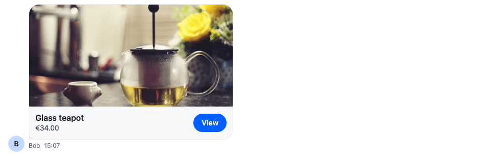
`Attachment` sorts a message's attachments into groups. A `product` attachment is none of the kinds it knows, so it goes to its `UnsupportedAttachment`. This card renders the product with a View link that opens the product page in a new tab:
```tsx label="React" title="src/ProductCard.tsx"
import type {
AttachmentProps,
UnsupportedAttachmentProps,
} from "stream-chat-react";
import { Attachment, UnsupportedAttachment } from "stream-chat-react";
import { formatPrice, isProductAttachment } from "./product";
import "./ProductCard.css";
const ProductOrUnsupported = ({ attachment }: UnsupportedAttachmentProps) => {
if (!isProductAttachment(attachment)) return ;
const { product_url } = attachment.custom;
return (
);
};
export const ProductAttachment = (props: AttachmentProps) => (
);
```
```css label="CSS" title="src/ProductCard.css"
@layer stream-overrides {
.cookbook-product-card {
overflow: hidden;
border-radius: var(--str-chat__radius-lg);
background: var(--str-chat__background-core-surface-card);
color: var(--str-chat__text-primary);
}
.cookbook-product-card__image {
display: block;
width: 100%;
height: 200px;
object-fit: cover;
}
.cookbook-product-card__body {
display: flex;
align-items: center;
gap: var(--str-chat__spacing-sm);
padding: var(--str-chat__spacing-sm);
}
.cookbook-product-card__details {
display: flex;
flex: 1;
flex-direction: column;
min-width: 0;
}
.cookbook-product-card__title {
font: var(--str-chat__font-body-emphasis);
}
.cookbook-product-card__price {
color: var(--str-chat__text-secondary);
font: var(--str-chat__font-caption-default);
}
.cookbook-product-card__link {
padding: var(--str-chat__spacing-xs) var(--str-chat__spacing-md);
border-radius: var(--str-chat__radius-max);
background: var(--str-chat__accent-primary);
color: var(--str-chat__text-on-accent);
font: var(--str-chat__font-caption-emphasis);
text-decoration: none;
}
.cookbook-product-card__link:focus-visible {
outline: 2px solid var(--str-chat__accent-primary);
outline-offset: 2px;
}
}
```
---
**The product card in a message**
---
The card fills the attachment's container, which the SDK makes `--str-chat__attachment-max-width` wide, as it does for files and link previews. The link's visible text is "View" and its accessible name is "View Glass teapot", so a screen reader tells several cards apart. [Change how attachments render](https://getstream.io/chat/docs/sdk/react/features/rich-content/attachments-and-uploads/#change-how-attachments-render) lists every renderer `Attachment` takes.
## The channel list's last-message preview
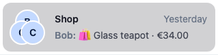
The channel list shows a channel's last message in one line, built by `useLatestMessagePreview()`. For an attachment type it doesn't know, that line is "Unsupported attachment". This preview, set on the `SummarizedMessagePreview` key, describes the product instead and keeps the sender in front, as the default does:
```tsx label="React" title="src/ProductMessagePreview.tsx"
import type { SummarizedMessagePreviewProps } from "stream-chat-react";
import {
SummarizedMessagePreview,
useLatestMessagePreview,
} from "stream-chat-react";
import { describeProduct, findProductAttachment } from "./product";
import "./ProductMessagePreview.css";
export const ProductMessagePreview = (props: SummarizedMessagePreviewProps) => {
// The sender prefix the default preview shows: "You", or the sender's name in a group.
const { senderName } = useLatestMessagePreview(props);
const product =
props.latestMessage && findProductAttachment(props.latestMessage);
if (!product) return ;
return (
);
};
```
```css label="CSS" title="src/ProductMessagePreview.css"
@layer stream-overrides {
.cookbook-product-message-preview {
display: flex;
gap: var(--str-chat__spacing-xxs);
min-width: 0;
color: var(--str-chat__text-secondary);
font: var(--str-chat__font-caption-default);
}
.cookbook-product-message-preview__sender {
flex-shrink: 0;
color: var(--str-chat__text-tertiary);
font: var(--str-chat__font-caption-emphasis);
}
.cookbook-product-message-preview__text {
flex: 1;
min-width: 0;
overflow: hidden;
text-overflow: ellipsis;
white-space: nowrap;
}
}
```
---
**The channel list row**
---
`useLatestMessagePreview()` returns the sender's name, "You" for the user's own messages, or nothing in a direct message. The delivery status of the user's own messages isn't shown in this preview. The [Preview UI recipe](https://getstream.io/chat/docs/sdk/react/ui-cookbooks/channel-list/preview-ui/) replaces the whole row.
## Quoted replies
A reply that quotes a message shows the quoted message above its own text, in the message list and in the composer while the user writes it. `QuotedMessagePreviewUI` renders both. It shows the quoted message's text, or a label and a thumbnail for the attachment types it knows, such as "Photo"; a product message has neither, so the quote is empty.
These two overrides give the quoted product message a text before passing it to `QuotedMessagePreviewUI`: `QuotedMessage` for the quote in the message list, and `QuotedMessagePreview` for the one above the composer's input:
```tsx title="src/ProductQuotedMessage.tsx"
import type {
LocalMessage,
MessageComposerState,
MessageResponse,
} from "stream-chat";
import type {
QuotedMessagePreviewProps,
QuotedMessageProps,
} from "stream-chat-react";
import {
QuotedMessagePreview,
QuotedMessagePreviewUI,
useMessageComposerController,
useMessageContext,
useMessagePaginator,
useStateStore,
} from "stream-chat-react";
import { describeProduct, findProductAttachment } from "./product";
/**
* The quoted preview shows the message's text, or a label for the attachment types it knows. A
* product message has no text, so it gets one to show.
*/
const withProductText = (
message: T,
): T => {
const product = findProductAttachment(message);
return product && !message.text
? { ...message, text: describeProduct(product) }
: message;
};
/** The quote above a reply in the message list. */
export const ProductQuotedMessage = ({
renderText: propsRenderText,
}: QuotedMessageProps) => {
const { message, renderText: contextRenderText } = useMessageContext();
const messagePaginator = useMessagePaginator();
const quotedMessage = message.quoted_message;
if (!quotedMessage) return null;
return (
{
event.preventDefault();
event.stopPropagation();
void messagePaginator.jumpToMessage(quotedMessage.id);
}}
quotedMessage={withProductText(quotedMessage)}
renderText={propsRenderText ?? contextRenderText}
/>
);
};
const quotedMessageSelector = ({ quotedMessage }: MessageComposerState) => ({
quotedMessage,
});
/** The quote above the composer's input while the user writes a reply. */
export const ProductQuotedMessagePreview = (
props: QuotedMessagePreviewProps,
) => {
const messageComposer = useMessageComposerController();
const { quotedMessage } = useStateStore(
messageComposer.state,
quotedMessageSelector,
);
if (!quotedMessage || !findProductAttachment(quotedMessage)) {
return ;
}
return (
// The SDK's slot class keeps the quote placed as the default preview places it.
);
};
```
---
**A reply quoting the product**

---
**Quoting the product in the composer**

---
The text is changed only on the copy passed to the preview; the message itself stays as it is. `ProductQuotedMessage` renders text with the `renderText` it's given, or the message context's, as the default `QuotedMessage` does. Clicking the quote in the message list jumps to the quoted message with `MessagePaginator.jumpToMessage()`, as the default does. In the composer, the ✕ removes the quote with `MessageComposer.setQuotedMessage(null)`. A quoted message that isn't a product goes to the default `QuotedMessagePreview`.
## Putting it together
Register every part under its key, and wrap `ChatView`, or a single `Channel`, in `WithProductAttachments`:
```tsx title="src/WithProductAttachments.tsx"
import type { PropsWithChildren } from "react";
import { WithComponents } from "stream-chat-react";
import { ProductAttachmentPreviewList } from "./ProductAttachmentPreview";
import { ProductAttachment } from "./ProductCard";
import { ProductMessagePreview } from "./ProductMessagePreview";
import { ProductAttachmentSelector } from "./ProductPicker";
import {
ProductQuotedMessage,
ProductQuotedMessagePreview,
} from "./ProductQuotedMessage";
// Declared once, so WithComponents gets the same object on every render.
const overrides = {
Attachment: ProductAttachment,
AttachmentPreviewList: ProductAttachmentPreviewList,
AttachmentSelector: ProductAttachmentSelector,
QuotedMessage: ProductQuotedMessage,
QuotedMessagePreview: ProductQuotedMessagePreview,
SummarizedMessagePreview: ProductMessagePreview,
};
export const WithProductAttachments = ({ children }: PropsWithChildren) => (
{children}
);
```
## How it works
>
> **Info:** **Example**
>
> The user opens the Shop channel and sends a honey jar:
>
> 1. The user opens the attachment menu with the + button and picks Attach product. `AttachmentSelector` renders the picker in its modal.
> 2. The user picks the honey jar. `AttachmentManager.upsertAttachments()` adds a `product` attachment, with only a `localMetadata.id`, to `messageComposer.attachmentManager`.
> 3. `AttachmentPreviewList` renders it with `ProductOrUnsupportedPreview`, since its type is unknown to the list.
> 4. The user sends. The composer's attachments middleware adds the finished uploads and the attachments with nothing to upload, such as the product, to the message, without their `localMetadata`. The server stores the product's `custom` with it.
> 5. The message list renders the message's attachments with `Attachment`, which sends the product to `ProductOrUnsupported`.
> 6. The channel's last message is now the product message, so its row in the channel list reads "You: 🛍 Honey jar · €9.50".
> 7. When Bob replies quoting it, the quote reads "🛍 Honey jar · €9.50".
> 8. The user edits the message's text. The composer loads the product back with only a `localMetadata.id`, and the attachments middleware keeps it in the update.
>
Every override branches on `attachment.type` and hands other attachments, and messages without a product, to the SDK's default, so the rest of the app looks as before.
## Related
- [Attachments and uploads](https://getstream.io/chat/docs/sdk/react/features/rich-content/attachments-and-uploads/): how attachments are added, uploaded and rendered.
- [Attachment previews](https://getstream.io/chat/docs/sdk/react/ui-cookbooks/composer/attachment-previews/): the composer's previews, one kind at a time.
- [Attachment Selector](https://getstream.io/chat/docs/sdk/react/component-reference/message-composer/attachment-selector/): the attachment menu's props and action set.
- [Attachments](https://getstream.io/chat/docs/sdk/react/component-reference/message/attachments/): the `Attachment` props.
- [Actions](https://getstream.io/chat/docs/sdk/react/ui/components/actions/#attachment-selector-actions): how action sets work.
- [Data conventions](https://getstream.io/chat/docs/sdk/react/state/state-and-entities/data-conventions/#custom-data-types): typing custom fields.
- [Attachments](https://getstream.io/chat/docs/sdk/react/state/writing-messages/attachments/): the composer's attachment manager.
- [Quoted replies](https://getstream.io/chat/docs/sdk/react/features/messaging/quoted-replies/): how a reply quotes a message.
---
For the most recent version of this documentation, visit [https://getstream.io/chat/docs/sdk/react/ui-cookbooks/custom-attachments/product-card/](https://getstream.io/chat/docs/sdk/react/ui-cookbooks/custom-attachments/product-card/).