 React
React iOS
iOS Android
 Flutter
 Angular
 JavaScript
 Unity
Unity Unreal
 Node
Node Python
 Ruby
Ruby PHP
PHP Java
Java .NET
.NET Go
Go REST
REST<io.getstream.chat.android.ui.feature.messages.list.MessageListView
android:id="@+id/messageListView"
android:layout_height="match_parent"
android:layout_width="match_parent" />MessageListView
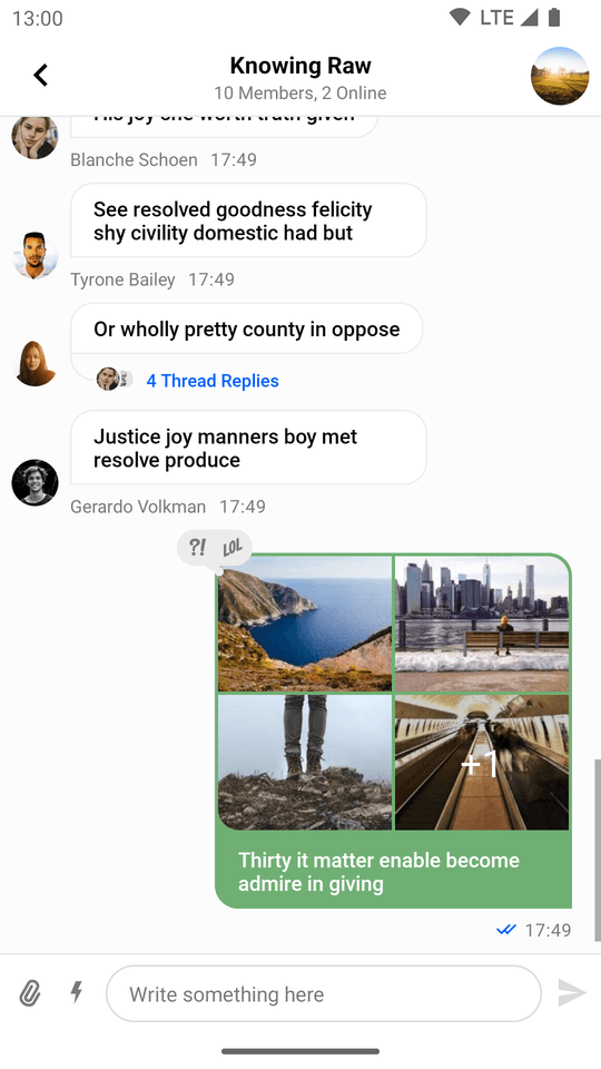
MessageListView is one of our core UI components, which displays a list of messages for the given channel. It contains the following list of possible items:
- Plain text message
- Text message with attachments (media or file)
- Deleted message placeholder
- Error message (for example inappropriate messages blocked by moderation)
- System message (for example when a user joins the channel)
- Giphy preview
- Date separator
- Loading more indicator
- Thread separator (for thread mode only)
- Typing indicator
You're able to customize the appearance of this component using custom attributes as well as method calls at runtime. MessageListView also contains a set of overridable action/option handlers and event listeners. By default, this component has the following appearance:
| Light Mode | Dark Mode |
|---|---|
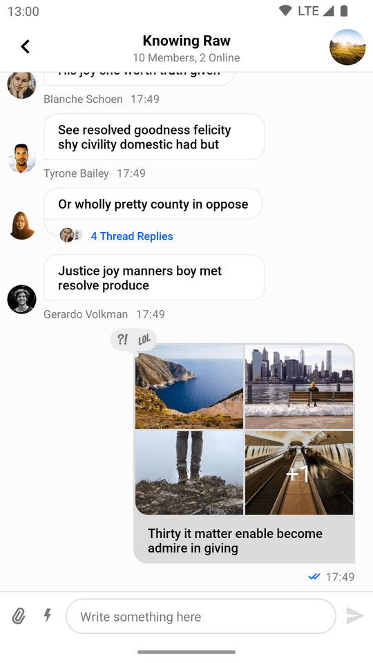 | 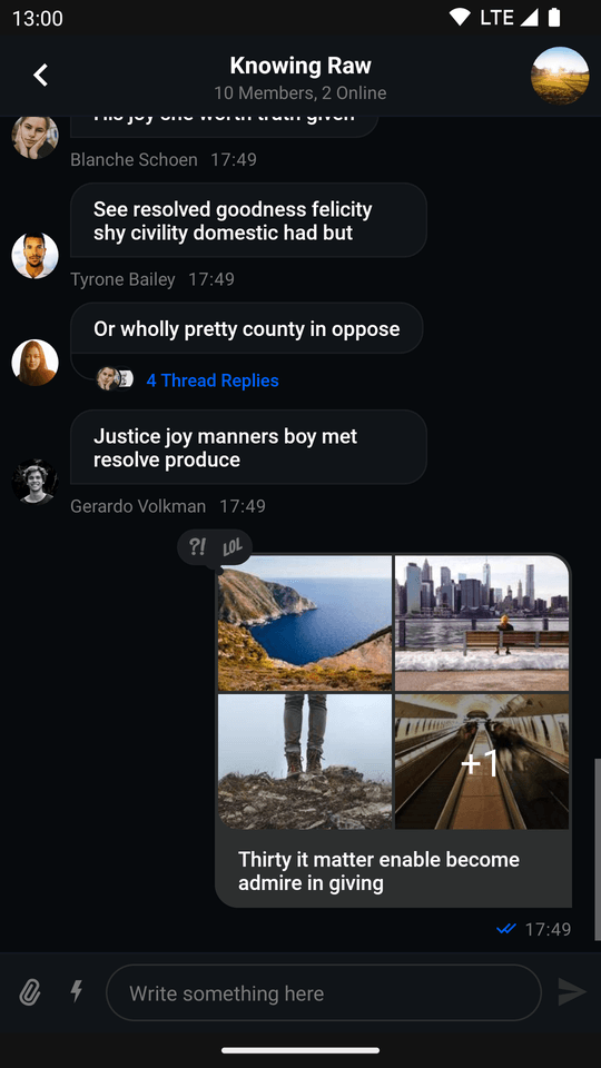 |
Usage
If you want to keep the default design and behavior of this component then getting started with it is very simple:
- Add the component to your XML layout hierarchy.
- Bind it to a
MessageListViewModel.
Adding MessageListView to your layout is as easy as inserting the following lines to your layout hierarchy:
The UI components library includes a ViewModel for MessageListView.
Binding it to the View is easily accomplished using an extension function called bindView:
// 1. Init ViewModel
val viewModel: MessageListViewModel by viewModels {
    ChannelViewModelFactory(context = requireContext(), cid = "messaging:123")
}

// 2. Bind View and ViewModel
viewModel.bindView(messageListView, lifecycleOwner)Handling Actions
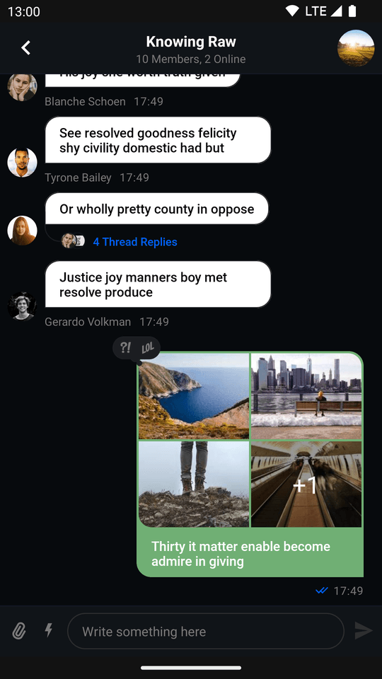
The MessageListView provides a set of actions which are activated by long pressing a message:
- Adding reactions
- Replying
- Replying in a thread
- Copying the message
- Editing the message
- Deleting the message
- Flagging the message
Certain actions are subject to how user permissions are setup. You can find them inside the Stream Dashboard.
Learn more about permissions here.
| Light Mode | Dark Mode |
|---|---|
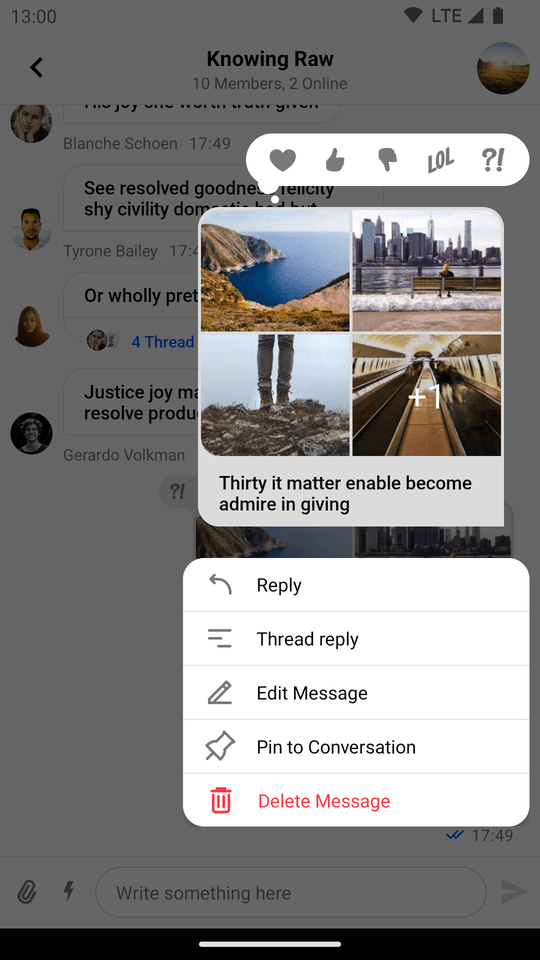 | 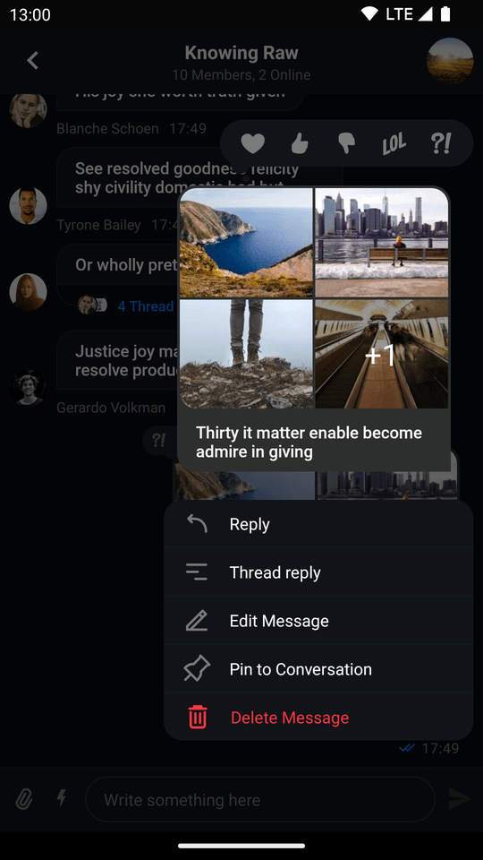 |
Default action handlers are set up when binding the ViewModel to the View.
You can customize the default behavior by overriding each of the following handlers:
messageListView.setLastMessageReadHandler {
    // Handle when last message got read
}
messageListView.setEndRegionReachedHandler {
    // Handle when end region reached
}
messageListView.setMessageEditHandler { message: Message ->
    // Handle when message is going to be edited
}
messageListView.setMessageDeleteHandler { message: Message ->
    // Handle when message is going to be deleted
}
messageListView.setThreadStartHandler { message: Message ->
    // Handle when new thread for message is started
}
messageListView.setMessageFlagHandler { message: Message ->
   // Handle when message is going to be flagged
}
messageListView.setMessagePinHandler { message: Message ->
    // Handle when message is going to be pinned
}
messageListView.setMessageUnpinHandler { message: Message ->
    // Handle when message is going to be unpinned
}
messageListView.setGiphySendHandler { giphyAction: GiphyAction ->
    // Handle when some giphyAction is going to be performed
}
messageListView.setMessageRetryHandler { message: Message ->
    // Handle when some failed message is going to be retried
}
messageListView.setMessageReactionHandler { message: Message, reactionType: String ->
    // Handle when some reaction for message is going to be sent
}
messageListView.setMessageReplyHandler { cid: String, message: Message ->
    // Handle when message is going to be replied in the channel with cid
}
messageListView.setAttachmentDownloadHandler {
    // Handle when attachment is going to be downloaded
}Handlers must be set before passing any data to MessageListView. If you're not using the default binding provided by bindView, please make sure to set up all the handlers yourself.
This section lists only some of the more important handlers, many more exist and you can find them inside MessageListView.
Listeners
In addition to the required handlers, MessageListView also provides optional listeners. They are also set by default if you use bindView.
You can always override them to get the event when something happens. Each listener returns a Boolean value - return true if you've handled the event and want to prevent default behavior, or false to allow the default behavior to proceed:
messageListView.setOnMessageClickListener { message: Message ->
    // Handle message being clicked
    // Return true to consume the event, false to allow default behavior
    true
}
messageListView.setOnEnterThreadListener { message: Message ->
    // Handle thread being entered
    true
}
messageListView.setOnAttachmentDownloadClickListener { attachment: Attachment ->
    // Handle clicks on the download attachment button
    true
}
messageListView.setOnUserReactionClickListener { message: Message, user: User, reaction: Reaction ->
    // Handle clicks on a reaction left by a user
    true
}
messageListView.setOnMessageLongClickListener { message: Message ->
    // Handle message being long clicked
    true
}
messageListView.setOnAttachmentClickListener { message: Message, attachment: Attachment ->
    // Handle attachment being clicked
    true
}
messageListView.setOnUserClickListener { user: User ->
    // Handle user avatar being clicked
    true
}Other available listeners for MessageListView can be found here.
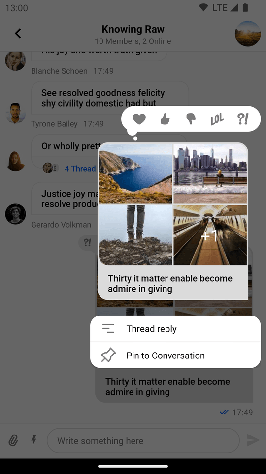
Previewing Attachments
Out-of-the-box previews are provided for the following attachment types: uploading, link, Giphy, image, video, and file.
Image and Video
Image and video attachments are previewed as thumbnails which can be displayed as a single tile or multiple ones depending on how many attachments are contained within the specific message.
In practice they appear as such:
| Video Thumbnails Enabled (Light Mode) | Video Thumbnails Enabled (Dark Mode) |
|---|---|
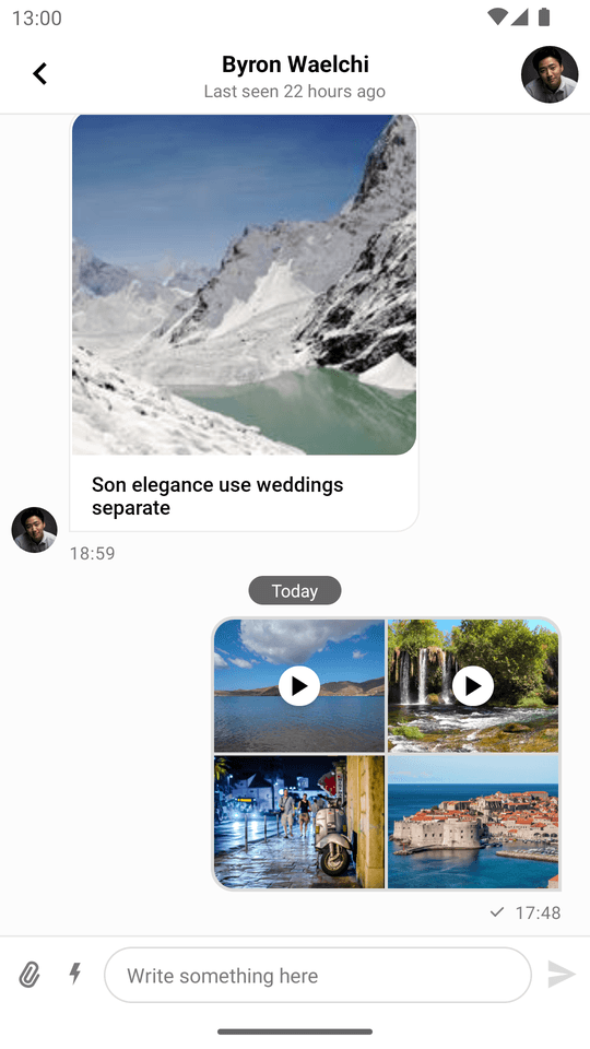 | 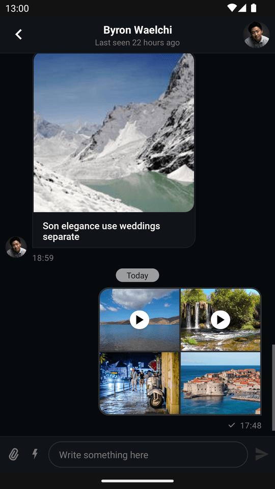 |
Video thumbnails are enabled by default but can be turned off by setting the ChatUI property videoThumbnailsEnabled to false. You can read more about disabling video thumbnails in the configuration documentation
Once video thumbnails are disabled, messages containing video attachments will be displayed in the following manner:
| Video Thumbnails Disabled (Light Mode) | Video Thumbnails Disabled (Dark Mode) |
|---|---|
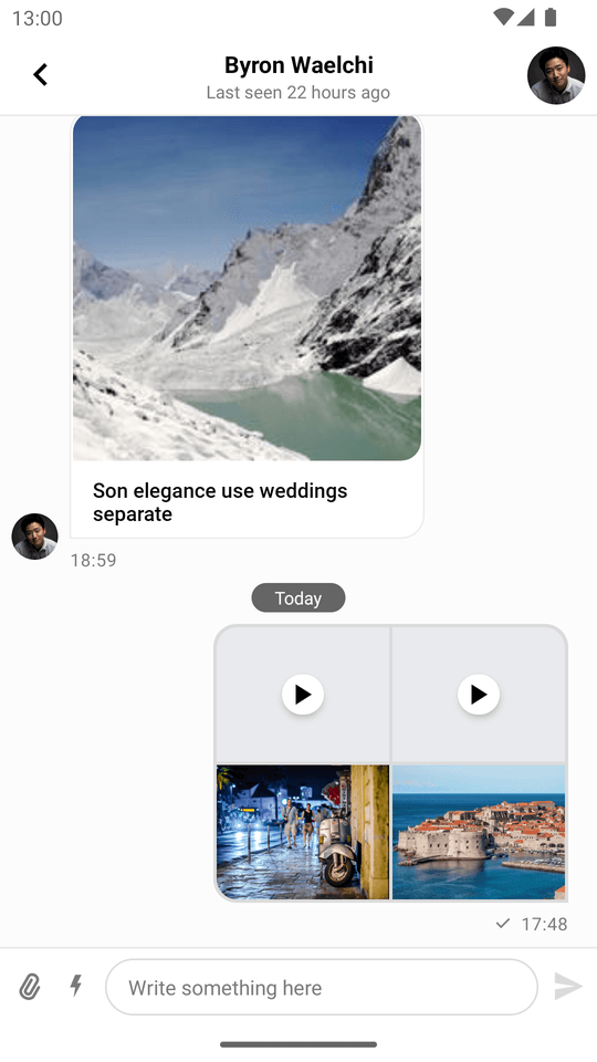 | 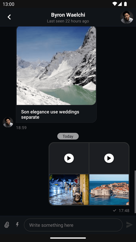 |
Customization
You can change the appearance of this component to fit your app's design requirements. These changes can be done either at compile-time through the use of XML attributes, or at runtime by using style transformations.
Using XML Attributes
MessageListView provides a large set of XML attributes available for customization. The complete list is available here.
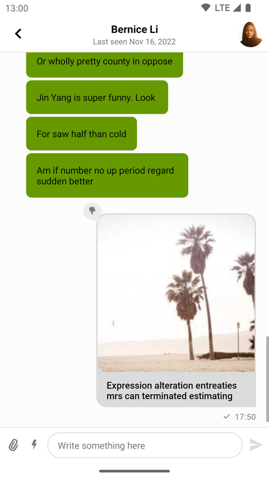
Let's consider an example in which we want to change the style of messages sent by the current user.
| Light Mode | Dark Mode |
|---|---|
 |  |
In order to do that, we need to add additional attributes to MessageListView:
<io.getstream.chat.android.ui.feature.messages.list.MessageListView
    android:clipToPadding="false"
    android:id="@+id/messageListView"
    android:layout_height="0dp"
    android:layout_marginHorizontal="0dp"
    android:layout_width="0dp"
    app:layout_constraintBottom_toTopOf="@+id/messageComposerView"
    app:layout_constraintEnd_toEndOf="parent"
    app:layout_constraintStart_toStartOf="parent"
    app:layout_constraintTop_toBottomOf="@+id/messagesHeaderView"
    app:streamUiMessageBackgroundColorMine="#70AF74"
    app:streamUiMessageBackgroundColorTheirs="#FFFFFF"
    app:streamUiMessageTextColorMine="#FFFFFF"
    app:streamUiMessageTextColorTheirs="#000000" />
Using Style Transformations
Both MessageListView and its ViewHolders can be configured programmatically (a list of supported customizations can be found here and here).
As an example, let's apply the green style from the previous section, but this time programmatically:
| Before | After |
|---|---|
| |
We are going to use a custom TransformStyle.messageListItemStyleTransformer:
TransformStyle.messageListItemStyleTransformer = StyleTransformer { defaultViewStyle ->
    defaultViewStyle.copy(
        messageBackgroundColorMine = Color.parseColor("#70AF74"),
        messageBackgroundColorTheirs = Color.WHITE,
        textStyleMine = defaultViewStyle.textStyleMine.copy(color = Color.WHITE),
        textStyleTheirs = defaultViewStyle.textStyleTheirs.copy(color = Color.BLACK),
    )
}The transformers should be set before the views are rendered to make sure that the new style was applied.
As another example, let's modify the default view which allows scrolling to the bottom when a new message arrives:
| Before | After |
|---|---|
 |  |
To achieve this effect we need to provide this custom TransformStyle.messageListStyleTransformer:
TransformStyle.messageListStyleTransformer = StyleTransformer { defaultViewStyle ->
    defaultViewStyle.copy(
        scrollButtonViewStyle = defaultViewStyle.scrollButtonViewStyle.copy(
            scrollButtonColor = Color.RED,
            scrollButtonUnreadEnabled = false,
            scrollButtonIcon = ContextCompat.getDrawable(requireContext(), R.drawable.stream_ui_ic_clock)!!,
        ),
    )
}Channel Feature Flags
Certain XML attributes let you enable/disable features in MessageListView.
streamUiScrollButtonEnabled- Show/hide the scroll-to-bottom button.streamUiScrollButtonUnreadEnabled- Show/hide the unread count badge on the scroll-to-bottom button.streamUiUnreadLabelButtonEnabled- Show/hide the unread label button that appears when there are unread messages.streamUiReactionsEnabled- Whether users can react to messages.streamUiReplyEnabled- Whether users can reply to messages.streamUiCopyMessageActionEnabled- Whether users can copy messages.streamUiMarkAsUnreadEnabled- Whether users can mark messages as unread.streamUiRetryMessageEnabled- Whether users can retry failed messages.streamUiEditMessageEnabled- Whether users can edit their messages.streamUiFlagMessageEnabled- Whether users can flag messages.streamUiFlagMessageConfirmationEnabled- Whether users will see the confirmation dialog while flagging messages.streamUiDeleteMessageEnabled- Whether users can delete their messages.streamUiDeleteConfirmationEnabled- Whether users will see the confirmation dialog when deleting messages.streamUiThreadsEnabled- Whether users can create thread replies.streamUiPinMessageEnabled- Whether users can pin messages.streamUiBlockUserOptionEnabled- Whether users can block other users from the message options.
These attributes let you enable/disable configuration for channel features. For example, if a channel's configuration supports message replies, but you disabled it via XML attributes, then members of this channel won't see such an option.
MessageListView provides you the possibility to enable/disable these channel features at runtime as well:
messageListView.setRepliesEnabled(false)
messageListView.setDeleteMessageEnabled(false)
messageListView.setEditMessageEnabled(false)| Before | After |
|---|---|
|  |
Messages Start Position
You can configure the messages to start at the top or the bottom (default) of the view by using streamUiMessagesStart and streamUiThreadMessagesStart attributes.
| Bottom | Top |
|---|---|
 |  |
The start position does not affect the orientation. The default is from bottom to top. If you would like to change that, use the method setCustomLinearLayoutManager and set a LinearLayoutManager with the desired orientation.
Filtering Messages
You can filter out certain messages if you don't want to show them in the MessageListView.
Imagine you want to hide all messages which contain the word 'secret'. This can be achieved using the following code:
val forbiddenWord = "secret"
val predicate = MessageListView.MessageListItemPredicate { item ->
    !(item is MessageListItem.MessageItem && item.message.text.contains(forbiddenWord))
}
messageListView.setMessageListItemPredicate(predicate)The predicate has to return true for the items that you do want to display in the list.
Custom Message Views
MessageListView provides an API for creating custom ViewHolders. To use your own ViewHolder:
- Extend
MessageListItemViewHolderFactory. - Write your own logic for creating ViewHolders.
- Create a new factory instance and set it on
MessageListView.
Let's consider an example in which we want to create a custom ViewHolder for messages sent by other users less than 24 hours ago. The result should look like this:
 |
|---|
- Add a new layout called
today_message_list_item.xml:
<?xml version="1.0" encoding="utf-8"?>
<androidx.constraintlayout.widget.ConstraintLayout xmlns:android="http://schemas.android.com/apk/res/android"
    xmlns:app="http://schemas.android.com/apk/res-auto"
    android:layout_width="match_parent"
    android:layout_height="wrap_content">

    <com.google.android.material.card.MaterialCardView
        android:layout_width="wrap_content"
        android:layout_height="wrap_content"
        android:layout_marginStart="40dp"
        android:layout_marginTop="4dp"
        android:layout_marginBottom="4dp"
        app:cardBackgroundColor="@android:color/holo_green_dark"
        app:cardCornerRadius="8dp"
        app:cardElevation="0dp"
        app:layout_constrainedWidth="true"
        app:layout_constraintEnd_toEndOf="@id/marginEnd"
        app:layout_constraintHorizontal_bias="0"
        app:layout_constraintStart_toStartOf="parent"
        app:layout_constraintTop_toTopOf="parent">

        <TextView
            android:id="@+id/textLabel"
            android:layout_width="wrap_content"
            android:layout_height="wrap_content"
            android:gravity="start"
            android:padding="16dp"
            android:textColor="@android:color/primary_text_light" />

    </com.google.android.material.card.MaterialCardView>

    <androidx.constraintlayout.widget.Guideline
        android:id="@+id/marginEnd"
        android:layout_width="wrap_content"
        android:layout_height="wrap_content"
        android:orientation="vertical"
        app:layout_constraintGuide_percent="0.7" />

</androidx.constraintlayout.widget.ConstraintLayout>- Add a new
TodayViewHolderclass that inflates this layout and populates it with data:
class TodayViewHolder(
    parentView: ViewGroup,
    private val binding: TodayMessageListItemBinding = TodayMessageListItemBinding.inflate(LayoutInflater.from(
        parentView.context),
        parentView,
        false),
) : BaseMessageItemViewHolder<MessageListItem.MessageItem>(binding.root) {

    override fun bindData(data: MessageListItem.MessageItem, diff: MessageListItemPayloadDiff?) {
        binding.textLabel.text = data.message.text
    }
}- Add a new
CustomMessageViewHolderFactoryclass that evaluates each message, and uses the custom ViewHolder when necessary:
class CustomMessageViewHolderFactory : MessageListItemViewHolderFactory() {
    override fun getItemViewType(item: MessageListItem): Int {
        return if (item is MessageListItem.MessageItem &&
            item.isTheirs &&
            item.message.attachments.isEmpty() &&
            item.message.createdAt.isLessThenDayAgo()
        ) {
            TODAY_VIEW_HOLDER_TYPE
        } else {
            super.getItemViewType(item)
        }
    }

    override fun getItemViewType(viewHolder: BaseMessageItemViewHolder<out MessageListItem>): Int {
        if (viewHolder is TodayViewHolder) {
            return TODAY_VIEW_HOLDER_TYPE
        }
        return super.getItemViewType(viewHolder)
    }

    private fun Date?.isLessThenDayAgo(): Boolean {
        if (this == null) {
            return false
        }
        val dayInMillis = TimeUnit.DAYS.toMillis(1)
        return time >= System.currentTimeMillis() - dayInMillis
    }

    override fun createViewHolder(
        parentView: ViewGroup,
        viewType: Int,
    ): BaseMessageItemViewHolder<out MessageListItem> {
        return if (viewType == TODAY_VIEW_HOLDER_TYPE) {
            TodayViewHolder(parentView)
        } else {
            super.createViewHolder(parentView, viewType)
        }
    }

    companion object {
        private const val TODAY_VIEW_HOLDER_TYPE = 1
    }
}- Finally, set an instance of the custom factory on
MessageListView:
messageListView.setMessageViewHolderFactory(CustomMessageViewHolderFactory())Custom Empty State
MessageListView handles loading and empty states out of the box. If you want to customize these, you can do it at runtime.
Let's consider an example where you want to set a custom empty state:
val textView = TextView(context).apply {
    text = "There are no messages yet"
    setTextColor(Color.RED)
}
messageListView.setEmptyStateView(
    view = textView,
    layoutParams = FrameLayout.LayoutParams(
        FrameLayout.LayoutParams.WRAP_CONTENT,
        FrameLayout.LayoutParams.WRAP_CONTENT,
        Gravity.CENTER
    )
)This code will display the following empty state:
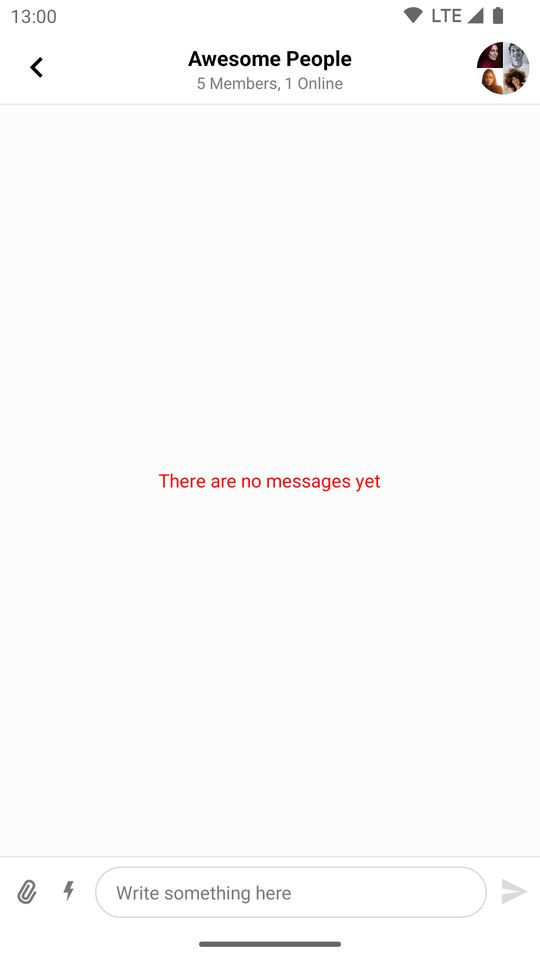 |
|---|
Configure When the User Avatar Appears
By default, user avatars will appear next to messages that are either the last message in a group of messages, or the only one within it.
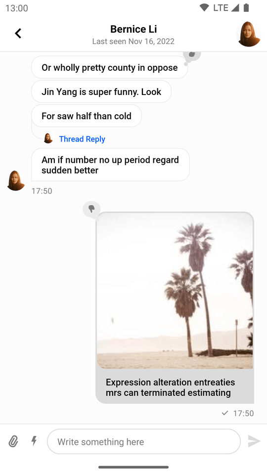 |
|---|
You can configure when the user avatar will appear by setting your own predicate using MessageListView.setShowAvatarPredicate().
For instance, the following code will make the user avatar appear next to all messages sent by other users, regardless of their position.
messageListView.setShowAvatarPredicate { messageItem ->
    messageItem.isTheirs
}The result looks like this:
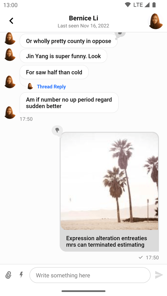 |
|---|
To avoid overlap between the avatar and the message bubble, remember to use streamUiMessageStartMargin and streamUiMessageEndMargin to create space for the message avatar.
If you set a predicate that shows avatars for your own messages as well, use the following value:
streamUiMessageEndMargin="@dimen/stream_ui_message_viewholder_avatar_missing_margin"If your predicate doesn't show avatars for your own messages (the default behavior), remove the end margin:
streamUiMessageEndMargin="0dp"Configuring Giphy Attachments
Giphy Sizing Modes
We offer two sizing modes:
adaptive: The container will automatically resize itself to respect the aspect ratio of the Giphy it is hosting.fixed_size: The container will retain a fixed size, regardless of the aspect ratio of the Giphy it is hosting.
If you use adaptive sizing, you're all set. However, if you use fixed sizing, you also need to set the container dimensions.
You have the following attributes at your disposal to do so:
streamUiGiphyMediaAttachmentWidth: Sets the width of the Giphy container.streamUiGiphyMediaAttachmentHeight: Sets the height of the Giphy container.streamUiGiphyMediaAttachmentDimensionRatio: Sets the dimension ratio of the Giphy container.
To apply them, include them in your app's theme. You can find out more about theming in the Theming documentation page.
Giphy Types
The following represent the available types (quality modes):
original: The original Giphy quality.fixedHeight: Usually results in a slightly lower quality than the original, but improves performance.fixedHeightDownsampled: Lower visual fidelity than the original along with a lower FPS (frames per second) count.
Scale type
The scale type affects how the Giphys are rendered inside the container with regards to the difference in their sizes and aspect ratios. If you are using adaptive sizing, then it's best not to change this setting. If however you decide to use fixed height sizing, then you can fine tune the way Giphys are displayed.
We support every scale type used by the stock Android ImageView attribute scaleType, some of them being:
fitCenter: Changes the aspect ratio of the Giphy in order to fit it inside its container.centerCrop: Centers the Giphy and crops it to the aspect ratio of its container.center: Doesn't scale the image and centers it inside its container.- ...
On this page: