 React
React iOS
iOS Android
 Flutter
 Angular
 JavaScript
 Unity
Unity Unreal
 Node
Node Python
 Ruby
Ruby PHP
PHP Java
Java .NET
.NET Go
Go REST
RESTval listViewModel: ChannelListViewModel by viewModels { ChannelListViewModelFactory() }
override fun onCreate(savedInstanceState: Bundle?) {
super.onCreate(savedInstanceState)
setContent {
// Override the component factory to control how each channel is rendered.
ChatTheme(componentFactory = CustomChannelItemFactory) {
ChannelList(viewModel = listViewModel)
}
}
}
// Use ChannelItem inside the factory to render each channel in the list.
object CustomChannelItemFactory : ChatComponentFactory {
@Composable
override fun LazyItemScope.ChannelListItemContent(params: ChannelListItemContentParams) {
ChannelItem(
channelItem = params.channelItem,
currentUser = params.currentUser,
onChannelClick = params.onChannelClick,
onChannelLongClick = params.onChannelLongClick,
)
}
}Channel Items
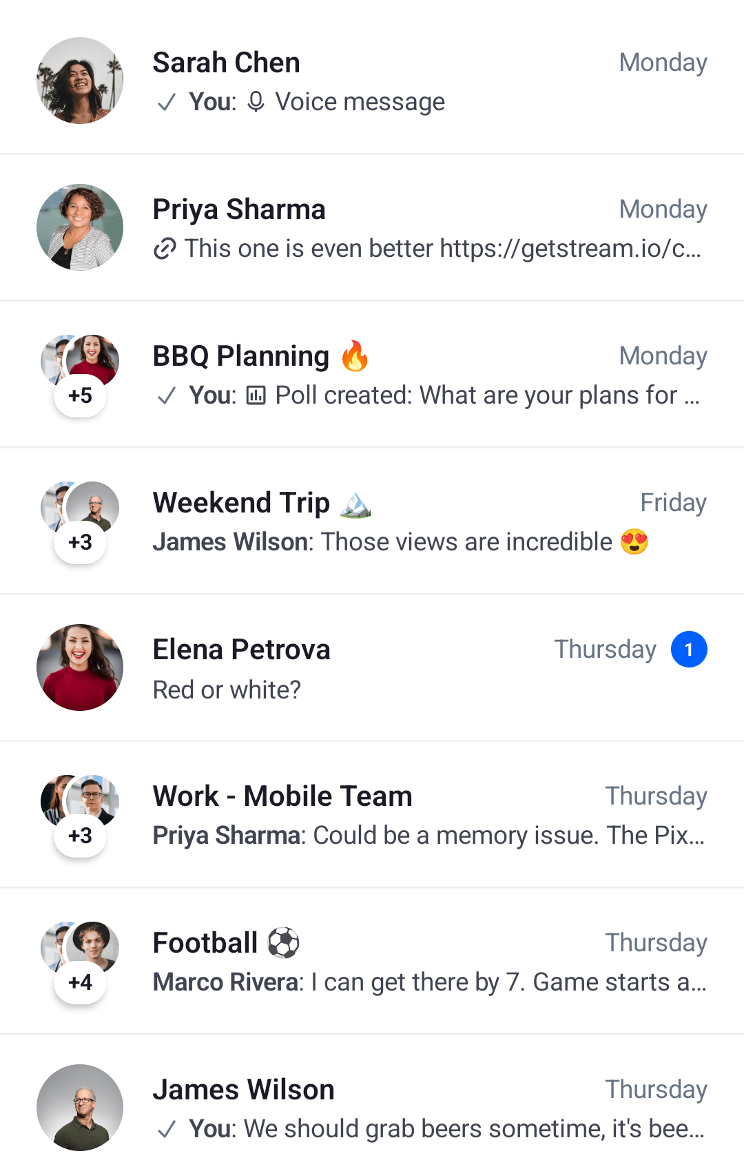
The ChannelItem component represents the default channel list item shown in ChannelList. It displays:
- Channel avatar: The channel or member images in the leading position.
- Channel name: With inline state icons when the channel is muted and/or pinned.
- Last message preview: Shows typing indicator, draft message, or last message text.
- Trailing info: Unread count, read status indicator, and timestamp.
The mute and pin icon positions are configurable via ChannelListConfig.muteIndicatorPosition and ChannelListConfig.pinIndicatorPosition, each accepting either InlineTitle (inline with the channel name, default) or TrailingBottom (at the trailing end of the preview row). The two attributes are configured independently, so integrators can mix positions (for example, mute inline and pin trailing).
You can use ChannelItem directly and customize its slot APIs to replace specific parts of the UI while keeping the rest.
Let's see how to use and customize this component.
Usage
The ChannelList renders each channel using ChannelItem via the component factory. To control how each channel is rendered, override ChannelListItemContent in the factory:
The snippet above will generate the following UI.
 |
|---|
To fully utilize the ChannelItem let's see how to handle its actions and how to customize its Slot APIs.
Handling Actions
The ChannelItem exposes two required action handlers:
@Composable
fun ChannelItem(
    // ... State
    onChannelClick: (Channel) -> Unit,
    onChannelLongClick: (Channel) -> Unit,
    // ... Content slots
)onChannelClick: Called when the user taps on an item. Use this to navigate to theChannelScreen.onChannelLongClick: Called when the user long-taps on an item. Use this to show channel options or update selection state.
You can override these action handlers in the component factory:
// Override ChannelItem action handlers in the factory.
object CustomActionsFactory : ChatComponentFactory {
    @Composable
    override fun LazyItemScope.ChannelListItemContent(params: ChannelListItemContentParams) {
        ChannelItem(
            channelItem = params.channelItem,
            currentUser = params.currentUser,
            onChannelClick = {
                // Start the ChannelScreen
            },
            onChannelLongClick = {
                // Show channel options
            },
        )
    }
}
onChannelClick and onChannelLongClick can also be passed directly to ChannelList, which forwards them to the factory via ChannelListItemContentParams.
This way, you get more control over what happens when the user interacts with the items, but you still have the default UI that you don't have to implement yourself.
Read on to learn how to customize the UI.
Customization
The ChannelItem exposes three content slots for UI customization:
@Composable
fun ChannelItem(
    ..., // State and action handlers
    modifier: Modifier = Modifier,
    leadingContent: @Composable RowScope.(ItemState.ChannelItemState) -> Unit = { /* Default avatar */ },
    centerContent: @Composable RowScope.(ItemState.ChannelItemState) -> Unit = { /* Default channel info */ },
    trailingContent: @Composable RowScope.(ItemState.ChannelItemState) -> Unit = { /* Default trailing info */ },
)modifier: Modifier for the root component. Apply background, elevation, padding, shape, or touch handlers.leadingContent: Content at the start of the item. By default, shows theChannelAvatar.centerContent: Content in the center of the item. By default, shows:- Channel name (with inline muted and/or pinned icons when applicable, see
muteIndicatorPositionandpinIndicatorPosition) - Typing indicator when users are typing
- Draft message preview if a draft exists
- Last message preview otherwise
- Channel name (with inline muted and/or pinned icons when applicable, see
trailingContent: Content at the end of the item. By default, shows:- Unread message count indicator
- Read status indicator (for messages sent by the current user)
- Timestamp of the last message
Here's a simple example that overrides these slots via the component factory:
// Customize the channel item by replacing trailing and center content.
object CustomChannelItemFactory : ChatComponentFactory {
    @Composable
    override fun LazyItemScope.ChannelListItemContent(params: ChannelListItemContentParams) {
        ChannelItem(
            channelItem = params.channelItem,
            currentUser = params.currentUser,
            onChannelLongClick = params.onChannelLongClick,
            onChannelClick = params.onChannelClick,
            trailingContent = { // Replace the trailing content with a spacer
                Spacer(modifier = Modifier.width(8.dp))
            },
            centerContent = { // Replace the details content with a simple Text
                Text(
                    text = ChatTheme.channelNameFormatter.formatChannelName(it.channel, params.currentUser),
                    style = ChatTheme.typography.bodyEmphasis,
                    color = ChatTheme.colors.textPrimary
                )
            }
        )
    }
}
As you can see, it's very easy to override and completely replace the Slot APIs in our ChannelItem. In the example, you replaced the trailingContent with a simple Spacer for some padding and the centerContent with a Text that shows the channel name.
The snippet above will generate the following UI:
 |
|---|
It was really easy to provide a completely custom UI for the channel items while still keeping the same functionality and actions of the rest of the screen.