 React
React iOS
iOS Android
 Flutter
 Angular
 JavaScript
 Unity
Unity Unreal
 Node
Node Python
 Ruby
Ruby PHP
PHP Java
Java .NET
.NET Go
Go REST
RESTobject CustomComponentFactory : ChatComponentFactory {
@Composable
override fun MediaAttachmentContent(params: MediaAttachmentContentParams) {
// Your custom media attachment rendering
// Access params.state for the AttachmentState and params.modifier for styling
super.MediaAttachmentContent(params) // or replace entirely
}
}Image and Video Previews
Introduction
The Compose UI Components chat SDK supports various types of attachments. Image and video attachments are rendered via MediaAttachmentContent, which is customizable through the Component Factory.
Customization
Message List
To customize how image and video attachments are rendered in the message list, override MediaAttachmentContent in your ChatComponentFactory:
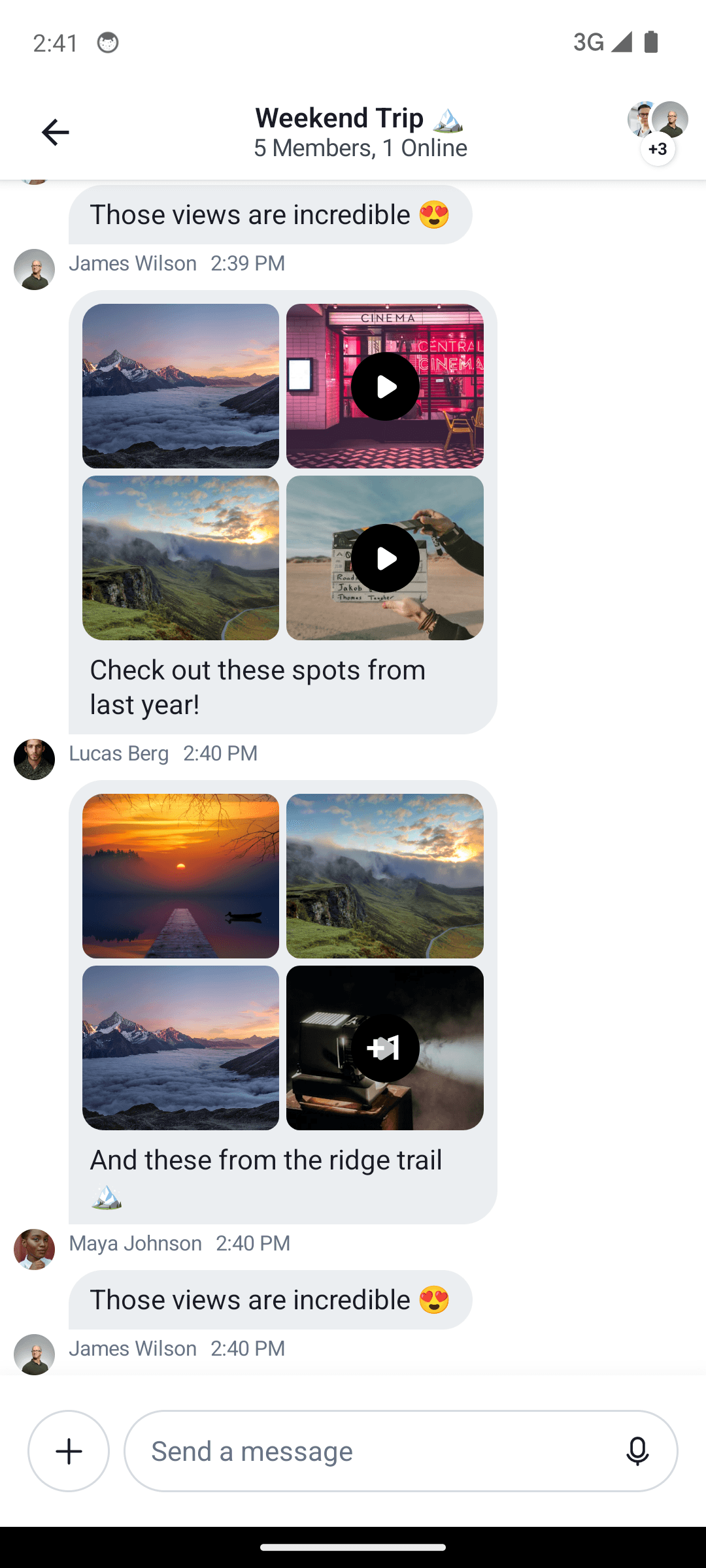
The stock experience we provide out of the box looks like this:
| Default Image and Video Attachment Previews |
|---|
 |
Provide your custom factory to ChatTheme:
ChatTheme(componentFactory = CustomComponentFactory) {
    ChannelScreen(/* ... */)
}
Attachment Gallery
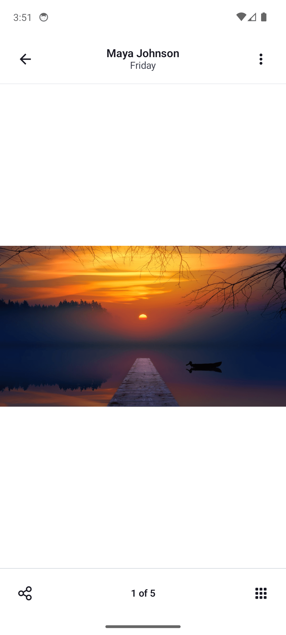
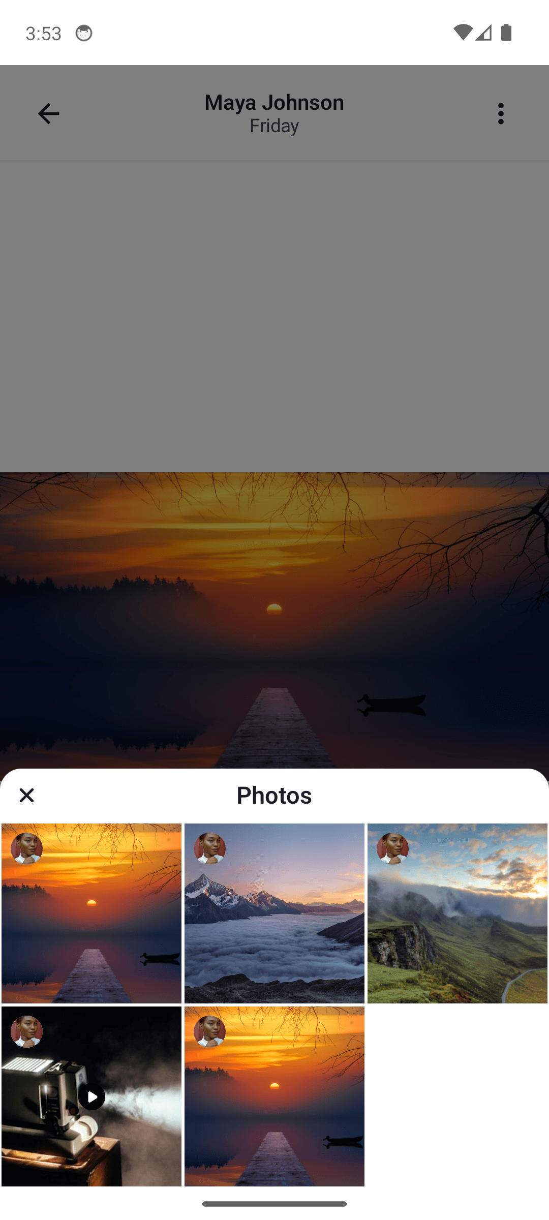
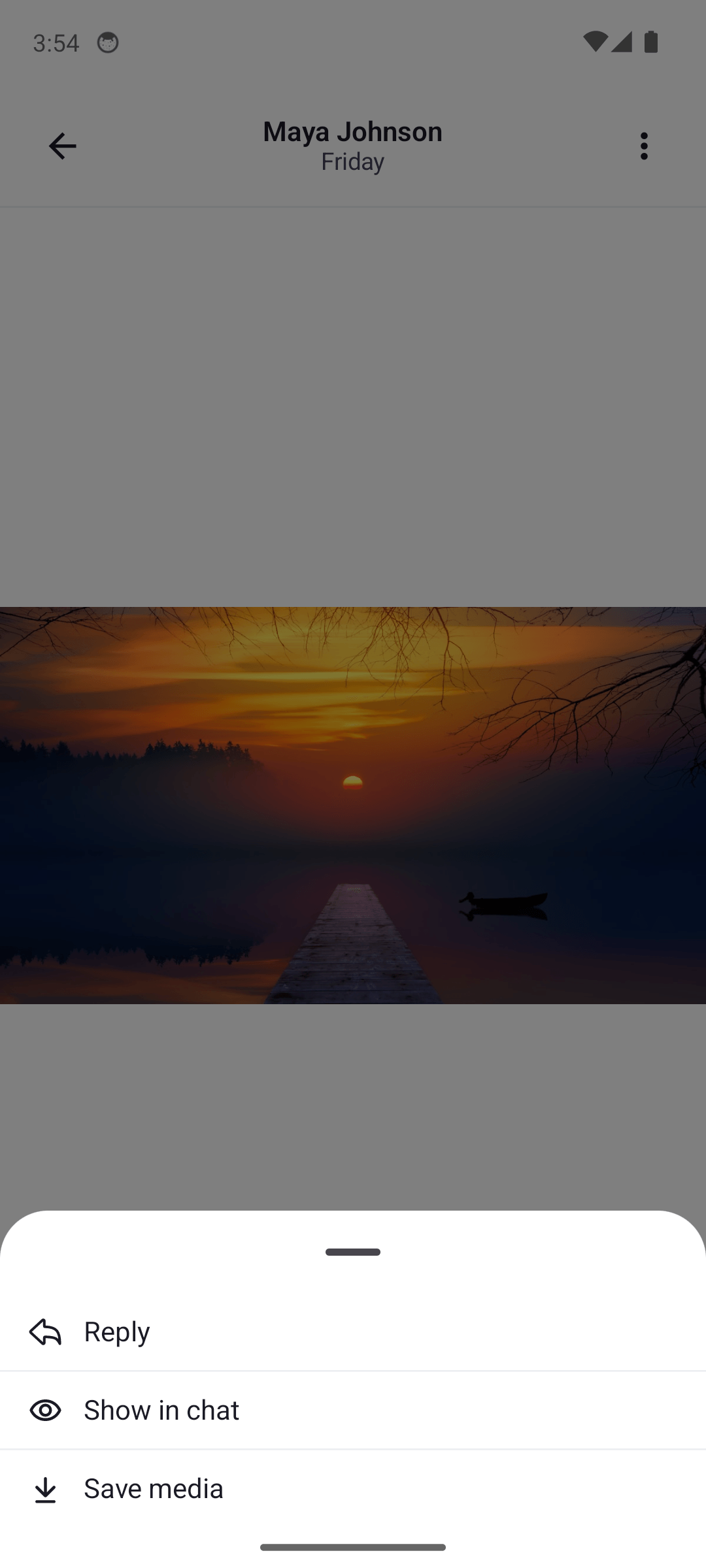
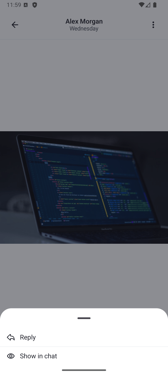
The attachment gallery is used for previewing image and video attachments. By default, this is a feature-complete Activity, which provides multiple actions to the user, such as zooming in and out, swiping between attachments, downloading or sharing them, or deleting them from the message.
By default, the gallery looks like:
| Default Image and Video Attachment Gallery (Light Mode) | Default Image and Video Attachment Gallery with Overview (Light Mode) | Default Image and Video Attachment Gallery with Options (Light Mode) |
|---|---|---|
 |  |  |
You can control which of the attachment actions are available to the user via the MediaGalleryConfig configuration class. This class is passed through ChatUiConfig to ChatTheme and is applied to the media gallery.
The MediaGalleryConfig class has the following properties:
isCloseVisible: Controls whether the close button is visible or not.isOptionsVisible: Controls whether the options button is visible or not.isShareVisible: Controls whether the share button is visible or not.isGalleryVisible: Controls whether the gallery button is visible or not.optionsConfig: Controls the visibility of the options inside the options menu. This is aMediaGalleryOptionsConfigclass that has the following properties:isShowInChatVisible: Controls whether the "Show in chat" option is visible or not.isReplyVisible: Controls whether the "Reply" option is visible or not.isSaveMediaVisible: Controls whether the "Save media" option is visible or not.isDeleteVisible: Controls whether the "Delete" option is visible or not.
The MediaGalleryConfig is configured as follows:
ChatTheme(
    config = ChatUiConfig(
        mediaGallery = MediaGalleryConfig(
            isCloseVisible = true,
            isOptionsVisible = true,
            isShareVisible = false,
            isGalleryVisible = false,
            optionsConfig = MediaGalleryOptionsConfig(
                isShowInChatVisible = true,
                isReplyVisible = true,
                isSaveMediaVisible = false,
                isDeleteVisible = false,
            ),
        ),
    ),
) {
    ChannelScreen(/* ... */)
}
This will hide both footer actions (share and gallery), and will hide the "Save media" and "Delete" options from the options menu:
| Custom Image and Video Attachment Gallery |
|---|
 |
Conclusion
If you need to customize how your app displays image and video attachments, override MediaAttachmentContent in your ChatComponentFactory. For gallery-level customization, use MediaGalleryConfig through ChatUiConfig.
You can read more about customization through the component factory here.