 React
React iOS
iOS Android
 Flutter
 Angular
 JavaScript
 Unity
Unity Unreal
 Node
Node Python
 Ruby
Ruby PHP
PHP Java
Java .NET
.NET Go
Go REST
REST<io.getstream.chat.android.ui.feature.messages.list.MessageListView
android:id="@+id/messageListView"
android:layout_width="match_parent"
android:layout_height="match_parent"
app:streamUiMessageBackgroundColorMine="#0277BD"
app:streamUiMessageBackgroundColorTheirs="#2E7D32"
app:streamUiMessageTextColorMine="@android:color/white"
app:streamUiMessageTextColorTheirs="@android:color/white" />Theming
Many aspects of the UI components can be changed and customized. For example, it's possible to change:
- Font family
- Text color
- View backgrounds
- Item views in lists
- Feature toggles
- Text style (italic, bold, normal)
- Icon drawables
- Stroke widths
- Divider color
It is not possible to change the tint of icons. Use colored drawables instead.
These customizations can be applied in multiple ways. From simplest to most complex, these are:
- Adding attributes to the View in the XML layout where it's created.
- Using the
TransformStyleobject to apply transformations to all style objects of a given type. - Using themes to style all Views globally.
Be careful when using multiple theming approaches. Themes are applied first, then XML attributes, then style transformations. Values applied later will override previously set values.
XML Attributes
The simplest way to customize Views is by setting attributes on them in the XML layout. For example, here are some custom values you can set on MessageListView.
This will have the following result:
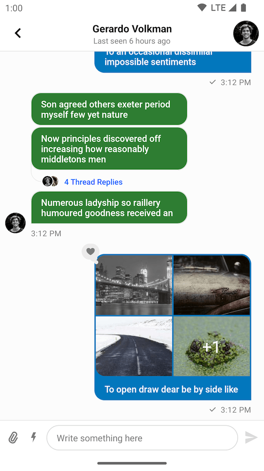 |
|---|
You can find the full list of available attributes for each view linked on their individual component pages, or in the attrs_<view_name>.xml files (e.g., attrs_message_list_view.xml) here.
Style Transformations
Styles can be configured programmatically by overriding the corresponding StyleTransformer from the TransformStyle object. These transformations will be applied to all UI Components of the given type.
You have to set up any custom StyleTransformer instances before the View instances are initialized, otherwise they won't take effect.
Here's an example using TransformStyle to change multiple appearance characteristics of all MessageListView instances:
TransformStyle.messageListItemStyleTransformer = StyleTransformer { defaultViewStyle ->
    defaultViewStyle.copy(
        messageBackgroundColorMine = Color.parseColor("#0277BD"),
        messageBackgroundColorTheirs = Color.parseColor("#2E7D32"),
        textStyleMine = defaultViewStyle.textStyleMine.copy(color = Color.WHITE),
        textStyleTheirs = defaultViewStyle.textStyleTheirs.copy(color = Color.WHITE),
    )
}This will have the following result:
|
|---|
This is the same as the XML customization shown above, but applied to all MessageListView instances in the app, and configured programmatically.
Themes
You can also use Android themes to set attributes for the UI Components. To do this, set a streamUiTheme attribute within your app's theme, in the themes.xml file:
<style name="AppTheme" parent="Theme.MaterialComponents.DayNight.NoActionBar">
    <!-- Other items... -->
    <item name="streamUiTheme">@style/CustomStreamUiTheme</item>
</style>
The theme you pass in as the streamUiTheme can then define a style for each type of UI Component where you can set attribute values.
For example, you can achieve the same styling as in the examples above by overriding the streamUiMessageListStyle attribute:
<style name="CustomStreamUiTheme" parent="@style/StreamUiTheme">
    <item name="streamUiMessageListStyle">@style/CustomMessageListStyle</item>
</style>

<style name="CustomMessageListStyle" parent="StreamUi.MessageList">
    <item name="streamUiMessageBackgroundColorMine">#0277BD</item>
    <item name="streamUiMessageBackgroundColorTheirs">#2E7D32</item>
    <item name="streamUiMessageTextColorMine">@android:color/white</item>
    <item name="streamUiMessageTextColorTheirs">@android:color/white</item>
</style>
The list of available styles you can define is available in our attrs file.
Themes for Activities
The SDK contains the following activities: AttachmentMediaActivity, AttachmentActivity, and AttachmentGalleryActivity. You can customize them by overriding the activity with a custom theme in your manifest.
Let's see how to change the color of the title on the gallery screen:
AndroidManifest.xml
<activity
    android:name="io.getstream.chat.android.ui.feature.gallery.AttachmentGalleryActivity"
    android:theme="@style/CustomAttachmentGalleryTheme"
    tools:replace="android:theme" />
themes.xml
<style name="CustomAttachmentGalleryTheme" parent="StreamUi.AttachmentGallery">
    <item name="streamUiTheme">@style/CustomStreamUiTheme</item>
</style>

<style name="CustomStreamUiTheme" parent="@style/StreamUiTheme">
    <item name="streamUiAttachmentGalleryTitleStyle">@style/CustomAttachmentGalleryTitleStyle</item>
</style>

<style name="CustomAttachmentGalleryTitleStyle">
    <item name="android:textAppearance">@style/CustomAttachmentGalleryTitleTextAppearance</item>
</style>

<style name="CustomAttachmentGalleryTitleTextAppearance" parent="StreamUiTextAppearance.HeadlineBold">
    <item name="android:textColor">#FF0000</item>
</style>
This will produce the UI below:
 |
|---|
Choosing Light or Dark Theme
The SDK provides a DayNight theme. If you want to force Dark or Light mode, you can use the standard Android mechanism:
// Force Dark theme
AppCompatDelegate.setDefaultNightMode(AppCompatDelegate.MODE_NIGHT_YES)

// Force Light theme
AppCompatDelegate.setDefaultNightMode(AppCompatDelegate.MODE_NIGHT_NO)