Component Factory

The ChatComponentFactory is a factory which defines most of the stateless low-level composable components, which are used as building blocks for the high-level screen components and the bound components (see Component Architecture).

The screen components, the bound components, and even the low-level components which depend on different low-level components, use the ChatComponentFactory to render specific components of the UI in a stateless manner.

By overriding the ChatComponentFactory, developers can easily customize or override specific parts of the Chat UI, without the need to build their own implementations from scratch. This enables a high degree of customization and flexibility, allowing the Chat UI to be tailored to specific design requirements.

For the complete API reference, see the ChatComponentFactory source on GitHub.

Usage

To apply a custom component factory to your Chat UI, implement the ChatComponentFactory interface:

class CustomChatComponentFactory : ChatComponentFactory {

    // Override the specific composable methods which you like to customize
}

And pass the custom ChatComponentFactory to the ChatTheme wrapping your Chat UI:

ChatTheme(
    componentFactory = CustomChatComponentFactory(),
) {
    ChannelScreen(
        viewModelFactory = viewModelFactory,
    )
}

The custom components provided by the custom ChatComponentFactory will now override all the default components used by the wrapped ChannelScreen.

Customization options

The ChatComponentFactory allows customization of most low-level components used in different Chat screens. It provides the ability to customize common components globally, as well as specific components in particular locations.

Available Components

Component Description
Avatars Customize user, group, and channel avatars.
Channel List Header Modify the header of the channel list.
Channel Items Customize how individual channels and their elements appear.
Messages List Header Customize the header of the message list.
Messages Items Customize message bubbles, timestamps, and other elements.
Message Composer Customize the message input field, send button, and attachments.
Attachments Replace built-in attachment rendering (images, videos, files) or add custom attachment types.
Attachment Picker Customize the attachment picker tabs and content.
Menus & Actions Customize context menus for messages and channels.
Reactions Modify the reaction picker and displayed reactions.
Thread List Customize the thread list components.
Pinned Message List Customize the pinned message list components.

Avatars

The ChatComponentFactory provides a way to customize the avatars which are used in the Chat screens.

To customize avatars, override the corresponding ChatComponentFactory method:

class CustomChatComponentFactory : ChatComponentFactory {

    @Composable
    override fun ChannelAvatar(params: ChannelAvatarParams) {
        // Your implementation of the channel avatar
        // Access params.modifier, params.channel, params.currentUser, params.onClick
    }
}
Method Description Used in
ChannelAvatar Avatar for a channel: shows the channel image, the other member's avatar (DMs), or stacked member avatars for group channels. Channel list items, channel header
UserAvatar Avatar for a single user: shows their image or initials plus an online indicator. Search results, channel members, mention suggestions
Avatar Low-level, context-free avatar. Channel list header, quoted messages, thread participants, polls, user reactions, message sender

Channel List Header

Method Description
ChannelListHeader Full header component shown in ChannelsScreen. Provides title, connection state, and user actions.
ChannelListHeaderLeadingContent Leading slot — defaults to the current user's avatar.
ChannelListHeaderCenterContent Center slot — defaults to the connection-state title.
ChannelListHeaderTrailingContent Trailing slot — defaults to the custom action button.
Note:

If you are not using the high-level screen component ChannelsScreen, you can still use the ChannelListHeader component independently from the ChatComponentFactory, and customize its leading/center/trailing content directly by passing your own content for the leadingContent/centerContent/trailingContent slots as described in Channel List Header.

Channel List Items

Method Description
ChannelListItemContent Full channel row. Provides channel item state, click/long-click callbacks.
ChannelItemLeadingContent Leading slot — defaults to the channel avatar.
ChannelItemCenterContent Center slot — defaults to channel name and last message preview.
ChannelItemTrailingContent Trailing slot — defaults to the last message timestamp.
Note:

See the Channel List documentation for more details on customizing the channel list.

Channel Header

Method Description
ChannelHeader Full header for ChannelScreen. Provides channel, connection state, typing users, and actions.
ChannelHeaderLeadingContent Leading slot — defaults to the back button.
ChannelHeaderCenterContent Center slot — defaults to channel name and member count subtitle.
ChannelHeaderTrailingContent Trailing slot — defaults to the channel avatar.
Note:

You can also customize the ChannelHeader from the ChannelScreen by passing your implementation in the topBarContent slot. If you are using the ChannelHeader component independently, customize its slots directly as described in Channel Header.

Message List Items

Method Description
MessageItem Entire content of a regular chat message row, including poll, reactions, and all callbacks.
MessageContainer Positions the message bubble, author avatar, and reactions within a message row.
MessageSpacer Empty space opposite the message bubble (e.g. before the bubble for outgoing messages).
MessageAuthor Author avatar shown next to the bubble.
MessageTop Top content inside the bubble, e.g. pinned indicator and thread labels.
MessageBottom Bottom content inside the bubble, e.g. timestamp and delivery status.
MessageContent Main content of the bubble, e.g attachments, text, polls.
MessageTextContent Text content inside a message bubble.
MessageFooterStatusIndicator Read status indicator (checkmarks and read count).
MessageListDateSeparatorItemContent Date separator shown between messages sent on different days.
MessageListUnreadSeparatorItemContent Unread separator shown after the last read message.
MessageListSystemItemContent System message rows (e.g. member joined).
MessageListTypingIndicatorItemContent Typing indicator shown at the bottom of the list. Not implemented by default — override to add your own UI.
MessageListBackground Background rendered behind all message list items; supports gradients, images, or layered backgrounds.

Message Composer

Message composer
MessageComposer
Method Description
MessageComposer Full composer component. Controls overall rendering including header, footer, and suggestion popups.
MessageComposerInput Full input field area. Provides state, onInputChanged, onAttachmentRemoved, and the label slot.
MessageComposerLeadingContent Container for the area before the input (wraps the attachments button).
MessageComposerTrailingContent Container for the area after the input (wraps send and audio record buttons).
MessageComposerSendButton Send button. Receives enabled, isInputValid, and onClick.
MessageComposerAudioRecordingButton Audio record button (enabled by default; disable via ComposerConfig.audioRecordingEnabled).
MessageComposerUserSuggestionItem Single item in the mentions popup.
MessageComposerUserSuggestionItemLeadingContent Leading slot of a mention item — defaults to user avatar.
MessageComposerUserSuggestionItemCenterContent Center slot of a mention item — defaults to user name and ID.
MessageComposerUserSuggestionItemTrailingContent Trailing slot of a mention item — empty by default.
MessageComposerCommandSuggestionItem Single item in the commands popup.
MessageComposerCommandSuggestionItemLeadingContent Leading slot of a command item — defaults to command icon.
MessageComposerCommandSuggestionItemCenterContent Center slot of a command item — defaults to name and usage example.
MessageComposerLinkPreview Link preview content within the composer header.
MessageComposerEditIndicator Edit indicator shown when editing a message.
MessageComposerQuotedMessage Quoted message preview shown in the composer when replying.
Commands popup
MessageComposerCommandsPopupContent
Note:

If you are using the bound/stateless component MessageComposer directly instead of the ChannelScreen, you can also customize most components by passing custom implementations in the specific slots. More details in the Message Composer docs.

Attachments

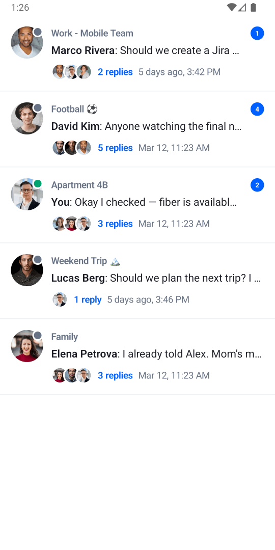
The ChatComponentFactory lets you customize how attachments are rendered both in the message list and in the message composer. You can replace the rendering of built-in attachment types (image, video, file, etc.) or add support for entirely new custom types.

Method Description
MediaAttachmentContent Renders image and video attachments in the message list. Override to change how media thumbnails, grids, or previews are displayed.
FileAttachmentContent Renders file attachments in the message list.
GiphyAttachmentContent Renders Giphy attachments in the message list.
LinkAttachmentContent Renders link preview attachments in the message list.
CustomAttachmentContent Renders attachments of unknown/custom types in the message list. The SDK calls this for any attachment that doesn't match built-in types.
MessageComposerAttachments Renders attachment previews in the message composer before the message is sent.

For examples and detailed guides on attachment customization, see:

  • Image and Video Previews — customizing MediaAttachmentContent and gallery configuration.
  • Custom Attachments — adding a new attachment type with custom rendering in the message list and composer.
  • Location Sharing — overriding MessageContent to render a custom attachment type, and adding a custom attachment picker tab.

Attachment Picker

Method Description
AttachmentPicker Overall attachment picker component.
AttachmentTypePicker Tab row showing attachment type options.
AttachmentPickerContent Content area for the selected picker mode.
AttachmentMediaPicker Gallery/media grid picker.
AttachmentFilePicker File list picker.
AttachmentCameraPicker Camera capture picker.
AttachmentPollPicker Poll creation picker.
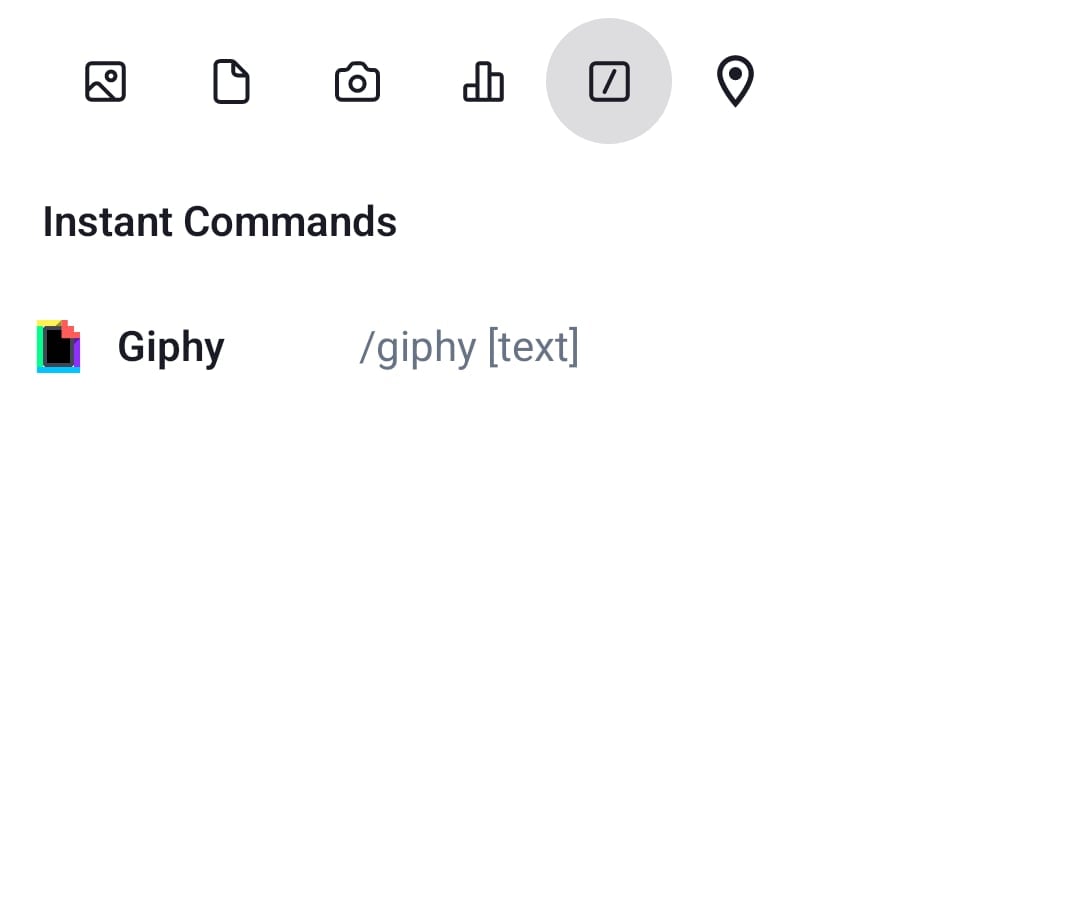
AttachmentCommandPicker Slash command picker.

Channel menu

Channel menu
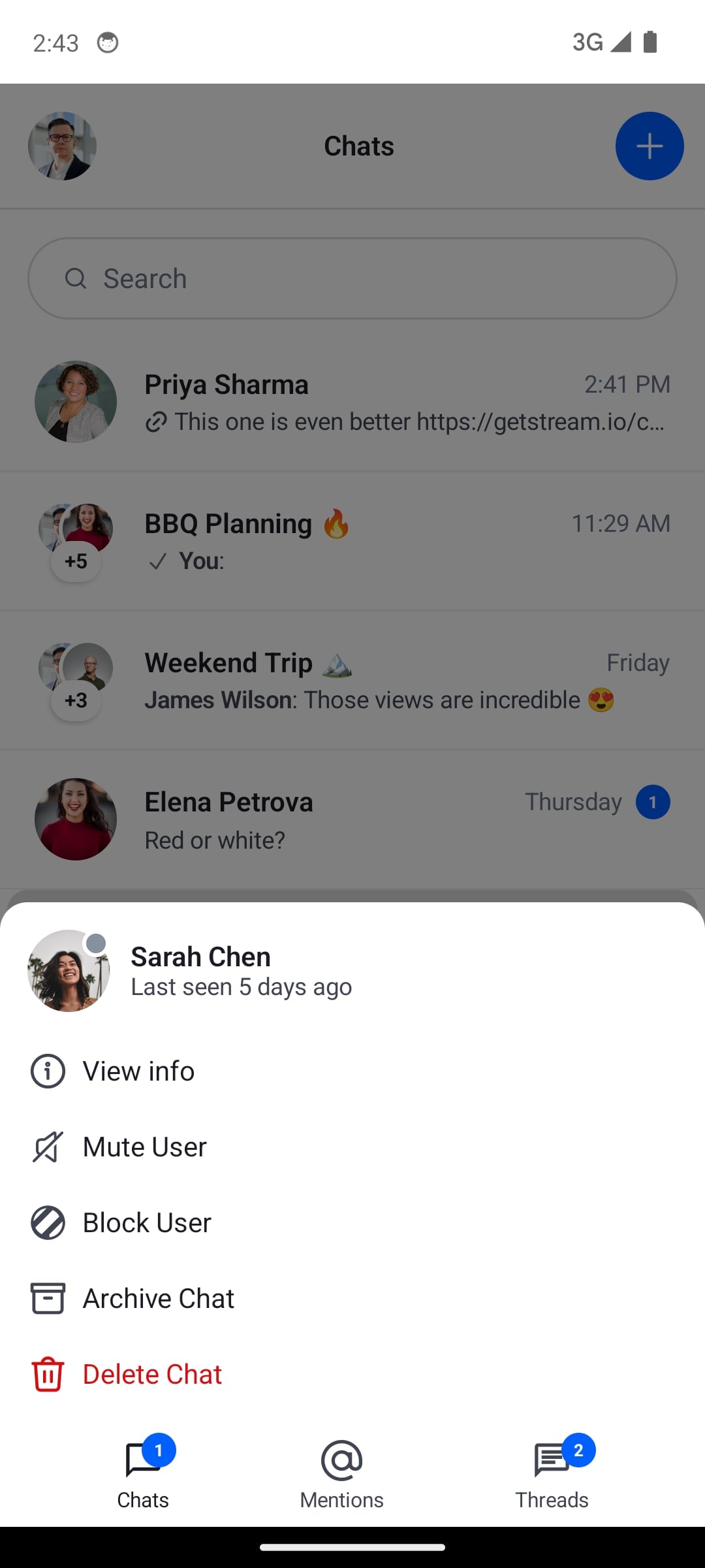
ChannelMenu
Method Description
ChannelMenu Full channel options menu. Provides channel, current user, actions list, and dismiss callback.
ChannelMenuHeaderContent Header section of the channel menu.
ChannelMenuOptions Options list section of the channel menu.
ChannelOptionsItem Single option row in the channel menu.
ChannelOptionsItemLeadingIcon Icon shown at the start of a channel option row.

Message actions

Message actions
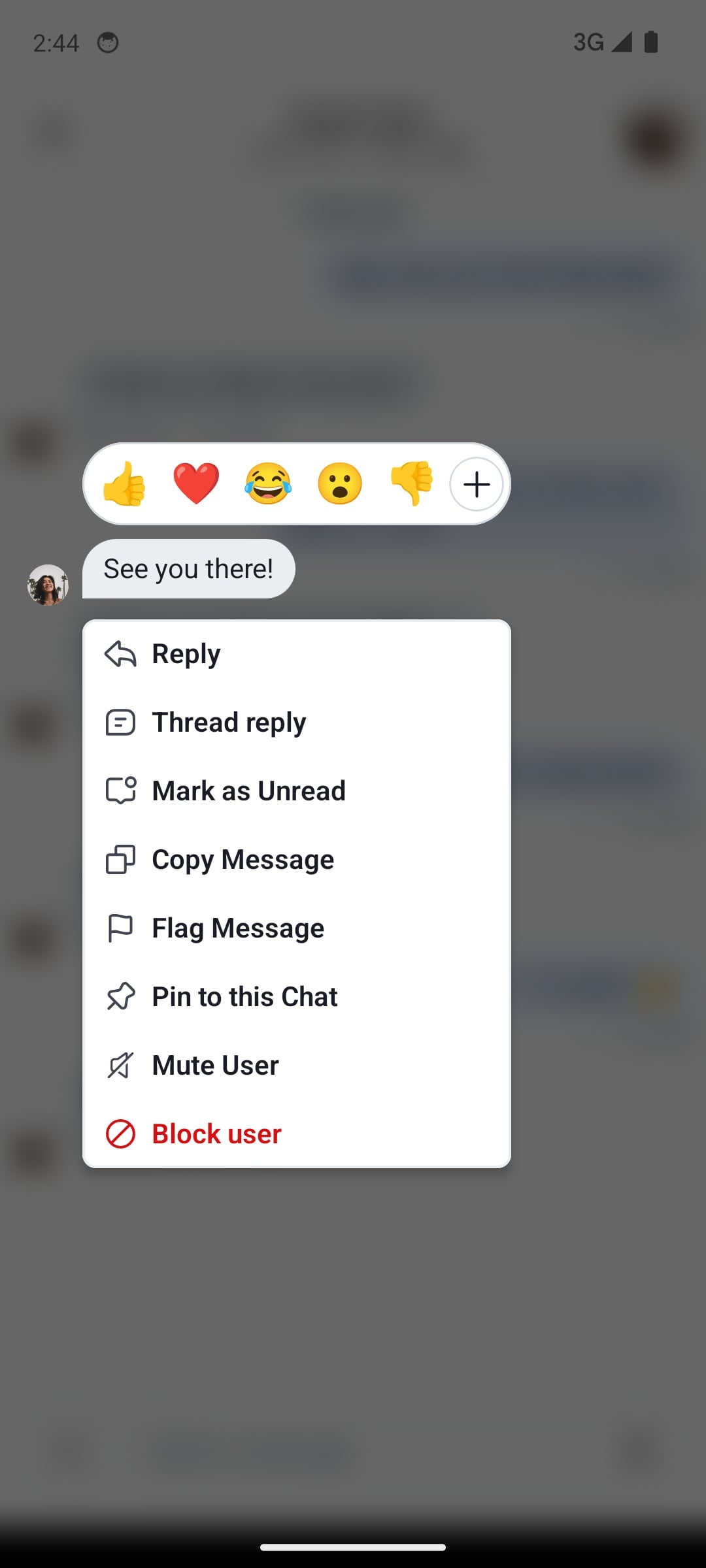
MessageActions
Method Description
MessageActions Full message actions overlay. Provides message, options list, capabilities, and action callbacks.
MessageActionsHeader Header section of the message actions overlay (shows reaction picker).
MessageActionsOptions Options list section of the message actions overlay.
MessageActionsOptionsItem Single option row in the message actions overlay.

Shared menu item

MenuOptionItem is shared by both the channel and message menus. Override it once to apply the same change to both menus — for example, to remove leading icons from all option rows.

Reactions menu

Reactions menu
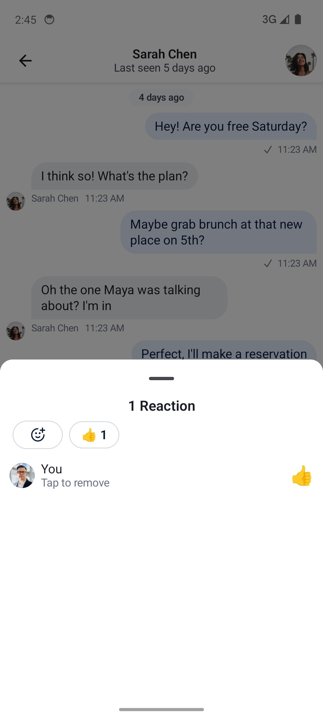
ReactionsMenu
Method Description
ReactionsMenu Full reactions menu shown when tapping the reaction icon on a message.
ReactionsMenuContent Content of the reactions menu.
ReactionMenuOptionItem Single reaction option in the picker row.
MessageReactionPicker Extended reactions picker opened by tapping "Show more".
MessageReactionsPickerContent Grid of all reactions in the extended picker.

Thread List

Thread list
ThreadList
Method Description
ThreadListBanner Banner showing the number of new unseen threads.
ThreadListItem Full thread row.
ThreadListLoadingContent Loading indicator shown during initial load.
ThreadListEmptyContent Empty state shown when there are no threads.
ThreadListLoadingMoreContent Loading indicator shown while fetching the next page.

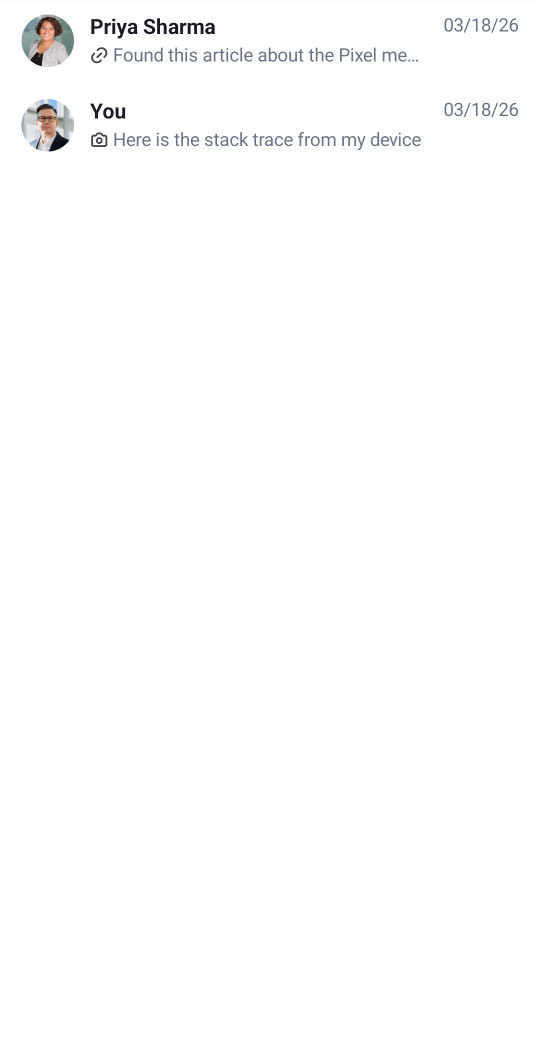
Pinned Message List

Pinned messages list
PinnedMessagesList
Method Description
PinnedMessageListItem Full pinned message row.
PinnedMessageListItemLeadingContent Leading slot — sender avatar.
PinnedMessageListItemCenterContent Center slot — sender name and message preview.
PinnedMessageListItemTrailingContent Trailing slot — message timestamp.
PinnedMessageListLoadingContent Loading indicator shown during initial load.
PinnedMessageListEmptyContent Empty state shown when there are no pinned messages.
PinnedMessageListLoadingMoreContent Loading indicator shown while fetching the next page.

Compound factory

You can compose multiple factories together. This is useful when you want to customize a specific UI component deep in a composable hierarchy, without overriding an entire factory:

ChatTheme(
    componentFactory = MyCustomChatComponentFactory()
) {
    val currentComponentFactory = LocalComponentFactory.current

    val myCustomMessageFooterStatusIndicator = remember {
        object : ChatComponentFactory by currentComponentFactory {
            @Composable
            override fun MessageFooterStatusIndicator(params: MessageFooterStatusIndicatorParams) {
                MyAwesomeMessageReadStatusIndicator()
            }
        }
    }
    CompositionLocalProvider(LocalComponentFactory provides myCustomMessageFooterStatusIndicator) {
        MessageList()
    }
}

Scoped components

Some factory methods are extensions of a scope (e.g. LazyItemScope). Calling super directly does not compile in that case. Use a delegate and the with operator to forward the call:

class CompoundComponentFactory(
    private val delegate: ChatComponentFactory = object : ChatComponentFactory {},
) : ChatComponentFactory by delegate {
    @Composable
    override fun LazyItemScope.ChannelListItemContent(params: ChannelListItemContentParams) {
        with(delegate) {
            Box(
                modifier = Modifier
                    .background(color = Color.Blue)
                    .padding(5.dp)
                    .background(color = ChatTheme.colors.backgroundCoreApp)
            ) {
                ChannelListItemContent(params)
            }
        }
    }
}
Add Chat to my app: getstream.io/SKILL.md

The fastest way to build with Stream. Start a new project or improve an existing one. Full CLI and documentation integration out of the box.


Ask your agent:

/stream Build me a Social App with Feeds and Moderation.
/stream Any livestream calls running?
/stream Chat Android v7: <Your Question>