 React
React iOS
iOS Android
 Flutter
 Angular
 JavaScript
 Unity
Unity Unreal
 Node
Node Python
 Ruby
Ruby PHP
PHP Java
Java .NET
.NET Go
Go REST
REST<io.getstream.chat.android.ui.feature.channels.list.ChannelListView
android:id="@+id/channelListView"
android:layout_width="match_parent"
android:layout_height="match_parent" />Channel List
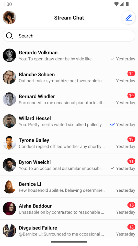
ChannelListView is a component that displays a list of channels available to the user. For users with a slower connection or who don't belong to any channels yet, ChannelListView also supports loading and empty states.
| Light Mode | Dark Mode |
|---|---|
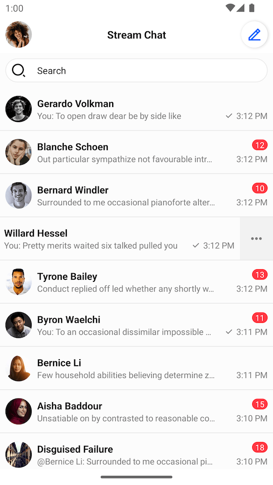 | 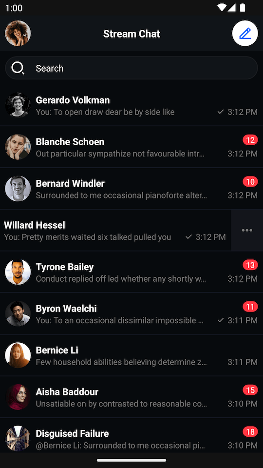 |
By default, a single channel item shows the following:
- Channel name
- User's read state
- Latest message
- Timestamp of the latest message
It also supports swiping behavior which allows handling different channel actions.
Usage
To use ChannelListView, include it in your XML layout as shown below:
We recommend fetching data from Stream's API using ChannelListViewModel, and then rendering it inside ChannelListView.
The basic setup of the ChannelListViewModel is done by configuring a ChannelListViewModelFactory. These are the available parameters:
filter: Filters the list of channels that will be displayed. When omitted, the default filter shows channels of typemessagingthat the current user is a member of.sort: Sorts the list of channels. Defaults toQuerySortByField.descByName("last_updated").limit: How many channels the initial page will fetch. Defaults to30.messageLimit: How many messages each channel will include. Defaults tonull(server default). For good performance, we recommend setting this to5.memberLimit: How many members each channel will include. Defaults tonull(server default). For good performance, we recommend setting this to10.
// Instantiate the ViewModel
val viewModel: ChannelListViewModel by viewModels {
    ChannelListViewModelFactory(
        filter = Filters.and(
            Filters.eq("type", "messaging"),
            Filters.`in`("members", listOf(ChatClient.instance().getCurrentUser()!!.id))
        ),
        sort = QuerySortByField.descByName("last_updated"),
        limit = 30,
    )
}
// Bind the ViewModel with ChannelListView
viewModel.bindView(channelListView, viewLifecycleOwner)To customize how real-time events affect the channel list (e.g., when using multiple lists filtered by channel type), see Channels State and Filtering.
All the logic of subscribing to data emitted by the ViewModel is provided by the bindView function. Other than channel data loading, the ViewModel also handles actions like deleting a channel and leaving a group conversation by default.
Using Predefined Filters
For frequently used queries, reference a predefined filter created in the Stream Dashboard instead of passing a Filter to the ViewModel. The filter and sort templates are stored server-side; you pass values for any placeholders via filterValues (and sortValues for templated sort fields). When predefinedFilterName is set, the query's filter and sort are ignored. See Querying Channels for more details.
// Reference a predefined filter by name and substitute its placeholder values.
val viewModel: ChannelListViewModel by viewModels {
    ChannelListViewModelFactory(
        predefinedFilterName = "user_messaging_channels",
        filterValues = mapOf("user_id" to userId),
    )
}
// Bind the ViewModel with ChannelListView
viewModel.bindView(channelListView, viewLifecycleOwner)

// Placeholder values accept 'Any' type (String, Boolean, Int, Float, Double, List, Map).
val viewModel: ChannelListViewModel by viewModels {
    ChannelListViewModelFactory(
        predefinedFilterName = "user_per_channel_type_archived_hidden",
        filterValues = mapOf(
            "channel_type" to "messaging",
            "user_id" to userId,
            "archived" to true,
        ),
    )
}

// If the predefined filter templates a sort field, supply it via `sortValues`.
val viewModel: ChannelListViewModel by viewModels {
    ChannelListViewModelFactory(
        predefinedFilterName = "team_channels",
        filterValues = mapOf("team_id" to "engineering"),
        sortValues = mapOf("sort_field" to "last_message_at"),
    )
}Handling Actions
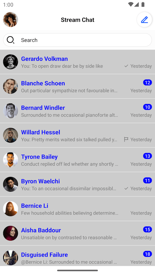
ChannelListView includes a set of channel actions. Actions on ChannelListView items are available on swipe. With these, you can:
- Delete the channel if you have sufficient permissions
- See channel members
- Leave the channel if it's a group channel
| Light Mode | Dark Mode |
|---|---|
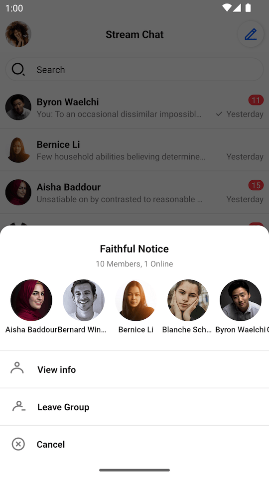 | 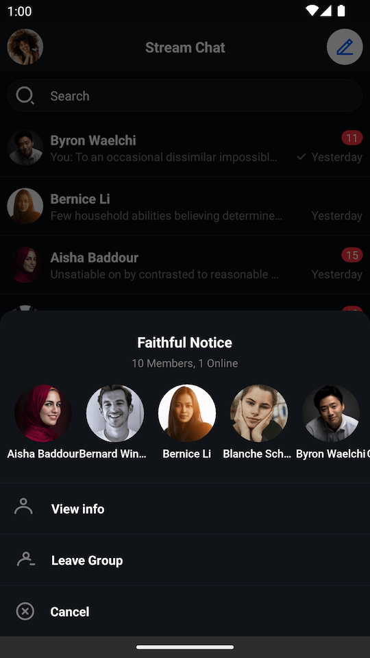 |
The following actions are not implemented by default, so you should add your own listeners if you want to handle them:
channelListView.setChannelItemClickListener { channel ->
    // Handle channel click
}
channelListView.setChannelInfoClickListener { channel ->
    // Handle channel info click
}
channelListView.setChannelLongClickListener { channel ->
    // Handle channel long click
}
channelListView.setChannelListUpdateListener { channels ->
    // Handle channel list updates
}
channelListView.setUserClickListener { user ->
    // Handle member click
}The full list of available listeners is available here.
Customization
There are two ways to customize the appearance of ChannelListView:
- Using XML attributes
- Using the
TransformStyleAPI at runtime to customize the style of allChannelListViewinstances
Using XML Attributes
There are many XML attributes that can be used to customize the appearance of the channel list. The most useful ones include:
streamUiChannelDeleteEnabled: Whether the delete icon should be displayed.streamUiChannelDeleteIcon: Drawable reference for the channel delete icon.streamUiChannelTitleTextColor: Color of the channel title text.streamUiChannelTitleTextSize: Size of the channel title text.streamUiLastMessageTextSize: Size of the last message text.streamUiLastMessageTextColor: Color of the last message text.streamUiForegroundLayoutColor: Foreground color of the channel list item.streamUiBackgroundLayoutColor: Background color of the channel list item, visible when swiping the list item.
The full list of available XML attributes is available under ChannelListView styleable, here.
Using Style Transformations
The following example shows how to modify the style of all ChannelListView instances globally to:
- Disable the default options
- Change the foreground color
- Change the read indicator icon
- Change the title text style
- Change the background color for unread messages
To make these changes, we need to define a custom TransformStyle.channelListStyleTransformer:
TransformStyle.channelListStyleTransformer = StyleTransformer { defaultStyle ->
    defaultStyle.copy(
        optionsEnabled = false,
        foregroundLayoutColor = Color.LTGRAY,
        indicatorReadIcon = ContextCompat.getDrawable(context, R.drawable.stream_ui_ic_flag)!!,
        channelTitleText = defaultStyle.channelTitleText.copy(
            color = Color.BLUE,
            size = context.resources.getDimensionPixelSize(R.dimen.stream_ui_text_large),
        ),
        unreadMessageCounterBackgroundColor = Color.BLUE,
    )
}These changes should have the following results:
| Before | After |
|---|---|
 |  |
The transformer should be set before the View is rendered to make sure that the new style was applied.
Customizing Swipe Actions
By default, ChannelListView supports two swipe actions:
More Options- available for every channel.Delete- available for the channels whereChannel.ownCapabilitiescontains"delete-channel"
Here is the default implementation:
| Swipe Actions |
|---|
 |
You can customize the swipe actions as shown below.
Customizing Icons
channelListView.setMoreOptionsIconProvider { channel ->
    // You can generate the icon Drawable based on the channel object
    ContextCompat.getDrawable(context, R.drawable.custom_action_icon_more)
}
channelListView.setDeleteOptionIconProvider { channel ->
    // You can generate the icon Drawable based on the channel object
    ContextCompat.getDrawable(context, R.drawable.custom_action_icon_delete)
}Customizing Visibility
channelListView.setIsMoreOptionsVisible { channel ->
    // You can determine visibility based on the channel object.
    true
}
channelListView.setIsDeleteOptionVisible { channel ->
    // You can determine visibility based on the channel object.
    // Here is the default implementation:
    channel.ownCapabilities.contains("delete-channel")
}Creating a Custom ViewHolder Factory
ChannelListView provides a way to completely change the default ViewHolders and add different types of views. All you need to do is to provide your own ChannelListItemViewHolderFactory. Let's see an example that displays the channel's photo, name, and member count.
- Create the
custom_channel_list_item.xmllayout:
<?xml version="1.0" encoding="utf-8"?>
<androidx.constraintlayout.widget.ConstraintLayout xmlns:android="http://schemas.android.com/apk/res/android"
    xmlns:app="http://schemas.android.com/apk/res-auto"
    android:layout_width="match_parent"
    android:layout_height="64dp">

    <io.getstream.chat.android.ui.widgets.avatar.ChannelAvatarView
        android:id="@+id/channelAvatarView"
        style="@style/StreamUi.ChannelList.Item.Avatar"
        android:layout_marginVertical="12dp"
        android:layout_marginStart="8dp"
        app:layout_constraintBottom_toBottomOf="parent"
        app:layout_constraintStart_toStartOf="parent"
        app:layout_constraintTop_toTopOf="parent" />

    <TextView
        android:id="@+id/channelNameTextView"
        android:layout_width="wrap_content"
        android:layout_height="wrap_content"
        android:layout_marginStart="8dp"
        android:ellipsize="end"
        android:singleLine="true"
        android:textAppearance="@style/StreamUiTextAppearance.BodyBold"
        app:layout_constraintBottom_toBottomOf="parent"
        app:layout_constraintEnd_toStartOf="@id/membersCountTextView"
        app:layout_constraintHorizontal_chainStyle="spread_inside"
        app:layout_constraintStart_toEndOf="@+id/channelAvatarView"
        app:layout_constraintTop_toTopOf="parent" />

    <TextView
        android:id="@+id/membersCountTextView"
        android:layout_width="wrap_content"
        android:layout_height="wrap_content"
        android:layout_marginHorizontal="8dp"
        android:textAllCaps="false"
        android:textColor="#7A7A7A"
        android:textSize="14sp"
        android:textStyle="normal"
        app:layout_constraintBottom_toBottomOf="parent"
        app:layout_constraintEnd_toEndOf="parent"
        app:layout_constraintStart_toEndOf="@id/channelNameTextView"
        app:layout_constraintTop_toTopOf="parent" />

</androidx.constraintlayout.widget.ConstraintLayout>- Add this plurals entry to
strings.xml:
<plurals name="members_count">
    <item quantity="one">%1d Member</item>
    <item quantity="other">%1d Members</item>
</plurals>- Create a custom ViewHolder and ViewHolder factory:
class CustomChannelListItemViewHolderFactory : ChannelListItemViewHolderFactory() {
    override fun createChannelViewHolder(parentView: ViewGroup): BaseChannelListItemViewHolder {
        return CustomChannelViewHolder(parentView, listenerContainer.channelClickListener)
    }
}

class CustomChannelViewHolder(
    parent: ViewGroup,
    private val channelClickListener: ChannelListView.ChannelClickListener,
    private val binding: CustomChannelListItemBinding = CustomChannelListItemBinding.inflate(
        LayoutInflater.from(parent.context),
        parent,
        false
    ),
) : BaseChannelListItemViewHolder(binding.root) {

    private lateinit var channel: Channel

    init {
        binding.root.setOnClickListener { channelClickListener.onClick(channel) }
    }

    override fun bind(channel: Channel, diff: ChannelListPayloadDiff) {
        this.channel = channel

        binding.channelAvatarView.setChannel(channel)
        binding.channelNameTextView.text = ChatUI.channelNameFormatter.formatChannelName(
            channel = channel,
            currentUser = ChatClient.instance().getCurrentUser()
        )
        binding.membersCountTextView.text = itemView.context.resources.getQuantityString(
            R.plurals.members_count,
            channel.members.size,
            channel.members.size
        )
    }
}- Set the custom ViewHolder factory on the
ChannelListView:
// Create custom view holder factory
val customFactory = CustomChannelListItemViewHolderFactory()

// Set custom view holder factory
channelListView.setViewHolderFactory(customFactory)These changes should have the following results:
 |
|---|
Creating a Custom Loading View
A custom loading view can be set using the setLoadingView method. Assuming that we have a setup similar to the one seen in the previous steps, we can create a loading view with a shimmer effect by taking the following actions:
- Add the Shimmer dependency in your
build.gradlefile's dependencies block:
implementation "com.facebook.shimmer:shimmer:0.5.0"- Add
shape_shimmer.xmlinto drawable folder:
<?xml version="1.0" encoding="utf-8"?>
<shape xmlns:android="http://schemas.android.com/apk/res/android"
    android:shape="rectangle">
    <solid android:color="#CCCCCC" />
    <corners android:radius="20dp" />
</shape>- Add a single row layout -
item_loading_view.xmlinto layout folder:
<?xml version="1.0" encoding="utf-8"?>
<androidx.constraintlayout.widget.ConstraintLayout xmlns:android="http://schemas.android.com/apk/res/android"
    xmlns:app="http://schemas.android.com/apk/res-auto"
    android:layout_width="match_parent"
    android:layout_height="64dp">

    <View
        android:id="@+id/avatarPlaceholder"
        android:layout_width="40dp"
        android:layout_height="40dp"
        android:layout_marginStart="8dp"
        android:background="@drawable/shape_shimmer"
        app:layout_constraintBottom_toBottomOf="parent"
        app:layout_constraintStart_toStartOf="parent"
        app:layout_constraintTop_toTopOf="parent" />

    <View
        android:id="@+id/titlePlaceholder"
        android:layout_width="80dp"
        android:layout_height="16dp"
        android:layout_gravity="center"
        android:layout_marginStart="8dp"
        android:layout_marginEnd="8dp"
        android:background="@drawable/shape_shimmer"
        app:layout_constraintStart_toEndOf="@id/avatarPlaceholder"
        app:layout_constraintTop_toTopOf="@id/avatarPlaceholder" />

    <View
        android:id="@+id/subtitlePlaceholder"
        android:layout_width="0dp"
        android:layout_height="16dp"
        android:layout_gravity="center"
        android:layout_marginStart="8dp"
        android:layout_marginTop="8dp"
        android:background="@drawable/shape_shimmer"
        app:layout_constraintBottom_toBottomOf="@id/avatarPlaceholder"
        app:layout_constraintEnd_toStartOf="@+id/datePlaceholder"
        app:layout_constraintStart_toEndOf="@id/avatarPlaceholder" />

    <View
        android:id="@+id/datePlaceholder"
        android:layout_width="40dp"
        android:layout_height="16dp"
        android:layout_gravity="center"
        android:layout_marginStart="16dp"
        android:layout_marginEnd="8dp"
        android:background="@drawable/shape_shimmer"
        app:layout_constraintEnd_toEndOf="parent"
        app:layout_constraintStart_toEndOf="@id/subtitlePlaceholder"
        app:layout_constraintTop_toTopOf="@id/subtitlePlaceholder" />

    <View
        android:id="@+id/separator"
        android:layout_width="0dp"
        android:layout_height="1dp"
        android:layout_gravity="center"
        android:background="@drawable/shape_shimmer"
        app:layout_constraintBottom_toBottomOf="parent"
        app:layout_constraintEnd_toEndOf="parent"
        app:layout_constraintStart_toStartOf="parent" />

</androidx.constraintlayout.widget.ConstraintLayout>- Create the final loading view with shimmer effect. Let's call it
channel_list_loading_view:
<?xml version="1.0" encoding="utf-8"?>
<com.facebook.shimmer.ShimmerFrameLayout xmlns:android="http://schemas.android.com/apk/res/android"
    xmlns:app="http://schemas.android.com/apk/res-auto"
    android:id="@+id/loadingViewContainer"
    android:layout_width="match_parent"
    android:layout_height="match_parent"
    android:layout_marginTop="64dp"
    app:shimmer_auto_start="true"
    app:shimmer_base_color="#CCCCCC"
    app:shimmer_colored="true"
    app:shimmer_highlight_color="#FFFFFF">

    <LinearLayout
        android:layout_width="match_parent"
        android:layout_height="match_parent"
        android:orientation="vertical">

        <include layout="@layout/item_loading_view" />

        <include layout="@layout/item_loading_view" />

        <include layout="@layout/item_loading_view" />

        <include layout="@layout/item_loading_view" />

        <include layout="@layout/item_loading_view" />

        <include layout="@layout/item_loading_view" />

    </LinearLayout>

</com.facebook.shimmer.ShimmerFrameLayout>- Change
ChannelListView's loading view:
// Inflate loading view
val loadingView = LayoutInflater.from(context).inflate(R.layout.channel_list_loading_view, null)
// Set loading view
channelListView.setLoadingView(loadingView, FrameLayout.LayoutParams(MATCH_PARENT, MATCH_PARENT))These changes should have the following results:
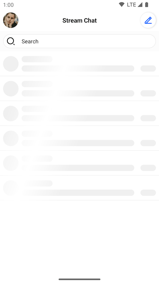 |
|---|
On this page: