 React
React iOS
iOS Android
 Flutter
 Angular
 JavaScript
 Unity
Unity Unreal
 Node
Node Python
 Ruby
Ruby PHP
PHP Java
Java .NET
.NET Go
Go REST
REST// The rest of your UI
if (selectedMessageState is SelectedMessageOptionsState) {
val selectedMessage = selectedMessageState.message
SelectedMessageMenu(
modifier = Modifier.align(Alignment.BottomCenter),
// Define your message options
messageOptions = defaultMessageOptionsState(
selectedMessage = selectedMessage,
currentUser = user,
isInThread = listViewModel.isInThread,
ownCapabilities = selectedMessageState.ownCapabilities
),
// The message you selected
message = selectedMessage,
// The capabilities the user has in a given channel
ownCapabilities = selectedMessageState.ownCapabilities,
onMessageAction = { action ->
// Handle message action
},
onShowMoreReactionsSelected = {
// Handle show more reactions button click
},
onDismiss = {
// Handle dismiss
}
)
}Selected Message Menu
The SelectedMessageMenu component allows you to show different message options to the user when they select a message in the MessageList. This is usually done by long tapping on a message item.
This is a stateless component that you can easily add to your UI if you're building a custom Messages screen. Internally, it sets up the following content:
- Header content: Shows a list of reactions the user can use to react to the message. The visibility of reaction options is controlled by
ChatTheme.reactionOptionsTheme.areReactionOptionsVisibleand the user'sSEND_REACTIONcapability. - Center content: Shows a list of actions the user can take with the selected message, such as delete, edit, reply to, flag, copy, pin and start a thread.
Let's see how to use it.
Usage
If you're using MessagesScreen, SelectedMessageMenu is already set up for you. To use SelectedMessageMenu in your custom screens, simply add it to your UI, like so:
As you can see, showing the menu is very simple. If the selectedMessageState is an instance of SelectedMessageOptionsState, you pass in the message options you want to expose to the user, as well as the selected message. The reactions you show are taken from the ChatTheme component and everything else required to show the component is taken care of internally.
The small snippet of code above produces the following UI:
| Light | Dark |
|---|---|
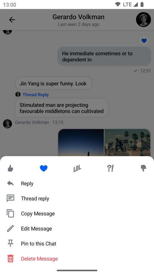 | 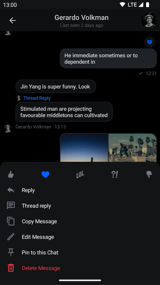 |
The component shows reactions from the ChatTheme on the top, followed by the message actions you passed in.
The menu overlay has a darker background and tapping it will dismiss the component, as will pressing the system back button.
Handling Actions
SelectedMessageMenu exposes the following actions as parameters:
@Composable
fun SelectedMessageMenu(
    ..., // State and styling
    onMessageAction: (MessageAction) -> Unit,
    onShowMoreReactionsSelected: () -> Unit,
    onDismiss: () -> Unit = {},
    ..., // Slot APIs
)onMessageAction: Handler used when the user triggers any message action, such as reply, edit, delete, react and others.onShowMoreReactionsSelected: Handler used when the show more reactions button is clicked.onDismiss: Handler used when the component is dismissed by clicking outside of the component UI or pressing the system back button.
To handle these actions, you can override them like so:
if (selectedMessageState is SelectedMessageOptionsState) {
    SelectedMessageMenu(
        ..., // State and options
        onMessageAction = { action ->
            composerViewModel.performMessageAction(action)
            listViewModel.performMessageAction(action)
        },
        onShowMoreReactionsSelected = {
            listViewModel.selectExtendedReactions(selectedMessage)
        },
        onDismiss = { listViewModel.removeOverlay() }
    )
}
In the snippet above, you propagate the action to the composerViewModel and listViewModel, for them to store the latest action. This will update the UI accordingly.
Alternatively, you call listViewModel.removeOverlay() to remove the overlay from the screen in onDismiss(). It's important to note that onMessageAction() calls removeOverlay() internally to hide the overlay.
Next, let's see how to customize the menu.
Customization
You can customize the SelectedMessageMenu component using the following parameters:
@Composable
fun SelectedMessageMenu(
    message: Message,
    messageOptions: List<MessageOptionItemState>,
    ownCapabilities: Set<String>,
    ..., // Actions
    modifier: Modifier = Modifier,
    shape: Shape = ChatTheme.shapes.bottomSheet,
    overlayColor: Color = ChatTheme.colors.overlay,
    reactionTypes: Map<String, ReactionIcon> = ChatTheme.reactionIconFactory.createReactionIcons(),
    @DrawableRes showMoreReactionsIcon: Int = R.drawable.stream_compose_ic_more,
    ..., // Slot APIs
)message: The selected message.messageOptions: The available message options within the menu. See below.ownCapabilities: Set of capabilities the user is given for the current channel. For a full list see ChannelCapabilities.modifier: Modifier for styling the component.shape: Changes the shape of the menu dialog.overlayColor: The color applied to the overlay behind the menu.reactionTypes: The available reactions within the menu. See below.showMoreReactionsIcon: Drawable resource used for the show more reactions button.
Customizing the Menu Option List
You can pass defaultMessageOptionsState() to the messageOptions parameter to get the default actions that we expose in our SDK. This function uses the ChatTheme.messageOptionsTheme.optionVisibility property and own capabilities under the hood to control which action is visible to the user.
The values that defaultMessageOptionsState() gets from ChatTheme.messageOptionsTheme.optionVisibility take precedence over own capabilities, so you can pass your own implementation of MessageOptionTheme to ChatTheme.messageOptionsTheme to control which options to show. This is useful when you are using MessagesScreen, for example, which sets up SelectedMessageMenu automatically.
ChatTheme(
    // ...
    messageOptionsTheme = MessageOptionsTheme.defaultTheme(
        optionVisibility = MessageOptionItemVisibility(
            isMarkAsUnreadVisible = false,
            isCopyTextVisible = false,
        ),
    ),
    // ...
) {
    // Rest of the UI
}
Customizing Reactions
By default, the reactionTypes parameter uses ChatTheme.reactionIconFactory as a value which is exposed by the ChatTheme component.
The best way to customize reactions is by overriding ChatTheme.reactionIconFactory with your own implementation of ReactionIconFactory so that all of your components wrapped inside of ChatTheme draw from the same source.
You can also control the reaction list visibility by using your own implementation of ReactionOptionsTheme for the ChatTheme.reactionOptionsTheme parameter.
Customizing the Appearance
By default SelectedMessageMenu looks like a bottom sheet. However you can customize it to look like a completely different component, such as a dialog, a drawer or whatever helps you retain the look and feel of your app.
if (selectedMessageState is SelectedMessageOptionsState) {
    SelectedMessageMenu(
        // Use a Modifier to customize the appearance
        modifier = Modifier
            .align(Alignment.Center)
            .padding(horizontal = 20.dp)
            .wrapContentSize(),
        // Assign a different shape to the Composable element
        shape = ChatTheme.shapes.attachment,
        onMessageAction = { action ->
            // Handle message action
        },
        onShowMoreReactionsSelected = {
            // Handle show more reactions button click
        },
        onDismiss = {
            // Handle dismiss
        },
        ...
    )
}
The code above will produce the following UI:
| Light | Dark |
|---|---|
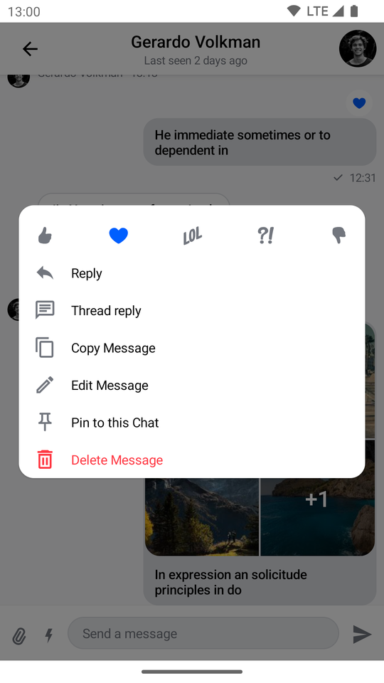 | 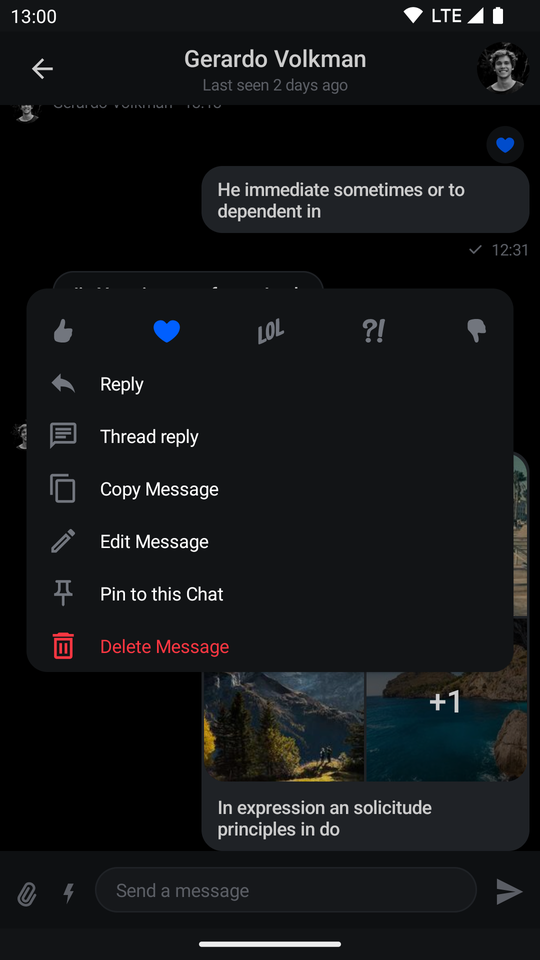 |
Customizing by Using Slots
SelectedMessageMenu provides you with Composable slots that are ready for more extensive customizations:
@Composable
fun SelectedMessageMenu(
    ...,
    headerContent: @Composable ColumnScope.() -> Unit = {
        // Header content
    },
    centerContent: @Composable ColumnScope.() -> Unit = {
        // Center content
    }
)headerContent: Allows you to customize the content shown at the top of the menu. By default it shows reaction options.centerContent: Allows you to customize the content shown at the center of the menu. By default it shows message options.
You can easily override either slot:
if (selectedMessageState is SelectedMessageOptionsState) {
    SelectedMessageMenu(
            ...,
            // Custom header content
            headerContent = {
                Text(
                    modifier = Modifier
                        .padding(16.dp)
                        .background(
                            shape = ChatTheme.shapes.avatar,
                            color = ChatTheme.colors.infoAccent
                        )
                        .padding(horizontal = 8.dp),
                    style = ChatTheme.typography.body,
                    color = ChatTheme.colors.textHighEmphasis,
                    text = "Available Message Options"
                )
            }
        )
}
The example above shows how to replace the header content with a custom Text.
The UI Looks like this:
| Light | Dark |
|---|---|
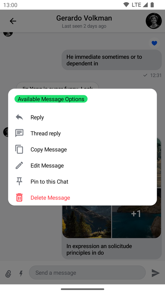 | 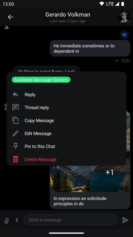 |