 React
React iOS
iOS Android
 Flutter
 Angular
 JavaScript
 Unity
Unity Unreal
 Node
Node Python
 Ruby
Ruby PHP
PHP Java
Java .NET
.NET Go
Go REST
RESTval factory by lazy {
ChannelViewModelFactory(
context = this,
channelId = channelId,
)
}
val listViewModel by viewModels<MessageListViewModel>(factoryProducer = { factory })Message List
The MessageList component is a crucial part of building a chat experience. We support two versions of the MessageList component:
- Bound: This version binds itself to the
MessageListViewModeland loads all the required data. It also connects single and long item tap, pagination, and bottom reached events to theViewModel. - Stateless: This is a stateless version of the list which doesn't know about the
ViewModeland depends on pure state from external sources to render its UI.
The bound version of the list uses the stateless list internally. That way, when providing the same state to either component, the behavior remains the same.
Additionally, we cannot provide a default ViewModel for this component, as it requires the channelId to load the data, so you'll have to build an instance yourself.
Based on the provided state, this component shows the following UI:
- Loading indicator: While we're loading the initial data.
- Empty content: If there is no data and we've finished loading.
- Messages: The list of messages in the channel, including file and image attachments, with various actions like thread clicks, item long taps, pagination and reaching the bottom.
Let's see how to show a list of messages.
Usage
To use the bound MessageList, first initialize the ViewModel using our ChannelViewModelFactory:
Then add it to the rest of your UI, for example within setContent():
override fun onCreate(savedInstanceState: Bundle?) {
    super.onCreate(savedInstanceState)
    // Load data

    setContent {
        ChatTheme {
            Column(
                Modifier.fillMaxSize()
            ) {
                ChannelHeader(...)

                MessageList(
                    viewModel = listViewModel,
                    modifier = Modifier.fillMaxSize()
                )

                // Rest of your UI
            }
        }
    }
}
As you can see, it's easy to add the component to your UI and combine it with our other components (or your own) to build a custom screen. Additionally, if you choose the bound version, as seen here, you just need to provide a MessageListViewModel and the component will work on its own.
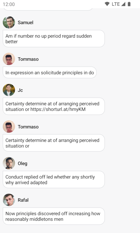
The snippet above will produce the following UI.

Notice how easy it was to integrate this component with other composable functions, like our ChannelHeader. You can see that the component shows different types of messages, such as link and image previews. It also handles pagination and various other events when scrolling or receiving new messages.
Let's see how to handle the actions within the list.
Handling Actions
The MessageList component exposes the following actions, as per the signature:
@Composable
fun MessageList(
    ..., // State & UI
    onThreadClick: (Message) -> Unit = { viewModel.openMessageThread(it) },
    onLongItemClick: (Message) -> Unit = { viewModel.selectMessage(it) },
    onReply: (Message) -> Unit = {},
    onMediaGalleryPreviewResult: (MediaGalleryPreviewResult?) -> Unit = { ... },
    // Pagination and scroll actions
    onMessagesPageStartReached: () -> Unit = { viewModel.loadOlderMessages() },
    onMessagesPageEndReached: (String) -> Unit = { viewModel.onBottomEndRegionReached(it) },
    onLastVisibleMessageChanged: (Message) -> Unit = { viewModel.updateLastSeenMessage(it) },
    onScrollToBottom: () -> Unit = { viewModel.clearNewMessageState() },
    onScrollToBottomClicked: (() -> Unit) -> Unit = { viewModel.scrollToBottom(scrollToBottom = it) },
    onPauseAudioRecordingAttachments: () -> Unit = { viewModel.pauseAudioRecordingAttachments() },
)
Message Actions
onThreadClick: Handler used when the user taps on a message with a thread.onLongItemClick: Handler used when the user long taps on an item.onReply: Handler used when the user triggers a reply action on a message.onMediaGalleryPreviewResult: Handler used when the user receives a result from the Media Gallery Preview screen, after opening an image or a video attachment.
Pagination and Scroll Actions
onMessagesPageStartReached: Handler used when the user reaches the oldest loaded message, to trigger pagination.onMessagesPageEndReached: Handler used when the user reaches the newest loaded message, to trigger pagination.onLastVisibleMessageChanged: Handler used when the user scrolls and the last visible item changes.onScrollToBottom: Handler used when the user reaches the newest message. Used to remove the "New message" or "Scroll to bottom" actions from the UI.onScrollToBottomClicked: Handler used when the user clicks on the scroll to bottom button.onPauseAudioRecordingAttachments: Handler used to pause any playing audio recording attachments when needed (e.g., when navigating away).
You can customize the behavior here by providing your own actions, like so:
MessageList(
    ..., // State
    onThreadClick = { message -> },
    onLongItemClick = { message -> },
    onReply = { message -> },
    // ... other handlers
)
If you're using the bound version of the component, these actions update the state within the ViewModel by default, while the default actions of the stateless version are all empty.
We recommend using the bound version for ease of use. Alternatively, you can use the stateless version and provide the data manually, for more control.
Controlling the scroll state
The MessageList allows you to control the scroll state of the list by providing a messagesLazyListState parameter, like so:
@Composable
fun MessageList(
    ..., // State, UI & Actions
    messagesLazyListState: MessagesLazyListState = rememberMessageListState(parentMessageId = viewModel.currentMessagesState.parentMessageId),
    ... // Content
)messagesLazyListState: The scroll state of the list. While not a handler, you can use it to control the scroll and trigger custom scroll actions.
You can customize this state in the following way:
val myListState = rememberMessageListState(parentMessageId = state.parentMessageId)

MessageList(
    ..., // the rest of the state, UI & actions
    messagesLazyListState = myListState,
)
rememberMessageListState() keeps a separate instance of MessagesLazyListState based on the parentMessageId. This helps you keep the scroll state of the main list intact when you enter and leave threads.
You can also provide your own instance of MessagesLazyListState where you define the starting scroll position of the state and how the focused message offset is calculated. For example, clicking on the original message contained within the reply will automatically scroll to the message and put it in focus. You can define where on the screen the focused message appears by passing in your own MessageOffsetHandler.
Previewing Attachments
Out of the box previews are provided for the following attachment types: uploading, link, Giphy, image, video and file.
Image and Video
Image and video attachments are previewed as thumbnails which can be displayed as a single tile or multiple ones depending on how many attachments are contained within the specific message. By default, these are rendered by ChatComponentFactory.MediaAttachmentContent().
Attachment rendering can be customized by overriding the corresponding methods in ChatComponentFactory. To learn more, see the Component Factory page.
In practice they appear as such:

Video thumbnails are enabled by default but can be turned off via ChatUiConfig.messageList.videoThumbnailsEnabled. When disabled, video attachments show a generic play icon instead of a thumbnail preview. See Customizing Image and Video Previews for more details.
Customization
The MessageList delegates all UI rendering to the component factory (ChatTheme.componentFactory). To customize how messages are displayed, override the relevant factory methods. See the Component Factory documentation for the full list of customizable components.
Here's an example of customizing the message items by overriding MessageItem in the factory:
// Customize the message item to show an avatar, username, and a message bubble.
object CustomMessageItemFactory : ChatComponentFactory {
    @Composable
    override fun LazyItemScope.MessageItem(params: MessageItemParams) {
        val messageListItem = params.messageListItem
        if (messageListItem is MessageItemState) {
            val message = messageListItem.message

            Column(
                modifier = Modifier
                    .padding(8.dp)
                    .widthIn(max = 300.dp)
            ) {
                Row(verticalAlignment = Alignment.CenterVertically) {
                    UserAvatar(
                        modifier = Modifier.size(36.dp),
                        user = message.user,
                    )

                    Text(
                        modifier = Modifier.padding(start = 8.dp),
                        text = message.user.name,
                        style = ChatTheme.typography.bodyEmphasis,
                        fontSize = 14.sp,
                        color = ChatTheme.colors.textPrimary
                    )
                }

                MessageBubble(
                    color = ChatTheme.colors.backgroundCoreElevation1,
                    modifier = Modifier.padding(top = 4.dp),
                    shape = RoundedCornerShape(
                        topEnd = 16.dp,
                        topStart = 0.dp,
                        bottomEnd = 16.dp,
                        bottomStart = 16.dp
                    ),
                    content = {
                        Text(
                            modifier = Modifier.padding(8.dp),
                            text = message.text,
                            color = ChatTheme.colors.textPrimary
                        )
                    }
                )
            }
        }
    }
}
Then pass the factory to ChatTheme:
ChatTheme(componentFactory = CustomMessageItemFactory) {
    MessageList(
        viewModel = listViewModel,
        modifier = Modifier.fillMaxSize(),
    )
}
This factory override features a Column that hosts a Row with an avatar and a text showing the user name, as well as a MessageBubble that wraps the message text. This will produce the following UI in the MessageList:
Note that this approach doesn't automatically display attachments, so you'll have to show attachment UI based on the provided attachmentFactories within the ChatTheme.
You can similarly customize the loading, empty, and helper states by overriding MessageListLoadingIndicator, MessageListEmptyContent, and MessageListHelperContent in the factory.