 React
React iOS
iOS Android
 Flutter
 Angular
 JavaScript
 Unity
Unity Unreal
 Node
Node Python
 Ruby
Ruby PHP
PHP Java
Java .NET
.NET Go
Go REST
RESTmessageListView.setAttachmentReplyOptionClickHandler { resultItem ->
resultItem.messageId
// Handle reply to attachment
}
messageListView.setAttachmentShowInChatOptionClickHandler { resultItem ->
resultItem.messageId
// Handle show in chat
}
messageListView.setDownloadOptionHandler { resultItem ->
resultItem.assetUrl
// Handle download the attachment
}
messageListView.setAttachmentDeleteOptionClickHandler { resultItem ->
resultItem.assetUrl
resultItem.imageUrl
// Handle delete
}Working with Attachments/Files
The SDK allows users to add attachments to a message. Several attachment types are supported, such as image, video, file and Giphy.
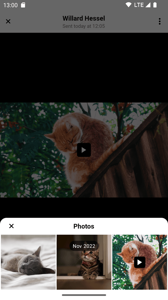
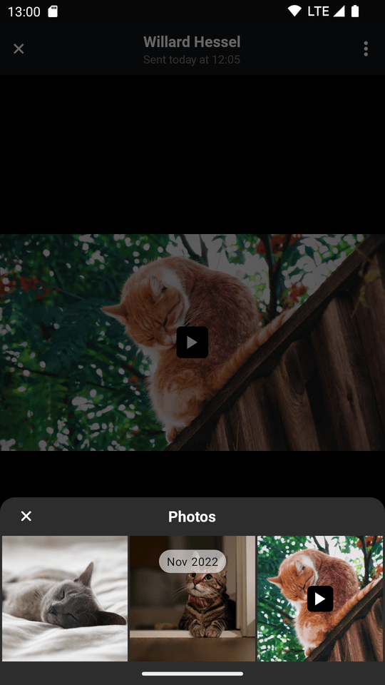
Attachment Gallery
AttachmentGalleryActivity is an Activity used to display image and video attachments that the users have sent in the chat. Users can view, share, and download the attachments, and use an overview to easily navigate through them.
| Light Mode | Dark Mode |
|---|---|
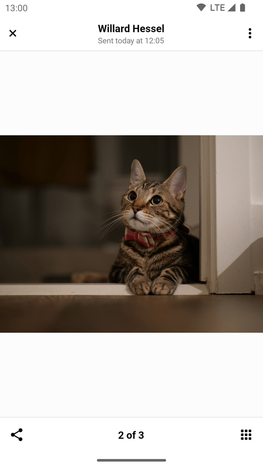 | 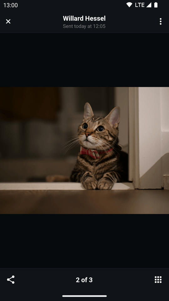 |
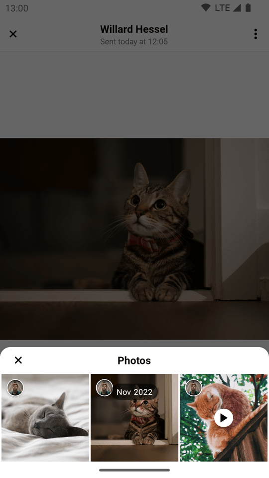 | 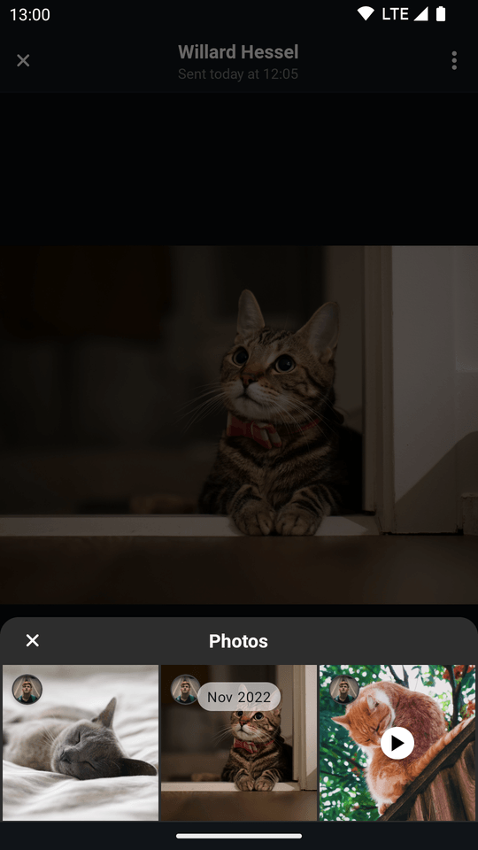 |
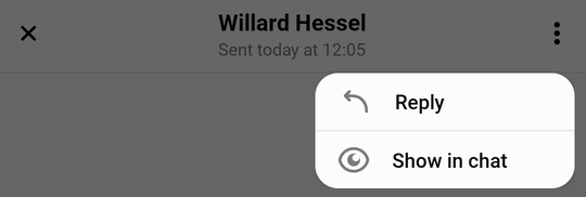
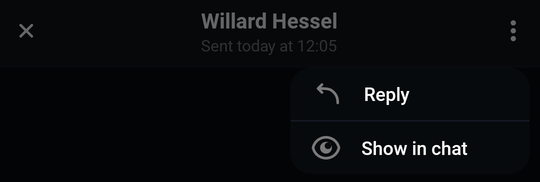
Handling Actions
There are four user actions that can be customized by the following handlers:
AttachmentReplyOptionHandlerAttachmentShowInChatOptionHandlerAttachmentDownloadOptionHandlerAttachmentDeleteOptionHandler
These are called when the user selects one of the options from the overflow menu in the top right corner:
| Light | Dark |
|---|---|
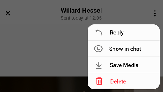 | 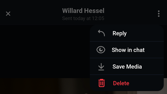 |
As the gallery is usually opened from MessageListView, you can set these handlers on the View in the following way:
Navigating to the Attachment Gallery
By default, the Attachment Gallery is opened when a user clicks on an attachment in MessageListView. In which case, all actions mentioned above have a default implementation, which can be changed by overriding MessageListView's handlers.
You can also navigate to AttachmentGalleryActivity manually from anywhere else in your code. In this case, you will need to implement all available actions:
// Create Attachment Gallery Destination
val destination = AttachmentGalleryDestination(
    requireContext(),
    attachmentReplyOptionHandler = { resultItem ->
        // Handle reply
    },
    attachmentShowInChatOptionHandler = { resultItem ->
        // Handle show image in chat
    },
    attachmentDownloadOptionHandler = { resultItem ->
        // Handle download image
    },
    attachmentDeleteOptionClickHandler = { resultItem ->
        // Handle delete image
    },
)

// Register destination with the ActivityResultRegistry
activity?.activityResultRegistry?.let { registry ->
    destination.register(registry)
}

// Set the data to display
destination.setData(attachmentGalleryItems = listOf(), attachmentIndex = 0)

// Fire the navigation request
ChatUI.navigator.navigate(destination)Customization
The gallery can be customized through the use of styleable attributes. These are organized into individual styles which apply to a certain aspect or feature of the gallery.
You can find all of the styles listed here.
Some of these styles are applied directly to stock Android components. These accept any attribute that is normally applicable to the given stock Android component. Others power Stream UI components and have custom made styled attributes.
streamUiAttachmentGalleryCloseButtonStyle: Styles the button used to close the gallery. Accepts allImageViewattributes.streamUiAttachmentGalleryTitleStyle: Styles the title seen in the header. Accepts allTextViewattributes.streamUiAttachmentGalleryDateStyle: Styles the date section in the header. Accepts allTextViewattributes.streamUiAttachmentGalleryActionsMenuStyle: Styles the button used to activate the options menu. Accepts allImageViewattributes.streamUiAttachmentGalleryBottomBarImageCountStyle: Styles the text displaying the number of all media attachments contained within the message and the position of the one currently being viewed. Accepts allTextViewattributes.streamUiAttachmentGalleryBottomBarLeftIconStyle: Styles the left icon inside the bottom bar. By default it shows a share icon. Accepts allImageViewattributes.streamUiAttachmentGalleryBottomBarRightIconStyle: Styles the right icon inside the bottom bar. By default it shows a tiled icon that opens the menu. Accepts allImageViewattributes.streamUiAttachmentGalleryOptionsStyle: Styles the actions menu. Accepts custom Stream attributes, all of which are listed here.streamUiAttachmentGalleryVideoAttachmentsStyle: Styles how video attachments are displayed in the main viewing area of the gallery. Accepts custom Stream attributes, all of which are listed here.streamUiMediaAttachmentGridViewStyle: Styles how the media overview menu is displayed. Accepts custom Stream attributes, all of which are listed here.
Creating styles to change the appearance
Let's start customizing our screen by styling the play button displayed over videos so that it features a flat design.
- Create a style which changes the way the play button is displayed in the main viewing area of the gallery:
<style name="CustomAttachmentGalleryVideoAttachmentStyle">
    <item name="streamUiAttachmentGalleryViewMediaPlayVideoIconTint">@color/stream_ui_literal_white</item>
    <item name="streamUiAttachmentGalleryViewMediaPlayVideoIconCornerRadius">5dp</item>
    <item name="streamUiAttachmentGalleryViewMediaPlayVideoIconBackgroundColor">@color/stream_ui_literal_black</item>
    <item name="streamUiAttachmentGalleryViewMediaPlayVideoIconPaddingTop">5dp</item>
    <item name="streamUiAttachmentGalleryViewMediaPlayVideoIconPaddingBottom">5dp</item>
    <item name="streamUiAttachmentGalleryViewMediaPlayVideoIconPaddingStart">5dp</item>
    <item name="streamUiAttachmentGalleryViewMediaPlayVideoIconPaddingEnd">5dp</item>
    <item name="streamUiAttachmentGalleryViewMediaPlayVideoIconElevation">0dp</item>
</style>- Create a style which changes the way the play button is displayed in the overview:
<style name="CustomMediaAttachmentGridView">
    <item name="streamUiMediaAttachmentGridViewPlayVideoButtonIcon">@drawable/stream_ui_ic_play</item>
    <item name="streamUiMediaAttachmentGridViewPlayVideoIconElevation">3dp</item>
    <item name="streamUiMediaAttachmentGridViewPlayVideoIconPaddingTop">2dp</item>
    <item name="streamUiMediaAttachmentGridViewPlayVideoIconPaddingBottom">2dp</item>
    <item name="streamUiMediaAttachmentGridViewPlayVideoIconPaddingStart">3dp</item>
    <item name="streamUiMediaAttachmentGridViewPlayVideoIconPaddingEnd">2dp</item>
    <item name="streamUiMediaAttachmentGridViewPlayVideoIconCornerRadius">24dp</item>
    <item name="streamUiMediaAttachmentGridViewPlayVideoIconBackgroundColor">@color/stream_ui_literal_white</item>
    <item name="streamUiMediaAttachmentGridViewImagePlaceholder">@drawable/stream_ui_picture_placeholder</item>
</style>- Use the newly created style to create a custom Stream theme:
<style name="CustomStreamUiTheme" parent="@style/StreamUiTheme">
    <item name="streamUiMediaAttachmentGridViewStyle">@style/CustomMediaAttachmentGridView</item>
    <item name="streamUiAttachmentGalleryVideoAttachmentsStyle">@style/CustomAttachmentGalleryVideoAttachmentStyle</item>
</style>- Add the custom theme to your attachment gallery Activity theme, along with a few lines that make the status and navigation bars look prettier:
<style name="CustomAttachmentGalleryTheme" parent="Theme.MaterialComponents.DayNight.NoActionBar">
    <!-- Style the status and navigation bars -->
    <item name="android:windowLightStatusBar">?attr/isLightTheme</item>
    <item name="android:statusBarColor">@android:color/transparent</item>
    <item name="android:navigationBarColor">@android:color/transparent</item>

    <!-- Add custom stream theme you've created -->
    <item name="streamUiTheme">@style/CustomStreamUiTheme</item>
</style>- Finally, override the default gallery theme in your app's manifest:
<activity
   android:name="io.getstream.chat.android.ui.feature.gallery.AttachmentGalleryActivity"
   android:theme="@style/CustomAttachmentGalleryTheme"
   tools:replace="android:theme" />
These few simple steps result in the following UI:
| Light Mode | Dark Mode |
|---|---|
 |  |
As you can see, we've replaced the elevated white circular play button shown in the first few screenshots with a flat black squircle.
We can customize other aspects of the gallery, for instance by removing menu options which we want to restrict from the user.
Let's remove the download and delete options:
- Create a style that disables the previously mentioned options:
<style name="CustomAttachmentGalleryOptionsStyle">
    <item name="streamUiDeleteEnabled">false</item>
    <item name="streamUiSaveMediaEnabled">false</item>
</style>- Add it to the custom Stream theme we've created in the previous example:
<style name="CustomStreamUiTheme" parent="@style/StreamUiTheme">
    <item name="streamUiMediaAttachmentGridViewStyle">@style/CustomMediaAttachmentGridView</item>
    <item name="streamUiAttachmentGalleryVideoAttachmentsStyle">@style/CustomAttachmentGalleryVideoAttachmentStyle</item>
    <!-- Add the custom options style to the custom theme -->
    <item name="streamUiAttachmentGalleryOptionsStyle">@style/CustomAttachmentGalleryOptionsStyle</item>
</style>
Which gives the options menu the following appearance:
| Light | Dark |
|---|---|
 |  |
Complete List of Options Menu Attributes
The following attributes are available for customizing the attachment options menu:
Enable/Disable Options:
streamUiAttachmentReplyEnabled- Enable or disable the "Reply" option.streamUiShowInChatEnabled- Enable or disable the "Show in Chat" option.streamUiSaveMediaEnabled- Enable or disable the "Save Media" option.streamUiDeleteEnabled- Enable or disable the "Delete" option.
Text Styling:
streamUiAttachmentOptionTextSize- Text size of option labels.streamUiAttachmentOptionTextColor- Text color of option labels.streamUiAttachmentOptionTextFont- Font resource for option labels.streamUiAttachmentOptionTextFontAssets- Font assets path for option labels.streamUiAttachmentOptionTextStyle- Text style:normal,bold, oritalic.streamUiDeleteTextTint- Tint color for the delete option text.
Icon Customization:
streamUiReplyIcon- Drawable for the reply icon.streamUiShowInChatIcon- Drawable for the "Show in Chat" icon.streamUiSaveMediaIcon- Drawable for the save media icon.streamUiDeleteIcon- Drawable for the delete icon.
Background:
streamUiAttachmentOptionsBackgroundColor- Background color of the options dialog.
Now you have the ability to make the gallery feel like an organic part of your app.