 React
React iOS
iOS Android
 Flutter
 Angular
 JavaScript
 Unity
Unity Unreal
 Node
Node Python
 Ruby
Ruby PHP
PHP Java
Java .NET
.NET Go
Go REST
RESToverride fun onCreate(savedInstanceState: Bundle?) {
super.onCreate(savedInstanceState)
setContent {
ChatTheme {
ChannelList(modifier = Modifier.fillMaxSize())
}
}
}Channel List
The ChannelList component allows you to build a paginated list of Channel items with exposed long tap and single tap actions. We provide two versions of the ChannelList component:
- Bound: Binds to a
ChannelListViewModeland loads all required data automatically. Connects long item tap and pagination events to theViewModel. - Stateless: Doesn't depend on a
ViewModel. Instead, it takeschannelsStateandcurrentUseras parameters for rendering.
You can learn more about the different component types on the Component Architecture page.
The bound version uses the stateless version internally. When providing the same state to either component, the behavior is identical.
Based on the provided state, the component shows the following UI:
- Loading indicator: When loading the initial data.
- Empty content: When loading is complete but there are no channels.
- Empty search content: When a search query returns no results.
- Channel list: The paginated list of channels.
Let's see how to show a list of channels.
Usage
To use the bound ChannelList, add it to your UI within setContent():
This basic example shows a paginated list of channels. The default ChannelListViewModel is created automatically with:
- Sort order:
QuerySortByField.descByName("last_updated") - Filters:
null(shows all channels the user is a member of)
We recommend passing in action handlers to react to item taps, or providing a custom ChannelListViewModel instance.
The snippet above will generate the following UI.
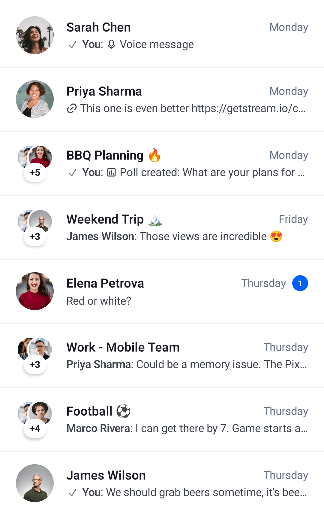 |
|---|
Let's see how to handle actions and use the ViewModel.
Handling Actions
If you've chosen the bound version of the ChannelList component, we recommend either providing your own instance of the ViewModel, or overriding default actions to react to state changes. To support that, the ChannelList signature exposes the following parameters:
@Composable
fun ChannelList(
    viewModel: ChannelListViewModel = viewModel(
        factory = ... // Our default factory
    ),
    onLastItemReached: () -> Unit = { viewModel.loadMore() },
    onChannelClick: (Channel) -> Unit = {},
    onChannelLongClick: (Channel) -> Unit = { viewModel.selectChannel(it) },
    onSearchResultClick: (Message) -> Unit = {},
    onStartChatClick: (() -> Unit)? = null,
)viewModel: The instance of theChannelListViewModelthat this component reads data from and sends events to. Pass in your own instance if you want more control over your business logic, such as changingChannelfilters or sort order in runtime.onLastItemReached: Handler when the user reaches the last item in the list to trigger pagination. You don't need to override this if you're using the defaultviewModel, but if you're using a custom one, you can add custom behavior.onChannelClick: Handler when the user taps on an item. Useful for starting theChannelScreen.onChannelLongClick: Handler when the user long taps on an item. By default, this updates state in theviewModel, which you can read to show custom UI andChannelactions if you're using a customViewModelinstance. Override if you're using the defaultviewModeland you want to change the behavior.onSearchResultClick: Handler when the user taps on a search result item. Useful for starting theChannelScreenwith the selected message.onStartChatClick: Handler for the "Start a chat" button shown in the empty state. When non-null, a button is displayed that triggers this handler. Whennull(default), the button is hidden.
Here's an example of using the default ViewModel, but overriding the behavior:
override fun onCreate(savedInstanceState: Bundle?) {
    super.onCreate(savedInstanceState)

    setContent {
        ChatTheme {
            // Custom state holder
            var selectedChannel by remember { mutableStateOf<Channel?>(null) }

            Box(modifier = Modifier.fillMaxSize()) {
                ChannelList(
                    modifier = Modifier.fillMaxSize(),
                    onChannelLongClick = { // Custom long tap handler
                        selectedChannel = it
                    },
                    onChannelClick = {
                        // Start the ChannelScreen
                    },
                    onSearchResultClick = {
                        // Start the ChannelScreen with the selected message
                    }
                )

                if (selectedChannel != null) {
                    // Show custom UI
                }
            }
        }
    }
}
In the example above, we created a selectedChannel state holder, which we use to show some custom UI if the data is not null. We update the state when the user long taps on an item.
We also provide a custom onChannelClick handler, to open the ChannelScreen with the selected item. This will produce the same UI, but with user-defined actions.
Finally we provide a custom onSearchResultClick handler, to open the ChannelScreen with the selected message.
Alternatively, you can override the default ViewModel and read the internal state:
val listViewModel: ChannelListViewModel by viewModels { ChannelListViewModelFactory() }

override fun onCreate(savedInstanceState: Bundle?) {
    super.onCreate(savedInstanceState)

    setContent {
        ChatTheme {
            Box(modifier = Modifier.fillMaxSize()) {
                ChannelList(
                    modifier = Modifier.fillMaxSize(),
                    viewModel = listViewModel, // Passing in our ViewModel
                    onChannelClick = {
                        // Start the ChannelScreen
                    },
                    onSearchResultClick = {
                        // Start the ChannelScreen with the selected message
                    },
                )

                if (listViewModel.selectedChannel.value != null) {
                    // Show custom UI
                }
            }
        }
    }
}
The behavior will be the same and you gain more control over the ViewModel.
We recommend that you create an instance of our ViewModel if you're thinking of using our predefined state and operations. If you're looking into a more low-level solution, with more control, you can use the stateless version of our components.
To customize how real-time events affect the channel list (e.g., when using multiple lists filtered by channel type), see Channels State and Filtering.
Controlling the scroll state
You can control the scroll state of the channel list by providing a lazyListState parameter, like in the example below:
@Composable
fun ChannelList(
    ..., // State
    lazyListState: LazyListState = rememberLazyListState(),
    ... // Actions
)lazyListState: The scroll state of the list. While not a handler, you can use it to control the scroll and trigger custom scroll actions.
To customize this state you can simply pass your own instance as a parameter:
val lazyListState = rememberLazyListState()

ChannelList(
    // State
    lazyListState = lazyListState
    // Actions
)
Customization
The ChannelList delegates all UI rendering to the component factory (ChatTheme.componentFactory). To customize how channels are displayed, override the relevant factory methods. See the Component Factory documentation for the full list of customizable components.
Here's a simple example that customizes the channel item to show only the avatar and name, by overriding ChannelListItemContent in the factory:
// Customize the channel item to show only the avatar and name.
object CustomChannelItemFactory : ChatComponentFactory {
    @Composable
    override fun LazyItemScope.ChannelListItemContent(params: ChannelListItemContentParams) {
        Row(
            modifier = Modifier
                .padding(8.dp)
                .fillMaxWidth(),
            verticalAlignment = Alignment.CenterVertically
        ) {
            ChannelAvatar(
                modifier = Modifier.size(40.dp),
                channel = params.channelItem.channel,
                currentUser = params.currentUser
            )

            Spacer(modifier = Modifier.width(8.dp))

            Text(
                text = ChatTheme.channelNameFormatter.formatChannelName(
                    params.channelItem.channel,
                    params.currentUser,
                ),
                style = ChatTheme.typography.bodyEmphasis,
                maxLines = 1,
            )
        }
    }
}
Then pass the factory to ChatTheme:
ChatTheme(componentFactory = CustomChannelItemFactory) {
    ChannelList(viewModel = listViewModel)
}
The snippet above will generate the following UI:
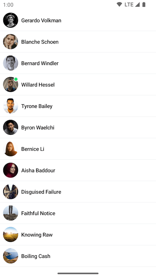 |
|---|
As you can see, the items now show just the image and the channel name. You can customize the items to any extent, whatever your design specification might require.
You can similarly customize the loading, empty, and divider states by overriding ChannelListLoadingIndicator, ChannelListEmptyContent, ChannelListEmptySearchContent, and ChannelListDividerItem in the factory.