 React
React iOS
iOS Android
 Flutter
 Angular
 JavaScript
 Unity
Unity Unreal
 Node
Node Python
 Ruby
Ruby PHP
PHP Java
Java .NET
.NET Go
Go REST
REST// Create a drawable for the non-selected reaction option
val loveDrawable = ContextCompat.getDrawable(context, R.drawable.stream_ui_ic_reaction_love)!!
// Create a drawable for the selected reaction option and set a tint to it
val loveDrawableSelected = ContextCompat.getDrawable(context, R.drawable.stream_ui_ic_reaction_love)!!
.mutate()
.apply { setTint(Color.RED) }
// Create a map of reactions
val supportedReactionsData = mapOf(
"love" to SupportedReactions.ReactionDrawable(loveDrawable, loveDrawableSelected)
)
// Replace the default reactions with your custom reactions
ChatUI.supportedReactions = SupportedReactions(context, supportedReactionsData)Customizing Components
The SDK provides an API for general configuration of the UI Component library's behavior and appearance, which is exposed via the ChatUI object.
ChatUI allows you to override the default implementations of commonly used parts of the SDK such as:
- Available message reactions
- The UI used for rendering attachments
- MIME type icons for attachments
- Default font used across the UI components
- Attachments URLs
- Text transformations
The full list of ChatUI properties you can override include:
style: Allows overriding the global, default style of UI components, such asdefaultTextStyle.navigator: Allows intercepting and modifying default navigation between SDK components (for example: navigating fromMessageListViewtoAttachmentGalleryActivity).fonts: The default font forTextViews displayed by UI Components.messageTextTransformer: Used to transform the way text is rendered on screen, for example: create clickable link text or implement markdown support. You can override it withMarkdownTextTransformerif you want to use Stream's ready-made markdown support.supportedReactions: The set of supported message reactions.reactionPushEmojiFactory: Allows overriding default emojis for reactions in push notifications.mimeTypeIconProvider: The icons used for different mime types.channelNameFormatter: Allows customizing the way channel names are formatted.messagePreviewFormatter: Allows you to generate a preview text for the given message.dateFormatter: Allows changing the way dates are formatted.durationFormatter: Allows formatting durations as strings.decoratorProviderFactory: Allows customizing message decorators in the message list.attachmentFactoryManager: Allows changing the way attachments are displayed in the message list. Includes adding UI for custom attachments.attachmentPreviewFactoryManager: Allows changing the way attachments are displayed in the message composer. Includes adding UI for custom attachments.quotedAttachmentFactoryManager: Allows changing the way attachments are displayed in quoted messages both in the message list and the message composer. Includes adding UI for custom attachments.currentUserProvider: Provides the currently logged in user.videoThumbnailsEnabled: Changes whether thumbnails are shown for video attachments.draftMessagesEnabled: Whether draft messages are enabled. Defaults totrue.streamCdnImageResizing: Sets the strategy for resizing images hosted on Stream's CDN.autoTranslationEnabled: Whether or not the auto-translation feature is enabled. Defaults totrue.showOriginalTranslationEnabled: Whether the option to show the original translation is enabled. Defaults totrue.userAvatarRenderer: Provides a custom renderer for user avatars.channelAvatarRenderer: Provides a custom renderer for channel avatars.
ChatUI is initialized out-of-the-box with default implementations - no initialization is required on app startup.
Custom Reactions
By default, the SDK provides 5 built-in reactions:
| Light Theme | Dark Theme |
|---|---|
 |  |
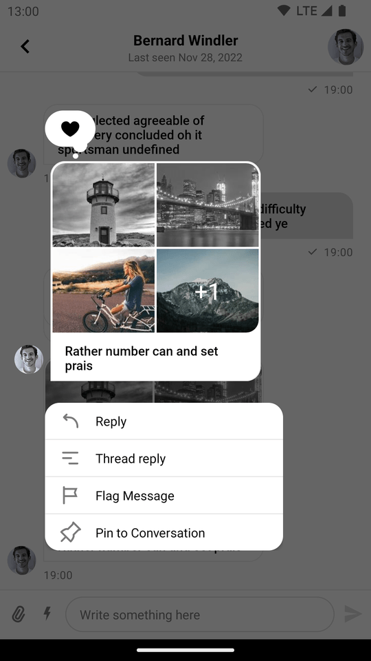
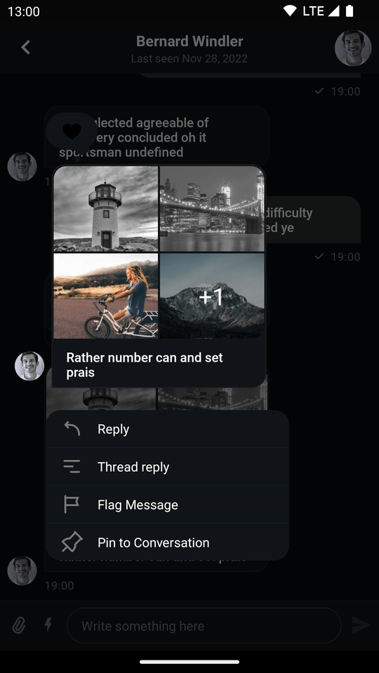
You can change the default reactions by overriding ChatUI.supportedReactions with your own set of reactions:
As a result, only the love reaction is available in the chat, and when selected, it will have a red tint.
| Normal state - available reactions (Light Mode) | Selected state - reaction selected (Light Mode) |
|---|---|
 |  |
| Normal state - available reactions (Dark Mode) | Selected state - reaction selected (Dark Mode) |
|---|---|
 |  |
Custom MIME Type Icons
When possible, the SDK displays thumbnails for image and video files. When thumbnails are unavailable or when other types of files are in question, mime type icons are displayed in MessageListView, MessageComposer and attachment picker.
By default, the SDK provides built-in MIME type icons for the most popular file types and displays a generic file icon for others.
To customize these icons, you need to override ChatUI.mimeTypeIconProvider like so:
ChatUI.mimeTypeIconProvider = MimeTypeIconProvider { mimeType ->
    when {
        // Generic icon for missing MIME type
        mimeType == null -> R.drawable.stream_ui_ic_file
        // Special icon for XLS files
        mimeType == "application/vnd.ms-excel" -> R.drawable.stream_ui_ic_file_xls
        // Generic icon for audio files
        mimeType.contains("audio") -> R.drawable.stream_ui_ic_file_mp3
        // Generic icon for video files
        mimeType.contains("video") -> R.drawable.stream_ui_ic_file_mov
        // Generic icon for other files
        else -> R.drawable.stream_ui_ic_file
    }
}Customizing Avatars
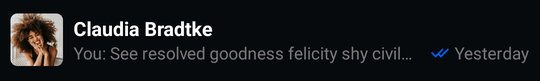
An avatar is a small image that identifies a specific user or channel.
UserAvatarView is used in the lists of users and messages, whereas ChannelAvatarView is used in the lists of channels.
The image in the UserAvatarView and ChannelAvatarView is being displayed based on the image property, present in both User and Channel objects respectively:
| Light Mode | Dark Mode |
|---|---|
 |  |
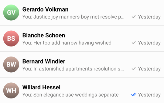
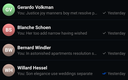
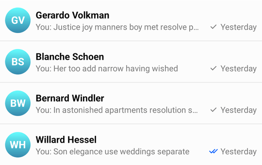
Both UserAvatarView and ChannelAvatarView will use the default gradient color with initials if the image property cannot be loaded:
| Light Mode | Dark Mode |
|---|---|
 |  |
In addition, ChannelAvatarView provides several fallback scenarios when the image property is an empty string:
- If the channel has just
1member, theimageproperty of this user will be used to display an avatar. - If the channel has just
2members, thenameproperty of the user who is not the current user will be used to display an avatar. - If the channel has more than two members, the avatar image will be produced from the first
4users in the channel's member list.
Customizing Avatars Using Styles
You can configure the avatar shape, border width, online indicator and other aspects using AvatarStyle. You can create this kind of avatar by changing the shape and corner radius:
| Light Mode | Dark Mode |
|---|---|
 |  |
Customizing User Avatars Using UserAvatarRenderer
Overriding the UserAvatarRenderer allows you to add custom logic for the user's avatars displayed using UserAvatarView.
The UserAvatarView.setAvatar method mentioned below can accept different data types as avatar parameter.
It can be a Bitmap, Drawable, Uri, String or DrawableRes (resource id).
ChatUI.userAvatarRenderer = object : UserAvatarRenderer {
    override fun render(style: AvatarStyle, user: User, target: UserAvatarView) {
        // You can apply custom image loading logic here
        val placeholder: Drawable = /* ... */
        target.setAvatar(avatar = user.image, placeholder = placeholder)
        target.setOnline(online = user.online)
    }
}Customizing Channel Avatars Using ChannelAvatarRenderer
Overriding the ChannelAvatarRenderer allows you to add custom logic for the channel's avatars displayed using ChannelAvatarView.
The AvatarImageView.setAvatar method mentioned below can accept different data types as avatar parameter.
It can be a Bitmap, Drawable, Uri, String or DrawableRes (resource id).
Let's look at the different scenarios for channel avatars, which are handled by the default.
You can override the ChannelAvatarRenderer to apply custom logic for each scenario or just simplify the logic to a single approach for all scenarios.
ChatUI.channelAvatarRenderer = object : ChannelAvatarRenderer {
    override fun render(
        style: AvatarStyle,
        channel: Channel,
        user: User,
        targetProvider: ChannelAvatarViewProvider,
    ) {
        // You can apply custom image loading logic here
        val placeholder: Drawable = /* ... */

        // Scenario_1: `Channel.image` is not empty
        val target1: AvatarImageView = targetProvider.regular()
        target1.setAvatar(avatar = channel.image, placeholder = placeholder)

        // Scenario_2: `Channel.image` is empty and `Channel` has less or equal to 2 members
        val singleUser: User = /* ... */
        val target2: UserAvatarView = targetProvider.singleUser()
        target2.setAvatar(avatar = singleUser.image, placeholder = placeholder)
        target2.setOnline(online = singleUser.online)

        // Scenario_3: `Channel.image` is empty and `Channel` has more than 2 members
        val users = channel.members.filter { it.user.id != currentUser?.id }.map { it.user }
        val target3: List<AvatarImageView> = targetProvider.userGroup(users.size)
        target3.forEachIndexed { index, targetItem ->
            targetItem.setAvatar(avatar = users[index].image, placeholder = placeholder)
        }
    }
}If you only would like to change the gradient colors for the default avatar, you can use stream_ui_avatar_gradient_colors.
The default color set includes a variety of colors:
| Light Mode | Dark Mode |
|---|---|
 |  |
The set can be overridden in the color.xml file - you can expand or reduce the number of supported colors, like in the example below:
<array name="stream_ui_avatar_gradient_colors">
    <item>@color/stream_ui_avatar_gradient_blue</item>
</array>
Which creates:
| Light Mode | Dark Mode |
|---|---|
 |  |
Hiding User Avatar in Message Replies
You can hide the user avatar in message replies of the message list and message composer views.
| Show User Avatar in Replies | Hide User Avatar in Replies |
|---|---|
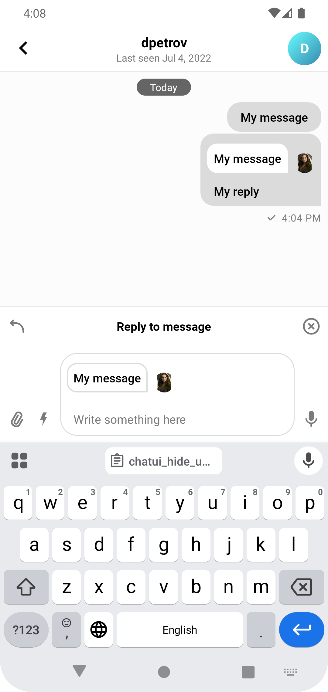 | 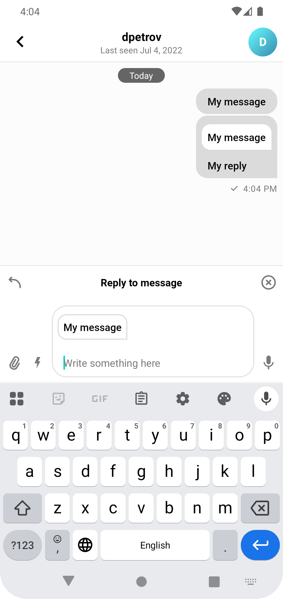 |
- It can be done directly in the XML layouts:
<io.getstream.chat.android.ui.feature.messages.list.MessageListView
    ...
    app:streamUiMessageReplyShowUserAvatar="false" />

<io.getstream.chat.android.ui.feature.messages.composer.MessageComposerView
    ...
app:streamUiMessageComposerMessageReplyShowUserAvatar="false" />- Or by overriding the styles in your
themes.xmlfile:
<style name="StreamTheme" parent="@style/StreamUiTheme">
    <item name="streamUiMessageListStyle">@style/MessageListTheme</item>
    <item name="streamUiMessageComposerViewStyle">@style/MessageComposerViewTheme</item>
</style>

<style name="MessageListTheme" parent="StreamUi.MessageList">
    <item name="streamUiMessageReplyShowUserAvatar">false</item>
</style>

<style name="MessageComposerViewTheme" parent="StreamUi.MessageComposerView">
    <item name="streamUiMessageComposerMessageReplyShowUserAvatar">false</item>
</style>
Changing the Default Font
You can customize the default fonts used by all of the UI components. To change the fonts, implement the ChatFont interface and set the new implementation on ChatUI:
ChatUI.fonts = object : ChatFonts {

    // Fetch the font you want to use
    val font = ResourcesCompat.getFont(context, R.font.stream_roboto_regular)

    override fun setFont(textStyle: TextStyle, textView: TextView) {
        textView.setTypeface(font, Typeface.BOLD)
    }

    override fun setFont(textStyle: TextStyle, textView: TextView, defaultTypeface: Typeface) {
        textView.setTypeface(font, Typeface.BOLD)
    }

    override fun getFont(textStyle: TextStyle): Typeface? = font
}Transforming Message Text
You can easily provide a transformer that can transform and apply the message text to a given TextView. You need to override ChatUI.messageTextTransformer to an instance of ChatMessageTextTransformers implementation.
ChatUI.messageTextTransformer = ChatMessageTextTransformer { textView: TextView, messageItem: MessageItem ->
    // Transform messages to upper case.
    textView.text = messageItem.message.text.uppercase()
}Stream UI TextView components don't have android:autoLink property set because it conflicts with Markdown plugins.
You can use AutoLinkableTextTransformer if you want to apply custom transformation but keep links clickable.
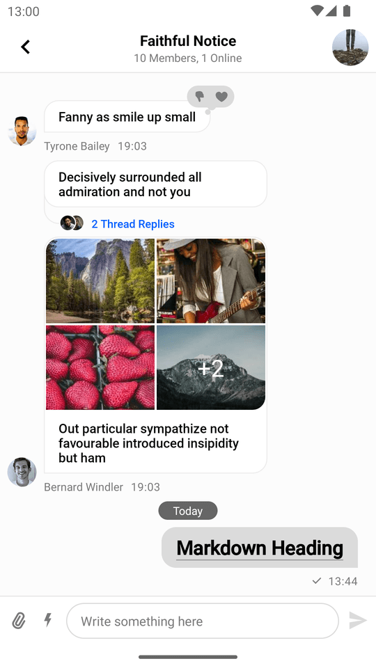
Markdown
The SDK provides a standalone Markdown module stream-chat-android-markdown-transformer that contains MarkdownTextTransformer which is an implementation of ChatMessageTextTransformer. It uses the Markwon library internally.
ChatUI.messageTextTransformer = MarkdownTextTransformer(context)If you use MarkdownTextTransformer, don't use android:autoLink attribute because it'll break the markdown Linkify implementation.
Then the SDK will parse Markdown automatically:
| Markdown Input in the Message Composer | Message with Markdown in the Message List |
|---|---|
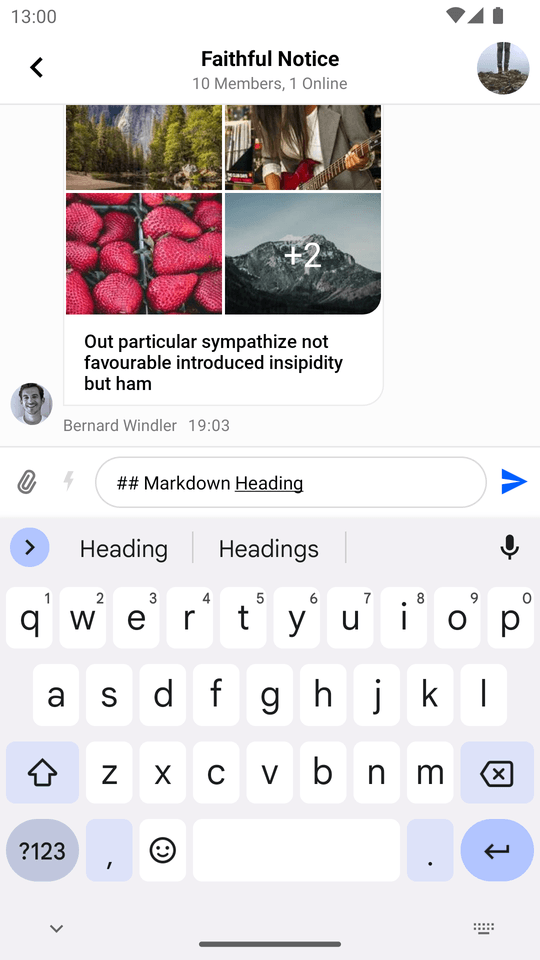 |  |
Navigator
The SDK performs navigation in certain cases:
- Navigating to
AttachmentGalleryActivityafter clicking on a video or an image attachment. - Opening the browser after clicking a link in the chat.
This action is performed by ChatNavigator. You can customize its behavior by providing your own implementation of ChatNavigationHandler:
val navigationHandler = ChatNavigationHandler { destination: ChatDestination ->
    // Perform a custom action here
    true
}

ChatUI.navigator = ChatNavigator(navigationHandler)Customizing ChannelNameFormatter
You can customize the way channel names are formatted by overriding the default ChannelNameFormatter:
ChatUI.channelNameFormatter = ChannelNameFormatter { channel, currentUser ->
    channel.name
}Customizing MessagePreviewFormatter
You can change the way the last messages are formatted in the channel list by overriding the default MessagePreviewFormatter:
ChatUI.messagePreviewFormatter = MessagePreviewFormatter { channel, message, currentUser ->
    message.text
}Customizing DateFormatter
Overriding the DateFormatter allows you to change the way dates are formatted in the application:
ChatUI.dateFormatter = object: DateFormatter {
    private val dateFormat: DateFormat = SimpleDateFormat("dd/MM/yyyy")
    private val timeFormat: DateFormat = SimpleDateFormat("HH:mm")

    override fun formatDate(date: Date?): String {
        date ?: return ""
        return dateFormat.format(date)
    }

    override fun formatTime(date: Date?): String {
        date ?: return ""
        return timeFormat.format(date)
    }

    override fun formatRelativeTime(date: Date?): String {
        // Used to format the time when a message was edited.
        date ?: return ""
        return timeFormat.format(date)
    }

    override fun formatRelativeDate(date: Date): String {
        // Used to format the date of the separator in the message list.
        return dateFormat.format(date)
    }
}Customizing Attachments
Stream allows both overriding the way the out-of-the-box supported attachments (image, video, etc.) are displayed, and implementing UI for custom attachments.
In the intro section, we've mentioned the different types of attachment factory managers. Depending on which part of the UI you want to customize, you will have to override different ChatUI properties.
If you want to customize the way attachments are presented in MessageListView:
val attachmentFactoryManager = AttachmentFactoryManager(
    // Set your custom attachment factories here
)

ChatUI.attachmentFactoryManager = attachmentFactoryManagerIf you want to customize the way attachments are presented in MessageComposerView:
val attachmentPreviewFactoryManager = AttachmentPreviewFactoryManager(
    // Set your custom attachment factories here
)

ChatUI.attachmentPreviewFactoryManager = attachmentPreviewFactoryManagerIf you want to customize the way attachments are presented inside quoted messages in MessageListView:
val quotedAttachmentFactoryManager = QuotedAttachmentFactoryManager(
    // Set your custom attachment factories here
)

ChatUI.quotedAttachmentFactoryManager = quotedAttachmentFactoryManagerGuide on Adding Support for Custom Attachments
We offer a guide on implementing custom attachment support which covers the topic extensively.
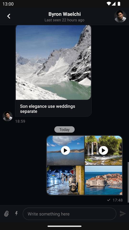
Disabling Video Thumbnails
Video thumbnails are enabled by default but can be disabled if needed.
When video thumbnails are enabled, the UI takes the following appearance:
| Messages List (Light Mode) | Attachment Gallery (Light Mode) |
|---|---|
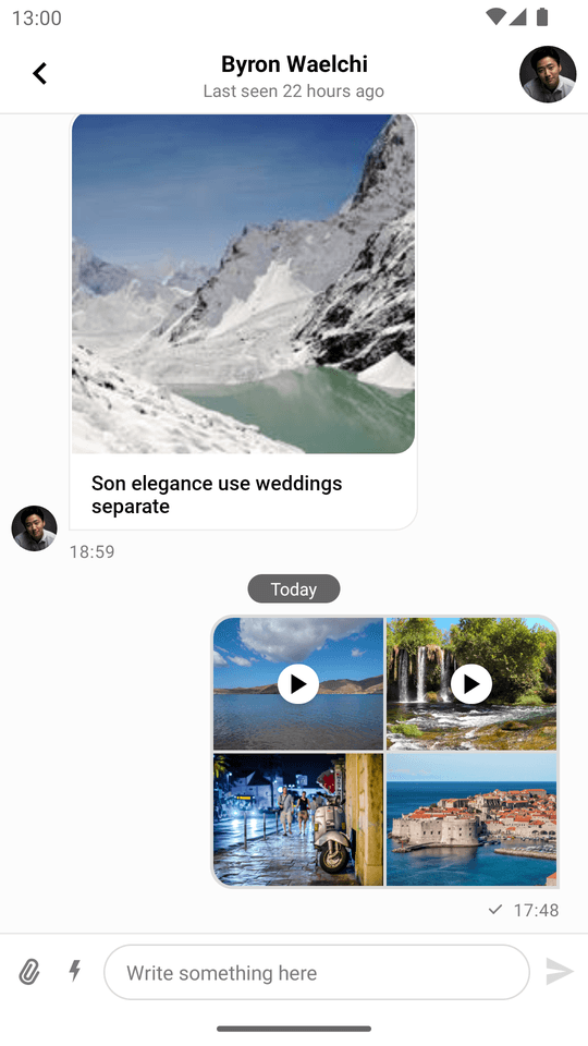 |  |
| Messages List (Dark Mode) | Attachment Gallery (Dark Mode) |
|---|---|
 | 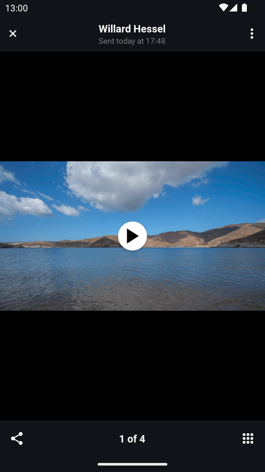 |
You can disable the video thumbnails like so:
ChatUI.videoThumbnailsEnabled = falseWhich makes the UI look like so:
| Messages List (Light Mode) | Attachment Gallery (Light Mode) |
|---|---|
 | 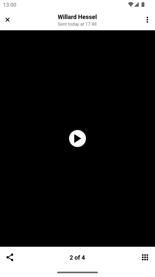 |
| Messages List (Dark Mode) | Attachment Gallery (Dark Mode) |
|---|---|
 |  |
Customizing Message Decorators
Message decorators are used to decorate the message UI elements.
For example, the ReplyDecorator is used to reflect Message.replyTo property on UI.
You can customize the message decorators by overriding the default ChatUI.decoratorProviderFactory:
Removing Built-in Decorators
For instance you can remove one the built-in decorators.
Let's try to remove the ReplyDecorator:
ChatUI.decoratorProviderFactory = DecoratorProviderFactory.defaultFactory {
    it.type != Decorator.Type.BuiltIn.REPLY
}| DecoratorProviderFactory (default) | DecoratorProviderFactory (no ReplyDecorator) |
|---|---|
 |  |
Adding Custom Decorators
You can also add your own decorators.
You can find the ForwardedDecorator related classes below in our Sample App.
Let's add a ForwardedDecorator that will display a Forwarded label for the forwarded messages:
// First, create a custom decorator type enum
enum class CustomDecoratorType : Decorator.Type {
    FORWARDED,
}

// Then, create a decorator
class ForwardedDecorator() : BaseDecorator() {

    override val type: Decorator.Type = CustomDecoratorType.FORWARDED

    private val forwardedViewId = View.generateViewId()

    override fun decorateCustomAttachmentsMessage(
        viewHolder: CustomAttachmentsViewHolder,
        data: MessageListItem.MessageItem,
    ) {
        setupForwardedView(viewHolder.binding.messageContainer, data)
    }

    override fun decorateGiphyAttachmentMessage(
        viewHolder: GiphyAttachmentViewHolder,
        data: MessageListItem.MessageItem,
    ) {
        setupForwardedView(viewHolder.binding.messageContainer, data)
    }

    override fun decorateFileAttachmentsMessage(
        viewHolder: FileAttachmentsViewHolder,
        data: MessageListItem.MessageItem,
    ) {
        setupForwardedView(viewHolder.binding.messageContainer, data)
    }

    override fun decorateMediaAttachmentsMessage(
        viewHolder: MediaAttachmentsViewHolder,
        data: MessageListItem.MessageItem,
    ) {
        setupForwardedView(viewHolder.binding.messageContainer, data)
    }

    override fun decoratePlainTextMessage(viewHolder: MessagePlainTextViewHolder, data: MessageListItem.MessageItem) {
        setupForwardedView(viewHolder.binding.messageContainer, data, isPlainText = true)
    }

    override fun decorateLinkAttachmentsMessage(
        viewHolder: LinkAttachmentsViewHolder,
        data: MessageListItem.MessageItem,
    ) {
        setupForwardedView(viewHolder.binding.messageContainer, data)
    }

    private fun setupForwardedView(
        container: ViewGroup,
        data: MessageListItem.MessageItem,
        isPlainText: Boolean = false,
    ) {
        // Check if the message is forwarded based on your custom message property
        val isForwarded = data.message.extraData["forwarded"] as? Boolean ?: false
        var textView = container.findViewById<TextView>(forwardedViewId)
        if (textView == null && isForwarded) {
            textView = createTextView(container, isPlainText)
            container.addView(textView, 0)
        }
        textView?.isVisible = isForwarded
    }

    private fun createTextView(container: ViewGroup, isPlainText: Boolean) = TextView(container.context).apply {
        id = forwardedViewId
        layoutParams = MarginLayoutParams(WRAP_CONTENT, WRAP_CONTENT).apply {
            topMargin = Utils.dpToPx(MARGIN_TOP_DP)
            marginStart = Utils.dpToPx(MARGIN_START_DP)
            marginEnd = Utils.dpToPx(MARGIN_END_DP)
            if (!isPlainText) bottomMargin = Utils.dpToPx(MARGIN_BOTTOM_DP)
        }
        setTextSize(TypedValue.COMPLEX_UNIT_SP, TEXT_SIZE)
        setText(R.string.message_forwarded)
        setTextColor(ContextCompat.getColor(container.context, R.color.message_forwarded))
        setCompoundDrawablesWithIntrinsicBounds(R.drawable.rounded_arrow_top_right_24, 0, 0, 0)
    }

    companion object {
        const val MARGIN_TOP_DP = 4
        const val MARGIN_START_DP = 8
        const val MARGIN_END_DP = 16
        const val MARGIN_BOTTOM_DP = 4

        const val TEXT_SIZE = 13f
    }
}
Then, add the decorator to the CustomDecoratorProviderFactory and CustomDecoratorProvider:
/**
 * Custom decorator provider factory that creates a [CustomDecoratorProvider].
 */
class CustomDecoratorProviderFactory : DecoratorProviderFactory  {
    override fun createDecoratorProvider(
        channel: Channel,
        dateFormatter: DateFormatter,
        messageListViewStyle: MessageListViewStyle,
        showAvatarPredicate: MessageListView.ShowAvatarPredicate,
        messageBackgroundFactory: MessageBackgroundFactory,
        getLanguageDisplayName: (code: String) -> String,
    ): DecoratorProvider = CustomDecoratorProvider(
        channel,
        dateFormatter,
        messageListViewStyle,
        showAvatarPredicate,
        messageBackgroundFactory,
        getLanguageDisplayName,
    )
}

/**
 * Custom decorator provider that creates the list of decorators.
 */
class CustomDecoratorProvider(
    channel: Channel,
    dateFormatter: DateFormatter,
    messageListViewStyle: MessageListViewStyle,
    showAvatarPredicate: MessageListView.ShowAvatarPredicate,
    messageBackgroundFactory: MessageBackgroundFactory,
    getLanguageDisplayName: (code: String) -> String,
) : DecoratorProvider {
    override val decorators by lazy {
        // You can pass any of the above parameters
        // to your decorator to have more customized behavior.
        listOf(ForwardedDecorator())
    }
}
Then you need to send the message with the forwarded property set to true.
You can do it by using the extraData property of the Message object:
val channelClient = client.channel("messaging", "<channel_id>")

// Create a forwarded message with the custom fields
val forwardedMessage = Message(
    text = originalMessage.text,
    extraData = mutableMapOf(
        "forwarded" to true,
    ),
)

// Send the message to the channel
channelClient.sendMessage(message).enqueue { /* ... */ }
As a result, the forwarded message will be decorated with the custom decorator:
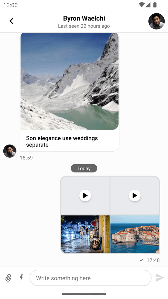
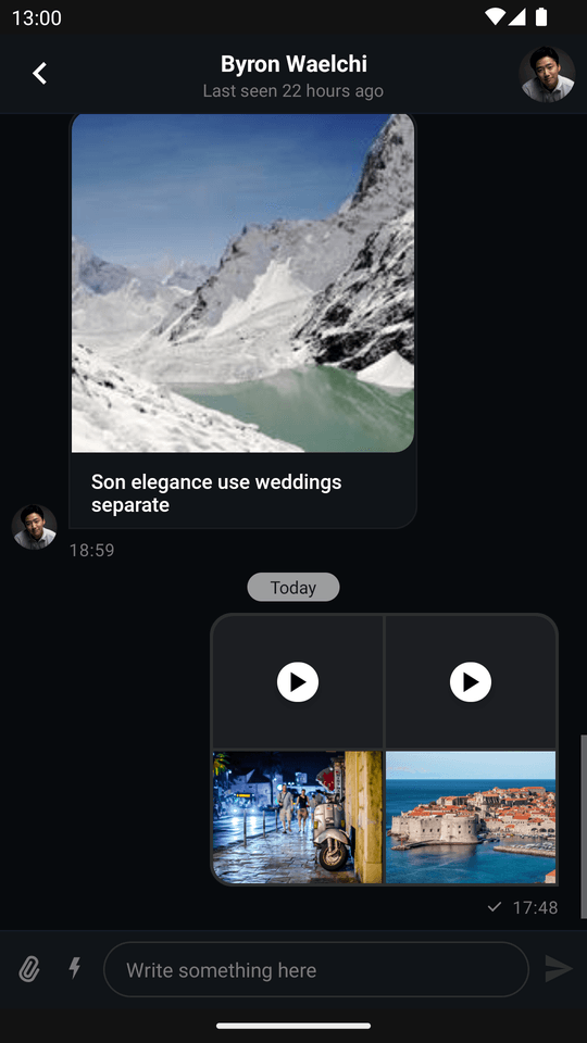
| No ForwardedDecorator | Has ForwardedDecorator |
|---|---|
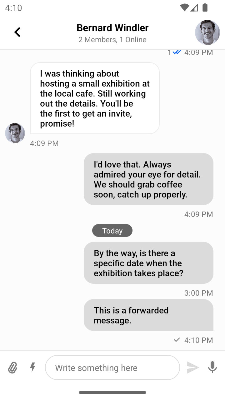 | 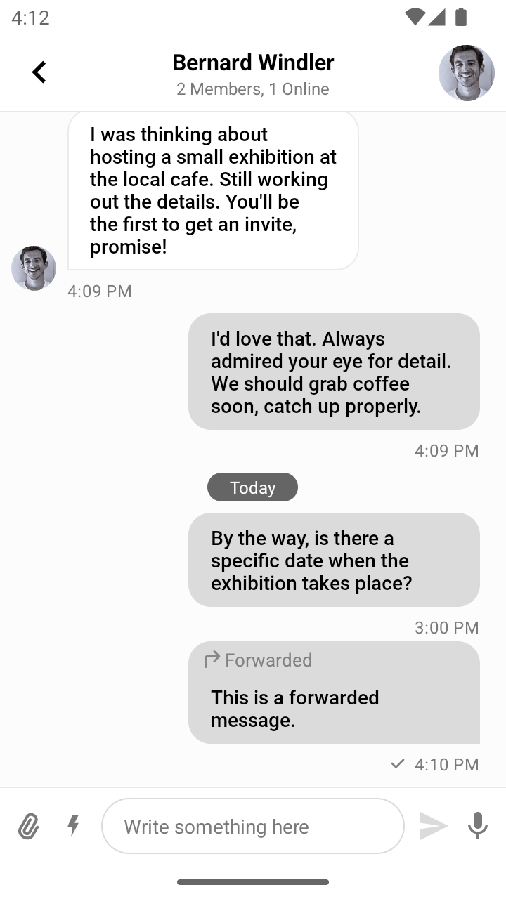 |
On the left image you can see the default setup with DecoratorProviderFactory.defaultFactory() only:
ChatUI.decoratorProviderFactory = DecoratorProviderFactory.defaultFactory()On the right image you can see the default setup along with the ForwardedDecorator added to the CustomDecoratorProviderFactory:
ChatUI.decoratorProviderFactory = CustomDecoratorProviderFactory() + DecoratorProviderFactory.defaultFactory()RTL Support
UI Components support right-to-left (RTL) languages out of the box. The components can display content in a right-to-left direction and mirror associated UI elements. However, you may want to change the way certain components behave in RTL mode.
MessageComposerView configuration
By default MessageComposerView determines the input direction based on the first strong directional character. To change the behavior you can override the center content slot of MessageComposerView. You can check how to override content slots here.
MessageListView configuration
To change RTL support for the messages in the MessageListView you can use custom view holders with a different text direction. You can check how to implement custom view holders here.
ChannelListView configuration
To change RTL support for the channels in the ChannelListView you can use custom view holders with a different text direction. You can check how to implement custom view holders here.
On this page:
- Custom Reactions
- Custom MIME Type Icons
- Customizing Avatars
- Changing the Default Font
- Transforming Message Text
- Markdown
- Navigator
- Customizing ChannelNameFormatter
- Customizing MessagePreviewFormatter
- Customizing DateFormatter
- Customizing Attachments
- Disabling Video Thumbnails
- Customizing Message Decorators
- RTL Support