 React
React iOS
iOS Android
 Flutter
 Angular
 JavaScript
 Unity
Unity Unreal
 Node
Node Python
 Ruby
Ruby PHP
PHP Java
Java .NET
.NET Go
Go REST
RESToverride fun onCreate(savedInstanceState: Bundle?) {
super.onCreate(savedInstanceState)
setContent {
ChatTheme {
ChannelScreen(
viewModelFactory = ChannelViewModelFactory(
context = this,
channelId = "messaging:123",
),
onBackPressed = { finish() },
onHeaderTitleClick = {}
)
}
}
}Theming
The ChatTheme component is a wrapper that you should use as the root of all Compose UI Components. It's used to provide the default properties that help us style the application, such as:
isInDarkMode: Flag that determines if the application should be themed in light or dark mode.config: AChatUiConfiginstance that holds feature flags grouped by area (translation, message list, composer, channel list, media gallery, attachment picker). See ChatUiConfig.colors: Defines a palette of colors we support in the app viaStreamDesign.Colors. These are applied to all components and provide us with a dark/light mode by default, but can be used to override the design system completely.typography: Used for all text elements viaStreamDesign.Typography, to apply different text styles to each component. Can be used to change the typography completely.componentFactory: Defines the component factory which renders the low-level composable components. Can be used to globally override specific components from the SDK screens or the high-level components. See: Component Factory.attachmentPreviewHandlers: Used to provide previews for all supported attachment types. If you do not wish to use the default previews, you can customize this.reactionResolver: Used to map reaction types to emoji characters. You can use the default resolver that supports 240+ emoji mappings, or provide a custom one. See ReactionResolver.messagePreviewIconFactory: Used to create a preview icon for the given message type.dateFormatter: Used to define the timestamp formatting in the app. You can use the default formatting, or customize it to your needs.durationFormatter: Used to define the DurationFormatter in the app. You can use the default formatting, or customize it to your needs.channelNameFormatter: Used to define the channel name formatting in the app. You can use the default implementation, or customize it according to your needs.messagePreviewFormatter: Used to define the message preview formatting in the app. You can use the default implementation, or customize the display of message previews according to your needs.messageTextFormatter: Used to format the message text displayed in the message list. See MessageTextFormatter.searchResultNameFormatter: Used to format names in search results.imageLoaderFactory: Used to create Coil image loader instances. You can use the default image loader factory, or provide a custom one.messageAlignmentProvider: Used to provide an alignment for a particular message. You can use the default implementation which aligns the messages of the current user to end, or customize it according to your needs.streamCdnImageResizing: Configuration for Stream CDN image resizing to optimize image loading.streamMediaRecorder: Used to record audio and video attachments.
If any of these properties are not provided to our Compose UI Components due to not being wrapped inside of ChatTheme, you'll get an exception saying that the required properties are missing.
Let's see how to use the ChatTheme and how to customize the UI within.
Using ChatTheme
To use the ChatTheme, simply wrap your UI content with it, like in the following example:
The ChatTheme provides default implementations for all its styling properties. That way, you can keep using our default color palette, typography, attachment factories and reaction types.
All you have to do is pass in the UI content you want to show, within its trailing lambda. This snippet above will produce the following UI. You'll also notice that if you switch to the dark theme in your system UI, the app will re-draw accordingly.
| Light theme | Dark theme |
|---|---|
 |  |
Let's see how to customize the theme.
Customization
To customize the ChatTheme, simply override any of the default properties by passing in your custom design style, like so:
setContent {
    ChatTheme(
        colors = StreamDesign.Colors.default().copy(
            accentPrimary = Color(0xFF6B5CE7),
            textPrimary = Color(0xFF1A1A2E),
        )
    ) {
        ChannelScreen(
            viewModelFactory = ChannelViewModelFactory(
                context = this,
                channelId = "messaging:123",
            ),
            onBackPressed = { finish() },
            onHeaderTitleClick = {}
        )
    }
}
In the snippet above, we customized the colors to use a different accent and text color. These colors propagate to all child components automatically.
Let's see what each property exposes and what the values are used for.
StreamDesign.Colors
StreamDesign.Colors exposes all the color tokens used across the SDK. Use StreamDesign.Colors.default() for light mode or StreamDesign.Colors.defaultDark() for dark mode — ChatTheme automatically picks the right one based on isInDarkMode.
Customizing any of the tokens below propagates everywhere they're used. Bubble, button, badge, control, input, and reaction surfaces are derived internally from these public tokens, so changing a single semantic color (for example accentPrimary) updates every component that consumes it.
Color Scales
| Token | Description |
|---|---|
brand | The brand accent color ramp. A ColorScale with stops s50 through s900. Most accent and on-brand surfaces are derived from this scale. |
chrome | The neutral gray ramp. A ChromeScale with stops s0 through s1000. Most surface, text, and border tokens are derived from this scale. |
Accent
| Token | Description |
|---|---|
accentPrimary | The main brand color. Used for interactive elements, buttons, links, and primary actions. Override this to apply your brand color across the SDK. |
accentError | Indicates a failure or destructive state. Used for failed messages, validation errors, and deletions. |
accentSuccess | Indicates a positive or completed state. Used for confirmations and success feedback. |
accentWarning | Indicates a cautionary state. Used for warning messages and pending states. |
accentNeutral | A mid-tone gray for de-emphasized UI elements. |
Text
| Token | Description |
|---|---|
textPrimary | Main body text. Used for message content, titles, and any text that carries primary meaning. |
textSecondary | Supporting metadata text. Used for timestamps, subtitles, and secondary labels. |
textTertiary | De-emphasized text. Used for hints, placeholders, and lowest-priority supporting information. |
textDisabled | Text for non-interactive or unavailable states. Communicates that an element cannot be interacted with. |
textOnAccent | Text on accent-colored surfaces. Stays white in both light and dark mode since the accent background does not invert. |
textOnInverse | Text on inverse-colored surfaces. Flips between light and dark to maintain legibility when the background inverts. |
textLink | Hyperlinks and inline actions. Uses the brand color to signal interactivity within text content. |
Background — Elevation
The elevation scale establishes a vertical hierarchy. Higher numbers sit visually closer to the user. In dark mode, values step progressively lighter as depth increases. In light mode, all levels are white.
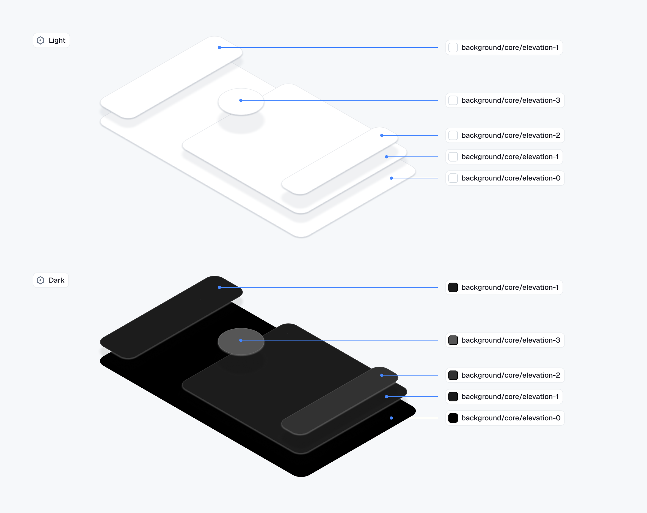
| Token | Description |
|---|---|
backgroundCoreElevation0 | The base layer. Used as the reference point for the elevation scale. |
backgroundCoreElevation1 | Slightly raised surfaces. Used for content containers like the message list and channel list. |
backgroundCoreElevation2 | Floating and modal surfaces. Used for popovers, dropdowns, and dialogs. |
backgroundCoreElevation3 | Used for badge counts and reaction pills that float above other UI elements. |
Background — Surface
| Token | Description |
|---|---|
backgroundCoreApp | The outermost application background. Sits behind all surfaces. |
backgroundCoreSurfaceDefault | Background for sectioned content areas. Used for grouped containers and distinct content regions. |
backgroundCoreSurfaceSubtle | A slightly receded background. Used for secondary containers or to create soft visual separation. |
backgroundCoreSurfaceCard | Background for contained, card-style elements. Matches the surface in light mode but lifts slightly in dark mode. |
backgroundCoreSurfaceStrong | A more prominent background. Used for elements that need to stand out from the main surface. |
backgroundCoreInverse | The opposite of the primary surface. Used for tooltips, snackbars, and high-contrast floating elements. |
backgroundCoreOnAccent | Background for elements placed on an accent-colored surface. Ensures legibility against brand colors. |
backgroundCoreHighlight | A tint for drawing attention to content. Used for highlights and pinned messages. |
backgroundCoreOverlayLight | A light semi-transparent layer. Used to lighten surfaces and for hover states on dark backgrounds. |
backgroundCoreOverlayDark | A dark semi-transparent layer. Used for image overlays. |
backgroundCoreScrim | A heavy semi-transparent layer. Used behind sheets, drawers, and modals to separate them from content. |
Background — Utility
| Token | Description |
|---|---|
backgroundUtilitySelected | Indicates an active or selected state. Used for selected messages, active list items, and toggled controls. |
backgroundUtilityDisabled | Background for non-interactive elements. Flattens the element visually to signal unavailability. |
Border — Core
| Token | Description |
|---|---|
borderCoreDefault | Standard border for surfaces and containers. Used for input fields, cards, and dividers on neutral backgrounds. |
borderCoreSubtle | A lighter border for minimal separation. Used where a full-strength border would feel too heavy. |
borderCoreStrong | An emphatic border for elements that need clear definition. Used for focused containers and prominent dividers. |
borderCoreOnInverse | Border on inverse-colored surfaces. Stays legible when the background flips between light and dark mode. |
borderCoreOnAccent | Border on accent-colored surfaces. Stays white in both light and dark mode since the accent background does not invert. |
borderCoreOnSurface | Border for elements sitting on elevated surfaces. |
borderCoreOpacitySubtle | A very light transparent border. Used as a frame treatment on images and media attachments. |
borderCoreOpacityStrong | A stronger transparent border for elements on colored or dark backgrounds. Used for waveform bars and similar treatments. |
Border — Utility
| Token | Description |
|---|---|
borderUtilitySelected | Border for selected or active states. |
borderUtilityFocused | Focus ring or focus border for keyboard navigation. |
borderUtilityActive | Border for actively-pressed states. |
borderUtilityDisabled | Border for non-interactive elements. Matches the disabled surface to visually flatten the element. |
borderUtilityDisabledOnSurface | Border for disabled elements on elevated surfaces. Stays visually distinct from the surface without drawing attention. |
borderUtilityError | Error state border. |
borderUtilityWarning | Warning state border. |
borderUtilitySuccess | Success state border. |
Avatar
| Token | Description |
|---|---|
avatarBgPlaceholder | Background for the avatar placeholder shown while loading or for users without an image. |
avatarTextPlaceholder | Text color used inside the avatar placeholder. |
avatarPaletteBg1–5 | Five background colors deterministically picked based on the user or channel ID, so each user gets a stable color. |
avatarPaletteText1–5 | Text colors paired with the corresponding avatarPaletteBg slot — used for initials over the palette background. |
avatarPresenceBorder | Outline color around the presence indicator dot. Designed to match the surface behind the avatar so the dot reads cleanly. |
Skeleton & System
| Token | Description |
|---|---|
skeletonLoadingBase | Base color for the skeleton loading shimmer (placeholder surfaces). |
skeletonLoadingHighlight | Highlight color for the skeleton loading shimmer (the moving sweep). |
systemCaret | Color of the text input caret. |
You can find the definitions of all 63 color properties in the class documentation.
StreamDesign.Typography
StreamDesign.Typography defines the text styles used across the SDK:
| Property | Usage |
|---|---|
bodyDefault | Standard body text |
bodyEmphasis | Bold body text |
captionDefault | Small descriptive text |
captionEmphasis | Bold small text |
headingExtraSmall | Smallest heading |
headingSmall | Small heading |
headingMedium | Medium heading |
headingLarge | Large heading |
metadataDefault | Metadata text (timestamps, etc.) |
metadataEmphasis | Bold metadata text |
numericMedium | Numeric displays (medium) |
numericLarge | Numeric displays (large) |
numericExtraLarge | Numeric displays (extra large) |
Use StreamDesign.Typography.default() for the default styles. You can pass a custom FontFamily to apply your own font:
ChatTheme(
    typography = StreamDesign.Typography.default(fontFamily = FontFamily(Font(R.font.my_custom_font)))
) {
    // Your UI content
}
ChatUiConfig
ChatUiConfig consolidates feature flags that were previously individual parameters on ChatTheme. It groups configuration by feature area:
ChatTheme(
    config = ChatUiConfig(
        translation = TranslationConfig(
            enabled = true,               // Automatic message translation (enabled by default)
            showOriginalEnabled = true,    // Show option to see original text (enabled by default)
        ),
        messageList = MessageListConfig(
            videoThumbnailsEnabled = true,  // Show video thumbnails
        ),
        composer = ComposerConfig(
            audioRecordingEnabled = true,        // Voice message recording (enabled by default)
            audioRecordingSendOnComplete = false, // Attach recording for manual send (disabled by default)
            linkPreviewEnabled = false,          // Show link previews in composer
            floatingStyleEnabled = false,        // Use floating composer style
        ),
        channelList = ChannelListConfig(
            swipeActionsEnabled = true,                              // Enable swipe-to-action on channels
            muteIndicatorPosition = MuteIndicatorPosition.InlineTitle, // Mute icon next to the channel name (default)
            pinIndicatorPosition = PinIndicatorPosition.InlineTitle,   // Pin icon next to the channel name (default)
            optionsVisibility = ChannelOptionsVisibility(
                isViewInfoVisible = true,        // "View Info" action (default: true)
                isLeaveChannelVisible = true,    // "Leave Group" action (default: true)
                isMuteChannelVisible = true,     // "Mute Channel" action (default: true)
                isMuteUserVisible = true,        // "Mute User" action for DMs (default: true)
                isArchiveChannelVisible = false, // "Archive Chat/Group" action (default: false)
                isPinChannelVisible = false,     // "Pin Chat/Group" action (default: false)
                isDeleteChannelVisible = true,   // "Delete Chat/Group" action (default: true)
            ),
        ),
        mediaGallery = MediaGalleryConfig(
            isShareVisible = true,
            isGalleryVisible = true,
        ),
        attachmentPicker = AttachmentPickerConfig(
            useSystemPicker = true,              // Use native OS pickers
            modes = listOf(                      // Available picker modes
                GalleryPickerMode(),
                FilePickerMode(),
                CameraPickerMode(),
                PollPickerMode(),
                CommandPickerMode,
            ),
        ),
    ),
) {
    // Your UI content
}
AttachmentPreviewHandler
AttachmentPreviewHandler.defaultAttachmentHandlers() provides default handlers for media, document and URL attachments.
If you want you can take a look at the class documentation.
You can customize file previews by creating your own list of AttachmentPreviewHandlers and overriding ChatTheme.attachmentPreviewHandlers with it.
ReactionResolver
Used for defining reactions the user can add to messages. ReactionResolver.defaultResolver() provides 240+ emoji mappings with 5 default quick-access reactions (like, love, haha, wow, sad).
Reactions are emoji-based. To customize the available reactions:
val customResolver = DefaultReactionResolver(
    emojiMapping = linkedMapOf(
        "like" to "\uD83D\uDC4D",
        "love" to "\u2764\uFE0F",
        "fire" to "\uD83D\uDD25",
        "party" to "\uD83C\uDF89",
    ),
    defaultReactions = listOf("like", "love", "fire"),
)

ChatTheme(reactionResolver = customResolver) {
    // Your UI content
}
DateFormatter
Used for formatting various times and dates such as the timestamp you see when a message is displayed. The default date formatter in ChatTheme is Stream's DefaultDateFormatter.
You can find out more about it by reading the class documentation.
The date formatter can be customized by overriding ChatTheme.dateFormatter with your own implementation of DateFormatter.
ChatTheme(
    dateFormatter = object : DateFormatter {
        private val dateFormat: DateFormat = SimpleDateFormat("dd/MM/yyyy")
        private val timeFormat: DateFormat = SimpleDateFormat("HH:mm")

        override fun formatDate(date: Date?): String {
            date ?: return ""
            return dateFormat.format(date)
        }

        override fun formatTime(date: Date?): String {
            date ?: return ""
            return timeFormat.format(date)
        }

        override fun formatRelativeTime(date: Date?): String {
            date ?: return ""
            return DateUtils.getRelativeDateTimeString(
                applicationContext,
                date.time,
                DateUtils.MINUTE_IN_MILLIS,
                DateUtils.WEEK_IN_MILLIS,
                0
            ).toString()
        }
    }
) {
    // Your UI content
}
TimeProvider
Used for providing the current time. The default time provider is TimeProvider.DEFAULT.
You can find out more about it by reading the class documentation.
The time provider can be customized by overriding ChatTheme.timeProvider with your own implementation of TimeProvider.
ChatTheme(
    timeProvider = object : TimeProvider {
        override fun invoke(): Long {
            // Return the current time in milliseconds
            // System.currentTimeMillis() is the default implementation
            // You can use your own implementation here which can be synchronized with a server
            // to avoid local clock tampering
            return System.currentTimeMillis()
        }
    }
) {
    // Your UI content
}
DurationFormatter
Used for formatting durations, such as the time elapsed since an audio playing was started.
The default duration formatter in ChatTheme formats durations in "hh:mm" format.
You can find out more about it by reading the class documentation.
The duration formatter can be customized by overriding ChatTheme.durationFormatter with your own implementation of DurationFormatter.
ChatTheme(
    durationFormatter = object : DurationFormatter {
        override fun format(durationInMillis: Int): String {
            // Your custom duration formatting logic
        }
    }
) {
    // Your UI content
}
ChannelNameFormatter
Used for formatting channel names. The default channel name formatter is Stream's DefaultChannelNameFormatter.
You can find out more about it by reading the class documentation.
The channel name formatter is customizable by overriding ChatTheme.channelNameFormatter with your own instance of ChannelNameFormatter.
MessagePreviewFormatter
Used for formatting the preview message in ChannelItem. The default message preview formatter is Stream's DefaultMessagePreviewFormatter.
You can find out more about it by reading the class documentation.
The message preview formatter can be customized by overriding ChatTheme.messagePreviewFormatter with your own implementation of MessagePreviewFormatter
ChatTheme(
    messagePreviewFormatter = object : MessagePreviewFormatter {
        override fun formatMessageTitle(message: Message): AnnotatedString {
            return buildAnnotatedString { append(message.user.name) }
        }
        override fun formatMessagePreview(
            message: Message,
            currentUser: User?,
            isDirectMessaging: Boolean,
        ): AnnotatedString {
            return buildAnnotatedString {
                append(message.text)
                // add your custom styling here
            }
        }
        override fun formatDraftMessagePreview(draftMessage: DraftMessage): AnnotatedString {
            return buildAnnotatedString { append(draftMessage.message.text) }
        }
    }
) {
    // Your UI content
}
MessageTextFormatter
Used for formatting the message text in MessageText component. The default message text formatter is Stream's DefaultMessageTextFormatter.
You can find out more about it by reading the class documentation.
The message text formatter can be customized by overriding ChatTheme.messageTextFormatter with your own implementation of MessageTextFormatter
ChatTheme(
    messageTextFormatter = object : MessageTextFormatter {
        override fun format(message: Message, currentUser: User?): AnnotatedString {
            return buildAnnotatedString {
                append(message.text)
                // Your custom styling here
            }
        }
    }
) {
    // Your UI content
}
StreamCoilImageLoaderFactory
Provides the Coil ImageLoader used to load images, GIFs, and video thumbnails. The default is StreamCoilImageLoaderFactory.defaultFactory(). See Customizing Image Loading for the registered Coil components, the canonical customization snippet, and troubleshooting for blank/placeholder images.
MessageAlignmentProvider
Used for aligning messages. The default message alignment provider is DefaultMessageAlignmentProvider which will align your own messages to end while aligning the messages of others to start.
You can find out more about it by reading the class documentation.
As with all of the other ChatTheme properties, you can easily customize how the messages are aligned by overriding ChatTheme.messageAlignmentProvider with your own implementation of MessageAlignmentProvider.
StreamCdnImageResizing
Configures Stream CDN image resizing to optimize image loading and reduce bandwidth.
ChatTheme(
    streamCdnImageResizing = StreamCdnImageResizing.defaultStreamCdnImageResizing()
) {
    // Your UI content
}
Accessing Theme Properties
All theme properties can be accessed anywhere within the ChatTheme scope using the ChatTheme object:
ChatTheme {
    val colors = ChatTheme.colors              // StreamDesign.Colors
    val typography = ChatTheme.typography       // StreamDesign.Typography
    val config = ChatTheme.config              // ChatUiConfig
    val factory = ChatTheme.componentFactory   // ChatComponentFactory

    // Use in your composables
    Text(
        text = "Hello",
        style = ChatTheme.typography.bodyDefault,
        color = ChatTheme.colors.textPrimary,
    )
}
The ChatUiConfig is also available via the LocalChatUiConfig composition local:
val config = LocalChatUiConfig.current
val isLinkPreviewEnabled = config.composer.linkPreviewEnabledOn this page: