 React
React iOS
iOS Android
 Flutter
 Angular
 JavaScript
 Unity
Unity Unreal
 Node
Node Python
 Ruby
Ruby PHP
PHP Java
Java .NET
.NET Go
Go REST
REST// The rest of your UI
if (selectedMessageState is SelectedMessageReactionsState) {
val selectedMessage = selectedMessageState.message
SelectedReactionsMenu(
modifier = Modifier.align(Alignment.BottomCenter),
// The currently logged-in user
currentUser = user,
// The capabilities the user has in a given channel
ownCapabilities = selectedMessageState.ownCapabilities,
// The message whose reactions you selected
message = selectedMessage,
onMessageAction = { action ->
// Handle message action
},
onShowMoreReactionsSelected = {
// Handle show more reactions button click
},
onDismiss = {
// Handle dismiss
}
)
}Reactions
SelectedReactionsMenu
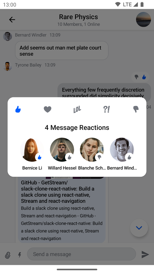
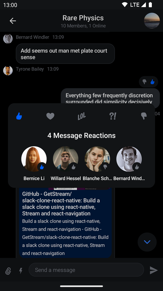
The SelectedReactionsMenu is a component that displays a list of message reactions with the users who left them. If a message already contains reactions, the user can tap on the section with reactions to show the component.
This is a stateless component which you can easily add to your UI if you're building a custom Messages screen. The component shows the following content:
- Header content: Shows a list of reactions the user can use to react to the message. Only visible if the user has the
SEND_REACTIONcapability. - Center content: Shows a list of users with the reactions they left for the message.
Let's see how to use the component.
Usage
If you're using the MessagesScreen component, the SelectedReactionsMenu component is already set up for you. To use the SelectedReactionsMenu component in your custom screens, simply add it to your UI, like so:
As you can see, showing the menu is very simple. If the selectedMessageState is an instance of SelectedMessageReactionsState, you pass in the currently logged in user, as well as the selected message. The reactions you show are taken from the ChatTheme component and everything else required to show the component is taken care of internally.
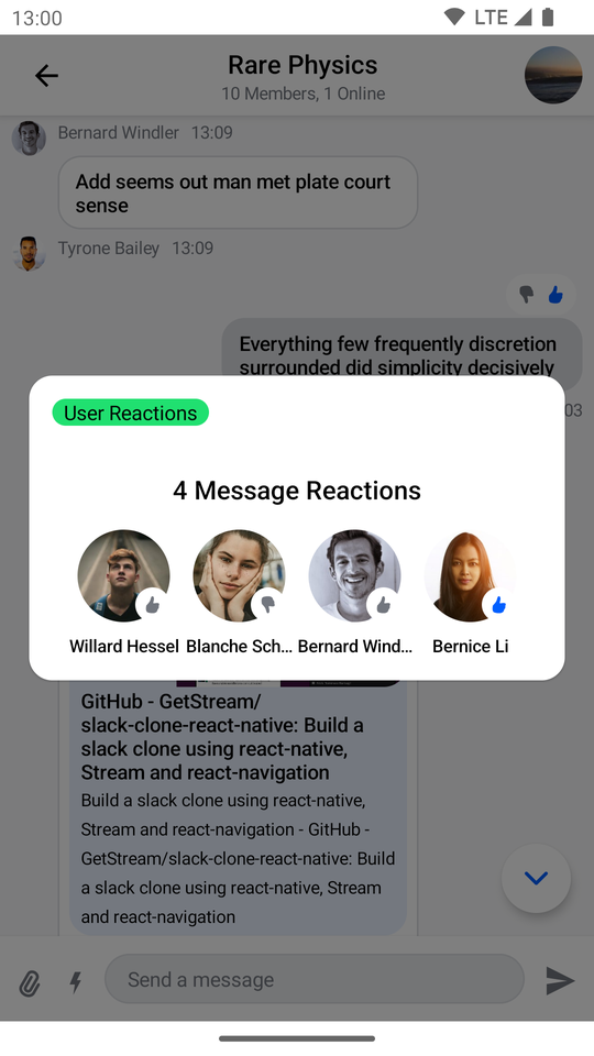
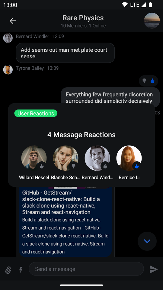
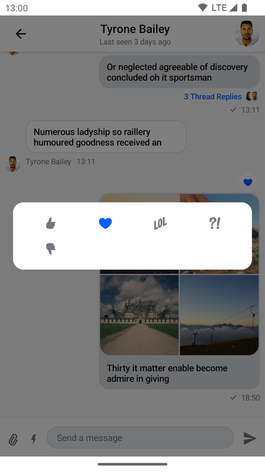
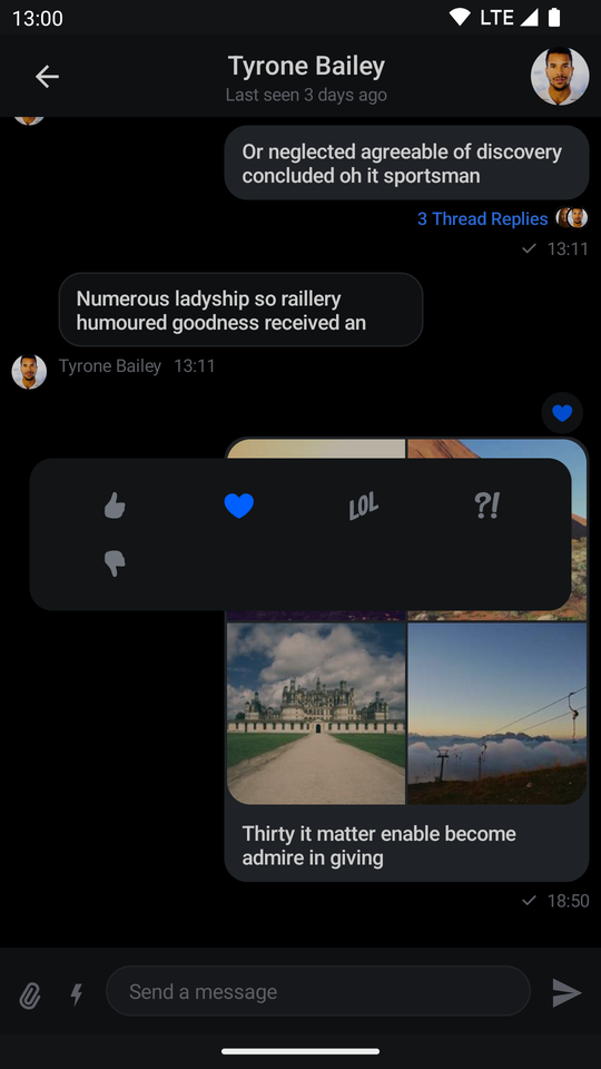
The aforementioned code produces the following UI:
| Light | Dark |
|---|---|
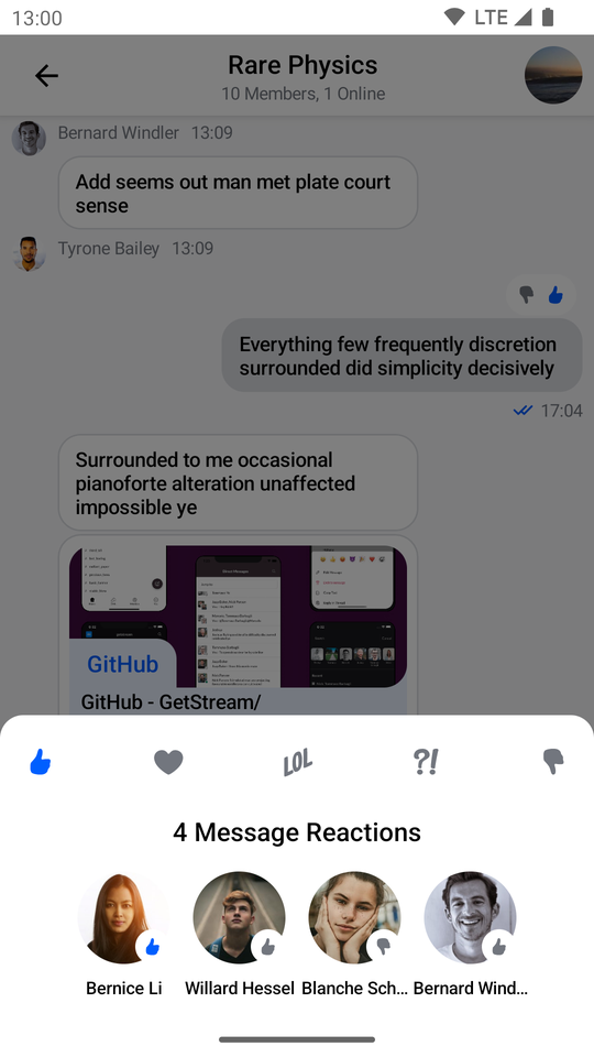 | 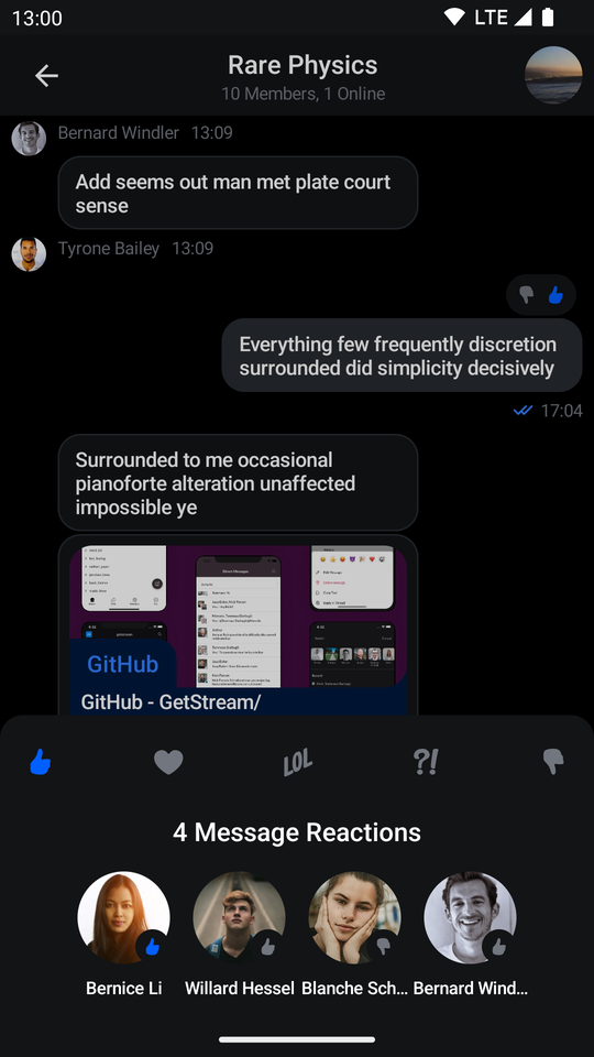 |
The component shows available reactions from the ChatTheme on the top, followed by a list of message reactions.
To dismiss the component just tap outside of the dialog or press the system back button.
Handling Actions
SelectedReactionsMenu exposes the following actions as parameters:
@Composable
fun SelectedReactionsMenu(
    ..., // State and styling
    onMessageAction: (MessageAction) -> Unit,
    onShowMoreReactionsSelected: () -> Unit,
    onDismiss: () -> Unit = {},
    ..., // Slot APIs
)onMessageAction: Handler used when the user performs an action such as leaving a reaction.onShowMoreReactionsSelected: Handler used when the show more reactions button is clicked.onDismiss: Handler used when the menu is dismissed by clicking outside of the dialog area or by pressing the system back button.
To handle these actions, you can override them like so:
if (selectedMessageState is SelectedMessageReactionsState) {
    SelectedReactionsMenu(
        ..., // State
        onMessageAction = { action ->
            composerViewModel.performMessageAction(action)
            listViewModel.performMessageAction(action)
        },
        onShowMoreReactionsSelected = {
            listViewModel.selectExtendedReactions(selectedMessage)
        },
        onDismiss = { listViewModel.removeOverlay() }
    )
}
In the snippet above, you propagate the action to the composerViewModel and listViewModel, for them to store the latest action. This will update the UI accordingly.
Alternatively, you call listViewModel.removeOverlay() to remove the overlay from the screen in onDismiss(). It's important to note that onMessageAction() calls removeOverlay() internally to hide the overlay.
Next, let's see how to customize the overlay.
Customization
You can customize the SelectedReactionsMenu component using the following parameters:
@Composable
fun SelectedReactionsMenu(
    message: Message,
    currentUser: User?,
    ownCapabilities: Set<String>,
    ..., // Actions
    modifier: Modifier = Modifier,
    shape: Shape = ChatTheme.shapes.bottomSheet,
    overlayColor: Color = ChatTheme.colors.overlay,
    reactionTypes: Map<String, ReactionIcon> = ChatTheme.reactionIconFactory.createReactionIcons(),
    @DrawableRes showMoreReactionsIcon: Int = R.drawable.stream_compose_ic_more,
    ..., // Slot APIs
)message: The selected message.currentUser: The currently logged in user.ownCapabilities: Set of capabilities the user is given for the current channel. For a full list see ChannelCapabilities.modifier: Modifier for styling the component.shape: Changes the shape of the menu dialog.overlayColor: The color applied to the overlay behind the menu.reactionTypes: The available reactions within the menu. By default it usesChatTheme.reactionIconFactorywhich is exposed by theChatThemecomponent.showMoreReactionsIcon: Drawable resource used for the show more reactions button. By default, the button will appear whenChatTheme.reactionIconFactoryprovides more than five reactions.
The best way to customize reactions is by overriding ChatTheme.reactionIconFactory with your own implementation of ReactionIconFactory so that all of your components wrapped inside of ChatTheme draw from the same source.
By default SelectedReactionsMenu looks like a bottom sheet, however you can customize it to look like a completely different component, such as a dialog, a drawer or whatever helps you retain the look and feel of your app.
if (selectedMessageState is SelectedMessageReactionsState) {
    // Use a Modifier to customize the appearance
    SelectedReactionsMenu(
        ..., // State
        // Use a Modifier to customize the appearance
        modifier = Modifier
            .align(Alignment.Center)
            .padding(horizontal = 20.dp)
            .wrapContentSize(),
        // Assign a different shape to the Composable element
        shape = ChatTheme.shapes.attachment,
        currentUser = user,
        onMessageAction = { action ->
            // Handle message action
        },
        onDismiss = {
            // Handle dismiss
        },
        ...
    )
}
The code above will produce the following UI:
| Light | Dark |
|---|---|
 |  |
SelectedReactionsMenu provides you with Composable slots that are ready for more extensive customizations.
@Composable
fun SelectedReactionsMenu(
    ...,
    headerContent: @Composable ColumnScope.() -> Unit = {
        // Header content
    },
    centerContent: @Composable ColumnScope.() -> Unit = {
        // Center content
    }
)headerContent: Allows you to customize the content shown at the top of the menu. By default it shows reaction options.centerContent: Allows you to customize the content shown at the center of the menu. By default it shows user reactions.
You can easily override either slot:
if (selectedMessageState is SelectedMessageReactionsState) {
    SelectedReactionsMenu(
        ...,
        // Custom header content
        headerContent = {
            Text(
                modifier = Modifier
                    .padding(16.dp)
                    .background(
                        shape = ChatTheme.shapes.avatar,
                        color = ChatTheme.colors.infoAccent
                    )
                    .padding(horizontal = 8.dp),
                style = ChatTheme.typography.body,
                color = ChatTheme.colors.textHighEmphasis,
                text = "User Reactions"
            )
        }
    )
}
The example above shows how to replace the header content with a custom Text.
The result looks like this:
| Light | Dark |
|---|---|
 |  |
ReactionsPicker
The ReactionsPicker component allows you to display all of the reactions your app contains inside a simple menu. Normally it is displayed after clicking on the show more reactions button inside SelectedMessageMenu or SelectedReactionsMenu.
Usage
If you're using the MessagesScreen component, ReactionsPicker is automatically set up for you. To use it inside of your custom screens simply add it like so:
ChatTheme {
    // The rest of your UI
    if (selectedMessageState != null) {
        val selectedMessage = selectedMessageState.message
        if (selectedMessageState is SelectedMessageReactionsPickerState) {
            ReactionsPicker(
                modifier = Modifier
                    .align(Alignment.BottomCenter)
                    .heightIn(max = 400.dp)
                    .wrapContentHeight(),
                message = selectedMessage,
                onMessageAction = { action ->
                    // Handle message action
                },
                onDismiss = {
                    // Handle on dismiss
                }
            )
        }
    }
}
Adding the ReactionsPicker component is very simple, all you need to do is make sure that it is displayed when the selectedMessageState is SelectedMessageReactionsPickerState and pass in the selected Message. The reactions are drawn from the ChatTheme and the rest is done for you.
The code above will render the following UI:
| Light | Dark |
|---|---|
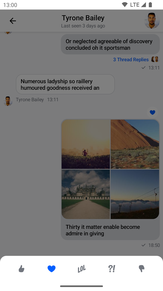 | 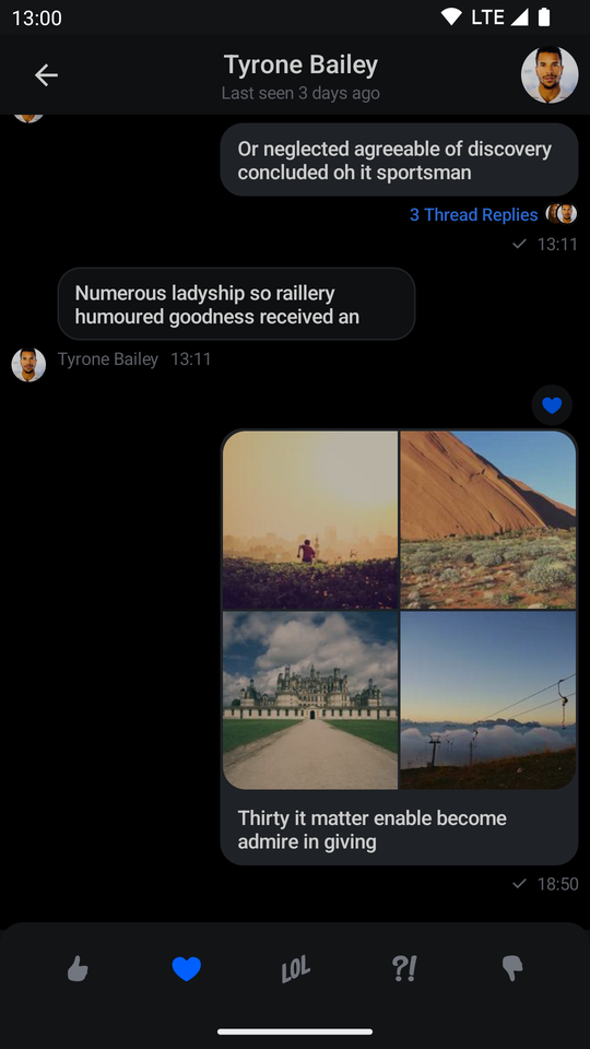 |
The menu overlay has a darker background and tapping it will dismiss the component, as will pressing the system back button.
Handling Actions
ReactionsPicker exposes the following actions:
@Composable
public fun ReactionsPicker(
    ..., // State,
    onMessageAction: (MessageAction) -> Unit,
    onDismiss: () -> Unit = {},
    ... // Content
)onMessageAction: Handler used for triggering message actions such as reply, edit, delete, react and others.onDismiss: Handler used when the component is dismissed by clicking outside of the component UI or pressing the system back button.
ReactionsPicker(
    ..., // State
    onMessageAction = { action ->
        composerViewModel.performMessageAction(action)
        listViewModel.performMessageAction(action)
    },
    onDismiss = { listViewModel.removeOverlay() },
    ... // Content
)
In the snippet above, you propagate the action to the composerViewModel and listViewModel, for them to store the latest action. This will update the UI accordingly.
Alternatively, you call listViewModel.removeOverlay() to remove the overlay from the screen, in onDismiss(). It's important to note that onMessageAction() calls removeOverlay() internally, to hide the overlay.
Next, let's see how to customize ReactionsPicker.
Customization
ReactionsPicker allows you to customize the reactions you are showing:
@Composable
public fun ReactionsPicker(
    ..., // State,
    reactionTypes: Map<String, ReactionIcon> = ChatTheme.reactionIconFactory.createReactionIcons(),
    ... // Actions and content
)reactionTypes: Allows you to customize which reactions are shown. By default it usesreactionIconFactoryinside ofChatTheme.
The best way to customize this is by overriding ChatTheme.reactionIconFactory with your own implementation of ReactionIconFactory so that all of your components wrapped inside of ChatTheme draw from the same source.
By default ReactionsPicker looks like a bottom sheet, however you can customize it to look like a completely different component, such as a dialog, a drawer or whatever helps you retain the look and feel of your app.
For example, you can it customize like so:
ReactionsPicker(
    modifier = Modifier
        .align(Alignment.Center)
        .padding(horizontal = 20.dp)
        .wrapContentSize(),
    shape = ChatTheme.shapes.attachment,
    message = selectedMessage,
    onMessageAction = { action ->
        composerViewModel.performMessageAction(action)
        listViewModel.performMessageAction(action)
    },
    onDismiss = { listViewModel.removeOverlay() },
    cells = GridCells.Fixed(4)
)
The code above will result in the following UI:
| Light | Dark |
|---|---|
 |  |
@Composable
public fun ReactionsPicker(
    ..., // State and actions
    headerContent: @Composable ColumnScope.() -> Unit = {},
    centerContent: @Composable ColumnScope.() -> Unit = {
        DefaultReactionsPickerCenterContent(
            message = message,
            onMessageAction = onMessageAction,
            cells = cells,
            reactionTypes = reactionTypes
        )
    },
)
Apart from customization through modifiers, the component provides these slots:
headerContent: Allows you to customize what content you show on the top part ofReactionsPicker. Empty by default.centerContent: Allows you to customize what content you show on the bottom part ofReactionsPicker. Shows reactions by default.
As an example, let's override the header content. First create a custom text label:
@Composable
fun TextLabel() {
    Text(
        modifier = Modifier.padding(start = 20.dp, top = 12.dp),
        text = "Available reactions",
        style = ChatTheme.typography.title3Bold,
        color = ChatTheme.colors.textHighEmphasis
    )
}
Then expand on the previous customization example by replacing the empty headerContent with the text label:
ReactionsPicker(
    ..., // State, actions and other content
    headerContent = { TextLabel() }
)
Doing so gives you the following UI:
| Light | Dark |
|---|---|
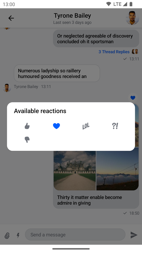 | 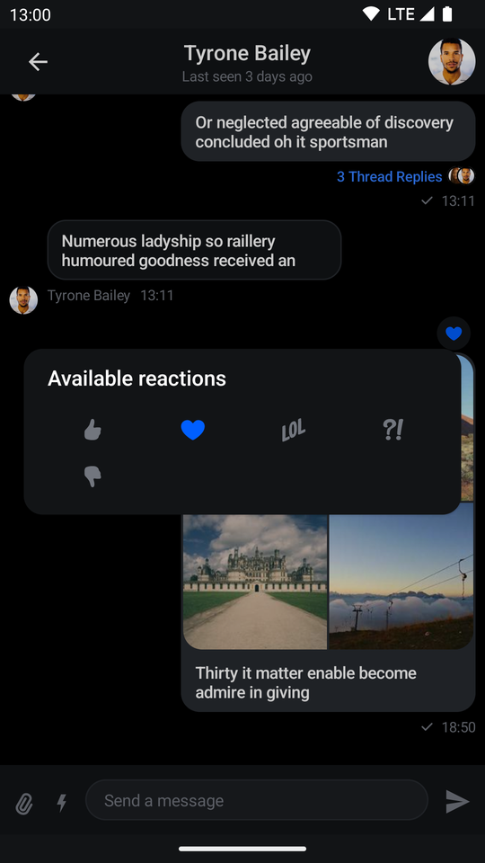 |