Message List Header
The MessageListHeader component is a clean, stateless component which doesn't require a ViewModel. It allows you to customize the data, design style, action
handlers and override the internal composable slots.
Out of the box it sets the following:
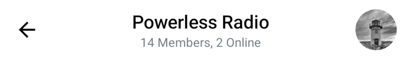
- Back button: A button to use for navigating back.
- Header content: Displays information such as the name of the current channel, number of participants, connection and typing status and message mode.
- Channel avatar: The image set for the current channel or tiles of member avatars if no image is set.
Let's see how to use it in your UI.
Usage
To use the component, simply combine it with the rest of your UI, for example in setContent, in you Activity or Fragment:
override fun onCreate(savedInstanceState: Bundle?) {
    super.onCreate(savedInstanceState)

    // Load the data for the header here

    setContent {
        ChatTheme {
            Column(Modifier.fillMaxSize()) {
                MessageListHeader(
                    modifier = Modifier.wrapContentHeight(),
                    channel = channel,
                    currentUser = currentUser,
                    connectionState = connectionState,
                    messageMode = messageMode,
                    onBackPressed = { },
                    onHeaderTitleClick = { },
                    onChannelAvatarClick = { },
                )

                // Rest of your UI
            }
        }
    }
}
This component is stateless and doesn't have its own ViewModel. You need to provide the data to the header, otherwise it doesn't know what to render.
We recommend using either our ChannelState directly or the MessageListViewModel for the required state. For greater ease of use you can use it with the rest of our components.
With the correct data the snippet above generates the following UI:
Now let's see how to handle the header actions.
Handling Actions
The MessageListHeader exposes these actions, as per the signature:
@Composable
fun MessageListHeader(
    ..., // State
    onBackPressed: () -> Unit = {},
    onHeaderTitleClick: (Channel) -> Unit = {},
    onChannelAvatarClick: () -> Unit = {},
)
onBackPressed: Handler used when the user clicks on the back button.onHeaderTitleClick: Handler used when the user clicks on the channel title.onChannelAvatarClick: Handler used when the user clicks on the channel avatar.
The leadingContent uses onBackPressed as its default action, while the centerContent uses onHeaderTitleClick and the trailingContent uses onChannelAvatarClick. If you want to keep the same UI but change the behavior, you can override onBackPressed, onHeaderTitleClick or onChannelAvatarClick.
Otherwise, skip over to Customization to learn how to customize the UI.
To customize these actions, simply use the MessageListHeader with the rest of your UI components, like within setContent, and pass in the required actions:
MessageListHeader(
    ..., // State
    onBackPressed = { finish() },
    onHeaderTitleClick = {
        // Handle clicks on the header title
    },
    onChannelAvatarClick = {
        // Handle clicks on the channel avatar
    },
    ... // Content
)
This way it's easy to combine the actions from this component with your custom UI and logic.
Customization
As the component is fully state-dependent, you can customize the data it shows, as per the signature:
@Composable
fun MessageListHeader(
    channel: Channel,
    currentUser: User?,
    modifier: Modifier = Modifier,
    typingUsers: List<User> = emptyList(),
    messageMode: MessageMode = MessageMode.Normal,
    connectionState: ConnectionState = ConnectionState.CONNECTED,
    color: Color = ChatTheme.colors.barsBackground,
    shape: Shape = ChatTheme.shapes.header,
    elevation: Dp = ChatTheme.dimens.headerElevation,
    ..., // Handlers
    ... // Content
)
channel: The information about the current channel, used to show the member count, name and avatar data.currentUser: Currently logged in user, used to differentiate it from other users, when loading the channel image.modifier: Modifier for the root component. You can use it to add padding or change the dimensions and such, however attributes such as color, shape and elevation have their own parameters.typingUsers: List of typing users used to show their names along with a typing indicator.messageMode: Used to determine the header title. If we're in a thread, we show a title saying who the owner of the parent message is.connectionState: Used to switch between the member count text and the network status information.color: The color of the header.shape: The shape of the header.elevation: The elevation of the header.
These will change what data is displayed in the header.
You can also customize the content of the header, using the following parameters:
@Composable
fun MessageListHeader(
    leadingContent: @Composable RowScope.() -> Unit = {
        DefaultMessageListHeaderLeadingContent(onBackPressed = onBackPressed)
    },
    centerContent: @Composable RowScope.() -> Unit = {
        DefaultMessageListHeaderCenterContent(
            modifier = Modifier.weight(1f),
            channel = channel,
            currentUser = currentUser,
            typingUsers = typingUsers,
            messageMode = messageMode,
            onHeaderTitleClick = onHeaderTitleClick,
            connectionState = connectionState
        )
    },
    trailingContent: @Composable RowScope.() -> Unit = {
        DefaultMessageListHeaderTrailingContent(
            channel = channel,
            currentUser = currentUser,
            onClick = onChannelAvatarClick,
        )
    },
)
leadingContent: Represents the content at the beginning of the header. By default shows a back button that you can override or customize the behavior of by overridingonBackPressed.centerContent: Represents the core and center part of the header. By default shows information about the channel that you can override or customize the behavior of by overridingonHeaderTitleClick.trailingContent: Represents the content at the end of the header. By default shows the channel avatar that you can override or customize the behavior of by overridingonChannelAvatarClick.
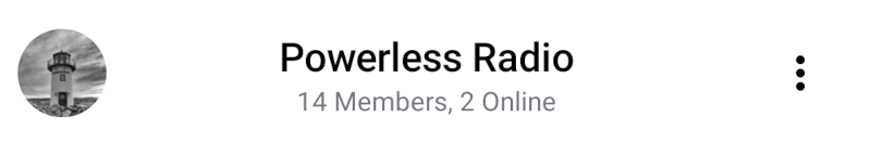
Here's an example of customizing the UI:
First, create a button with a drawable of your choosing:
@Composable
fun InfoButton() {
    IconButton(
        onClick = {
            // Handle on click
        }
    ) {
        Icon(
            modifier = Modifier.height(40.dp),
            painter = painterResource(id = R.drawable.ic_info),
            contentDescription = "info button",
            tint = Color.Black
        )
    }
}
Then place that button into the trailingContent slot while placing our own ChannelAvatar component into the leadingContent slot:
MessageListHeader(
    ... // State
    leadingContent = {
        ChannelAvatar(
            modifier = Modifier.size(40.dp),
            channel = channel,
            currentUser = currentUser,
            contentDescription = channelName,
        )
    },
    trailingContent = { InfoButton() }
)
The resulting UI looks like this:
For a more in-depth customization check out this Cookbook page.