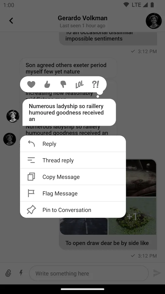
By default, the UI Components SDK provides the following reaction options and corresponding icons for them:
like
love
haha
wow
sad
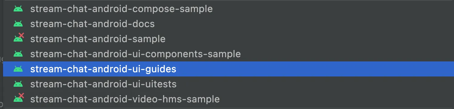
You can find the full code from this guide on GitHub. To check the final result, clone the repository, select the stream-chat-android-ui-guides module on your Android Studio like the image below, and run the module.
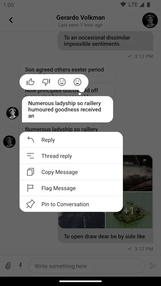
If you want to override the supported reactions, you need to create a custom instance of SupportedReactions with your custom set of reactions and provide it using the ChatUI.supportedReactions property.
Map<String, SupportedReactions.ReactionDrawable> reactions = new HashMap<>();reactions.put( "thumbs_up", new SupportedReactions.ReactionDrawable( ContextCompat.getDrawable(context, R.drawable.ic_thumb_up), ContextCompat.getDrawable(context, R.drawable.ic_thumb_up_selected) ));reactions.put( "thumbs_down", new SupportedReactions.ReactionDrawable( ContextCompat.getDrawable(context, R.drawable.ic_thumb_down), ContextCompat.getDrawable(context, R.drawable.ic_thumb_down_selected) ));reactions.put( "mood_good", new SupportedReactions.ReactionDrawable( ContextCompat.getDrawable(context, R.drawable.ic_mood_good), ContextCompat.getDrawable(context, R.drawable.ic_mood_good_selected) ));reactions.put( "mood_bad", new SupportedReactions.ReactionDrawable( ContextCompat.getDrawable(context, R.drawable.ic_mood_bad), ContextCompat.getDrawable(context, R.drawable.ic_mood_bad_selected) ));ChatUI.setSupportedReactions(new SupportedReactions(context, reactions));
In the example above, we defined a set of 4 custom reactions and provided corresponding icons for them. Notice that you need to provide icons for both normal and selected states.
By default, the reactions are sorted by the time they were added (ReactionSortingByFirstReactionAt).
If you want to change the sorting behavior, you can provide a custom ReactionSorting implementation or use one of the provided ones.
You can sort the reactions by the following fields in ReactionGroup:
count - The number of times the reaction was added.
sumScore - The score value of the reaction. By default it is the same value as count.
firstReactionAt - The date of the first reaction from this type of reaction.
lastReactionAt - The date of the last reaction from this type of reaction.
 React
React iOS
iOS Android
 Flutter
 Angular
 JavaScript
 Unity
Unity Unreal
 Node
Node Python
 Ruby
Ruby PHP
PHP Java
Java .NET
.NET Go
Go REST
REST