 React
React iOS
iOS Android
 Flutter
 Angular
 JavaScript
 Unity
Unity Unreal
 Node
Node Python
 Ruby
Ruby PHP
PHP Java
Java .NET
.NET Go
Go REST
RESTChannelAvatar(
channel = channel,
currentUser = currentUser,
modifier = Modifier.size(36.dp)
)ChannelAvatar
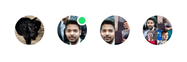
The ChannelAvatar displays a channel avatar that adapts based on the channel state and member count:
- If the channel has an image set, it displays the channel image.
- For direct conversations (1:1), it displays the other user's avatar with an optional online indicator.
- For group channels, it displays a grid of member avatars.
Usage
To use the component, pass the Channel object and the current user to ChannelAvatar:
Based on the state of the Channel and the number of members, it shows different types of images:
 |
|---|
Handling Actions
To handle clicks on ChannelAvatar, pass a lambda to the onClick parameter:
ChannelAvatar(
    channel = channel,
    currentUser = currentUser,
    modifier = Modifier.size(36.dp),
    onClick = {
        // Handle avatar clicks here
    }
)
Customization
The ChannelAvatar exposes the following properties for customization:
@Composable
fun ChannelAvatar(
    channel: Channel,
    currentUser: User?,
    modifier: Modifier = Modifier,
    shape: Shape = ChatTheme.shapes.avatar,
    textStyle: TextStyle = ChatTheme.typography.title3Bold,
    groupAvatarTextStyle: TextStyle = ChatTheme.typography.captionBold,
    showOnlineIndicator: Boolean = true,
    onlineIndicatorAlignment: OnlineIndicatorAlignment = OnlineIndicatorAlignment.TopEnd,
    onlineIndicator: @Composable BoxScope.() -> Unit = {
        OnlineIndicator(modifier = Modifier.align(onlineIndicatorAlignment.alignment))
    },
    contentDescription: String? = null,
    onClick: (() -> Unit)? = null,
)channel: The channel whose data to display.currentUser: The current user, used to determine which member's avatar to show in direct conversations.modifier: Modifier for the root component. Useful for the component size, padding, background and similar.shape: The shape of the avatar.textStyle: The text style for initials text.groupAvatarTextStyle: The text style for initials in group avatars.showOnlineIndicator: Whether to display the online status indicator.onlineIndicatorAlignment: The alignment of the online indicator. Defaults toOnlineIndicatorAlignment.TopEnd.onlineIndicator: Custom composable that replaces the default online indicator.contentDescription: The content description of the avatar for accessibility.onClick: Handler for avatar click events.
Custom Shape
You can customize the shape of the avatar:
ChannelAvatar(
    channel = channel,
    currentUser = currentUser,
    modifier = Modifier.size(48.dp),
    shape = RoundedCornerShape(8.dp)
)
The sample above will produce a custom channel avatar with rounded corners:
 |
|---|