 React
React iOS
iOS Android
 Flutter
 Angular
 JavaScript
 Unity
Unity Unreal
 Node
Node Python
 Ruby
Ruby PHP
PHP Java
Java .NET
.NET Go
Go REST
RESToverride fun onCreate(savedInstanceState: Bundle?) {
super.onCreate(savedInstanceState)
// Load the ID of the channel you've opened
val channelId = "messaging:123"
setContent {
ChatTheme {
MessagesScreen(
viewModelFactory = MessagesViewModelFactory(
context = this,
channelId = channelId
)
)
}
}
}Channel
MessagesScreen is a ready-to-use chat screen that handles the entire messaging experience. Use it when you want a full-featured chat UI with minimal setup.
Included features:
- Message list: Displays messages with automatic pagination, date separators, loading states, empty states, and a scroll-to-bottom button for new messages
- Message composer: Full-featured input with text formatting, attachment buttons, voice recording, edit mode, and reply-to-message functionality
- Attachment picker: Bottom sheet for selecting images from gallery, capturing photos/videos, or picking files
- Message actions: Long-press menu with options for reactions, reply, thread reply, copy, edit, delete, pin, and flag
- Reactions: Emoji picker for adding reactions and display of reaction counts on messages
- Thread support: Inline thread replies with automatic navigation to thread view
- Typing indicators: Shows when other users are typing in the channel
- Read receipts: Displays read status for sent messages
If you need more control over the layout or want to add custom UI elements, consider using the individual bound components like MessageList and MessageComposer instead.
Usage
The benefit of a screen component solution is easy integration. All you need to do to integrate MessagesScreen in your app is to call it within setContent() in your Activity or Fragment and pass in the MessagesViewModelFactory with your channelId:
This small snippet of code will render the UI shown below:
| Light | Dark |
|---|---|
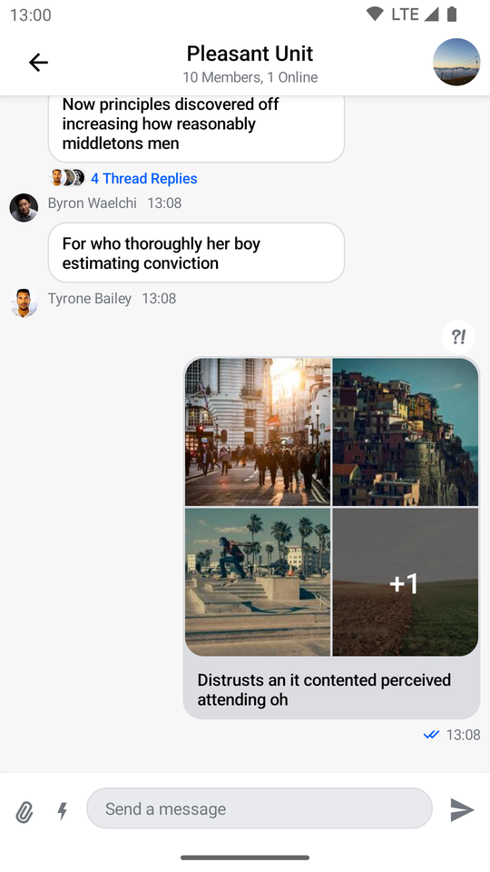 | 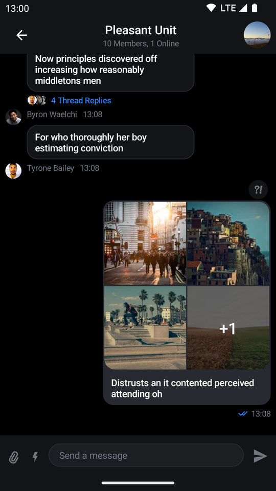 |
Next, learn more about handling screen actions.
Handling Actions
The MessagesScreen component exposes several actions for handling user interactions:
@Composable
fun MessagesScreen(
    ..., // State and customization
    onBackPressed: () -> Unit = {},
    onHeaderTitleClick: (channel: Channel) -> Unit = {},
    onChannelAvatarClick: (() -> Unit)? = null,
    onComposerLinkPreviewClick: ((LinkPreview) -> Unit)? = null,
    onMessageLinkClick: ((Message, String) -> Unit)? = null,
    onUserAvatarClick: ((User) -> Unit)? = null,
    onUserMentionClick: (User) -> Unit = {},
)onBackPressed: Called when the user taps on the header back button.onHeaderTitleClick: Called when the user taps on the header title. Useful for showing the channel information.onChannelAvatarClick: Called when the user taps on the channel avatar. Can also be used to show more channel information.onComposerLinkPreviewClick: Called when the user taps on a link preview in the message composer. Useful for opening the link in a browser or custom handler.onMessageLinkClick: Called when the user taps on a link within a message. Receives both theMessageand the URLStringthat was clicked.onUserAvatarClick: Called when the user taps on another user's avatar in the message list. Useful for showing user profile information.onUserMentionClick: Called when the user taps on a user mention (e.g.,@username) within a message. Useful for navigating to the mentioned user's profile.
Here's an example of setting up custom behavior:
MessagesScreen(
    viewModelFactory = viewModelFactory,
    onBackPressed = { finish() },
    onHeaderTitleClick = { channel ->
        // Show channel info
    },
    onChannelAvatarClick = {
        // Show channel details
    },
    onComposerLinkPreviewClick = { linkPreview ->
        // Open link preview URL
        openUrl(linkPreview.originUrl)
    },
    onMessageLinkClick = { message, url ->
        // Handle link click within a message
        openUrl(url)
    },
    onUserAvatarClick = { user ->
        // Navigate to user profile
        navigateToUserProfile(user.id)
    },
    onUserMentionClick = { user ->
        // Navigate to mentioned user's profile
        navigateToUserProfile(user.id)
    }
)
Customization
The MessagesScreen component offers several customization options:
@Composable
fun MessagesScreen(
    viewModelFactory: MessagesViewModelFactory,
    showHeader: Boolean = true,
    reactionSorting: ReactionSorting = ReactionSortingByFirstReactionAt,
    skipPushNotification: Boolean = false,
    skipEnrichUrl: Boolean = false,
    showAnonymousAvatar: Boolean = false,
    verticalArrangement: Arrangement.Vertical = Arrangement.Top,
    topBarContent: @Composable (BackAction) -> Unit = { ... },
    bottomBarContent: @Composable () -> Unit = { ... },
    ... // action handlers
)viewModelFactory: The factory that you build yourself. This lets you control not just the way theViewModels are built, but also their lifecycle, as you can share them between components. This requires of you to provide achannelIdin order to power the screen and show data, but it also allows you to customize the behavior of the screen through various parameters.showHeader: Controls whether the messages header is shown or not.reactionSorting: Defines how reactions are sorted when displayed. Defaults toReactionSortingByFirstReactionAt, which sorts reactions by the time the first reaction of each type was added.skipPushNotification: When set totrue, sending messages from this screen will not trigger push notifications to other users. Defaults tofalse.skipEnrichUrl: When set totrue, URLs in messages will not be enriched with link previews. Defaults tofalse.showAnonymousAvatar: When set totrue, displays avatars for anonymous users in poll comments. Defaults tofalse.verticalArrangement: Controls the vertical arrangement of messages in the list. Defaults toArrangement.Top. You can use other arrangements likeArrangement.BottomorArrangement.SpaceBetweento change how messages are positioned.topBarContent: A composable slot for customizing the top bar/header content. Receives aBackActionparameter that you can use to handle back navigation. Use this to completely replace the default header with your own implementation.bottomBarContent: A composable slot for customizing the bottom bar content, which by default contains the message composer. Use this to replace or wrap the default composer with additional UI elements.
Hiding the Header
If you set showHeader to false you'll get the following UI:
| Light | Dark |
|---|---|
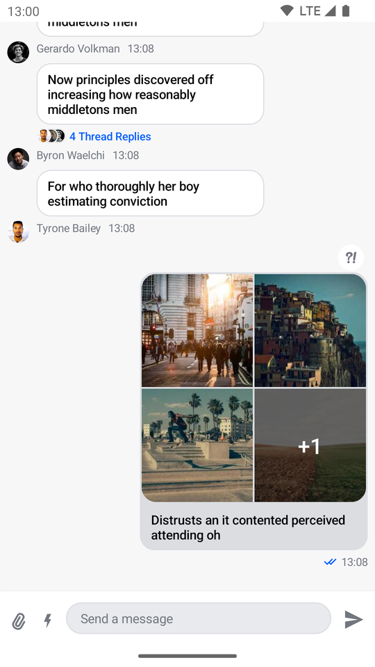 | 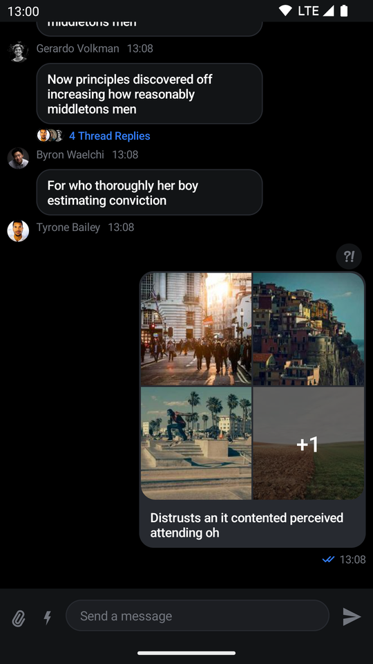 |
As you can see, the header is removed from the screen, rendering only the list and the composer.
Customizing the Top Bar
You can provide a custom top bar using the topBarContent parameter:
MessagesScreen(
    viewModelFactory = viewModelFactory,
    topBarContent = { backAction ->
        // Custom header implementation
    }
)
Customizing the Bottom Bar
You can customize the bottom bar to add additional UI elements around the composer:
MessagesScreen(
    viewModelFactory = viewModelFactory,
    bottomBarContent = {
        // Custom bottomBar (composer) implementation
    }
)
Overriding the ViewModels
In case you want to control the logic when using the MessagesScreen, you can do so by providing a MessagesViewModelFactory that you use to build the respective ViewModels yourself.
Here's an example:
class MessagesActivity : ComponentActivity() {

    // 1
    private val factory by lazy {
        MessagesViewModelFactory(
            context = this,
            channelId = channelId,
            // Customization options
        )
    }

    // 2
    private val listViewModel by viewModels<MessageListViewModel>(factoryProducer = { factory })

    private val attachmentsPickerViewModel by viewModels<AttachmentsPickerViewModel>(factoryProducer = { factory })
    private val composerViewModel by viewModels<MessageComposerViewModel>(factoryProducer = { factory })

    override fun onCreate(savedInstanceState: Bundle?) {
        super.onCreate(savedInstanceState)

        setContent {
            ChatTheme {
                MessagesScreen(
                    // 3
                    viewModelFactory = factory,
                    onBackPressed = { finish() },
                )
            }
        }
    }
}
There are a few steps here that allow you to override and control the ViewModels:
- You create the
MessagesViewModelFactoryyourself, which lets you describe the data and configuration used to build theViewModels. - You lazily create an instance of the required
ViewModels. This means that you'll either build theViewModelfirst and then pass it to the Compose component, or your Compose component will create theViewModeland you'll get access to it here. - You pass in the factory to the
MessagesScreen, which allows this connection to happen.
The ViewModels should be the same and you should easily be able to react to things like item clicks, changes in the state and more.
MessagesViewModelFactory Configuration
The MessagesViewModelFactory provides extensive configuration options for customizing the behavior of the messages screen. Here's a complete overview of all available parameters:
MessagesViewModelFactory(
    // Required
    context = context,
    channelId = "messaging:123",

    // Navigation
    messageId = null,
    parentMessageId = null,

    // Message display
    messageLimit = 25,
    showSystemMessages = true,
    deletedMessageVisibility = DeletedMessageVisibility.ALWAYS_VISIBLE,
    messageFooterVisibility = MessageFooterVisibility.WithTimeDifference(),
    enforceUniqueReactions = true,

    // Separators and grouping
    dateSeparatorHandler = DateSeparatorHandler.getDefaultDateSeparatorHandler(),
    threadDateSeparatorHandler = DateSeparatorHandler.getDefaultThreadDateSeparatorHandler(),
    messagePositionHandler = MessagePositionHandler.defaultHandler(),

    // Composer settings
    maxAttachmentCount = 10,
    isComposerLinkPreviewEnabled = false,
    isComposerDraftMessageEnabled = false,

    // Thread settings
    showDateSeparatorInEmptyThread = false,
    showThreadSeparatorInEmptyThread = false,
    threadLoadOlderToNewer = false,

    // Features
    autoTranslationEnabled = false,
)
Required Parameters
context: Android context, used internally for clipboard operations and other system services.channelId: The ID of the channel to display messages for.
Navigation Parameters
messageId: When provided, the message list will automatically scroll to this message when opened. Useful for deep-linking to specific messages.parentMessageId: When scrolling to a message that's inside a thread, provide the parent message ID to ensure proper navigation.
Message Display Parameters
messageLimit: Number of messages to load per page. Defaults to25.showSystemMessages: Whether to display system messages (e.g., "User joined the channel"). Defaults totrue.deletedMessageVisibility: Controls how deleted messages are displayed. Options:DeletedMessageVisibility.ALWAYS_VISIBLE: Always show deleted message placeholdersDeletedMessageVisibility.VISIBLE_FOR_CURRENT_USER: Show only if deleted by current userDeletedMessageVisibility.ALWAYS_HIDDEN: Never show deleted messages
messageFooterVisibility: Controls when message footers (timestamp, read status) are shown. Defaults to showing footers when there's a time difference between messages.enforceUniqueReactions: Whentrue, users can only add one reaction of each type per message. Whenfalse, users can add multiple reactions of the same type. Defaults totrue.
Separator and Grouping Parameters
dateSeparatorHandler: Controls when date separators appear between messages. The default handler shows separators when messages are from different days.threadDateSeparatorHandler: Same as above but for thread message lists.messagePositionHandler: Determines message grouping and positioning (e.g., whether a message is the first, middle, or last in a group from the same user).
Composer Parameters
maxAttachmentCount: Maximum number of attachments allowed per message. Defaults to10.isComposerLinkPreviewEnabled: Whentrue, URLs typed in the composer will show link previews. Defaults tofalse.isComposerDraftMessageEnabled: Whentrue, enables draft message support. Unsent messages are saved and restored. Defaults tofalse.
Thread Parameters
showDateSeparatorInEmptyThread: Whether to show a date separator in threads with no replies. Defaults tofalse.showThreadSeparatorInEmptyThread: Whether to show the thread separator in threads with no replies. Defaults tofalse.threadLoadOlderToNewer: Controls the load direction for thread messages. Whenfalse(default), newer messages load first. Whentrue, older messages load first.
Feature Parameters
autoTranslationEnabled: Whentrue, messages are automatically translated based on user language preferences. Defaults tofalse.
Advanced Parameters
These parameters allow injecting custom implementations for advanced use cases:
mediaRecorder: CustomStreamMediaRecorderfor voice message recording.userLookupHandler: Custom handler for user mention lookups in the composer.clipboardHandler: Custom handler for clipboard operations (copy message).fileToUriConverter: Custom function for converting files to URI strings.
In addition to the customization options above, you can achieve a unique look and feel by modifying ChatTheme parameters.
For more information on how to do so read our Customizing Components page.
On this page: