 React
React iOS
iOS Android
 Flutter
 Angular
 JavaScript
 Unity
Unity Unreal
 Node
Node Python
 Ruby
Ruby PHP
PHP Java
Java .NET
.NET Go
Go REST
RESTprivate val viewModelFactory by lazy {
ChannelInfoViewModelFactory(
context = applicationContext,
cid = cid,
)
}Channel Info
Channel Info components are used to display information about a channel, such as its name, members, and provide actions like leaving the channel or deleting it.
They are typically used in the context of a channel details screen and have two main components available:
DirectChannelInfoScreen- for direct channels (1:1 conversations). It shows the avatar and information about the other user, as well as the following actions:- Mute/Unmute Conversation - to mute or unmute the channel.
- Hide Conversation - to hide the channel from the list.
- Pinned Messages - to navigate to the pinned messages in the channel.
- Leave Conversation - to leave the channel.
- Delete Conversation - to delete the channel.
GroupChannelInfoScreen- for group channels (channels with more than 2 members or non-distinct channels). It shows information about the members, as well as the following actions:- Add Members - to add members to the channel.
- Add/Edit Group Name - to add or edit the name of the channel.
- Mute/Unmute Group - to mute or unmute the channel.
- Hide Group - to hide the channel from the list.
- Pinned Messages - to navigate to the pinned messages in the channel.
- Leave Group - to leave the channel.
- Delete Group - to delete the channel.
Long pressing on the member item in the list will show a bottom sheet with the following actions:
- Message - to send a direct message to the member.
- Ban/Unban - to ban or unban the member from the channel.
- Remove from Group - to remove the member from the channel.
Channel Info components are available on the Compose SDK since version 6.18.0
Usage
Both screen components are backed by ChannelInfoViewModel.
The minimum requirement is to create a ChannelInfoViewModelFactory and pass it to the screen component.
The ChannelInfoViewModelFactory constructor has the following parameters:
context- The application context, used to access the clipboard handler for copying the member name to the clipboard.cid- The channel ID (CID) of the channel for which the info is being displayed.optionFilter- Optional filter for the channel options. It can be used to customize the options available in the channel info screens. Defaults to make all options available.
Example of a custom filter that hides the "Add Member" option in the group channel info screen, even if the member has the capability to add members:
private val viewModelFactory by lazy {
    ChannelInfoViewModelFactory(
        context = applicationContext,
        cid = cid,
        optionFilter = { option ->
            option != ChannelInfoViewState.Content.Option.AddMember
        }
    )
}
Availability of options is also determined by the channel capabilities, so if the member doesn't have such capability, the option will not be available regardless of the filter.
With the factory created, you can pass it to the screen components:
override fun onCreate(savedInstanceState: Bundle?) {
    super.onCreate(savedInstanceState)

    setContent {
        ChatTheme {
            // Use DirectChannelInfoScreen for direct channels
            DirectChannelInfoScreen(
                modifier = Modifier.statusBarsPadding(),
                viewModelFactory = viewModelFactory,
                onNavigationIconClick = ::finish,
            )
            // Use GroupChannelInfoScreen for group channels
            GroupChannelInfoScreen(
                modifier = Modifier.statusBarsPadding(),
                viewModelFactory = viewModelFactory,
                onNavigationIconClick = ::finish,
            )
        }
    }
}
These snippets will produce the following screens:
| Direct channel | Group Channel |
|---|---|
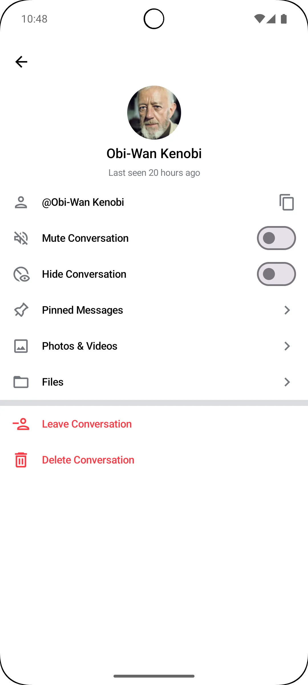 | 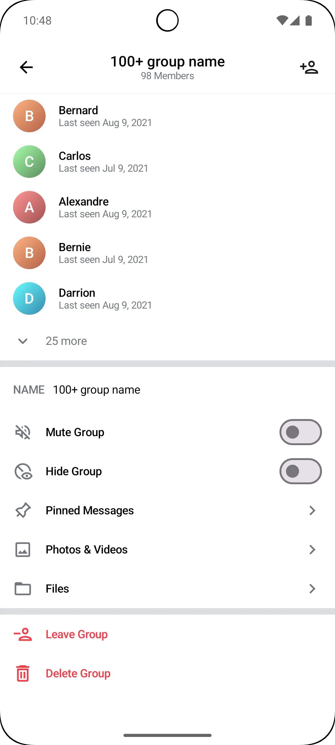 |
To check if the channel is a direct or group channel, you can use the following condition:
channel.memberCount > 2 || !channel.id.contains("!members")Handling Actions
Both the Channel Info components expose action handlers for the top bar actions such as onNavigationIconClick, which is invoked when the user taps on the navigation icon in the top bar.
The GroupChannelInfoScreen component exposes onAddMembersClick as an action handler
and it's invoked when a user taps on the "Add Members" button.
You can use it to show a dialog or navigate to another screen to add members to the channel.
var showAddMembers by remember { mutableStateOf(false) }
GroupChannelInfoScreen(
    modifier = Modifier.statusBarsPadding(),
    viewModelFactory = viewModelFactory,
    onAddMembersClick = { showAddMembers = true },
)
if (showAddMembers) {
    AddMembersDialog(
        cid = cid,
        onDismiss = { showAddMembers = false },
    )
}
Handling Events
The Channel Info components process option actions via the ChannelInfoViewModel and expose them as events.
You can handle these events by collecting them from the ViewModel in your Composable function.
private val viewModel by viewModels<ChannelInfoViewModel> { viewModelFactory }

LaunchedEffect(viewModel) {
   viewModel.events.collectLatest { event ->
       when (event) {
           is ChannelInfoViewEvent.Error -> /* ... */,
           is ChannelInfoViewEvent.Navigation -> /* ... */,
           is ChannelInfoViewEvent.Modal -> /* ... */,
       }
   }
}ChannelInfoViewEvent.Error- Represents an error event. You can show a toast or a snackbar based on the error type. The types of error are the following:RenameChannelError,MuteChannelError,UnmuteChannelError,HideChannelError,UnhideChannelError,LeaveChannelError,DeleteChannelError,BanMemberError,UnbanMemberError, andRemoveMemberError.
ChannelInfoViewEvent.Navigation- Represents a navigation event. You can navigate to another screen or perform an action based on the event. The type of navigation are the following:ChannelInfoViewEvent.NavigateUp- Indicates an intention to navigate up in the navigation hierarchy.ChannelInfoViewEvent.NavigateToPinnedMessages- Indicates an intention to navigate to the pinned messages. See Pinned Messages.ChannelInfoViewEvent.NavigateToChannel- Indicates an intention to navigate to the channel with the specified CID.ChannelInfoViewEvent.NavigateToDraftChannel- Indicates an intention to navigate to the draft channel with the specified member ID.
ChannelInfoViewEvent.Modal- Represents a modal event. No need to handle this event, as it is used internally by the components to show modals like confirmation dialogs or bottom sheets
Customization
The Channel Info components allow customization via ChatComponentFactory of the following UI elements:
DirectChannelInfoTopBar- The top bar of the direct channel info screen.DirectChannelInfoAvatarContainer- The container for the avatar in the direct channel info screen.GroupChannelInfoTopBar- The top bar of the group channel info screen.GroupChannelInfoAddMembersButton- The button to add members in the top bar of the group channel info screen.ChannelInfoSeparatorItem- The separator item in the channel info screens.ChannelInfoOptionItem- The option item in the channel info screens.GroupChannelInfoMemberItem- The item representing a member in the group channel info screen.GroupChannelInfoExpandMembersItem- The item to expand the members list in the group channel info screen.ChannelInfoScreenModal- The modal that is shown in the channel info screens, such as confirmation dialogs or bottom sheets. You can use this to customize the appearance of each modal shown in the channel info screens.ChannelInfoMemberInfoModalSheetTopBar- The top bar of the member info modal sheet in the group channel info screen.ChannelInfoMemberOptionItem- The option item in the member info modal sheet in the group channel info screen.