 React
React iOS
iOS Android
 Flutter
 Angular
 JavaScript
 Unity
Unity Unreal
 Node
Node Python
 Ruby
Ruby PHP
PHP Java
Java .NET
.NET Go
Go REST
RESTval listViewModel: ChannelListViewModel by viewModels { ChannelViewModelFactory() }
override fun onCreate(savedInstanceState: Bundle?) {
super.onCreate(savedInstanceState)
setContent {
val user by listViewModel.user.collectAsState() // Fetch user
ChatTheme {
ChannelList(
channelContent = { channelItem -> // Customize the channel items
ChannelItem(
channelItem = channelItem,
currentUser = user,
onChannelClick = {},
onChannelLongClick = {}
)
}
)
}
}
}Channel Items
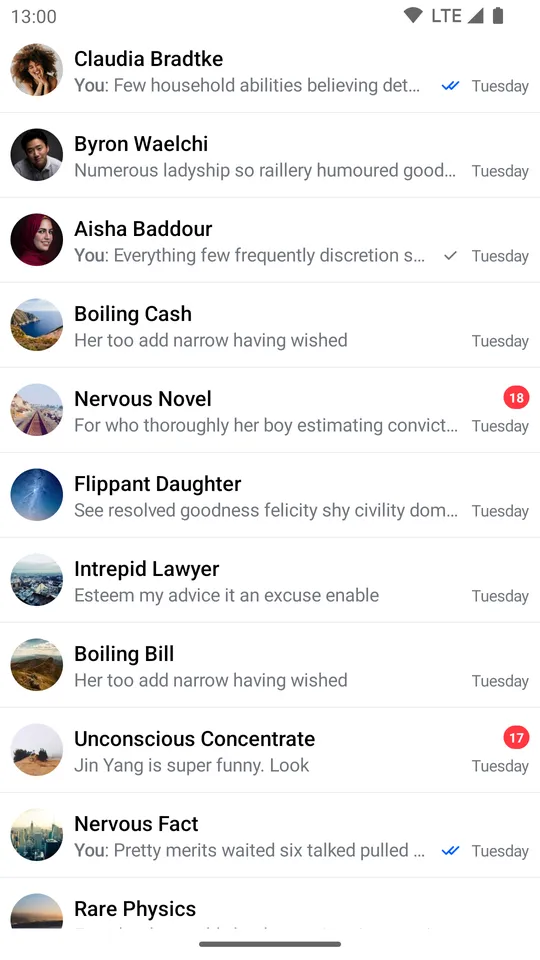
The ChannelItem component represents the default channel list item shown in ChannelList. It displays:
- Channel avatar: The channel or member images in the leading position.
- Channel name: With a muted icon if the channel is muted.
- Last message preview: Shows typing indicator, draft message, or last message text.
- Trailing info: Unread count, read status indicator, and timestamp.
You can use ChannelItem directly and customize its slot APIs to replace specific parts of the UI while keeping the rest.
Let's see how to use and customize this component.
Usage
To use the ChannelItem, it's best to override the channelContent parameter in the ChannelList and use it for the channel items:
This is a very basic and crude example of a ChannelList, where you override the channelContent.
The snippet above will generate the following UI.
 |
|---|
To fully utilize the ChannelItem let's see how to handle its actions and how to customize its Slot APIs.
Handling Actions
The ChannelItem exposes two required action handlers:
@Composable
fun ChannelItem(
    // ... State
    onChannelClick: (Channel) -> Unit,
    onChannelLongClick: (Channel) -> Unit,
    // ... Content slots
)onChannelClick: Called when the user taps on an item. Use this to navigate to theMessagesScreen.onChannelLongClick: Called when the user long-taps on an item. Use this to show channel options or update selection state.
Here's an example of using the default component, but overriding the behavior:
val listViewModel: ChannelListViewModel by viewModels { ChannelViewModelFactory() }

override fun onCreate(savedInstanceState: Bundle?) {
    super.onCreate(savedInstanceState)

    setContent {
        val user by listViewModel.user.collectAsState() // Fetch user

        ChatTheme {
            ChannelList(
                channelContent = { channelItem ->
                    ChannelItem(
                        channelItem = channelItem,
                        currentUser = user,
                        onChannelLongClick = {
                            listViewModel.selectChannel(it)
                        },
                        onChannelClick = {
                            // Start the MessagesScreen
                        },
                    )
                }
            )
        }
    }
}
In the example above, we customized onChannelLongClick and onChannelClick handlers to show the messages screen when the user taps on an item and store the selected channel state in the ViewModel, on long taps.
This way, you get more control over what happens when the user interacts with the items, but you still have the default UI that you don't have to implement yourself.
Read on to learn how to customize the UI.
Customization
The ChannelItem exposes three content slots for UI customization:
@Composable
fun ChannelItem(
    ..., // State and action handlers
    modifier: Modifier = Modifier,
    leadingContent: @Composable RowScope.(ItemState.ChannelItemState) -> Unit = { /* Default avatar */ },
    centerContent: @Composable RowScope.(ItemState.ChannelItemState) -> Unit = { /* Default channel info */ },
    trailingContent: @Composable RowScope.(ItemState.ChannelItemState) -> Unit = { /* Default trailing info */ },
)modifier: Modifier for the root component. Apply background, elevation, padding, shape, or touch handlers.leadingContent: Content at the start of the item. By default, shows theChannelAvatar.centerContent: Content in the center of the item. By default, shows:- Channel name (with muted icon if muted)
- Typing indicator when users are typing
- Draft message preview if a draft exists
- Last message preview otherwise
trailingContent: Content at the end of the item. By default, shows:- Unread message count indicator
- Read status indicator (for messages sent by the current user)
- Timestamp of the last message
Here's a simple example for building your own channel item, by overriding the mentioned parameters:
val listViewModel: ChannelListViewModel by viewModels { ChannelViewModelFactory() }

override fun onCreate(savedInstanceState: Bundle?) {
    super.onCreate(savedInstanceState)

    setContent {
        val user by listViewModel.user.collectAsState() // Fetch user

        ChatTheme {
            ChannelList(
                channelContent = { channelItem -> // Customize the channel items
                    CustomChannelListItem(channelItem = channelItem, user = user)
                }
            )
        }
    }
}

@Composable
fun CustomChannelListItem(channelItem: ItemState.ChannelItemState, user: User?) {
    ChannelItem(
        channelItem = channelItem,
        currentUser = user,
        onChannelLongClick = {},
        onChannelClick = {},
        trailingContent = { // Replace the trailing content with a spacer
            Spacer(modifier = Modifier.width(8.dp))
        },
        centerContent = { // Replace the details content with a simple Text
            Text(
                text = ChatTheme.channelNameFormatter.formatChannelName(it.channel, user),
                style = ChatTheme.typography.bodyBold,
                color = ChatTheme.colors.textHighEmphasis
            )
        }
    )
}
As you can see, it's very easy to override and completely replace the Slot APIs in our ChannelItem. In the example, you replaced the trailingContent with a simple Spacer for some padding and the centerContent with a Text that shows the channel name.
The snippet above will generate the following UI:
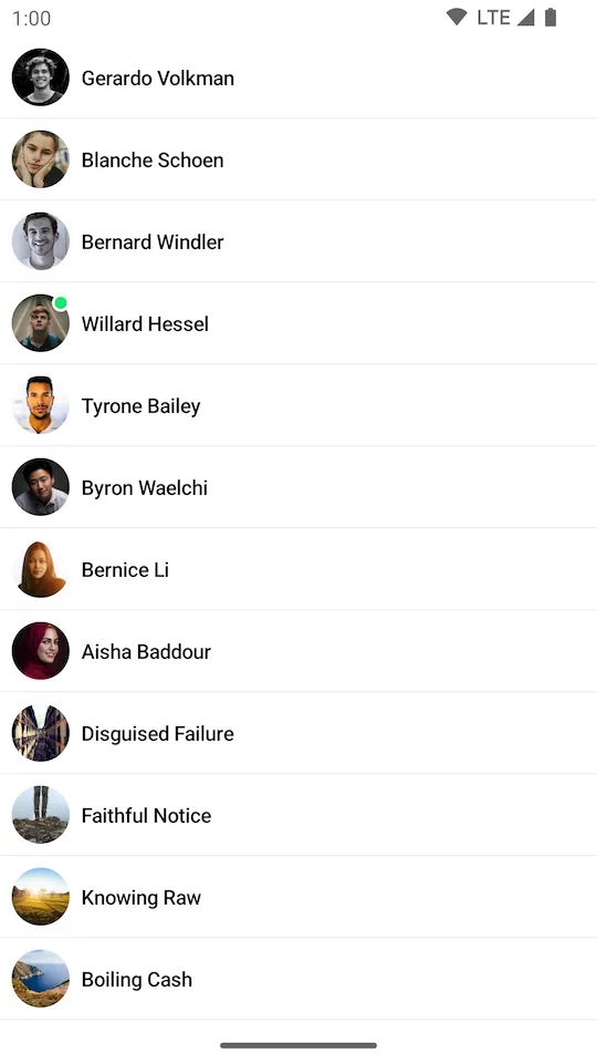 |
|---|
It was really easy to provide a completely custom UI for the channel items while still keeping the same functionality and actions of the rest of the screen.