 React
React iOS
iOS Android
 Flutter
 Angular
 JavaScript
 Unity
Unity Unreal
 Node
Node Python
 Ruby
Ruby PHP
PHP Java
Java .NET
.NET Go
Go REST
RESTmessageComposerView.pollSubmissionListener = { pollConfig ->
// Handle the poll submission
// Use pollConfig properties to create the poll
}Polls
Stream Chat's UI Components SDK includes the capability to create polls within your chat application. Polls are an effective tool for enhancing user interaction and engagement, providing a dynamic way to gather opinions and feedback.
Polls on UI Components are available since version 6.5.0.
Polls are disabled by default. In order to enable this feature, you need to go to the Stream dashboard for your app, and enable the "Polls" flag for your channel type.
As soon as you do that, an additional "Polls" icon will be shown in the attachment picker in the default composer implementation in the SDK.
Poll Configuration
When you tap the "Polls" icon, a new screen for creating polls will be shown. On this screen, you can configure the poll title, the options, as well as several other settings, such as the maximum number of votes, whether the poll is anonymous, and whether it allows comments.
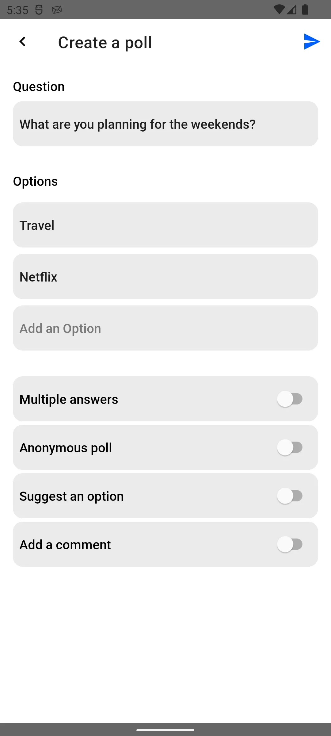
Poll Creation Screen
If you are using the MessageComposerView with the default MessageComposerViewModel.bindView() binding, poll creation is already handled for you. The MessageComposerViewModel will automatically send the poll when the user submits it.
However, if you want to intercept or customize the poll creation, you can use the pollSubmissionListener property on MessageComposerView:
After receiving the PollConfig, you can create the poll using MessageComposerViewModel.createPoll(pollConfig) or by directly calling ChatClient.sendPoll(channelType, channelId, pollConfig).
Custom Poll Creation Screen
You can replace the default poll creation screen by implementing your own AttachmentsPickerTabFactory. This allows you to provide a completely custom poll creation experience:
class CustomPollAttachmentsPickerTabFactory : AttachmentsPickerTabFactory {

    override fun createTabIcon(style: AttachmentsPickerDialogStyle): Drawable {
        // Return your custom poll tab icon
        return style.pollAttachmentsTabIconDrawable
    }

    override fun createTabFragment(
        style: AttachmentsPickerDialogStyle,
        attachmentsPickerTabListener: AttachmentsPickerTabListener,
    ): Fragment {
        // Return your custom poll creation fragment
        return MyCustomPollFragment.newInstance().apply {
            // When poll is created, call:
            // attachmentsPickerTabListener.onPollSubmitted(pollConfig)
        }
    }
}
To use your custom factory with MessageComposerView, set the attachmentsPickerDialogBuilder property:
messageComposerView.attachmentsPickerDialogBuilder = { style ->
    // Get the default factories
    val defaultFactories = AttachmentsPickerTabFactories.defaultFactories(
        mediaAttachmentsTabEnabled = style.mediaAttachmentsTabEnabled,
        fileAttachmentsTabEnabled = style.fileAttachmentsTabEnabled,
        cameraAttachmentsTabEnabled = style.cameraAttachmentsTabEnabled,
        pollAttachmentsTabEnabled = style.pollAttachmentsTabEnabled,
    )

    // Replace the poll factory with your custom one
    val customFactories = defaultFactories.map { factory ->
        if (factory is AttachmentsPickerPollTabFactory) {
            CustomPollAttachmentsPickerTabFactory()
        } else {
            factory
        }
    }

    // Create the dialog with custom factories
    AttachmentsPickerDialogFragment.newInstance(
        style = style,
        attachmentsPickerTabFactories = customFactories,
    )
}
PollView
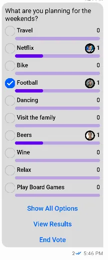
When a message contains a poll, the optional poll property inside Message will have a value of type Poll. In those cases, the PollView will be shown inside the MessageListView.
Poll attachments have the same behavior as other types of messages - you can send reactions, reply, delete them, or pin them.
The default poll view has the following UI:
Poll Interaction Listeners
The MessageListView provides several listeners to handle poll interactions. You can set these listeners to customize the behavior when users interact with polls:
// Called when a user clicks on a poll option to vote
messageListView.setOnPollOptionClickListener { message, poll, option ->
    // Handle option click (e.g., cast or remove vote)
    // Return true to consume the event, false to use default behavior
    false
}

// Called when the poll owner clicks "End Vote"
messageListView.setOnPollCloseClickListener { poll ->
    // Handle poll closing
    // Return true to consume the event, false to use default behavior
    false
}

// Called when a user clicks "View Results"
messageListView.setOnViewPollResultClickListener { poll ->
    // Handle view results click
    // Return true to consume the event, false to show default dialog
    false
}
Styling PollView
You can customize the appearance of PollView by defining style attributes in your theme. The following attributes are available:
<style name="MyMessageListStyle" parent="StreamUi.MessageList">
    <!-- Poll title styling -->
    <item name="streamUiPollTitleTextSize">16sp</item>
    <item name="streamUiPollTitleTextColor">@color/my_title_color</item>
    <item name="streamUiPollTitleTextStyle">bold</item>

    <!-- Poll subtitle styling -->
    <item name="streamUiPollSubtitleTextSize">14sp</item>
    <item name="streamUiPollSubtitleTextColor">@color/my_subtitle_color</item>

    <!-- Poll option styling -->
    <item name="streamUiPollOptionTextSize">14sp</item>
    <item name="streamUiPollOptionTextColor">@color/my_option_color</item>
    <item name="streamUiPollOptionCheckDrawable">@drawable/my_check_icon</item>

    <!-- Vote count styling -->
    <item name="streamUiPollVotesTextSize">12sp</item>
    <item name="streamUiPollVotesTextColor">@color/my_votes_color</item>

    <!-- Button styling -->
    <item name="streamUiPollCloseTextSize">14sp</item>
    <item name="streamUiPollCloseTextColor">@color/my_close_color</item>
    <item name="streamUiPollResultsTextSize">14sp</item>
    <item name="streamUiPollResultsTextColor">@color/my_results_color</item>
    <item name="streamUiPollShowAllOptionsTextSize">14sp</item>
    <item name="streamUiPollShowAllOptionsTextColor">@color/my_show_all_color</item>
</style>
For a complete list of available styling attributes, see attrs_poll_view.xml.
Poll Results and Answers
The SDK provides dialogs for viewing poll results and detailed vote information.
AllPollOptionsDialogFragment
This dialog is shown when the user clicks "Show All Options" on a poll with more than 10 options. It displays all available poll options and allows voting from within the dialog.
// Show the all options dialog manually
val dialog = AllPollOptionsDialogFragment.newInstance(message)
dialog.show(supportFragmentManager, AllPollOptionsDialogFragment.TAG)
PollResultsDialogFragment
Displays the poll results in a modal bottom sheet, showing each option with its vote count and a winner indicator. By default, this dialog is shown when the user clicks "View Results" on a poll.
// Show the poll results dialog manually
val dialog = PollResultsDialogFragment.newInstance(poll)
dialog.show(supportFragmentManager, PollResultsDialogFragment.TAG)
Polls API
In addition to the UI Components SDK, the Stream Chat Android Low-Level Client provides various methods to manage polls programmatically. You can find all the available operations in the Polls API.
On this page: