 React
React iOS
iOS Android
 Flutter
 Angular
 JavaScript
 Unity
Unity Unreal
 Node
Node Python
 Ruby
Ruby PHP
PHP Java
Java .NET
.NET Go
Go REST
REST// Remember search query for recomposition
var searchQuery by rememberSaveable { mutableStateOf("") }
SearchInput(
modifier = Modifier
.background(color = ChatTheme.colors.appBackground)
.padding(horizontal = 12.dp, vertical = 8.dp)
.fillMaxWidth(),
query = searchQuery,
onSearchStarted = {},
onValueChange = {
searchQuery = it
},
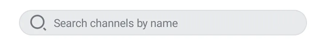
)SearchInput
The SearchInput component allows users to fill in a search query. It contains the following elements:
leadingIcon: The icon at the start of the search component.label: The label shown in the search component when there's no input.clearButton: A button to clear user input, shown when the search is focused and not empty.
Usage
To use the SearchInput, you need to remember the search query and add the component to your UI:
The snippet above will produce the next UI:
 |
|---|
Handling Actions
The SearchInput component exposes the following actions, as per the signature:
@Composable
fun SearchInput(
    ..., // State & UI
    onValueChange: (String) -> Unit,
    onSearchStarted: () -> Unit = {},
)onValueChange: Handler when the value changes.onSearchStarted: Handler when the search starts, by focusing the input field.
You can use the ChannelListViewModel to search for named channels by name and distinct channels by member name. To do so, simply pass the search query from onValueChange callback to the ChannelListViewModel. The results can be displayed using the ChannelList.
var searchQuery by rememberSaveable { mutableStateOf("") }

SearchInput(
    ...,
    query = searchQuery,
    onValueChange = {
        searchQuery = it

        // Use ChannelListViewModel to search for channels
        channelListViewModel.setSearchQuery(it)
    }
)
Customization
The SearchInput exposes the following properties for customization:
@Composable
fun SearchInput(
    ..., // State
    modifier: Modifier = Modifier,
    leadingIcon: @Composable RowScope.() -> Unit = { ... },
    label: @Composable () -> Unit = { ... },
    clearButton: @Composable RowScope.() -> Unit = { ... },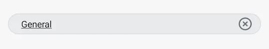
)modifier: Modifier for the root component. Useful for the component size, padding, background and similar.leadingIcon: Customizable composable that overrides the default leading icon.label: Customizable composable that overrides the search label.clearButton: Customizable composable that overrides the clear button shown when the search is focused and not empty.
Here's an example of customizing the UI of the SearchInput:
var searchQuery by rememberSaveable { mutableStateOf("") }

SearchInput(
    modifier = Modifier
        .background(color = ChatTheme.colors.appBackground)
        .padding(horizontal = 12.dp, vertical = 12.dp)
        .fillMaxWidth(),
    query = searchQuery,
    onValueChange = {
        searchQuery = it

        // Use ChannelListViewModel to search for channels
        channelListViewModel.setSearchQuery(it)
    },
    leadingIcon = {
        // Remove the leading icon
        Spacer(Modifier.width(16.dp))
    },
    label = {
        // Customize the hint
        Text(
            text = "Search channels",
            style = ChatTheme.typography.body,
            color = ChatTheme.colors.textLowEmphasis,
        )
    }
)
The snippet above will produce the following UI.
 |
|---|