 React
React iOS
iOS Android
 Flutter
 Angular
 JavaScript
 Unity
Unity Unreal
 Node
Node Python
 Ruby
Ruby PHP
PHP Java
Java .NET
.NET Go
Go REST
REST// Manage the full screen state of the attachment picker
var isFullScreenContent by rememberSaveable { mutableStateOf(false) }
val screenHeight = LocalConfiguration.current.screenHeightDp
val pickerHeight by animateDpAsState(
targetValue = if (isFullScreenContent) screenHeight.dp else ChatTheme.dimens.attachmentsPickerHeight,
label = "full sized picker animation",
)
AttachmentsPicker(
attachmentsPickerViewModel = attachmentsPickerViewModel,
modifier = Modifier
.align(Alignment.BottomCenter)
.height(pickerHeight),
// Use a different shape based on the full screen state
shape = if (isFullScreenContent) {
RoundedCornerShape(0.dp)
} else {
ChatTheme.shapes.bottomSheet
},
onTabClick = { _, tab -> isFullScreenContent = tab.isFullContent },
onAttachmentPickerAction = { action ->
if (action is AttachmentPickerPollCreation) {
composerViewModel.createPoll(action.pollConfig)
}
},
// Other callbacks ..
)Polls
Stream Chat's Compose SDK includes the capability to create polls within your chat application. Polls are an effective tool for enhancing user interaction and engagement, providing a dynamic way to gather opinions and feedback.
Polls on Compose are available since version 6.5.0.
Polls are disabled by default. In order to enable this feature, you need to go to the Stream dashboard for your app, and enable the "Polls" flag for your channel type.
As soon as you do that, an additional "Polls" icon will be shown in the attachment picker in the default composer implementation in the SDK.
Poll Configuration
When you tap the "Polls" icon, a new screen for creating polls will be shown. On this screen, you can configure the poll title, the options, as well as several other settings, such as the maximum number of votes, whether the poll is anonymous, and whether it allows comments.
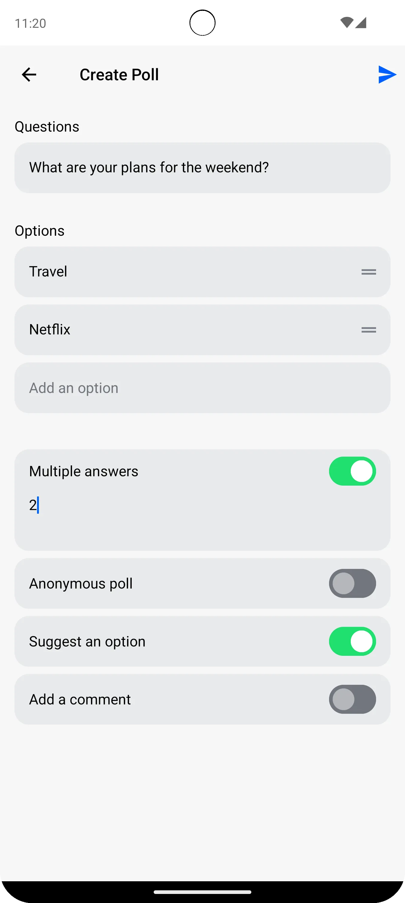
Poll Creation Screen
If you are using the high-level MessagesScreen component, the poll creation is already handled for you. However, if you are implementing your own message composer with the AttachmentsPicker component, you need to handle the poll creation action yourself.
The poll creation action is represented by the AttachmentPickerPollCreation class, and is returned in the onAttachmentPickerAction lambda of the AttachmentsPicker component. After receiving this action, you can use the MessageComposerViewModel.createPoll or ChatClient.sendPoll methods to create the poll with the provided configuration.
Custom Poll Creation Screen
You can also swap the whole view that shows the poll creation sheet. To do that, you need to implement your own AttachmentsPickerTabFactory and override the PickerTabContent function to show your custom poll creation screen:
class CustomPollAttachmentsPickerTabFactory: AttachmentsPickerTabFactory {

    override val attachmentsPickerMode: AttachmentsPickerMode
        get() = Poll

    @Composable
    override fun PickerTabIcon(isEnabled: Boolean, isSelected: Boolean) {
        // Your icon for the poll tab in the AttachmentsPicker
    }

    @Composable
    override fun PickerTabContent(
        onAttachmentPickerAction: (AttachmentPickerAction) -> Unit,
        attachments: List<AttachmentPickerItemState>,
        onAttachmentsChanged: (List<AttachmentPickerItemState>) -> Unit,
        onAttachmentItemSelected: (AttachmentPickerItemState) -> Unit,
        onAttachmentsSubmitted: (List<AttachmentMetaData>) -> Unit,
    ) {
        // Your custom poll creation screen implementation
    }
}
And then provide your custom factory to the ChatTheme:
// Obtain the default factories
val defaultFactories = AttachmentsPickerTabFactories.defaultFactories()
// Replace the Poll tab factory with your custom implementation
val customFactories = defaultFactories.map {
    if (it.attachmentsPickerMode == Poll) {
        CustomPollAttachmentsPickerTabFactory()
    } else {
        it
    }
}
// Pass the custom factories to the ChatTheme
ChatTheme(
    attachmentsPickerTabFactories = customFactories,
) {
    MessagesScreen(/* ... */)
}
Standalone Poll Creation Screen
If you want to integrate the poll creation screen without using the AttachmentsPicker component, you can use the standalone CreatePollScreen composable function provided by the SDK:
@Composable
fun CreatePollScreen(
    onAttachmentPickerAction: (AttachmentPickerAction) -> Unit,
)
This component accepts a single parameter onAttachmentPickerAction, a lambda function that will be invoked with one of the following AttachmentPickerActions:
AttachmentPickerBack- triggered when the user presses the back button and the poll creation should be canceled.AttachmentPickerPollCreation- triggered when the user completes the poll creation. This action contains the poll configuration data needed to create the poll. You can then use this data to create the poll via theMessageComposerViewModel.createPollmethod, or by directly callingChatClient.sendPoll.
Poll Creation Components
In addition to the aforementioned CreatePollScreen, the SDK provides several composable functions that you can use to build your own custom poll creation screen. These components include:
PollCreationHeader- A customizable header for the poll creation screen, including back navigation and poll submission actions.PollQuestionInput- An input field for entering the poll question.PollOptionList- A re-orderable list of poll options with validation for unique entries.PollSwitchList- A list of switches to configure poll properties such as multiple answers and anonymity.PollCreationDiscardDialog- A dialog to confirm discarding unsaved changes when navigating back.
PollCreationHeader
Default header of the poll creation screen. It consists of three parts: leading, center, and trailing content, each with its dedicated roles such as navigating back, displaying the title, and submitting the poll creation. You can fully customize the header using the provided parameters as shown in the code below:
@Composable
public fun PollCreationHeader(
    modifier: Modifier = Modifier,
    color: Color = ChatTheme.colors.appBackground,
    shape: Shape = ChatTheme.shapes.header,
    elevation: Dp = 0.dp,
    onBackPressed: () -> Unit = {},
    enabledCreation: Boolean,
    onPollCreateClicked: () -> Unit,
    leadingContent: @Composable (RowScope.() -> Unit)? = null,
    centerContent: @Composable (RowScope.() -> Unit)? = null,
    trailingContent: @Composable (RowScope.() -> Unit)? = null,
)
PollQuestionInput
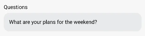
The poll input component allows the poll creator to describe the question of the poll. You can use this component to receive the poll title during poll creation. This provides a user-friendly interface for entering and displaying the main question of the poll, ensuring clarity and engagement.
@Composable
public fun PollQuestionInput(
    modifier: Modifier = Modifier,
    title: String,
    question: String,
    onQuestionChanged: (String) -> Unit,
)
PollOptionList
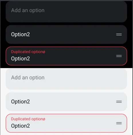
The re-orderable list of options consists of input fields where each entry must be unique. If a duplicate entry is detected, an error message will be displayed. This ensures that all poll options are distinct, maintaining the integrity and clarity of the poll.
@Composable
public fun PollOptionList(
    modifier: Modifier = Modifier,
    lazyListState: LazyListState,
    title: String,
    optionItems: List<PollOptionItem>,
    onQuestionsChanged: (List<PollOptionItem>) -> Unit,
    itemHeightSize: Dp,
    itemInnerPadding: PaddingValues,
)
The onQuestionsChanged lambda provides a List of PollOptionItem, which contains information about each option item whenever the input list is modified, reordered, or added to. This ensures that any changes to the poll options are tracked and updated accordingly.
PollSwitchList
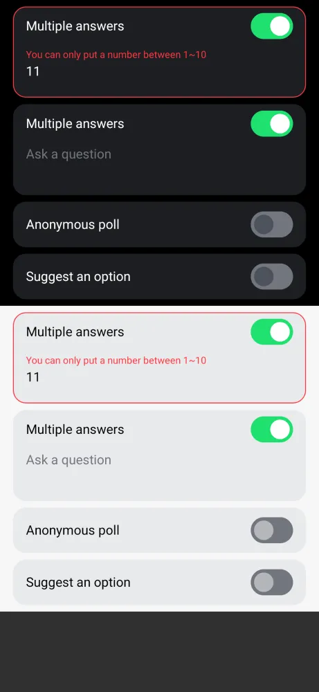
The list of switches configures the poll properties, such as allowing multiple answers, enabling anonymous polling, or suggesting an option.
@Composable
public fun PollSwitchList(
    modifier: Modifier = Modifier,
    pollSwitchItems: List<PollSwitchItem>,
    onSwitchesChanged: (List<PollSwitchItem>) -> Unit,
    itemHeightSize: Dp,
    itemInnerPadding: PaddingValues,
)
The onSwitchesChanged lambda provides a list of PollSwitchItem, detailing each switch configuration whenever changes occur in the switch list. You can customize the default switch options by implementing your own PollSwitchItemFactory, as shown in the example below:
public class MyPollSwitchItemFactory(private val context: Context) : PollSwitchItemFactory {

    /**
     * Provides a default list of [PollSwitchItem] to create the poll switch item list.
     */
    override fun providePollSwitchItemList(): List<PollSwitchItem> =
        listOf(
            PollSwitchItem(
                title = context.getString(R.string.stream_compose_poll_option_switch_multiple_answers),
                pollSwitchInput = PollSwitchInput(
                    value = "",
                    description = context.getString(R.string.stream_compose_poll_option_max_number_of_answers_hint),
                    minValue = 2,
                    maxValue = 10,
                    keyboardType = KeyboardType.Number,
                ),
                key = "maxVotesAllowed",
                enabled = false,
            ),
            PollSwitchItem(
                title = context.getString(R.string.stream_compose_poll_option_switch_anonymous_poll),
                key = "votingVisibility",
                enabled = false,
            ),
//            Remove the "Suggest an option" and "Add a comment" switches
//            PollSwitchItem(
//                title = context.getString(R.string.stream_compose_poll_option_switch_suggest_option),
//                key = "allowUserSuggestedOptions",
//                enabled = false,
//            ),
//            PollSwitchItem(
//                title = context.getString(R.string.stream_compose_poll_option_switch_add_comment),
//                key = "allowAnswers",
//                enabled = false,
//            ),
        )
}
You can apply your custom PollSwitchItemFactory to the ChatTheme as shown in the example below:
ChatTheme(
    pollSwitchItemFactory = MyPollSwitchItemFactory(context)
)
PollCreationDiscardDialog
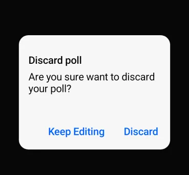
The dialog that appears when a user attempts to navigate back with unsaved changes on the poll creation screen helps prevent accidental loss of poll information. This safeguard ensures users are prompted to confirm their intent to leave, thereby protecting any data they have entered from being inadvertently discarded.
@Composable
public fun PollCreationDiscardDialog(
    usePlatformDefaultWidth: Boolean,
    onCancelClicked: () -> Unit,
    onDiscardClicked: () -> Unit,
)
By combining all the components mentioned above, you will see the resulting poll creation screen below:
| Light Mode - Poll Creation | Dark Mode - Poll Creation |
|---|---|
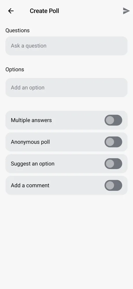 | 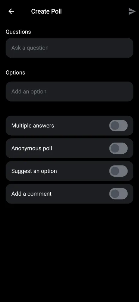 |
This setup includes a customizable header, input fields for the poll question, a list of options with unique validation, configurable switches, and a back navigation confirmation dialog.
PollMessageContent
When a message contains a poll, the optional poll property inside Message will have a value of type Poll. In those cases, the PollMessageContent will be shown.
Poll attachments have the same behavior as other types of messages - you can send reactions, reply, delete them or pin them.
The default poll attachment view has the following UI:
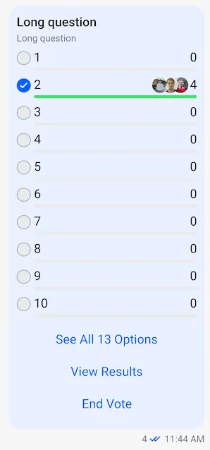
It is implemented inside the MessageItem, so you can customize the poll content message by implementing your own MessageItem composable.
if (messageItem.message.isPoll() && !messageItem.message.isDeleted()) {
    val poll = messageItem.message.poll
    LaunchedEffect(key1 = poll) {
        if (poll != null) {
            onPollUpdated.invoke(messageItem.message, poll)
        }
    }

    PollMessageContent(
        modifier = finalModifier,
        messageItem = messageItem,
        onCastVote = onCastVote,
        onRemoveVote = onRemoveVote,
        selectPoll = selectPoll,
        onAddAnswer = onAddAnswer,
        onClosePoll = onClosePoll,
        onAddPollOption = onAddPollOption,
        onLongItemClick = onLongItemClick,
    )
}
The PollMessageContent composable accepts the following parameters:
| Parameter | Type | Description |
|---|---|---|
modifier | Modifier | Modifier for styling |
messageItem | MessageItemState | The message item containing the poll |
onCastVote | (Message, Poll, Option) -> Unit | Called when user votes for an option |
onRemoveVote | (Message, Poll, Vote) -> Unit | Called when user removes their vote |
selectPoll | (Message, Poll, PollSelectionType) -> Unit | Called when user selects poll actions (view results, view answers, more options) |
onAddAnswer | (Message, Poll, String) -> Unit | Called when user adds a text answer/comment |
onClosePoll | (String) -> Unit | Called when poll owner closes the poll |
onAddPollOption | (Poll, String) -> Unit | Called when user suggests a new option |
onLongItemClick | (Message) -> Unit | Called on long press |
Poll Results and Answers
The SDK provides dialogs for viewing poll results and answers.
PollMoreOptionsDialog
This dialog is shown when the user clicks on the "See All Options" button in the poll message content. It displays all available poll options when the poll has more than 10 options.
@Composable
public fun PollMoreOptionsDialog(
    selectedPoll: SelectedPoll,
    listViewModel: MessageListViewModel,
    onDismissRequest: () -> Unit,
    onBackPressed: () -> Unit,
)
PollViewResultDialog
Displays the poll results in a modal bottom sheet, showing each option with its vote count and a winner indicator.
@Composable
fun PollViewResultDialog(
    selectedPoll: SelectedPoll,
    onDismissRequest: () -> Unit,
    onBackPressed: () -> Unit,
)
PollAnswersDialog
Displays all text answers/comments for the poll, with the ability to add or edit answers.
@Composable
public fun PollAnswersDialog(
    selectedPoll: SelectedPoll,
    showAnonymousAvatar: Boolean,
    listViewModel: MessageListViewModel,
    onDismissRequest: () -> Unit,
    onBackPressed: () -> Unit,
)
PollDialogs
If you are using the high-level MessagesScreen component, these dialogs are already implemented for you. However, if you are implementing your own message list and message item components, you need to handle the dialog visibility and implementation yourself. For a more convenient way to manage the poll dialogs, the SDK provides the PollDialogs component, which encapsulates all the dialogs mentioned above. You can use it as shown in the example below:
val viewModelFactory = MessagesViewModelFactory(
    context = context,
    channelId = channelId,
)
val messageListViewModel = viewModel(MessageListViewModel::class.java, factory = viewModelFactory)

PollDialogs(
    listViewModel = messageListViewModel,
    showAnonymousAvatar = showAnonymousAvatar,
)
This composable will render the poll dialogs when needed, based on the state of the MessageListViewModel. You just need to provide the MessageListViewModel instance and a flag indicating whether to show the user avatars for comments on polls with anonymous voting.
Polls API
In addition to the Compose SDK components, the Stream Chat Android Low-Level Client provides various methods to manage polls programmatically. You can find all the available operations in the Polls API.
On this page: