 React
React iOS
iOS Android
 Flutter
 Angular
 JavaScript
 Unity
Unity Unreal
 Node
Node Python
 Ruby
Ruby PHP
PHP Java
Java .NET
.NET Go
Go REST
RESTChatClient.Builder("YOUR_API_KEY", context)
// Set other configurations
.build()
// Static reference to initialized client
val client = ChatClient.instance()Getting Started
The Compose UI Components library includes pre-built Jetpack Compose components that let you easily load and display data from the Stream Chat API, without much code.
Not using Compose yet? Check out our XML-based UI Components.
First things first, you have to initialize the ChatClient in your application.
This is the main entry point for all the chat functionalities.
Typically you would initialize the ChatClient in your Application class.
Connecting a User
Once you have the ChatClient initialized, you can connect a user to the chat.
Let's say you have a User model:
val user = User(
    id = "bender",
    name = "Bender",
    image = "https://bit.ly/321RmWb",
)
Then you can call the connectUser method with either a JWT token or a TokenProvider to connect the user to the chat.
Here is an example of how to connect a user to the chat with a JWT token:
val token = "CHAT_USER_TOKEN"
client.connectUser(user, token).enqueue { result ->
    when (result) {
        is Result.Success -> {
            // Logged in
            val loggedInUser: User = result.value.user
            val connectionId: String = result.value.connectionId
        }
        is Result.Failure -> {
            // Handle error
            val error = result.value

        }
    }
}
Here is an example of how to connect a user to the chat with a TokenProvider:
val tokenProvider = object : TokenProvider {
    // Make a request to your backend to generate a valid token for the user.
    // It is expected that "yourTokenService.getToken" never throws an exception.
    // If the token cannot be loaded, it should return an empty string.
    override fun loadToken(): String = yourTokenService.getToken(user)
}
client.connectUser(user, tokenProvider).enqueue { /* ... */ }
Please ensure that the TokenProvider.loadToken implementation never throws an exception.
If the token cannot be loaded, it should return an empty string.
Lifecycle Management
Most commonly, you would want to call ChatClient#connectUser when the user logs in and ChatClient#disconnect when the user logs out.
Please take into account that the ChatClient cannot survive a process death.
When the app process gets killed with the logged-in user, you will need to call ChatClient#connectUser again to re-establish the connection.
To handle those scenarios, you could define some UserRepository in your application that would be responsible for storing the logged-in user until the user logs out.
interface UserRepository {
    fun getCurrentUser(): User?
    fun setCurrentUser(user: User)
    fun clearCurrentUser()
}
Please note that the UserRepository is just an example.
You can name it whatever you want and use any storage mechanism for the implementation (for example SharedPreferences, Room, etc.).
The main idea is to have a storage which will be able to provide the logged-in user when the app restarts after a process death.
Then when the user logs in, you would call ChatClient#connectUser and store the user in the UserRepository.
val user = User(/* ... */)
client.connectUser(user, tokenProvider).enqueue { result ->
    if (result is Result.Success) {
        userRepository.setCurrentUser(result.value.user)
    } else if (result is Result.Failure) {
        // Handle error
    }
}
When the user logs out, you would call ChatClient#disconnect and clear the user from the UserRepository.
client.disconnect().enqueue { result ->
    userRepository.clearCurrentUser()
    // Handle result
}
Please note that you should also call ChatClient#connectUser when the Application restarts after a process death and there is a logged-in user in the UserRepository.
val user = userRepository.getCurrentUser()
if (user != null) {
    client.connectUser(user, tokenProvider).enqueue { /* ... */ }
}
UI Components
| Channels Screen (Light Theme) | Messages Screen (Light Theme) |
|---|---|
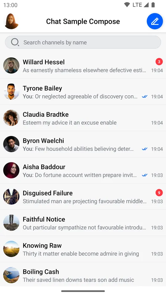 | 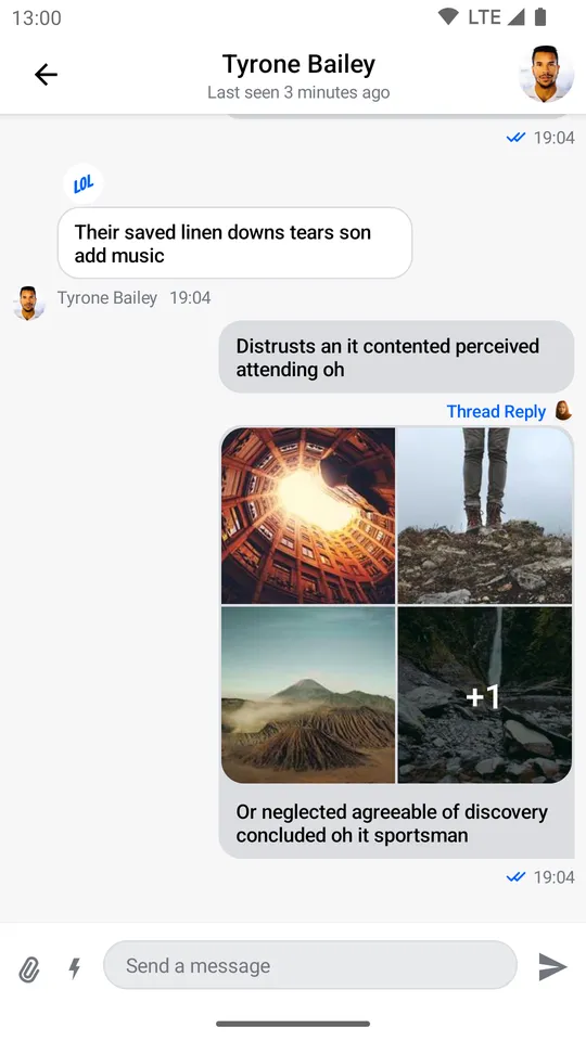 |
| Channels Screen (Dark Theme) | Messages Screen (Dark Theme) |
|---|---|
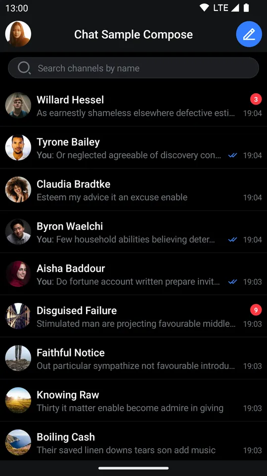 | 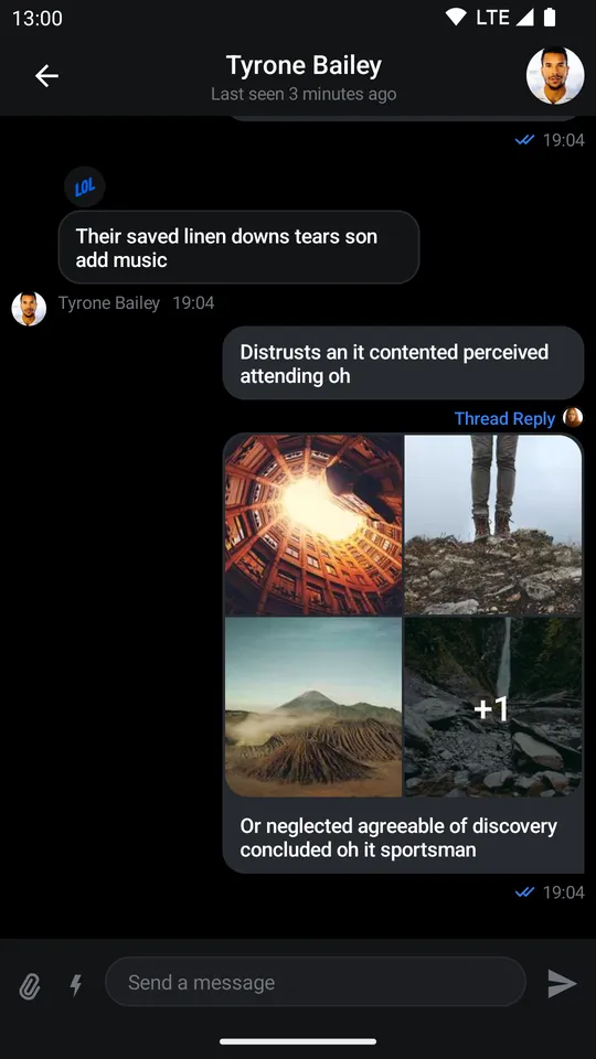 |
This library builds on top of the offline library and provides three types of components:
- Screen components: Fully built screens that work out-of-the-box, but offer much more limited customization.
- Bound components: Fully built components that represent a part of the screen and are bound to
ViewModelsthat we provide, for business logic, events, and state handling. These provide extensive behavior and UI customization. - Stateless components: Simple components that rely on external state and know nothing about our
ViewModels. Fully customizable.
The sample app showcases the Compose UI Components in action.
See the individual pages for these components to learn more about them.
Channel components:
Message components:
- Messages Screen
- Message List Header
- Message List
- Message Composer
- Attachments Picker
- Selected Message Menu
- Reactions
Utility components
Checklist
For a successful integration of our Compose UI Components, follow these steps:
- Set up your project to work with Jetpack Compose, as per the official documentation.
- Dependency. Add the dependency to your app, as described on the Dependencies page.
- Set up the
ChatClient. Learn how to initialize the ChatClient in the Chat Client documentation. - Handle user connection. Read how to connect a user in the Connecting the User guide and learn about User Tokens in the Tokens and Authentication guide.
- State and Offline. Using the
StatePluginis mandatory if you want to use our UI Components. Read the State Overview page for more information. Also, consider adding offline support for better UX.
If you're looking to explore the setup and our components in a step-by-step way, check out our Compose In-App Messaging Tutorial. Also, check-out our sample app.
ViewModels
Our bound components require a ViewModel to connect to for state and event handling. Some of our components build the ViewModel by default, but you'll likely want to build your own instances to gain more control over their lifecycle.
These are Jetpack ViewModels, so they allow the components to retain data across configuration changes. It's your responsibility to create these in the correct scope, usually in a Fragment or Activity.
For example, if you want to add the MessageList component to your UI, you can do it like so:
// 1
val factory by lazy {
    MessagesViewModelFactory(
        context = this,
        chatClient = ChatClient.instance(),
        channelId = "messaging:123",
        enforceUniqueReactions = true,
        messageLimit = 30
    )
}

// 2
val listViewModel: MessageListViewModel by viewModels { factory }

override fun onCreate(savedInstanceState: Bundle?) {
    super.onCreate(savedInstanceState)
    // 3
    setContent {
        ChatTheme {
            MessageList(
                modifier = Modifier
                    .padding(8.dp)
                    .fillMaxSize(),
                viewModel = listViewModel // 4
            )
        }
    }
}- Create the
ViewModelfactory, providing any necessary parameters. - Build the
ViewModel, using the AndroidViewModelAPIs and thefactoryyou created. - Set the content of your
ActivityorFragmentand call theMessageListcomponent. - Pass in the
ViewModelto the component.
By passing in the ViewModel, the component knows where to fetch the data from and where to delegate various events, like selecting a message or tapping on a thread reply.
You can learn more about each component's setup and usages on their individual pages.
Sample App
The Compose UI Components sample app is an open-source and fully functional messaging application that lets you explore and test our API. It features channels, threads, reactions, various attachments, UI updates and offline storage, all built using our Compose UI Components and the offline library.
Customization
Our Compose UI Components offer different ways of customization:
- Behavior: Through event handlers for clicks, taps, dismiss requests and more.
- Appearance: Through different parameters for shapes, colors or a Compose
Modifier, you can customize the component appearance. - Content: Some components provide slot APIs, composable function parameters that let you define (or override) their internal content.
- Design style: By using our
ChatThemecomponent as the root of all of your UI, you can define the colors, typography, shapes, attachment factories, reaction types and various other things our components use. Through this, you can apply your own design style to all Compose UI Components.
To learn what level of customization each component exposes, check out their respective documentation pages. If you want to learn about general customization, read our ChatTheme page.