 React
React iOS
iOS Android
 Flutter
 Angular
 JavaScript
 Unity
Unity Unreal
 Node
Node Python
 Ruby
Ruby PHP
PHP Java
Java .NET
.NET Go
Go REST
RESTval listViewModel: ChannelListViewModel by viewModels { ChannelViewModelFactory() }
override fun onCreate(savedInstanceState: Bundle?) {
super.onCreate(savedInstanceState)
setContent {
ChatTheme {
val user by listViewModel.user.collectAsState()
val selectedChannelState by listViewModel.selectedChannel
val currentlySelectedChannel = selectedChannelState
Box(modifier = Modifier.fillMaxSize()) {
// The rest of your UI
if (currentlySelectedChannel != null) {
val isMuted = listViewModel.isChannelMuted(currentlySelectedChannel.cid)
SelectedChannelMenu(
modifier = Modifier
.fillMaxWidth() // Fill width
.wrapContentHeight() // Wrap height
.align(Alignment.BottomCenter), // Aligning the content to the bottom
selectedChannel = currentlySelectedChannel,
isMuted = isMuted,
currentUser = user,
onChannelOptionClick = { listViewModel.performChannelAction(it) },
onDismiss = { listViewModel.dismissChannelAction() }
)
}
}
}
}
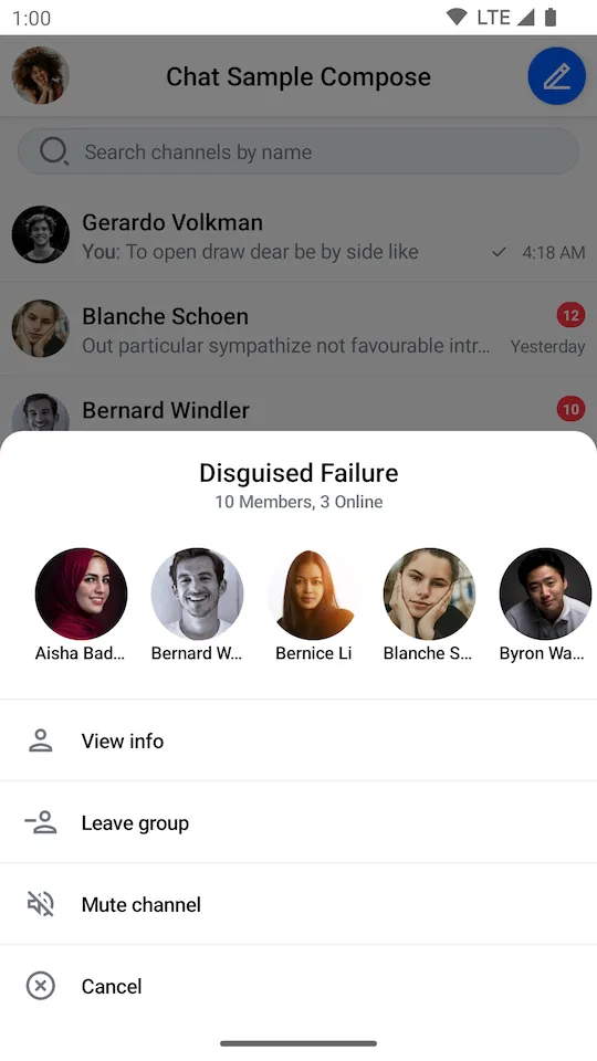
}Selecting Channels
The SelectedChannelMenu component displays information about a selected Channel and provides actions the user can take. It shows:
- Channel name: The formatted name of the selected channel.
- Channel members: Avatars of the channel members.
- Member status: Online/offline status or member count.
- Channel options: Actions like "View Info", "Leave Group", "Delete Conversation", or "Mute Channel" based on user permissions.
Let's see how to use the SelectedChannelMenu in your code.
Usage
If you're using the ChannelScreen component, you don't have to do anything. The SelectedChannelMenu component and its logic will be integrated into the UI.
If you're looking to build a custom UI, you can add the SelectedChannelMenu component on top of your UI, like so:
For the SelectedChannelMenu component to work, you need to provide selectedChannel, isMuted and currentUser parameters.
In the example above, you fetch the data from a ChannelListViewModel that you use in the rest of the UI. But you can also provide the data manually if you decide not to use our components.
Notice how you also show the SelectedChannelMenu only if the selectedChannel is not null. This is a smart way of knowing when to show the info and when to hide it.
With a bit of extra code for the rest of the content, when selecting a channel, the snippet above will produce the next UI:
 |
|---|
This represents just the SelectedChannelMenu component, the rest of the UI can be whatever your implementation requires.
Finally, you can see a list of ChannelOptions, which are different depending on whether you're an admin for this channel or just a member. Clicking these will trigger channel actions.
Let's see how to handle these.
Handling Actions
The SelectedChannelMenu exposes two required action handlers:
@Composable
fun SelectedChannelMenu(
    ..., // State & styling
    onChannelOptionClick: (ChannelAction) -> Unit,
    onDismiss: () -> Unit,
)onChannelOptionClick: Called when the user taps on any channel option. Receives aChannelActionwhich can be one of:ViewInfo- View channel detailsMuteChannel/UnmuteChannel- Mute or unmute notificationsPinChannel/UnpinChannel- Pin or unpin the channelArchiveChannel/UnarchiveChannel- Archive or unarchive the channelLeaveGroup- Leave the group channelDeleteConversation- Delete the conversationCancel- Dismiss the menu
onDismiss: Called when the menu is dismissed (e.g., by tapping the overlay).
Here's how ChannelsScreen handles these actions internally:
SelectedChannelMenu(
    ..., // State and styling
    onChannelOptionClick = { action ->
        when (action) {
            is ViewInfo -> {
                listViewModel.dismissChannelAction()
                onViewChannelInfoAction(action.channel)
            }
            is MuteChannel -> listViewModel.muteChannel(action.channel)
            is UnmuteChannel -> listViewModel.unmuteChannel(action.channel)
            is PinChannel -> listViewModel.pinChannel(action.channel)
            is UnpinChannel -> listViewModel.unpinChannel(action.channel)
            is ArchiveChannel -> listViewModel.archiveChannel(action.channel)
            is UnarchiveChannel -> listViewModel.unarchiveChannel(action.channel)
            else -> listViewModel.performChannelAction(action)
        }
    },
    onDismiss = { listViewModel.dismissChannelAction() }
)
For destructive actions like LeaveGroup and DeleteConversation, you should show a confirmation dialog before executing the action. Here's how to handle them:
val activeAction = listViewModel.activeChannelAction

if (activeAction is LeaveGroup) {
    SimpleDialog(
        modifier = Modifier.padding(16.dp),
        title = "Leave group",
        message = "Are you sure you want to leave this group?",
        onPositiveAction = { listViewModel.leaveGroup(activeAction.channel) },
        onDismiss = { listViewModel.dismissChannelAction() },
    )
} else if (activeAction is DeleteConversation) {
    SimpleDialog(
        modifier = Modifier.padding(16.dp),
        title = "Delete conversation",
        message = "Are you sure you want to delete this conversation?",
        onPositiveAction = { listViewModel.deleteConversation(activeAction.channel) },
        onDismiss = { listViewModel.dismissChannelAction() },
    )
}
The performChannelAction() method stores the action in activeChannelAction, which you can observe to show the appropriate confirmation dialog.
Customization
The SelectedChannelMenu offers the following customization options:
@Composable
fun SelectedChannelMenu(
    ..., // State and actions
    modifier: Modifier = Modifier,
    channelOptions: List<ChannelOptionState> = buildDefaultChannelOptionsState(...),
    shape: Shape = ChatTheme.shapes.bottomSheet,
    overlayColor: Color = ChatTheme.colors.overlay,
    headerContent: @Composable ColumnScope.() -> Unit = { /* Default header */ },
    centerContent: @Composable ColumnScope.() -> Unit = { /* Default options */ },
)modifier: Modifier for the root component. Useful for size, padding, and alignment.channelOptions: The list of options shown in the menu. By default, usesbuildDefaultChannelOptionsState()which builds options based on user permissions (ownCapabilities).shape: Shape of the menu card. Defaults toChatTheme.shapes.bottomSheet(rounded top corners). Change toRoundedCornerShapefor a dialog style.overlayColor: Color of the background overlay. Defaults toChatTheme.colors.overlay.headerContent: Content at the top of the menu. By default, shows channel name, member status text, and member avatars.centerContent: Content in the center of the menu. By default, shows the list of channel options.
Here's an example of customizing this component to imitate a dialog:
SelectedChannelMenu(
    modifier = Modifier
        .padding(16.dp) // Adding padding to the component
        .fillMaxWidth() // Fill width
        .wrapContentHeight() // Wrap height
        .align(Alignment.Center), // Centering the component
    shape = RoundedCornerShape(16.dp), // Rounded corners for all sides
    ... // State
)
This code will produce the following UI:
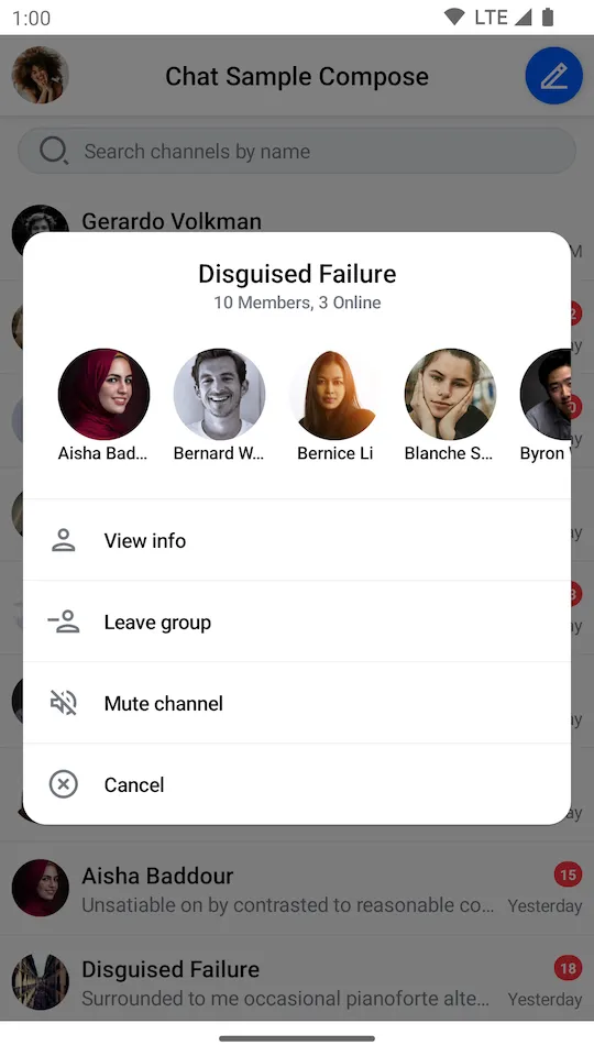 |
|---|
The SelectedChannelMenu component now looks more like a dialog that displays over other elements. This is just an example of how easy it is to apply UI customization to our components.