 React
React iOS
iOS Android
 Flutter
 Angular
 JavaScript
 Unity
Unity Unreal
 Node
Node Python
 Ruby
Ruby PHP
PHP Java
Java .NET
.NET Go
Go REST
RESToverride fun onCreate(savedInstanceState: Bundle?) {
super.onCreate(savedInstanceState)
setContent {
ChatTheme {
ChannelListHeader(
modifier = Modifier.fillMaxWidth(),
currentUser = ChatClient.instance().getCurrentUser(),
connectionState = ConnectionState.Connected,
title = "My Awesome App",
)
}
}
}Channel List Header
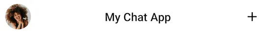
The ChannelListHeader component allows you to display a header for the channels screen. It sets up the following:
- User avatar: Shows the current user image in the leading position.
- Header title: Shows a screen title when connected, a loading indicator when connecting, or a "Disconnected" message when offline.
- Action button: A customizable trailing action shown at the end of the header.
Let's see how to use the header.
Usage
To use the ChannelListHeader, add it to your UI within setContent():
This will produce the UI below:
 |
|---|
The connectionState parameter is required. You should observe the connection state from ChatClient and pass it to the header. The title, currentUser, and action handlers are optional but recommended.
Next, let's see how to handle actions in the header.
Handling Actions
The ChannelListHeader exposes two action handlers:
@Composable
fun ChannelListHeader(
    // ... State and styling
    onAvatarClick: (User?) -> Unit = {},
    onHeaderActionClick: () -> Unit = {},
)onAvatarClick: Called when the user taps on their avatar in the leading content. Receives the current user as a parameter.onHeaderActionClick: Called when the user taps on the trailing action button. Only used if you don't overridetrailingContent.
The default trailingContent uses onHeaderActionClick internally. To keep the default UI but change the behavior, override onHeaderActionClick. To customize the UI itself, override trailingContent as shown in Customization.
Here's an example of handling both actions:
ChannelListHeader(
    connectionState = ConnectionState.Connected,
    title = "My Chat App",
    currentUser = currentUser,
    onAvatarClick = { user ->
        // Navigate to user profile or show settings
    },
    onHeaderActionClick = {
        // Navigate to new channel creation
    },
)
These two parameters let you control the behavior of the ChannelListHeader. Let's see how to customize the appearance next.
Customization
The ChannelListHeader exposes the following customization options:
@Composable
fun ChannelListHeader(
    modifier: Modifier = Modifier,
    title: String = "",
    currentUser: User? = null,
    connectionState: ConnectionState,
    color: Color = ChatTheme.colors.barsBackground,
    shape: Shape = ChatTheme.shapes.header,
    elevation: Dp = ChatTheme.dimens.headerElevation,
    onAvatarClick: (User?) -> Unit = {},
    onHeaderActionClick: () -> Unit = {},
    leadingContent: @Composable RowScope.() -> Unit = { /* Default avatar */ },
    centerContent: @Composable RowScope.() -> Unit = { /* Default title/status */ },
    trailingContent: @Composable RowScope.() -> Unit = { /* Default action button */ },
)modifier: Modifier for the root component. Use it for padding, dimensions, or other layout modifications.title: The text shown when the connection state isConnected.currentUser: The current user, used to display their avatar in the leading content.connectionState: Required. The WebSocket connection state. Determines what the center content displays:ConnectionState.Connected: Shows thetitletext.ConnectionState.Connecting: Shows aNetworkLoadingIndicator.ConnectionState.Offline: Shows a "Disconnected" message.
color: Background color of the header. Defaults toChatTheme.colors.barsBackground.shape: Shape of the header. Defaults toChatTheme.shapes.header.elevation: Shadow elevation of the header. Defaults toChatTheme.dimens.headerElevation.leadingContent: Content at the start of the header. By default, shows the user's avatar or a spacer if no user is provided.centerContent: Content in the center of the header. By default, shows the title, loading indicator, or disconnected message based onconnectionState.trailingContent: Content at the end of the header. By default, shows a circular action button with a "new chat" icon.
Here's an example of customizing the trailing content:
ChannelListHeader(
    modifier = Modifier.fillMaxWidth(),
    connectionState = ConnectionState.Connected,
    currentUser = currentUser,
    title = "My Chat App",
    trailingContent = {
        Icon(
            modifier = Modifier.clickable {
                // Custom click handler
            },
            imageVector = Icons.Default.Add,
            contentDescription = "Add",
            tint = ChatTheme.colors.textHighEmphasis,
        )
    },
)
By overriding trailingContent, you replace the default action button with your custom UI. The clickable modifier lets you handle clicks on the custom component.
The snippet above will produce the following UI.
 |
|---|