


The new v5 Compose Chat SDK provides a ReactionsTypes API that supports more complex reactions, like animated emojis or uploaded images, similar to other social media platforms.
Note: The Jetpack Compose UI components are now stable. Check out the full announcement here. You can try out the new SDK in the Jetpack Compose Chat Tutorial.
Overriding Default Reactions With Custom Reactions
The Compose Chat SDK comes with the following reactions:
- Thumbs up/down
- Love
- LOL
Users can respond to messages with either of these reactions. As with all the components in the Chat SDK, you can override these default reactions and provide your own custom ones. There are two ways in which you can provide your custom reactions:
- Using the
reactionIconFactoryproperty inChatTheme. - Using the
reactionTypesproperty in theSelectedReactionsMenuorSelectedMessageMenu.
To get started, you'll learn how to use the ReactionIconFactory class in the next section.
Looking at ReactionIconFactory
The ReactionIconFactory is a newly introduced class. It handles all the creation of the icons for all the reactions types. You can create your custom ReactionIconFactory by implementing this class as shown below:
1234567891011121314151617181920212223242526272829303132333435363738394041424344class CustomReactionIconFactory(
    private val customReactions: Map<String, ReactionDrawable> = mapOf(
        "happy" to ReactionDrawable(
            iconResId = R.drawable.ic_baseline_emoji_emotions_24,
            selectedIconResId = R.drawable.ic_selected_baseline_emoji_emotions_24
        ),
        "rocket" to ReactionDrawable(
            iconResId = R.drawable.ic_baseline_rocket_launch_24,
            selectedIconResId = R.drawable.ic_selected_baseline_rocket_launch_24
        ),
        "sad" to ReactionDrawable(
            iconResId = R.drawable.ic_baseline_emoji_emotions_24,
            selectedIconResId = R.drawable.ic_selected_baseline_sentiment_very_dissatisfied_24
        ),
        "plus_one" to ReactionDrawable(
            iconResId = R.drawable.ic_baseline_exposure_plus_1_24,
            selectedIconResId = R.drawable.ic_selected_baseline_exposure_plus_1_24
        ),
        "celebration" to ReactionDrawable(
            iconResId = R.drawable.ic_baseline_celebration_24,
            selectedIconResId = R.drawable.ic_selected_baseline_celebration_24
        )
    )
) : ReactionIconFactory {
    @Composable
    override fun createReactionIcon(type: String): ReactionIcon {
        val reactionDrawable = requireNotNull(customReactions[type])
        return ReactionIcon(
            painter = painterResource(reactionDrawable.iconResId),
            selectedPainter = painterResource(reactionDrawable.selectedIconResId)
        )
    }

    @Composable
    override fun createReactionIcons(): Map<String, ReactionIcon> {
        return customReactions.mapValues {
            createReactionIcon(it.key)
        }
    }

    override fun isReactionSupported(type: String): Boolean {
        return customReactions.containsKey(type)
    }
}
To sum up what the code above does:
- You have a map of your custom reactions. Each reaction has its
ReactionDrawable, a data class that holds the drawable resources for the reaction. It has the drawables for both the normal and selected state of the icon. - The
ReactionIconFactoryrequires you to override three methods:createReactionIcon: Creates aReactionIconfor your reaction types. AReactionIconcontains painters for your reaction in normal and selected states.createReactionIcons: Creates all theReactionIcons for all of your reactions. It uses thecreateReactionIconto create the icons.isReactionSupported: Checks if your reactions are supported by the SDK.
With this CustomReactionIconFactory, you're now ready to support custom reactions. You'll be adding this CustomReactionIconFactory to ChatTheme next.
Providing Custom Reactions to ChatTheme
You'll use the reactionIconFactory property to provide your custom reactions to ChatTheme.
12345ChatTheme(
    reactionIconFactory = CustomReactionIconFactory()
) {
    // Your UI Components
}
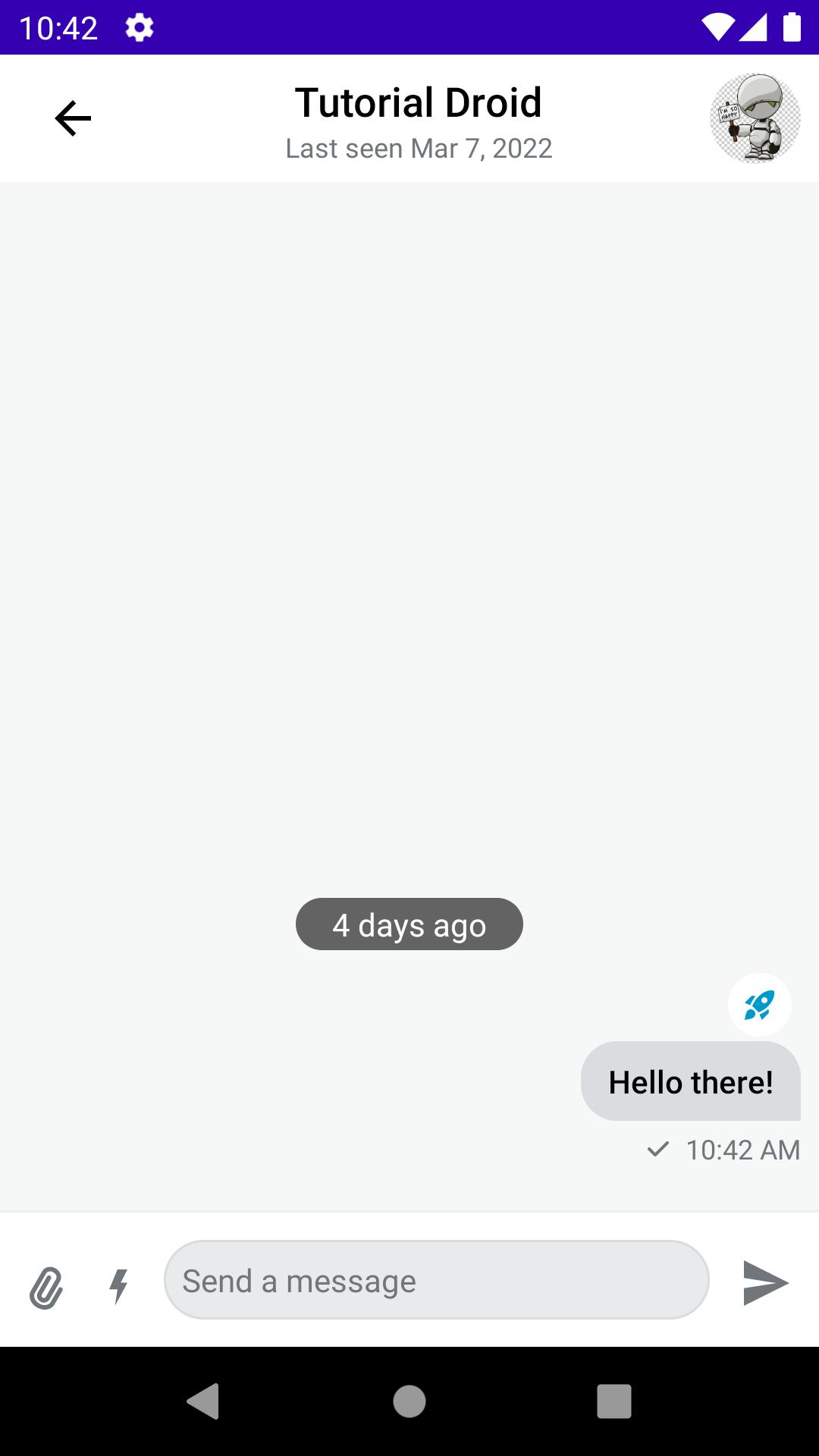
When you run your app, you should see the following screens:

In addition to using the reactionIconFactory in ChatTheme, you can also provide your custom reactions using the SelectedReactionsMenu or SelectedMessageMenu components. You'll look at those in the next section.
Adding Custom Reactions to SelectedReactionsMenu and SelectedMessageMenu
To start, you need to create a map of ReactionIcon:
1234567891011121314151617181920212223242526@Composable
fun customReactionIcons(): Map<String, ReactionIcon> {
    return mapOf(
        "happy" to ReactionIcon(
            painter = painterResource(id = R.drawable.ic_baseline_emoji_emotions_24),
            selectedPainter = painterResource(id = R.drawable.ic_selected_baseline_emoji_emotions_24)
        ),
        "rocket" to ReactionIcon(
            painter = painterResource(id = R.drawable.ic_baseline_rocket_launch_24),
            selectedPainter = painterResource(id = R.drawable.ic_selected_baseline_rocket_launch_24),
        ),

        "sad" to ReactionIcon(
            painter = painterResource(id = R.drawable.ic_baseline_sentiment_very_dissatisfied_24),
            selectedPainter = painterResource(id = R.drawable.ic_selected_baseline_sentiment_very_dissatisfied_24)
        ),
        "plus_one" to ReactionIcon(
            painter = painterResource(id = R.drawable.ic_baseline_exposure_plus_1_24),
            selectedPainter = painterResource(id = R.drawable.ic_selected_baseline_exposure_plus_1_24)
        ),
        "celebration" to ReactionIcon(
            painter = painterResource(id = R.drawable.ic_baseline_celebration_24),
            selectedPainter = painterResource(id = R.drawable.ic_selected_baseline_celebration_24)
        )
    )
}
This is a Composable function that returns a map of your custom reactions. Each map has its type and a ReactionIcon. Now, you only need to add these to your SelectedReactionsMenu or SelectedMessageMenu:
1234567891011121314151617181920SelectedMessageMenu(
    modifier = Modifier
        .align(Alignment.Center)
        .padding(horizontal = 20.dp)
        .wrapContentSize(),
    shape = ChatTheme.shapes.attachment,
    messageOptions = defaultMessageOptionsState(
        selectedMessage,
        user,
        listViewModel.isInThread
    ),
    message = selectedMessage,
    onMessageAction = { action ->
        composerViewModel.performMessageAction(action)
        listViewModel.performMessageAction(action)
    },
    reactionTypes = customReactionIcons(),
    onDismiss = { listViewModel.removeOverlay() },
    onShowMoreReactionsSelected = {},
)
In the code snippet above, you provide your custom reactions using the reactionTypes property in the SelectedMessageMenu. The same applies to SelectedMessageMenu.
When you run the app, it will use your custom reactions even if you've not provided the custom ReactionIconFactory.
You've learned how to add your custom reactions. In the next section, you'll learn how to add spring and size animations to the reactions you've added.
Adding Animations to Reactions
The Stream Jetpack Compose UI components are highly customizable. You can easily add new components to them or customize the existing components according to your requirements. With this, it's easy to add animations to components and still take advantage of the SDK's features.
Adding Spring Animations
You're going to add spring animations to the DefaultReactionOptionItem component to give your reaction icons spring animations.
123456789101112131415161718192021@Composable
internal fun DefaultReactionOptionItem(
    option: ReactionOptionItemState,
    onReactionOptionSelected: (ReactionOptionItemState) -> Unit,
) {
    var animationState by remember { mutableStateOf(ReactionState.START) }

    val springValue: Float by animateFloatAsState(
        if (animationState == ReactionState.START) 0f else 1f,
        spring(dampingRatio = 0.10f, stiffness = Spring.StiffnessLow)
    )

    LaunchedEffect(Unit) {
        animationState = ReactionState.END
    }

    CustomReactionOptionItem(
        option = option,
        springValue = springValue,
        onReactionOptionSelected = { onReactionOptionSelected(option) })
}
You're creating an animation value for the spring animation in the code above. You also have a LaunchedEffect block that updates the animation state. Here's what the ReactionButtonState looks like:
123enum class ReactionButtonState {
    IDLE, ACTIVE
}
It's an enum class which holds the state of the reaction icon. Below the LaunchedEffect you have a CustomReactionOptionItem. This is a custom implementation for overriding the DefaultReactionOptionItem. This allows you to add the animations on top of the default implementations. This is how the class looks:
12345678910111213141516171819202122232425262728293031323334353637383940414243444546@Composable
fun CustomReactionOptionItem(
    option: ReactionOptionItemState,
    springValue: Float,
    onReactionOptionSelected: (ReactionOptionItemState) -> Unit
) {
    // 1
    var currentState by remember { mutableStateOf(ReactionButtonState.IDLE) }
    val normalIconSize = 24.dp
    val animatedIconSize = 50.dp
    val sizeAnimation by animateDpAsState(
        if (currentState == ReactionButtonState.ACTIVE) 24.1.dp else 24.dp,
        animationSpec = keyframes {
            durationMillis = 500
            animatedIconSize.at(100)
            normalIconSize.at(200)
        },
        finishedListener = {
            onReactionOptionSelected(option)
        }
    )

    // 2
    Image(
        modifier = Modifier
            .size(size = sizeAnimation)
            .scale(springValue)
            .offset(x = (-15).dp + (15 * springValue).dp)
            .rotate(-45f + (45 * springValue))
            .clickable(
                interactionSource = remember { MutableInteractionSource() },
                indication = rememberRipple(bounded = false),
                onClick = {
                    currentState = if (currentState == ReactionButtonState.IDLE)
                        ReactionButtonState.ACTIVE else ReactionButtonState.IDLE
                    onReactionOptionSelected(option)
                }
            ),
        painter = option.painter,
        contentDescription = option.type,
    )
}

enum class ReactionButtonState {
    IDLE, ACTIVE
}
To sum up this code:
- It creates the
ReactionIconsize animation. The animation enlarges the reaction icon once a user taps on any of the reactions. - Here, you create an
Imagecomposable for a single reaction. You also pass the spring animation to theModifier. When the image is clicked, you also update theReactionButtonStatefor the size animation. The icon enlarges; once the animation is complete, you send your reaction to the message by callingonReactionOptionSelected(option)inside thefinishedListenerof the animation.
Adding CustomReactionOptions to SelectedReactionsMenu
You already have all the custom implementation for reactions and animations. Now you'll learn how to integrate this custom implementation to SelectedReactionsMenu.
To start, you'll use the headerContent property of SelectedMessageMenu and SelectedReactionsMenu to add the custom UI implementations.
Note: to use these components, you must use the CustomUI options where you add the components to the MesssageScreen. You can view the entire sample class here.
The SelectedMessageMenu, a component that shows different message options when a message is selected, looks like this:
1234567891011121314151617181920212223242526272829SelectedMessageMenu(
    modifier = Modifier
        .align(Alignment.Center)
        .padding(horizontal = 20.dp)
        .wrapContentSize(),
    shape = ChatTheme.shapes.attachment,
    messageOptions = defaultMessageOptionsState(
        selectedMessage,
        user,
        listViewModel.isInThread
    ),
    message = selectedMessage,
    onMessageAction = { action ->
        composerViewModel.performMessageAction(action)
        listViewModel.performMessageAction(action)
    },
    onDismiss = { listViewModel.removeOverlay() },
    onShowMoreReactionsSelected = {},
    headerContent = {
        CustomReactionOptions(
            message = selectedMessage,
            reactionTypes = customReactionIcons(),
            onMessageAction = { action ->
                composerViewModel.performMessageAction(action)
                listViewModel.performMessageAction(action)
            }
        )
    }
)
In the code above, you add your CustomReactionOptions component and pass in the selectedMessage and your customReactionIcons in the headerContent. In addition, you also pass your actions so that the SDK can perform the message action. Running the app, you should have the spring animation on your reactions now.
Wow! You can now see the fantastic spring animations on your reactions! See how easy it is to customize the components.
Lastly, you'll look at the size animation on the reaction icon. The SelectedReactionsMenu, a component that shows all user reactions to a message, looks like this:
123456789101112131415161718192021222324SelectedReactionsMenu(
modifier = Modifier
.align(Alignment.Center)
.padding(horizontal = 20.dp)
.wrapContentSize(),
shape = ChatTheme.shapes.attachment,
message = selectedMessage,
currentUser = user,
reactionTypes = customReactionIcons(),
onMessageAction = {},
onDismiss = {
listViewModel.removeOverlay()
},
onShowMoreReactionsSelected = {},
headerContent = {
CustomReactionOptions(
message = selectedMessage,
reactionTypes = customReactionIcons()
) { action ->
composerViewModel.performMessageAction(action)
listViewModel.performMessageAction(action)
}
}
)
In the code above, as before, you add your CustomReactionOptions component, passing in the selectedMessage and your customReactionIcons. Here, the only difference is that you use the Stream low-level client to send reactions. Running the app, you should have the size animation when you tap a single reaction.
You can add as many animations to these UI Components as you need according to your requirements.
Conclusion
To learn more about Stream's Android SDK, go to the GitHub repository, which is a great starting point to see all the available docs and samples.
Now that the JetPack Compose Components are stable, we can't wait to see what you'll build. Furthermore, as seen from this article they're highly customizable. In case you have any feedback on using the SDK, reach out to the team on Twitter and on GitHub.
You can get the complete sample project with the examples shown in this tutorial here.