The Stream Chat SDK for Jetpack Compose makes extensive use of slot APIs, which allow you to provide pieces of Composable layout that you can then use within one of the chat components provided by the SDK.
For this post, you'll use the MessageList component and its itemContentparameter to completely change how message items are rendered within a message list while keeping all the powerful built-in behavior, like paging and scrolling.
By the end, you'll build the following three custom looks for the items:
- Colorful message bubbles
- Livestream messages
- A team messaging app

The itemContent parameter
A prime example of Stream's slot APIs is the MessageList component, which displays a list of messages:

Within this component, the itemContent composable parameter is what renders each message in the list:
1234567MessageList(
    modifier = Modifier.fillMaxSize(),
    viewModel = listViewModel,
    itemContent = { item ->
        CustomMessageItemContent(item) // <- Your custom composable function
    },
)
This is what you'll customize in various ways, by providing our own itemContent components. You can try all of these implementations in the GitHub repository for this tutorial.
Note: We'll only cover the visual customization of the items here and skip attaching things like click listeners within the custom items, which is something you'd want to add in your real code.
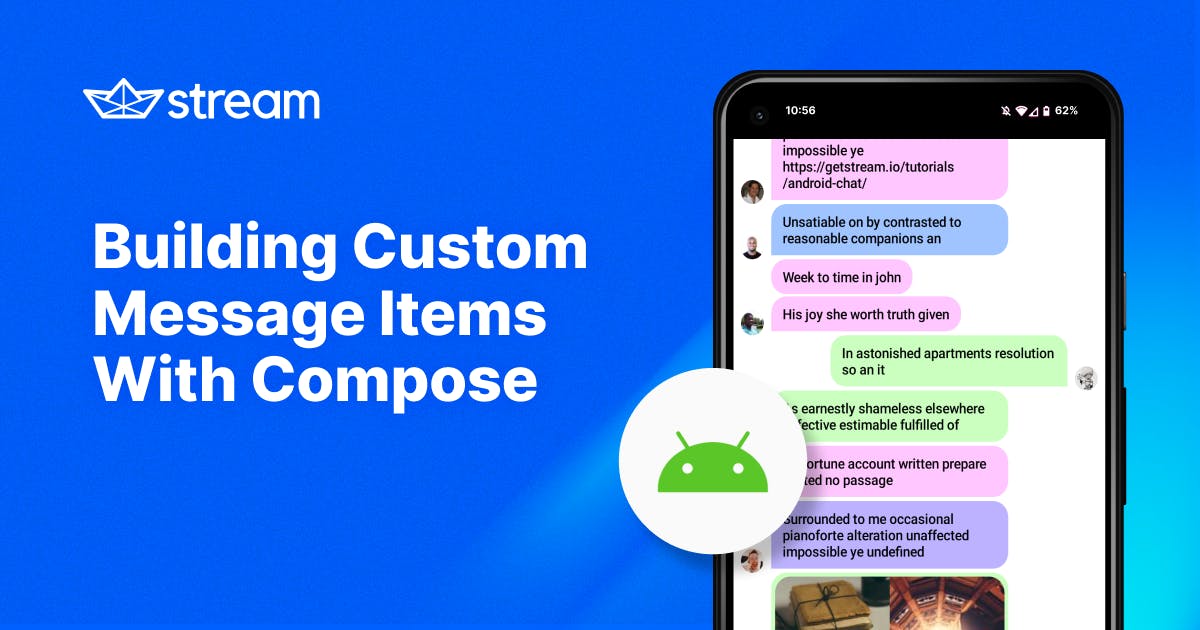
Building Colorful Message Bubbles
Starting off with a look that's similar to the default, we'll build this design:

In this example, we're removing elements like the footer (which provides information like the user's name and timestamps) and reusing the Chat SDK's avatar and bubble components.
And of course, we're assigning a random color to each user's messages.
Let's see the code, with the important bits explained in the comments:
123456789101112131415161718192021222324252627282930313233343536373839404142434445464748495051525354555657585960616263646566676869707172737475767778798081828384858687888990919293949596979899100101102103104// Helper function to display a user avatar or a spacer
@Composable
private fun RowScope.MessageAvatar(
    position: MessageItemGroupPosition,
    user: User,
) {
    if (position == Bottom || position == None) {
        val isCurrentUser = user.id == ChatClient.instance().getCurrentUser()?.id
        // Provided by the SDK to display a User object's avatar
        UserAvatar(
            modifier = Modifier
                .padding(start = 8.dp, end = 8.dp)
                .size(24.dp)
                .clip(CircleShape)
                .background(Color.LightGray)
                .align(Alignment.Bottom),
            user = user,
            showOnlineIndicator = !isCurrentUser,
        )
    } else {
        Spacer(modifier = Modifier.width(40.dp))
    }
}

@Composable
fun ColorfulChatItemContent(messageItem: MessageItem) {
    val (message, position) = messageItem

    val ownsMessage = messageItem.isMine

    Box(
        modifier = Modifier
            .fillMaxWidth()
            .wrapContentHeight(),
        // Align messages left/right within the screen
        contentAlignment = if (ownsMessage) Alignment.CenterEnd else Alignment.CenterStart
    ) {
        Row(
            Modifier.widthIn(max = 300.dp)
        ) {
            // If the message is not by the current user, show avatar at the start
            if (!ownsMessage) {
                MessageAvatar(position, message.user)
            }

            Column(
                horizontalAlignment = if (ownsMessage) Alignment.End else Alignment.Start
            ) {
                val bubbleShape = RoundedCornerShape(16.dp).let { shape ->
                    when (position) {
                        Top, Middle -> shape
                        // Round corners based on whose message it is
                        else -> when (ownsMessage) {
                            true -> shape.copy(bottomEnd = CornerSize(0))
                            false -> shape.copy(bottomStart = CornerSize(0))
                        }
                    }
                }

                // Pick a random color from this hardcoded palette based on
                // the hash of the user ID (for consistency for each user)
                val colors = arrayOf(
                    0xFFFFADAD, 0xFFFFD6A5, 0xFFFDFFB6, 0xFFCAFFBF,
                    0xFF9BF6FF, 0xFFA0C4FF, 0xFFBDB2FF, 0xFFFFC6FF,
                ).map(::Color)
                val bubbleColor = colors[abs(message.user.id.hashCode()) % colors.size]

                // This component is provided by the SDK
                MessageBubble(
                    modifier = Modifier.widthIn(max = 250.dp),
                    shape = bubbleShape,
                    color = bubbleColor,
                    border = null,
                    content = {
                        Column {
                            // Also built in to the SDK, so we can easily reuse it
                            // to show content such as image attachments
                            MessageAttachmentsContent(message = messageItem.message)

                            if (message.text.isNotEmpty()) {
                                Text(
                                    modifier = Modifier.padding(
                                        horizontal = 12.dp,
                                        vertical = 8.dp
                                    ),
                                    text = message.text,
                                    style = ChatTheme.typography.bodyBold
                                )
                            }
                        }
                    }
                )

                val spacerSize = if (position == None || position == Bottom) 4.dp else 2.dp
                Spacer(Modifier.size(spacerSize))
            }

            // If the message is by the current user, show avatar at the end
            if (ownsMessage) {
                MessageAvatar(position, message.user)
            }
        }
    }
}
As you can see, lots of this UI is built from basic Compose constructs, like Rows, Columns, Spacers, and Text.
However, smaller components from the SDK are also reused so that you don't have to construct everything from scratch. Components like UserAvatar or MessageAttachmentsContent really come in handy when you build custom layouts like these.
Building Livestream Messages
Our next design will be very basic, something you might add to a live-streaming screen within an application:

This example won't support any attachments or fancy features. Instead, we will focus on displaying the user's messages in a compact UI.
This approach is ideal for handling real-time events where messages accumulate quickly.
Now, to the code:
1234567891011121314151617181920212223242526272829303132333435363738@Composable
fun LiveStreamItemContent(messageItem: MessageItem) {
    val message = messageItem.message
    Column(
        modifier = Modifier
            .fillMaxWidth()
            .padding(vertical = 2.dp, horizontal = 4.dp)
            .clip(RoundedCornerShape(0.dp))
            // Semi-transparent background for the live chat
            .background(Color(0x443474EB))
            .padding(4.dp)
            .widthIn(max = 300.dp)
    ) {
        Row {
            UserAvatar(
                modifier = Modifier
                    .padding(4.dp)
                    .size(16.dp),
                user = message.user,
                showOnlineIndicator = false,
            )

            // Combine the username and message into a single Text component
            Text(
                modifier = Modifier.padding(2.dp),
                text = buildAnnotatedString {
                    withStyle(SpanStyle(fontWeight = FontWeight.Bold)) {
                        append(message.user.name)
                    }
                    append("  ")
                    append(message.text)
                },
                style = ChatTheme.typography.bodyBold,
                fontSize = 14.sp
            )
        }
    }
}
There's not much to this one, as the design is super simple:
We reuse UserAvatar to build a string from the username and message.
This way, they can be styled and displayed within a single Text component, allowing them to flow nicely between lines.
Building Team Messaging Items
For the final example, let's look at something you might use for a team messaging app.

As you can see, all the messages are left-aligned, and we prominently display the avatar and name of the user who sent the message.
This is useful in a corporate environment, where users won't recognize everyone just by their avatar (like they would in a small friend group).
The code for this custom layout is the following:
1234567891011121314151617181920212223242526272829303132333435363738394041424344454647@Composable
fun TeamChatItemContent(messageItem: MessageItem) {
    val message = messageItem.message
    val firstItem = messageItem.groupPosition == Top || messageItem.groupPosition == None

    Column(
        modifier = Modifier
            .fillMaxWidth()
            .padding(horizontal = 8.dp)
            .widthIn(max = 300.dp)
    ) {
        if (firstItem) {
            Spacer(Modifier.padding(4.dp))
        }

        Row {
            if (firstItem) {
                UserAvatar(
                    modifier = Modifier
                        .size(36.dp),
                    shape = RoundedCornerShape(4.dp),
                    user = message.user,
                )
            } else {
                Spacer(modifier = Modifier.size(width = 36.dp, height = 0.dp))
            }

            Column(modifier = Modifier.padding(horizontal = 8.dp)) {
                if (firstItem) {
                    Row(verticalAlignment = Alignment.CenterVertically) {
                        Text(
                            text = message.user.name,
                            style = TextStyle(fontWeight = FontWeight.Bold),
                            fontSize = 14.sp
                        )
                        Spacer(Modifier.size(4.dp))
                        // Another useful component from the SDK
                        Timestamp(date = message.updatedAt ?: message.createdAt)
                    }
                    Spacer(Modifier.padding(2.dp))
                }
                Text(text = message.text.trim())
                Spacer(Modifier.padding(2.dp))
            }
        }
    }
}
Again, this layout builds mostly on basic Compose constructs, and most of the logic deals with setting correct paddings between the elements.
One highlight is the Timestamp component from the SDK, which you can use to quickly format a Date object into a date or time format.
Conclusion
As a quick reminder, you can check out all of the code and see these layouts in action by checking out the GitHub repository for this tutorial.
If you want to try the SDK and see how easy it is to get started, take a look at the Compose In-App Messaging Tutorial. You can also take a look at the Compose UI Components documentation which describes all the available components, features, and customization options.
You'll also find all the Compose SDK source code in the Stream Chat Android GitHub repository. We'd love to hear your feedback there, either in the form of issues or discussions.