

Specifically, this tutorial will cover:
- What an AttachmentFactory is
- Creating a custom
AttachmentFactory - Customizing Stream Compose UI Components
- Sending custom files as attachments
- Adding previews for your custom attachment
Note: Stream recently announced their Jetpack Compose UI components, which are currently in beta. This follows the announcement of the stable version of Jetpack Compose. You can try out the new SDK in the Jetpack Compose Chat Tutorial.
The Stream Chat SDK supports several attachments by default, including images, URLs, gifs, and videos. With the XML UI components, you can create a custom AttachmentViewFactory class that renders your attachment preview. The good news is that with the Compose UI components, this is still achievable :]
But first, you'll need to understand what an AttachmentFactory is.
Note: all the code from this tutorial is available on GitHub.
Introduction to AttachmentFactory
AttachmentFactory is a class that allows you to build and render your attachments in a list of messages. The Stream Chat Compose SDK provides several default factories to transform images, files, and link attachments. You can get all the default factories using:
1val defaultFactories = StreamAttachmentFactories.defaultFactories()
If your app needs attachments other than those provided by the default factories, you have to create custom ones (you'll cover this in the subsequent sections).
To create a custom AttachmentFactory, you'll need:
- A view to show the attachment. In this case, this will be a composable function.
- To create a new
AttachmentFactory. Here, you supply a predicate that checks for your custom attachment and specifies how to render the attachment content.
Before creating a custom AttachmentFactory, you'll need to create an Attachment object.
Custom Password Attachment
To start, you have to prepare a message that you'll send to a channel.
12345678val attachment = Attachment(
    type = "password",
    extraData = mutableMapOf("password" to "12345"),
)
val message = Message(
    cid = channelId,
    attachments = mutableListOf(attachment),
)
This is a message with an attachment that contains a password. You pass the password through the extraData property. By default, Stream's Chat SDK doesn't know how to render the attachment's content.
To render this, you'll create a composable that shows your password. Here's what the code looks like:
123456789101112131415161718192021222324252627282930313233343536// 1
@Composable
// 2
fun PasswordAttachmentView(attachmentState: AttachmentState) {
    // 3
    var showPassword by remember { mutableStateOf(false) }
    // 4
    val passwordAttachment = attachmentState.messageItem.message.attachments.first { it.type == "password" }

    Row(
        modifier = Modifier
            .padding(6.dp)
            .clip(ChatTheme.shapes.attachment)
            .background(Color.White)
    ) {
        // 5
        OutlinedTextField(
            value = passwordAttachment.extraData["password"].toString(),
            onValueChange = {},
            modifier = Modifier
                .fillMaxWidth()
                .padding(6.dp)
                .height(50.dp),
            enabled = false,
            visualTransformation = if (showPassword) VisualTransformation.None else PasswordVisualTransformation(),
            keyboardOptions = KeyboardOptions(keyboardType = KeyboardType.Number),
            trailingIcon = {
                val image = if (showPassword) Icons.Filled.Visibility else Icons.Filled.VisibilityOff

                IconButton(onClick = { showPassword = !showPassword }) {
                    Icon(imageVector = image, null)
                }
            }
        )
    }
}
In the snippet above, you:
- Annotate the
PasswordAttachmentViewfunction using the @Composable annotation. This lets you build the component's UI with Compose as opposed to using XML. - Pass in
AttachmentStateas an argument to thePasswordAttachmentViewfunction.AttachmentStateis a class that handles the state of the attachment. It has aMessageItem,Modifier, andonLongItemClickhandler:- The
MessageItemcontains all the information about a particular attachment. Modifierallows you to specify component size, padding, background, etc.
- The
- Store the
showPasswordvalue in memory of the composable with the remember composable. This value triggers a recomposition of the composable when the value changes. - Look for attachments whose
typeispasswordfrom theAttachmentState. - Use the
OutlinedTextFieldcomposable for handling user inputs. In this scenario, you're using it to display your password attachment:- You set the value of the
OutlinedTextFieldby getting theextraDatathat you passed to the attachment. - Notice that the
visualTransformationandtrailingIconare dependent on the value ofshowPassword. This helps in toggling the password visibility.
- You set the value of the
You've built the view that will render your attachment content. Next, you'll create a custom AttachmentFactory, which you need to show your attachment content.
Creating a Custom Password AttachmentFactory
To build your custom password message content, you have to create your own factory. It will look like this:
1234567@ExperimentalStreamChatApi
val customAttachmentFactories: List<AttachmentFactory> = listOf(
     AttachmentFactory(
        canHandle = { attachments -> attachments.any { it.type == "password" } },
        content = @Composable { PasswordAttachmentView(it) }
    )
)
This is a list of attachment factories. Each AttachmentFactory has the following two properties:
canHandle- a lambda function that accepts a list of attachments. You also specify what type of attachments the factory can handle. In this case, it's the attachments withtypepassword.content- specifies the composable that renders your password attachment content. It uses thePasswordAttachmentViewcomposable that you created earlier.
The last thing to do is to add your custom factory to the ChatTheme. To do this, override the attachmentFactories in your ChatTheme wrapper:
123ChatTheme(
    attachmentFactories = customAttachmentFactories + defaultFactories
)
Here, you override the default factories by providing your own custom factoring and also adding the defaultFactories.
Now, when you send a message with a type password, it will appear in Message List like this:

Tapping the password visibility icon, you'll see the password value:

The showPassword variable toggles the password content visibility. It also toggles the password visibility icon to change depending on what is shown. This view will render all attachments with type password by default.
You've seen how to send attachments that don't have files. In the next section, you'll learn how to record audio files and send them as custom attachments, too.
Custom Audio Attachment
Sending audio files is a sought-after feature in chat apps. With Stream Chat, you can send audio files as custom attachments. Similar to the password attachment, you'll need to:
- Create and send your custom attachment.
- Create a custom view for your attachment.
- Add your custom
AttachmentFactory.
Here's the message with the attachment:
12345678val attachment = Attachment(
    type = "audio",
    upload = File(output),
)
val message = Message(
    cid = channelId,
    attachments = mutableListOf(attachment),
)
For attachments with files, you have to use the upload property. It uploads your attachment. You can access the attachment using the url property of the attachment.
For more info about creating and sending attachments, read the Sending Custom Attachments guide.
You'll use MediaRecorder to create the output file. We won't detail this functionality here, but you can find all the code for it in the sample project on GitHub.
You have your Attachment object ready. Next, you'll learn how to create a preview of the audio attachment content.
Custom Audio Attachments View
For audio, you'll need a UI with playback functionality so that you can listen to the audio that has been sent. You'll use the Android MediaPlayer for playing the audio file.
Here's the code for this component:
123456789101112131415161718192021222324252627282930313233343536373839404142434445464748495051525354555657585960616263@Composable
fun AudioAttachmentView(attachmentState: AttachmentState) {
    // 1
    var playing by remember { mutableStateOf(false) }
    // 2
    val audioAttachment = attachmentState.messageItem.message.attachments.first { it.type == "audio" }
    // 3
    val player = PlayerWrapper(
        player = MediaPlayer.create(LocalContext.current, Uri.parse(audioAttachment.url)),
        onStop = { playing = false },
    )

    // 4
    DisposableEffect(Unit) {
        onDispose { player.release() }
    }

    ConstraintLayout(
        modifier = Modifier
            .fillMaxWidth()
            .padding(6.dp)
            .clip(ChatTheme.shapes.attachment)
            .background(Color.White)
    ) {
        val (iconButton, text) = createRefs()
        // 5
        IconButton(
            onClick = {
                playing = !playing
                if (playing) player.play() else player.stop()
            },
            modifier = Modifier
                .width(50.dp)
                .height(55.dp)
                .constrainAs(iconButton) {
                    start.linkTo(parent.start)
                    top.linkTo(parent.top)
                }
        ) {
            Image(
                painter = painterResource(
                    when (playing) {
                        true -> R.drawable.ic_baseline_stop_circle_24
                        false -> R.drawable.ic_baseline_play_circle_filled_24
                    }
                ),
                contentDescription = "Play Icon",
            )
        }
        val fileName = audioAttachment.name ?: ""
        // 6
        Text(
            text = fileName,
            fontSize = 16.sp,
            modifier = Modifier
                .constrainAs(text) {
                    start.linkTo(iconButton.end)
                    top.linkTo(iconButton.top)
                    bottom.linkTo(iconButton.bottom)
                }
        )
    }
}
In the snippet above, you:
- Use the
playingstate variable to track the playback state. It helps in toggling between the play and stop icons. - Get the audio attachment from
AttachmentState. - Create a
PlayerWrapperinstance. It has utility methods for playing, stopping, and releasing the MediaPlayer. You also pass the audio file as URI. - Call the
release()function from thePlayerWrapperclass to clean up the MediaPlayer. This ensures your composable doesn't have any side effects and the PlayerWrapper is cleaned up when the composable leaves composition. - Create an
IconButtonthat changes state depending on the state of the player. Tapping this button plays the audio and shows the stop icon. Tapping the stop icon will stop the audio. - Call the
Textcomposable, which shows the name of the file.
You have the preview ready. Next, you'll create a custom messages screen with a record button at the bottom.
Customizing the Messages Screen
With the new Compose UI components, it's easy to add chat features to your app and customize these components to your needs. You learn how to customize some of these components in the following sections.
For the audio recording functionality, you need to add a recording icon on your message input layout like so:

In the image above, notice the two new icons added:
- A password icon that sends the password attachment you've learned about earlier in this article.
- A microphone icon that enables all the recording functionality.
To get this UI, begin by customizing your Messages Screen:
12345ChatTheme(
    attachmentFactories = customAttachmentFactories + defaultFactories
) {
    CustomUi(onBackPressed = { onBackPressed() })
}
Here, you use the ChatTheme from Stream's Compose UI elements. It provides you with default styling, but you can choose to use a custom theme if you need different styling. You'll also pass your custom factories to handle the custom attachments.
Set the content to a custom component that you'll implement with the following code:
1234567891011121314151617181920212223242526272829303132333435363738394041424344454647484950515253545556575859606162636465666768697071727374@Composable
fun CustomUi(onBackPressed: () -> Unit) {
    val isShowingAttachments = attachmentsPickerViewModel.isShowingAttachments
    val selectedMessage = listViewModel.currentMessagesState.selectedMessage
    val user by listViewModel.user.collectAsState()

    Box(modifier = Modifier.fillMaxSize()) {
        Scaffold(
            modifier = Modifier.fillMaxSize(),
            bottomBar = {
                CustomAudioComposer()
            },
            content = {
                Column(modifier = Modifier.fillMaxSize()) {
                    MessageListHeader(
                        channel = listViewModel.channel,
                        currentUser = user,
                        isNetworkAvailable = true,
                        messageMode = listViewModel.messageMode,
                        modifier = Modifier
                            .fillMaxWidth()
                            .height(56.dp),
                        onBackPressed = onBackPressed,
                        onHeaderActionClick = {},
                    )

                    MessageList(
                        modifier = Modifier
                            .padding(it)
                            .background(ChatTheme.colors.appBackground),
                        viewModel = listViewModel,
                        onThreadClick = { message ->
                            composerViewModel.setMessageMode(Thread(message))
                            listViewModel.openMessageThread(message)
                        }
                    )
                }
            }
        )

        if (isShowingAttachments) {
            AttachmentsPicker(
                attachmentsPickerViewModel = attachmentsPickerViewModel,
                modifier = Modifier
                    .align(Alignment.BottomCenter)
                    .height(350.dp),
                onAttachmentsSelected = { attachments ->
                    attachmentsPickerViewModel.changeAttachmentState(false)
                    composerViewModel.addSelectedAttachments(attachments)
                },
                onDismiss = {
                    attachmentsPickerViewModel.changeAttachmentState(false)
                    attachmentsPickerViewModel.dismissAttachments()
                }
            )
        }

        if (selectedMessage != null) {
            SelectedMessageOverlay(
                messageOptions = defaultMessageOptions(
                    selectedMessage,
                    user,
                    listViewModel.isInThread
                ),
                message = selectedMessage,
                onMessageAction = { action ->
                    composerViewModel.performMessageAction(action)
                    listViewModel.performMessageAction(action)
                },
                onDismiss = { listViewModel.removeOverlay() }
            )
        }
    }
}
Some of the code from the CustomMessageScreen is omitted for brevity. To explain the key components in the CustomUi composable: You're defining the parent layout, which is Box and Scaffold.
The Box layout allows you to show things on top of each other. Scaffold is a material design layout structure that makes it easier to add different material components like app bar, bottom navigation, and content. In the Scaffold you define:
bottomBar- This is the bottom bar with aMessageComposerfor sending messages and attachments. By default, it only has the attachment icon. You'll add other icons and their actions, too. You'll see the contents ofCustomAudioComposerin a moment.content- This has the contents of the rest of the screen. You have aColumnwith aMessageListHeaderand aMessageList.MessageListHeadershows the back button, channels information (like members online), and displays the current user's avatar.- The
MessageListcomponent shows messages in the selected channel. These two components are customizable depending on what information you want to display.
Next, you'll dive deep into the CustomAudioComposer component to see how you can add custom actions to MessageComposer.
Creating a Custom Message Composer
MessageComposer allows a user to type and send messages and add and send attachments, too.
1234567891011121314151617181920212223242526272829303132333435363738394041424344454647484950515253545556575859606162636465666768697071727374757677787980@Composable
fun CustomAudioComposer() {
    val buttonState by stateViewModel.isRecording.collectAsState()
    MessageComposer(
        modifier = Modifier
            .fillMaxWidth()
            .wrapContentHeight(),
        viewModel = composerViewModel,
        // 1
        integrations = {
            IconButton(
                modifier = Modifier
                    .align(Alignment.CenterVertically)
                    .width(35.dp)
                    .height(35.dp)
                    .padding(4.dp),
                content = {
                    Icon(
                        imageVector = Icons.Default.Attachment,
                        contentDescription = null,
                        tint = ChatTheme.colors.textLowEmphasis,
                    )
                },
                onClick = {
                    attachmentsPickerViewModel.changeAttachmentState(true)
                }
            )
            IconButton(
                onClick = {
                    sendPasswordAttachmentMessage()
                },
                modifier = Modifier
                    .width(35.dp)
                    .height(35.dp)
                    .padding(4.dp)
            ) {
                Icon(
                    imageVector = Icons.Default.Visibility,
                    contentDescription = null,
                    tint = ChatTheme.colors.textLowEmphasis,
                )
            }
            IconButton(
                onClick = {
                    if (!buttonState) {
                        checkPermissions()
                    } else {
                        stopRecording()
                    }
                },
                modifier = Modifier
                    .width(35.dp)
                    .height(35.dp)
                    .padding(4.dp)
            ) {
                Icon(
                    imageVector = if (buttonState) {
                        Icons.Default.Stop
                    } else Icons.Default.Mic,
                    contentDescription = null,
                    tint = if (buttonState) ChatTheme.colors.errorAccent else ChatTheme.colors.textLowEmphasis,
                )
            }
        },
        // 2
        input = {
            MessageInput(
                modifier = Modifier
                    .fillMaxWidth()
                    .weight(7f)
                    .padding(start = 8.dp),
                value = composerViewModel.input,
                attachments = composerViewModel.selectedAttachments,
                activeAction = composerViewModel.activeAction,
                onValueChange = { composerViewModel.setMessageInput(it) },
                onAttachmentRemoved = { composerViewModel.removeSelectedAttachment(it) },
            )
        }
    )
}
This is the CustomAudioComposer with the following two key components:
integrations- You use this to provide attachment integrations. By default, there are the image, file, and media capture attachments. In this custom attachment, there are three integrations: the default attachment browser button, a button for password integration, and a button with a microphone for audio integration. With theseIconButtons, you can provide custom actions to handle them when they're selected. In this case, they handle sending passwords and audio attachments.input- This has aMessageInputcomponent where the user can type their messages.
And that's all you need for your custom messages screen with custom integrations. Once you run the app, your MessageComposer will look like this:

When you tap on the microphone icon, you'll see a Toast with a "Recording started!" message:

When you tap Stop, the recording will stop and your audio file will be uploaded:

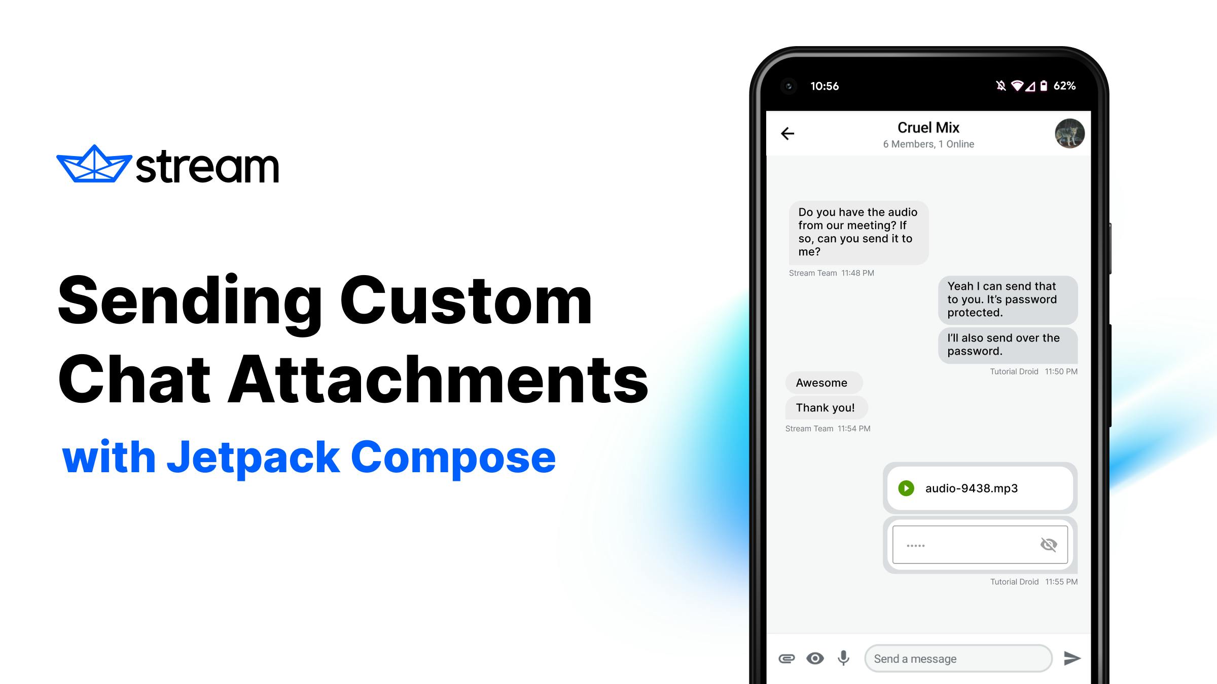
The custom factory will render your audio attachment, which shows the audio name and a Play icon. When you tap play, your audio starts playing:

Notice the icon changes color and shows the stop icon now, which will stop playback when tapped.
This is how the two custom attachments look:

Congratulations! You've learned how to add custom attachments with and without files. Now, you can enhance your chat application with all these amazing custom features you've learned!
Conclusion
You've seen how easy it is to add custom attachments to Stream Compose UI components. You can add as many different custom attachment types as your app needs.
In case you missed it, you can find the full sample project with examples in this tutorial on GitHub.
The Compose SDK is still in beta. In case you have any feedback on using the SDK, reach the team on Twitter and on GitHub.