 React
React iOS
iOS Android
 Flutter
 Angular
 JavaScript
 Unity
Unity Unreal
 Node
Node Python
 Ruby
Ruby PHP
PHP Java
Java .NET
.NET Go
Go REST
RESTclass iMessageComposerView: ComposerView {
override func setUpLayout() {
super.setUpLayout()
// Move the send button from the trailing container to input container
trailingContainer.removeArrangedSubview(sendButton)
inputMessageView.inputTextContainer.addArrangedSubview(sendButton)
// Remove spacing in leading container for bigger attachment button
leadingContainer.spacing = 0
// Make send button inside input container aligned to bottom
inputMessageView.inputTextContainer.alignment = .bottom
// Make the attachment button (camera button) bigger
attachmentButton.widthAnchor.constraint(equalToConstant: 30).isActive = true
attachmentButton.heightAnchor.constraint(equalToConstant: 30).isActive = true
}
override func layoutSubviews() {
super.layoutSubviews()
// Adjust the input corner radius to make the input rounder
inputMessageView.container.layer.cornerRadius = 18
}
}Customize Message Composer
The ComposerVC is the component responsible to create new messages or change existing messages. The composer belongs to the ChatMessageListVC component that integrates the message list and the composer in one view. But if you are not using our ChatMessageListVC you can use the composer component in isolation with your own chat view as well. The ComposerVC manages all the logic and actions of the ComposerView, where the latter is only responsible for the composer’s layout.
How to Change the Composer Layout
Since the ComposerView is responsible for the composer’s layout, if you want to change the styling, the position of the views, remove views or add new ones, you need to override the ComposerView. Let’s go through an example of customizing the composer to look like the iMessage app. The iMessage’s composer is quite different than the composer that comes with the SDK: there is only one button to add pictures/videos and the send button is inside the input text container.
| Before | After |
|---|---|
 |  |
After changing the layout through the following steps you should have the result of the picture above.
First thing we need to do is to subclass the ComposerView and change its layout. To have a better understand of how the ComposerView’s layout is structured, please check this page.
To remove the commands button, we disable the commands feature by subclassing ComposerVC and overriding isCommandsEnabled property, which can also be disabled by the Stream’s Dashboard.
class iMessageComposerVC: ComposerVC {

    override var isCommandsEnabled: Bool {
        false
    }
}
Then, we need to replace the default components with our custom ones:
Components.default.messageComposerView = iMessageComposerView.self
Components.default.messageComposerVC = iMessageComposerVC.self
You can find more information on how the components configuration works here.
Finally, we replace the default attachments button icon with a camera icon:
Appearance.default.images.openAttachments = UIImage(systemName: "camera.fill")!.withTintColor(.systemBlue)You can find more information on how the appearance configuration works here.
How to add a new Composer Action
All the actions triggered by the Composer buttons are wired in the ComposerVC.setUp() lifecycle. When adding new buttons it is possible to add new actions by overriding this function. Let’s pick the iMessage example and add an emoji button to the composer to open an Emoji picker.
First, we need to add the emoji button to the ComposerView:
class iMessageComposerView: ComposerView {

    lazy var emojiButton: UIButton = {
        let button = UIButton()
        button.translatesAutoresizingMaskIntoConstraints = false
        button.setImage(UIImage(systemName: "face.smiling.fill"), for: .normal)
        return button
    }()

    override func setUpLayout() {
        super.setUpLayout()
        ...

        // Add the emoji button to the left side of attachment button
        leadingContainer.insertArrangedSubview(emojiButton, at: 0)
        // Make the emoji button same size as attachment button
        emojiButton.widthAnchor.constraint(equalToConstant: 30).isActive = true
        emojiButton.heightAnchor.constraint(equalToConstant: 30).isActive = true
}| Before | After |
|---|---|
|  |
Now, that we have our emoji button in the composer view, we need to setup an action for it and handle the logic of the new emoji picker. For this, we need to subclass the ComposerVC and override the setUp() function to add a new action and override updateContent() to hide the emoji button when the input text is empty.
class iMessageComposerVC: ComposerVC {

    // We need to cast the composerView to our new `iMessageComposerView`
    // so that we can have access to the new `emojiButton`.
    var iMessageComposerView: iMessageComposerView {
        composerView as! iMessageComposerView
    }

    override func setUp() {
        super.setUp()

        // Add a target action to the emoji button
        iMessageComposerView
            .emojiButton
            .addTarget(self, action: #selector(showEmojiPicker), for: .touchUpInside)
    }

    @objc func showEmojiPicker(sender: UIButton) {

        // For the sake of making the guide simple,
        // we use an alert controller to select emojis.
        let sheetAlertController = UIAlertController(
            title: "Emoji Picker",
            message: nil,
            preferredStyle: .actionSheet
        )

        ["😃", "😇", "😅", "😂"].forEach { emoji in

            let action = UIAlertAction(title: emoji, style: .default) { _ in
                let inputTextView = self.composerView.inputMessageView.textView
                // Populate the emoji in the input view where is the caret position
                inputTextView.replaceSelectedText(emoji)
            }

            sheetAlertController.addAction(action)
        }

        present(sheetAlertController, animated: true)
    }

    override func updateContent() {
        super.updateContent()

        // Hide the emojiButton when the input text is not empty (Input expands)
        self.iMessageComposerView.emojiButton.isHidden = !self.content.text.isEmpty
    }
}
Finally, replace the custom component:
Components.default.messageComposerVC = iMessageComposerVC.self
Components.default.messageComposerView = iMessageComposerView.self
After customizing the ComposerVC with the changes above you should now have an emoji picker when tapping the emoji button. To make the guide simple, we used an UIAlertController for the emoji picker but you can create your own custom emoji picker.
Customizing Typing Suggestions
When typing on the composer, if you type @ it will present a view suggesting users that you can mention, or if you type / as the first character, it will show command suggestions. You can customize not only the UI of the suggestions but also the logic around it, as well as disable this feature.
Disabling the Suggestions
Your app might not want to support suggestions at all like the iMessage app, or want to support only one of the suggestions available. You can disable the suggestions feature by just returning nil on the following functions:
class iMessageComposerVC: ComposerVC {

    override func typingMention(in textView: UITextView) -> (String, NSRange)? {
        return nil
    }

    override func typingCommand(in textView: UITextView) -> String? {
        return nil
    }
}
Changing the Suggestions UI
The UI SDK provides a ChatSuggestionsVC component responsible for showing user suggestions and commands suggestions.
Customizing the Suggestions Container
In case you only want to change the styling of the container that shows both suggestions, you can override the ChatSuggestionsVC. Here is an example of a basic customization of the container component:
class CustomChatSuggestionsVC: ChatSuggestionsVC {
    override func setUpAppearance() {
        super.setUpAppearance()

        collectionView.layer.borderWidth = 1
        collectionView.layer.borderColor = appearance.colorPalette.border.cgColor
        view.layer.shadowOpacity = 0.0
    }

    override func layoutSubviews() {
        super.layoutSubviews()
        collectionView.layer.cornerRadius = 10
    }
}
Then, replace the custom component:
Components.default.suggestionsVC = CustomChatSuggestionsVC.selfHere we simply remove the shadow and customize the border style of the suggestions component.
| Before | After |
|---|---|
 |  |
Customizing the Suggestions Cells
If you want to further customize the suggestions UI and want to change the suggestions cells, the recommended way is to subclass the ChatMentionSuggestionView and ChatCommandSuggestionView components. Let’s see an example of how we can change the user mention cell by removing the username and the ”@” symbol:
class CustomMentionSuggestionView: ChatMentionSuggestionView {

    override func setUpLayout() {
        super.setUpLayout()

        textContainer.removeArrangedSubview(usernameTagLabel)
        mentionSymbolImageView.removeFromSuperview()
    }
}
Then, replace the custom component:
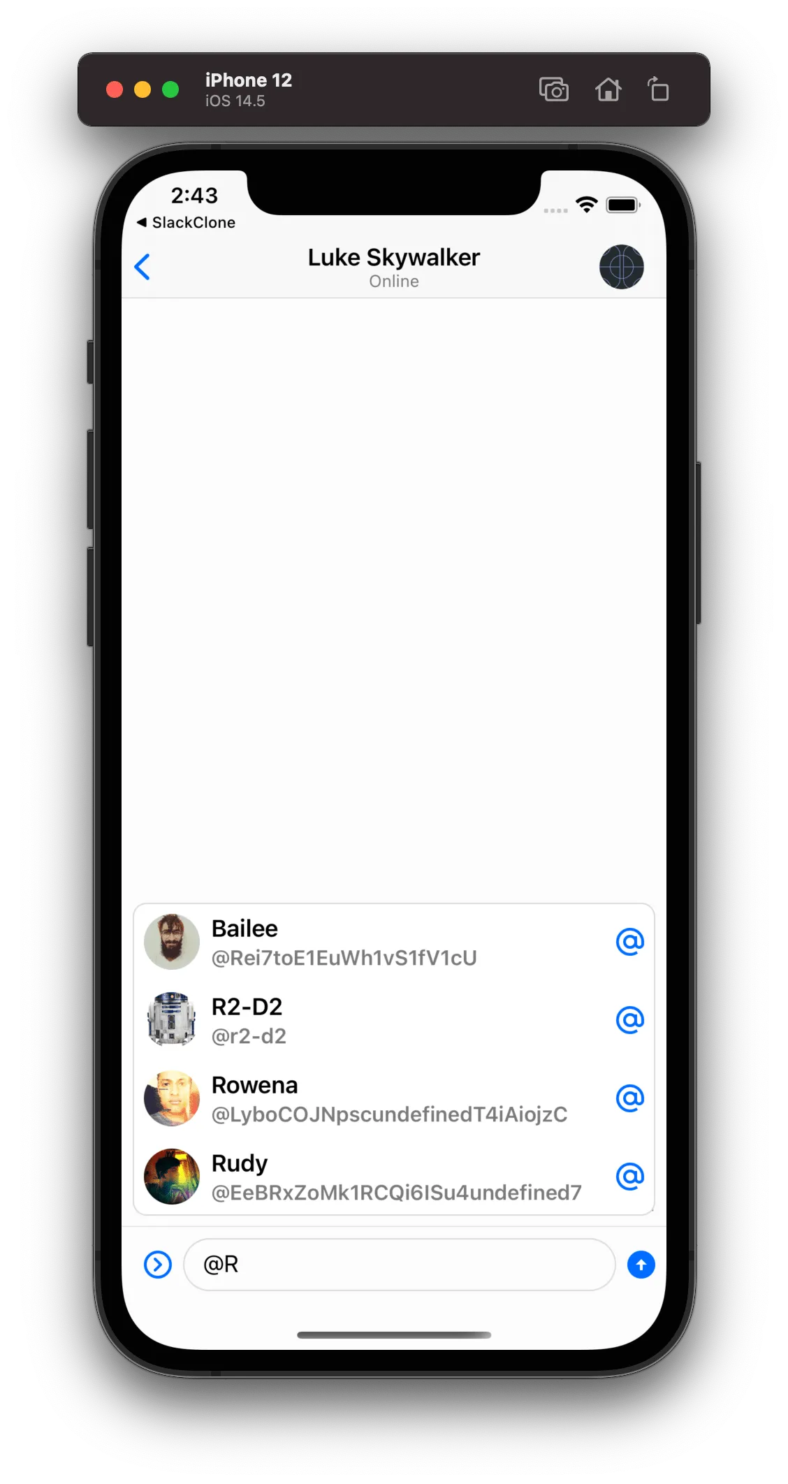
Components.default.suggestionsMentionView = CustomMentionSuggestionView.self| Before | After |
|---|---|
| 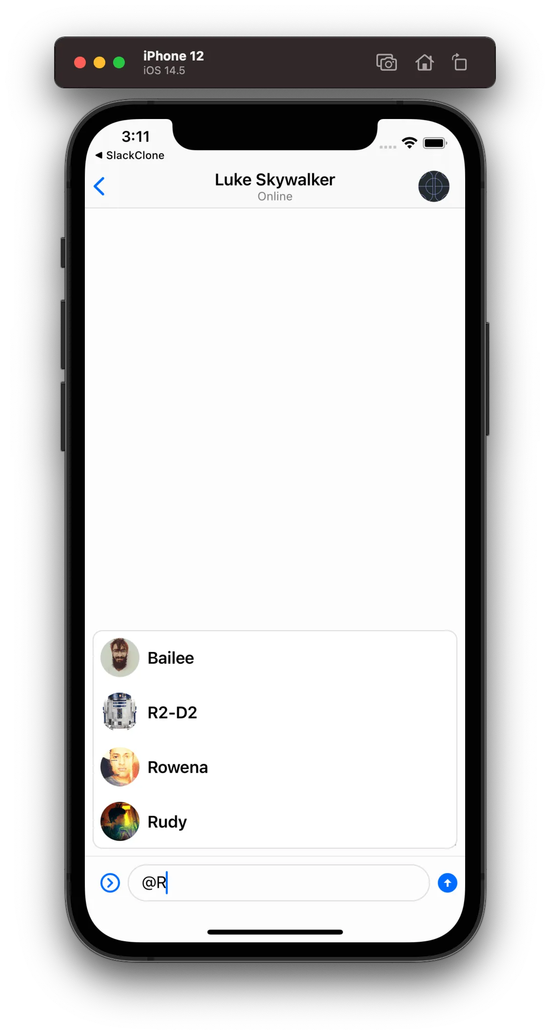 |
Bypassing how the Suggestions are Presented
Finally, if you need to have complete control over how the suggestions are presented and not use our ChatSuggestionsVC component, you can do that by overriding the following functions:
class CustomComposerVC: ComposerVC {
    override func showMentionSuggestions(for typingMention: String, mentionRange: NSRange) {
        // Add your custom implementation to show mention suggestions
    }

    override func showCommandSuggestions(for typingCommand: String) {
        // Add your custom implementation to show command suggestions
    }
}