 React
React iOS
iOS Android
 Flutter
 Angular
 JavaScript
 Unity
Unity Unreal
 Node
Node Python
 Ruby
Ruby PHP
PHP Java
Java .NET
.NET Go
Go REST
REST/// The content of the composer. Property of `ComposerVC`.
public var content: Content = .initial() {
didSet {
updateContentIfNeeded()
}
}Message Composer
The Message Composer provides all the UI and necessary functionality for writing and sending messages. It supports sending text, handling chat commands, suggestions autocompletion, uploading attachments like images, files, and videos. The composer is a combination of two components, the ComposerVC and the ComposerView, the first one is a view controller responsible for the functionality, where the latter is only responsible for the UI and layout.
If you enable photo library or camera attachments, make sure your app declares the required permissions in Info.plist (for example NSPhotoLibraryUsageDescription and NSCameraUsageDescription).
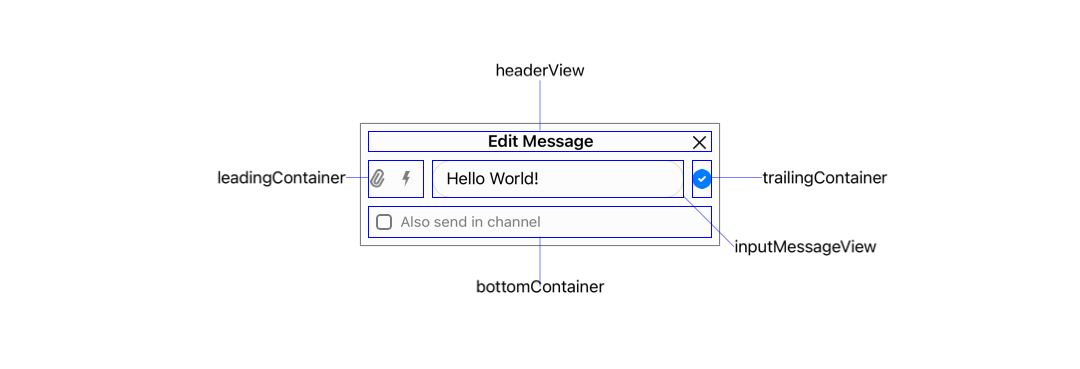
The ComposerVC is the view controller that manages all the functionality and interaction with the ComposerView. The ComposerView class holds all the composer subviews and implements the composer layout. The composer layout is built with multiple stack views, this makes it very customizable since to change the layout you only need to move/remove/add views from different containers.
In the picture below you can see all the containers and main views of the composer:
Composer Content
The ComposerVC.Content is a struct that contains all the data that will be part of the composed message. It contains the current text of the message, the attachments, the threadMessage in case you are inside a Thread, the command if you are sending, for example, a Giphy, and the state of the composer to determine whether you are creating, editing or quoting a message.
State
The composer has three states: .new, .edit, and .quote. The .new state is when the composer is creating a new message, the .edit state is when we are editing an existing message and changing its content, and finally, the .quote state is when we are replying to a message inline (not in a thread). In the table below we can see the composer in all three different states:
.new | .edit | .quote |
|---|---|---|
 | 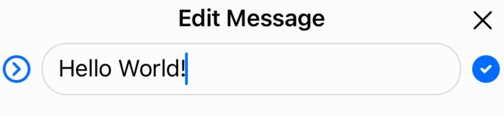 | 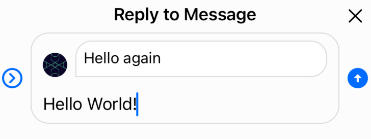 |
The .new state is the composer's default state, and it is initialized by the initial() static function of ComposerVC.Content:
You can change the state of the composer through the ComposerVC.Content's mutating functions:
content.editMessage(message:): Set's the state to.editand populates theeditingMessagewith the provided message.content.quoteMessage(message:): Set's the state to.quoteand populates thequotingMessage.content.clear(): Set's the state to.newand clears all the composer's content data.
Adding a Command
When adding a command to a message we need to make sure we clean the attachments and the current text. This is why you can only add a command through the ComposerVC.Content's addCommand(command:) mutating function which does this automatically for you.
UI Customization
The ComposerVC and ComposerView are highly customizable in both styling and functionality. You can change the layout, add new buttons and actions, customize the attachment picker, and modify typing suggestions.
Composer View
Since the ComposerView is responsible for the composer's layout, if you want to change the styling, the position of the views, remove views or add new ones, you need to override the ComposerView. Let's go through an example of customizing the composer to look like the iMessage app. The iMessage's composer is quite different than the composer that comes with the SDK: there is only one button to add pictures/videos and the send button is inside the input text container.
| Before | After |
|---|---|
 |  |
First, subclass the ComposerView and change its layout:
class iMessageComposerView: ComposerView {
    override func setUpLayout() {
        super.setUpLayout()

        // Move the send button from the trailing container to input container
        trailingContainer.removeArrangedSubview(sendButton)
        inputMessageView.inputTextContainer.addArrangedSubview(sendButton)

        // Remove spacing in leading container for bigger attachment button
        leadingContainer.spacing = 0

        // Make send button inside input container aligned to bottom
        inputMessageView.inputTextContainer.alignment = .bottom

        // Make the attachment button (camera button) bigger
        attachmentButton.widthAnchor.constraint(equalToConstant: 30).isActive = true
        attachmentButton.heightAnchor.constraint(equalToConstant: 30).isActive = true
    }

    override func layoutSubviews() {
        super.layoutSubviews()

        // Adjust the input corner radius to make the input rounder
        inputMessageView.container.layer.cornerRadius = 18
    }
}
To remove the commands button, disable the commands feature by subclassing ComposerVC and overriding isCommandsEnabled property, which can also be disabled by the Stream's Dashboard:
class iMessageComposerVC: ComposerVC {

    override var isCommandsEnabled: Bool {
        false
    }
}
Then, replace the default components with your custom ones:
Components.default.messageComposerView = iMessageComposerView.self
Components.default.messageComposerVC = iMessageComposerVC.self
You can find more information on how the components configuration works here.
Finally, replace the default attachments button icon with a camera icon:
Appearance.default.images.openAttachments = UIImage(systemName: "camera.fill")!.withTintColor(.systemBlue)You can find more information on how the appearance configuration works here.
New Composer Action
All the actions triggered by the Composer buttons are wired in the ComposerVC.setUp() lifecycle. When adding new buttons it is possible to add new actions by overriding this function. Let's pick the iMessage example and add an emoji button to the composer to open an Emoji picker.
First, add the emoji button to the ComposerView:
class iMessageComposerView: ComposerView {

    lazy var emojiButton: UIButton = {
        let button = UIButton()
        button.translatesAutoresizingMaskIntoConstraints = false
        button.setImage(UIImage(systemName: "face.smiling.fill"), for: .normal)
        return button
    }()

    override func setUpLayout() {
        super.setUpLayout()
        ...

        // Add the emoji button to the left side of attachment button
        leadingContainer.insertArrangedSubview(emojiButton, at: 0)
        // Make the emoji button same size as attachment button
        emojiButton.widthAnchor.constraint(equalToConstant: 30).isActive = true
        emojiButton.heightAnchor.constraint(equalToConstant: 30).isActive = true
    }
}| Before | After |
|---|---|
|  |
Now, setup an action for it and handle the logic of the new emoji picker. Subclass the ComposerVC and override the setUp() function to add a new action and override updateContent() to hide the emoji button when the input text is empty:
class iMessageComposerVC: ComposerVC {

    // We need to cast the composerView to our new `iMessageComposerView`
    // so that we can have access to the new `emojiButton`.
    var iMessageComposerView: iMessageComposerView {
        composerView as! iMessageComposerView
    }

    override func setUp() {
        super.setUp()

        // Add a target action to the emoji button
        iMessageComposerView
            .emojiButton
            .addTarget(self, action: #selector(showEmojiPicker), for: .touchUpInside)
    }

    @objc func showEmojiPicker(sender: UIButton) {

        // For the sake of making the guide simple,
        // we use an alert controller to select emojis.
        let sheetAlertController = UIAlertController(
            title: "Emoji Picker",
            message: nil,
            preferredStyle: .actionSheet
        )

        ["😃", "😇", "😅", "😂"].forEach { emoji in

            let action = UIAlertAction(title: emoji, style: .default) { _ in
                let inputTextView = self.composerView.inputMessageView.textView
                // Populate the emoji in the input view where is the caret position
                inputTextView.replaceSelectedText(emoji)
            }

            sheetAlertController.addAction(action)
        }

        present(sheetAlertController, animated: true)
    }

    override func updateContent() {
        super.updateContent()

        // Hide the emojiButton when the input text is not empty (Input expands)
        self.iMessageComposerView.emojiButton.isHidden = !self.content.text.isEmpty
    }
}
Finally, replace the custom component:
Components.default.messageComposerVC = iMessageComposerVC.self
Components.default.messageComposerView = iMessageComposerView.self
After customizing the ComposerVC with the changes above you should now have an emoji picker when tapping the emoji button. To make the guide simple, we used an UIAlertController for the emoji picker but you can create your own custom emoji picker.
Using PHPickerViewController
If you want to use Apple's modern PHPickerViewController instead of the default attachment picker, you can customize the composer to present and handle the PHPicker.
First, import the necessary PhotosUI framework and create a custom ComposerVC subclass that conforms to PHPickerViewControllerDelegate:
import PhotosUI

class CustomComposerVC: ComposerVC, PHPickerViewControllerDelegate {

    // Override the media picker to use PHPickerViewController.
    override var mediaPickerVC: UIViewController {
        var configuration = PHPickerConfiguration()
        configuration.filter = .images
        configuration.selectionLimit = 8

        let picker = PHPickerViewController(configuration: configuration)
        picker.delegate = self
        return picker
    }

    func picker(_ picker: PHPickerViewController, didFinishPicking results: [PHPickerResult]) {
        picker.dismiss(animated: true)

        let imageItems: [NSItemProvider] = results
            .map { $0.itemProvider }
            .filter { $0.hasItemConformingToTypeIdentifier(UTType.image.identifier) }

        for item in imageItems {
            item.loadObject(ofClass: UIImage.self) { [weak self] image, error in
                guard let image = image as? UIImage else { return }
                guard let imageUrl = try? image.temporaryLocalUrl() else { return }

                let localAttachmentInfo: [LocalAttachmentInfoKey: Any] = [
                    .originalImage: image
                ]

                DispatchQueue.main.async {
                    do {
                        try self?.addAttachmentToContent(
                            from: imageUrl,
                            type: .image,
                            info: localAttachmentInfo
                        )
                    } catch {
                        self?.handleAddAttachmentError(
                            attachmentURL: imageUrl,
                            attachmentType: .image,
                            error: error
                        )
                    }
                }
            }
        }
    }
}
You'll also need a helper extension to convert the UIImage to a temporary URL that can be used by the SDK:
extension UIImage {
    func temporaryLocalUrl() throws -> URL? {
        guard let imageData = jpegData(compressionQuality: 1.0) else { return nil }
        let imageName = "\(UUID().uuidString).jpg"
        let documentDirectory = NSTemporaryDirectory()
        let localPath = documentDirectory.appending(imageName)
        let photoURL = URL(fileURLWithPath: localPath)
        try imageData.write(to: photoURL)
        return photoURL
    }
}
Finally, replace the default composer component with your custom one:
Components.default.messageComposerVC = CustomComposerVC.selfCustom Typing Suggestions
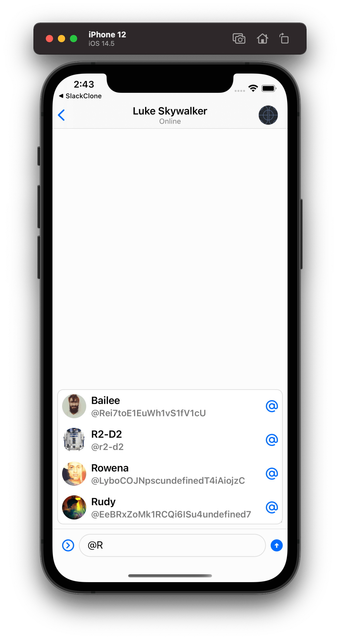
When typing on the composer, if you type @ it will present a view suggesting users that you can mention, or if you type / as the first character, it will show command suggestions. You can customize not only the UI of the suggestions but also the logic around it, as well as disable this feature.
Disabling the Suggestions
Your app might not want to support suggestions at all like the iMessage app, or want to support only one of the suggestions available. You can disable the suggestions feature by just returning nil on the following functions:
class iMessageComposerVC: ComposerVC {

    override func typingMention(in textView: UITextView) -> (String, NSRange)? {
        return nil
    }

    override func typingCommand(in textView: UITextView) -> String? {
        return nil
    }
}
Changing the Suggestions UI
The UI SDK provides a ChatSuggestionsVC component responsible for showing user suggestions and commands suggestions.
Customizing the Suggestions Container
In case you only want to change the styling of the container that shows both suggestions, you can override the ChatSuggestionsVC. Here is an example of a basic customization of the container component:
class CustomChatSuggestionsVC: ChatSuggestionsVC {
    override func setUpAppearance() {
        super.setUpAppearance()

        collectionView.layer.borderWidth = 1
        collectionView.layer.borderColor = appearance.colorPalette.border.cgColor
        view.layer.shadowOpacity = 0.0
    }

    override func layoutSubviews() {
        super.layoutSubviews()
        collectionView.layer.cornerRadius = 10
    }
}
Then, replace the custom component:
Components.default.suggestionsVC = CustomChatSuggestionsVC.selfHere we simply remove the shadow and customize the border style of the suggestions component.
| Before | After |
|---|---|
 |  |
Customizing the Suggestions Cells
If you want to further customize the suggestions UI and want to change the suggestions cells, the recommended way is to subclass the ChatMentionSuggestionView and ChatCommandSuggestionView components. Let's see an example of how we can change the user mention cell by removing the username and the "@" symbol:
class CustomMentionSuggestionView: ChatMentionSuggestionView {

    override func setUpLayout() {
        super.setUpLayout()

        textContainer.removeArrangedSubview(usernameTagLabel)
        mentionSymbolImageView.removeFromSuperview()
    }
}
Then, replace the custom component:
Components.default.suggestionsMentionView = CustomMentionSuggestionView.self| Before | After |
|---|---|
|  |
Bypassing how the Suggestions are Presented
Finally, if you need to have complete control over how the suggestions are presented and not use our ChatSuggestionsVC component, you can do that by overriding the following functions:
class CustomComposerVC: ComposerVC {
    override func showMentionSuggestions(for typingMention: String, mentionRange: NSRange) {
        // Add your custom implementation to show mention suggestions
    }

    override func showCommandSuggestions(for typingCommand: String) {
        // Add your custom implementation to show command suggestions
    }
}
Advanced Usage
The ComposerVC is used by both the Channel and Thread components, but you can also add the ComposerVC in your View Controller as a child view if needed. Please keep in mind that if you do so you will need to manage the keyboard yourself. Here is an example of how you can add the composer as a child view controller:
class CustomChatVC: UIViewController {

    /// The channel controller injected from the Channel List
    var channelController: ChatChannelController!

    /// Your own custom message list view
    lazy var customMessageListView: CustomMessageListView = CustomMessageListView()

    /// The Message Composer view controller
    lazy var messageComposerVC = ComposerVC()

    /// The bottom constraint of the Message Composer for managing the keyboard
    private var messageComposerBottomConstraint: NSLayoutConstraint?

    /// Component responsible for setting the correct offset when keyboard frame is changed.
    open lazy var keyboardHandler: KeyboardHandler = ComposerKeyboardHandler(
        composerParentVC: self,
        composerBottomConstraint: messageComposerBottomConstraint
    )

    override func viewDidLoad() {
        super.viewDidLoad()

        // Set the required dependencies of the composer
        messageComposerVC.channelController = channelController
        messageComposerVC.userSearchController = ChatClient.shared.userSearchController()

        // Add the message composer as a child view controller
        messageComposerVC.view.translatesAutoresizingMaskIntoConstraints = false
        messageComposerVC.willMove(toParent: self)
        addChild(messageComposerVC)
        view.addSubview(messageComposerVC.view)
        messageComposerVC.didMove(toParent: self)

        // Set the message composer at the bottom of the view
        NSLayoutConstraint.activate([
            messageComposerVC.view.topAnchor.pin(equalTo: customMessageListView.bottomAnchor),
            messageComposerVC.view.leadingAnchor.pin(equalTo: view.leadingAnchor),
            messageComposerVC.view.trailingAnchor.pin(equalTo: view.trailingAnchor)
        ])

        // Message composer bottom constraint to manage the keyboard
        messageComposerBottomConstraint = messageComposerVC.view.bottomAnchor.pin(equalTo: view.bottomAnchor)
        messageComposerBottomConstraint?.isActive = true
    }

    override open func viewDidAppear(_ animated: Bool) {
        super.viewDidAppear(animated)

        keyboardHandler.start()
    }

    override open func viewDidDisappear(_ animated: Bool) {
        super.viewDidDisappear(animated)

        keyboardHandler.stop()
    }
}
As you can see if you want to use the ComposerVC in your custom message list view you need to setup the dependencies of the composer, add it as a child view controller of your custom message list view controller, and even manage the keyboard yourself or use our keyboard observer to manage it.
By default, the ComposerView is managed by the ComposerVC, but if you want to provide your custom view controller to manage the composer view from scratch you can too. The only thing you need to do is to add the composer view to your custom view controller, and then manage all the actions and logic of the composer yourself:
class CustomComposerVC: UIViewController {

    lazy var composerView = ComposerView()

    override func viewDidLoad() {
        super.viewDidLoad()

        // Add the composer view as subview of custom view controller
        view.addSubview(composerView)

        // Setup the composer view constraints to cover all the view
        NSLayoutConstraint.activate([
            composerView.leadingAnchor.constraint(equalTo: view.leadingAnchor),
            composerView.trailingAnchor.constraint(equalTo: view.trailingAnchor),
            composerView.topAnchor.constraint(equalTo: view.topAnchor),
            composerView.bottomAnchor.constraint(equalTo: view.bottomAnchor)
        ])
    }
}